
 v0.8.2
custom_navigation_bar
具有氣泡點擊效果的自訂導航列。靈感來自《無聊的Flutter開發秀》第35集。
534喜歡 1740近 30 天下載140Pub 分數
AndroidiOSWebmacOSWindowsLinux
帶有氣泡點擊效果的自訂導覽列(Flutter)

{"sdk":"flutter"}{"sdk":"flutter"}^1.8.2以下為英文專案原文快照,最新內容請造訪 GitHub。
A custom navigation bar with bubble click effect.
pub package License: MIT Star on Github Star on Github
This project is inspired by this post from Dribbble and The Boring Flutter Development Show, Ep. 35
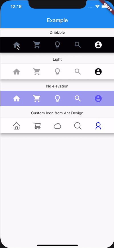
This package gives you a cute bubble effect when you click on the navigation bar.
Dribbble:
https://cdn.dribbble.com/users/2114584/screenshots/7134849/media/96e4a6002a476bad7bd809ac71e28698.gif
Implemented:
https://raw.githubusercontent.com/rickywen911/custom_bubble_navigation_bar/master/screenshot/6.gif
Add this to your package's pubspec.yaml file:
dependencies:
  custom_navigation_bar: lastest version
If you update from version under 0.6.0, there are some breaking changes in the version 0.6.0. The icon in CustomNavigationBarItem has changed from IconData to Widget.
old version
CustomNavigationBarItem(
      {@required this.icon,
      IconData selectedIcon,
      this.selectedTitle,
      this.unSelectedTitle,
      this.badgeCount = 0,
      this.showBadge = true})
      : selectedIcon = selectedIcon ?? icon;

  ///
  /// The icon of the item
  /// Typically the icon is an [Icon].
  ///
  final IconData icon;
new version
CustomNavigationBarItem(
      {@required this.icon,
      Widget selectedIcon,
      this.title,
      Text selectedTitle,
      this.badgeCount = 0,
      this.showBadge = false})
      : selectedIcon = selectedIcon ?? icon,
        selectedTitle = selectedTitle ?? title;

  ///
  /// The icon of the item
  /// Typically the icon is an [Icon].
  ///

  final Widget icon;
| Attributes | Type | Description | Default |
|---|---|---|---|
scaleFactor |
double |
scale factor for the icon scale animation. | 0.2 |
elevation |
double |
The z-coordinate of this CustomNavigationBar | 8.0 |
items |
List |
item data in CustomNavigationBar | required |
selectedColor |
Color |
[Color] when [CustomNavigationBarItem] is selected | [blueAccent] |
unSelectedColor |
Color |
[Color] when [CustomNavigationBarItem] is not selected. | grey[600] |
onTap |
Function(int) |
callback function when item tapped | null |
currentIndex |
int |
current index of navigation bar. | 0 |
iconSize |
double |
size of icon. also represent the max radius of bubble effect animation. | 24.0 |
backgroundColor |
Color |
Background color of [CustomNavigationBar] | Colors.white |
strokeColor |
Color |
stroke color | blueAccent |
bubbleCurve |
Curve |
animation curve of bubble effect | linear |
scaleCurve |
Curve |
animation curve of scale effect | linear |
borderRadius |
Radius |
border radius of navigation bar | Radius.zero |
isFloating |
bool |
control if CustomNavigationBar is floating | false |
blurEffect |
bool |
control if CustomNavigationBar show blur effect | false |
opacity |
double |
control CustomNavigationBar blur effect opacity when blurEffect is true |
0.8 |
brightness |
Brightness |
describes the contrast of a theme or color palette. If you want adaptive system display setting like iOS dark mode , you should set Brightness.dark or Brightness.light . if this attribute be set , other attributes with "*Color" (like selectedColor) will not take effect , should use lightThemeData or darkThemeData |
null |
lightThemeData |
CustomNavigationBarThemeData |
when brightnessis light,you can custom the light theme color if you want it |
null |
darkThemeData |
CustomNavigationBarThemeData |
when brightnessis dark,you can custom the dark theme color if you want it |
null |
Attention: If you set isFloating to true, I would recommand you to set extendBody to true in Scaffold for a better performance.
And for customize icon in the navigation bar, just put the icons you want in the CustomNavigationBarItem like this.
CustomNavigationBar(
        ...
        items: [
          CustomNavigationBarItem(
          icon: Icon(Icons.home),
          title: Text("hello"),
        ),
        CustomNavigationBarItem(
          icon: Icon(Icons.shopping_cart),
        ),
        CustomNavigationBarItem(
          icon: Icon(Icons.lightbulb_outline),
        ),
        CustomNavigationBarItem(
          icon: Icon(Icons.search),
        ),
        CustomNavigationBarItem(
          icon: Icon(Icons.account_circle),
        ),
        ],
        ...
      )
If you want add notification badge, just use like this
CustomNavigationBar(
        ...
        items: [
        CustomNavigationBarItem(
          icon: Icon(Icons.home),
          badgeCount: _badgeCounts[0],
          showBadge: _badgeShows[0],
        ),
        CustomNavigationBarItem(
          icon: Icon(Icons.shopping_bag),
          badgeCount: _badgeCounts[1],
          showBadge: _badgeShows[1],
        ),
        CustomNavigationBarItem(
          icon: Icon(Icons.lightbulb_outline),
          badgeCount: _badgeCounts[2],
          showBadge: _badgeShows[2],
        ),
        CustomNavigationBarItem(
          icon: Icon(Icons.search),
          badgeCount: _badgeCounts[3],
          showBadge: _badgeShows[3],
        ),
        CustomNavigationBarItem(
          icon: Icon(Icons.account_circle),
          badgeCount: _badgeCounts[4],
          showBadge: _badgeShows[4],
        ),
      ],
        ...
      )
To clear a badge, set showBadge to false
If you want add title under icon, just use like this
CustomNavigationBar(
      iconSize: 30.0,
      selectedColor: Color(0xff040307),
      strokeColor: Color(0x30040307),
      unSelectedColor: Color(0xffacacac),
      backgroundColor: Colors.white,
      items: [
        CustomNavigationBarItem(
          icon: Icon(Icons.home),
          title: Text("Home"),
        ),
        CustomNavigationBarItem(
          icon: Icon(Icons.shopping_cart),
          title: Text("Cart"),
        ),
        CustomNavigationBarItem(
          icon: Icon(Icons.lightbulb_outline),
          title: Text("Explore"),
        ),
        CustomNavigationBarItem(
          icon: Icon(Icons.search),
          title: Text("Search"),
        ),
        CustomNavigationBarItem(
          icon: Icon(Icons.account_circle),
          title: Text("Me"),
        ),
      ],
      currentIndex: _currentIndex,
      onTap: (index) {
        setState(() {
          _currentIndex = index;
        });
      },
    );
Check example app for more details.
Issues and pull requests are welcomed!!