搜尋套件、儲存庫與 APP 分類

custom_navigation_bar 封面
套件詳情v0.8.2

custom_navigation_bar

具有氣泡點擊效果的自訂導航列。靈感來自《無聊的Flutter開發秀》第35集。

AndroidiOSWebmacOSWindowsLinux
近 30 天下載
1120
喜歡數
534
Pub 分數
140

安裝套件

flutter pub add custom_navigation_bar

套件介紹

根據套件公開資料產生的選型評估,僅供參考。

一個可自訂的底部落導航列,具備氣泡點擊效果,靈感來自《無聊的Flutter開發秀》第35集。它透過流暢的動畫與點擊時的視覺反饋,提升使用者互動體驗。此套件支援多個平台,包括 Android、iOS、Web、macOS、Windows 和 Linux,非常適合跨平台應用。開發者可輕鬆調整外觀與行為,以符合應用程式設計語言。

適用情境

  • 跨平台移動和網頁應用
  • 需要動畫導航反饋的應用
  • 帶有互動元件的自訂UI設計
  • 增強底部導航中的使用者體驗
  • 將有趣的動畫融入導航欄

主要特色

  • 氣泡點擊動畫效果
  • 高度可自訂的外觀
  • 支援多個平台
  • 與 Flutter 的輕鬆整合
  • 流暢的觸覺反饋
  • 可設定的項目間距和大小

適合對象

  • 尋求動畫導航欄的Flutter開發者
  • 注重設計的應用程式
  • 需要互動式UI組件的項目
  • 受《無聊的Flutter開發秀》啟發的開發者
  • 針對多平台部署的應用程式

使用建議

  • 可能影響低階裝置的效能
  • 需要仔細規劃顏色和尺寸以獲得最佳視覺效果
  • 有限的內建輔助功能
  • 動畫可能不適合所有設計美學
  • 不適合極簡或平面設計主題

原始 README

以下為關聯原始碼儲存庫的 README 原文快照,最新內容請造訪原始碼儲存庫。

custom_navigation_bar

A custom navigation bar with bubble click effect.

pub package License: MIT Star on Github Star on Github

Overview

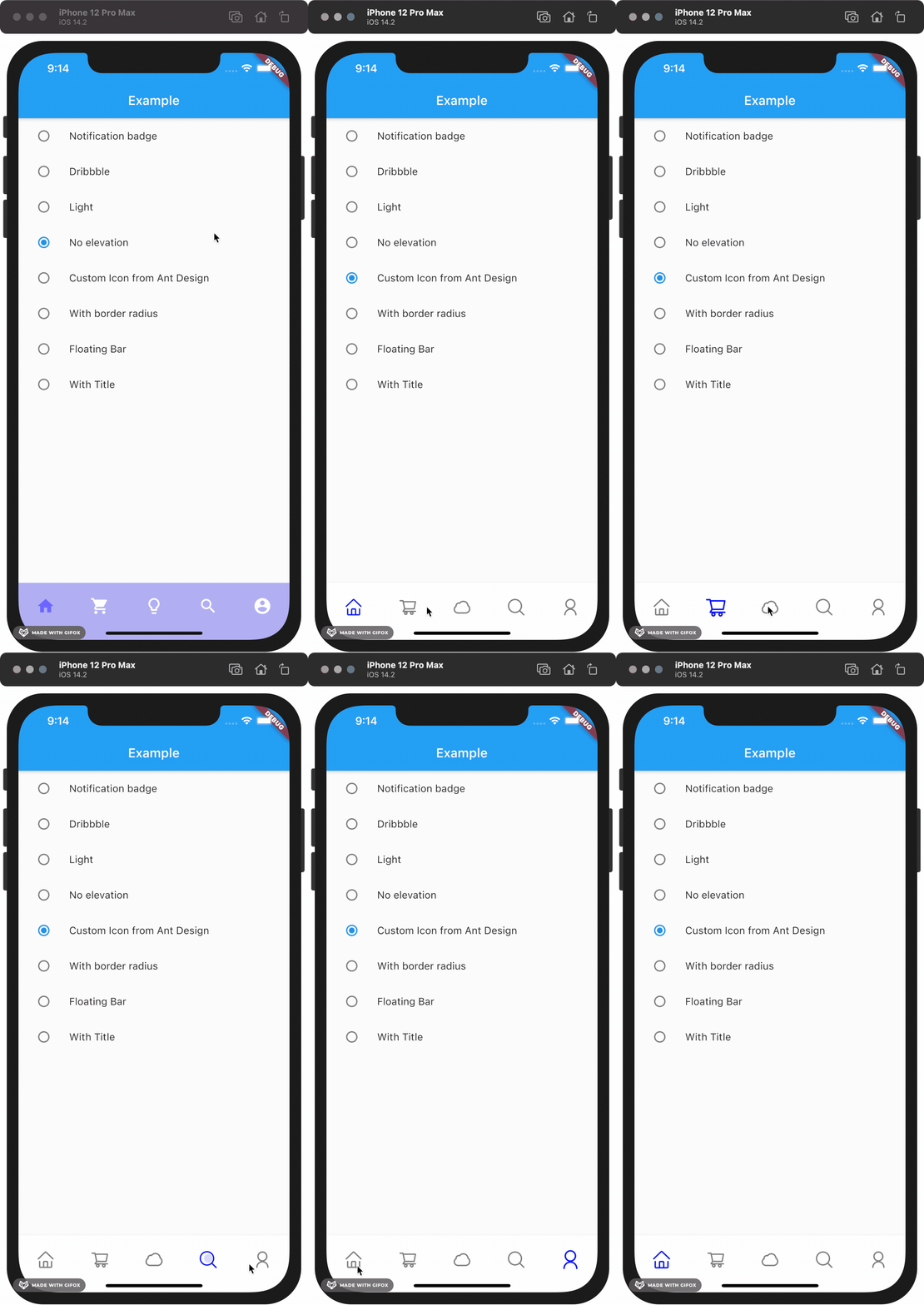
This project is inspired by this post from Dribbble and The Boring Flutter Development Show, Ep. 35

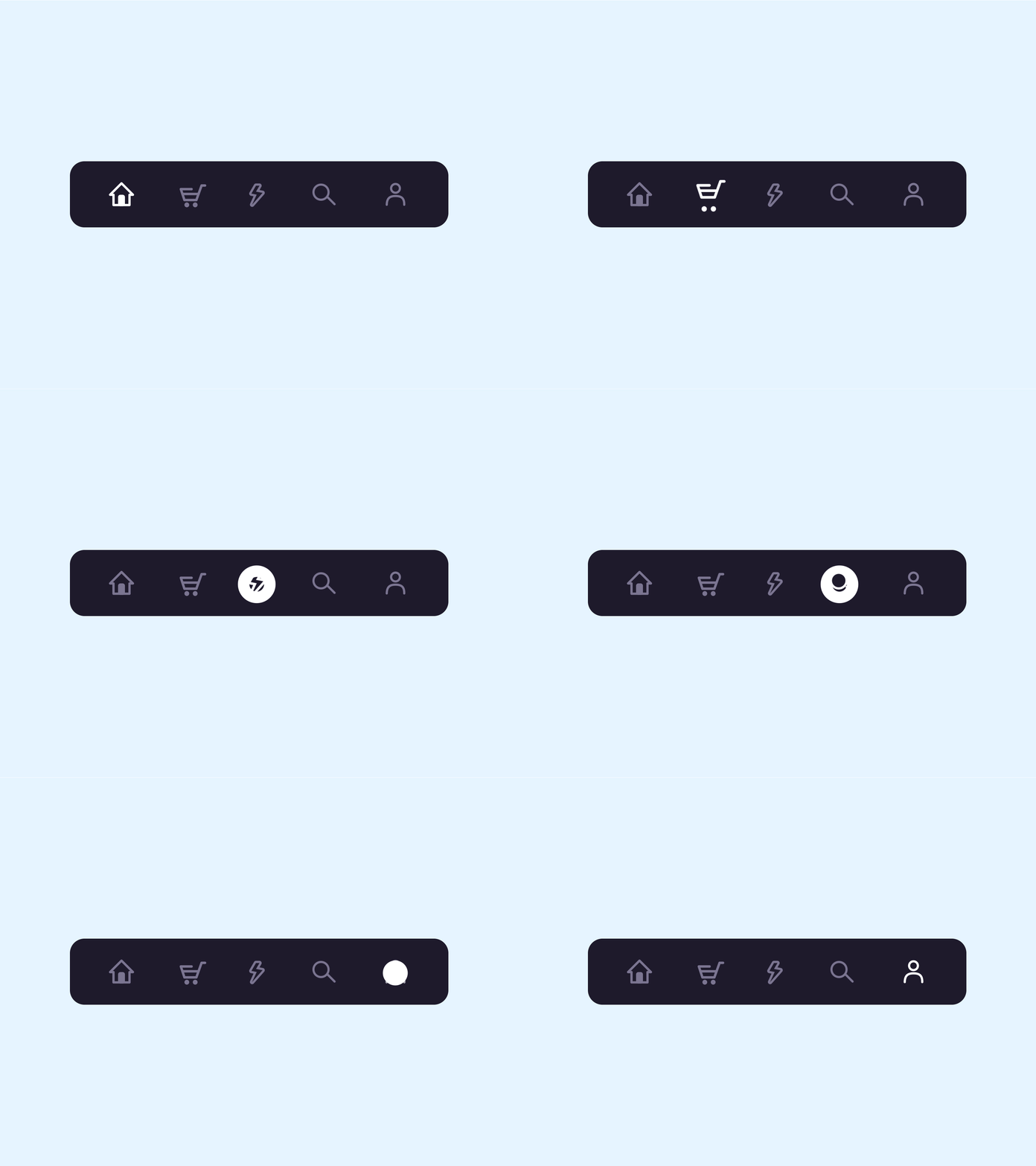
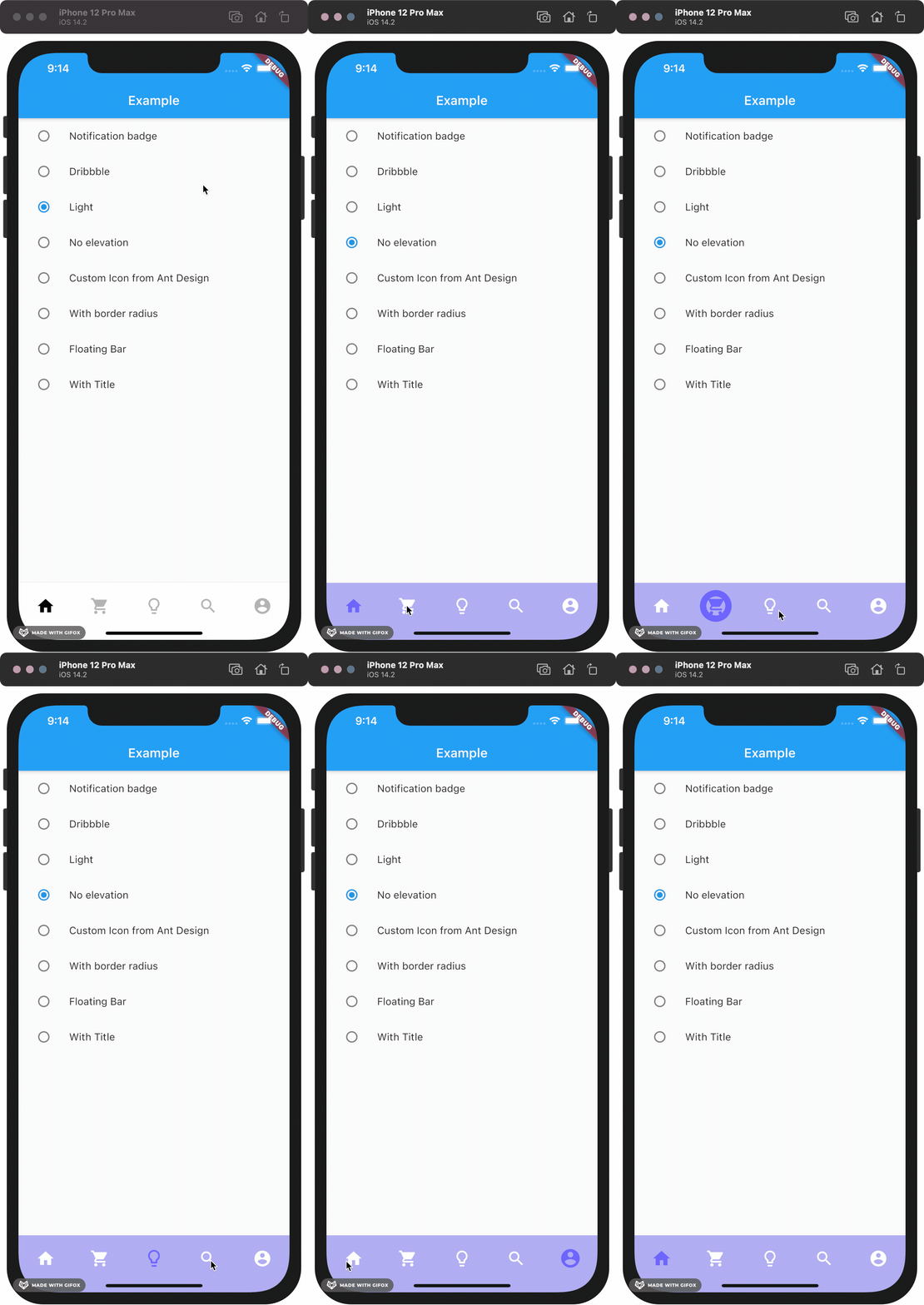
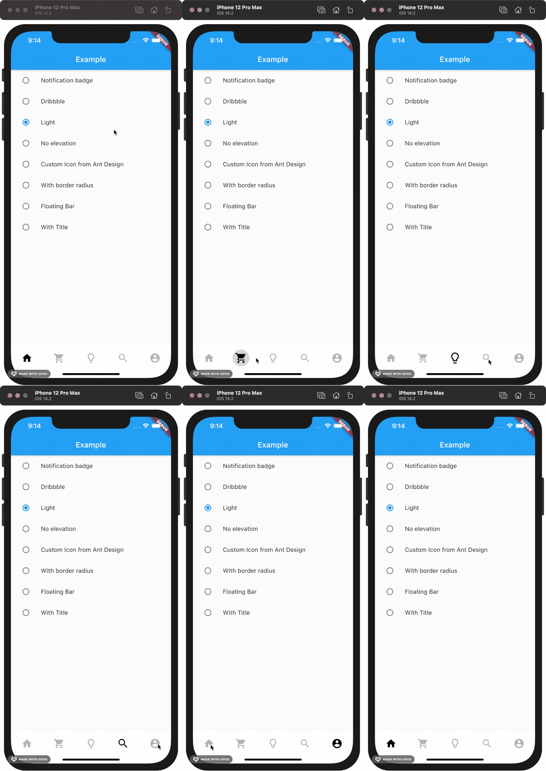
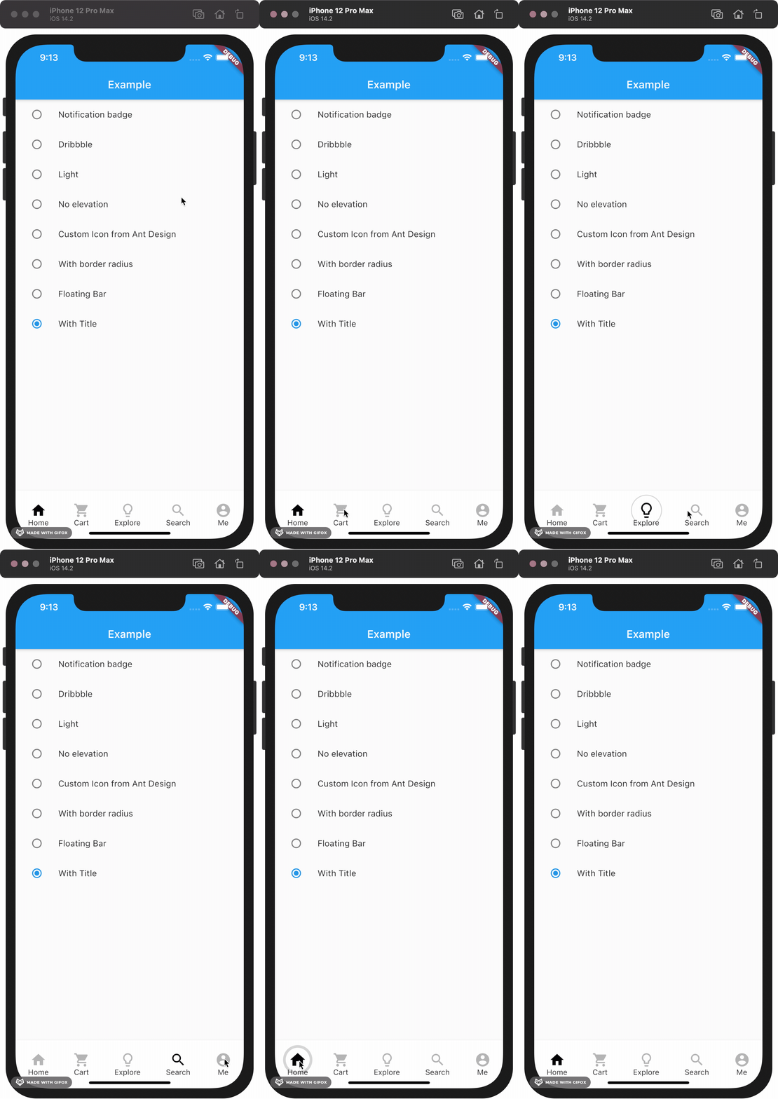
This package gives you a cute bubble effect when you click on the navigation bar.

Dribbble:

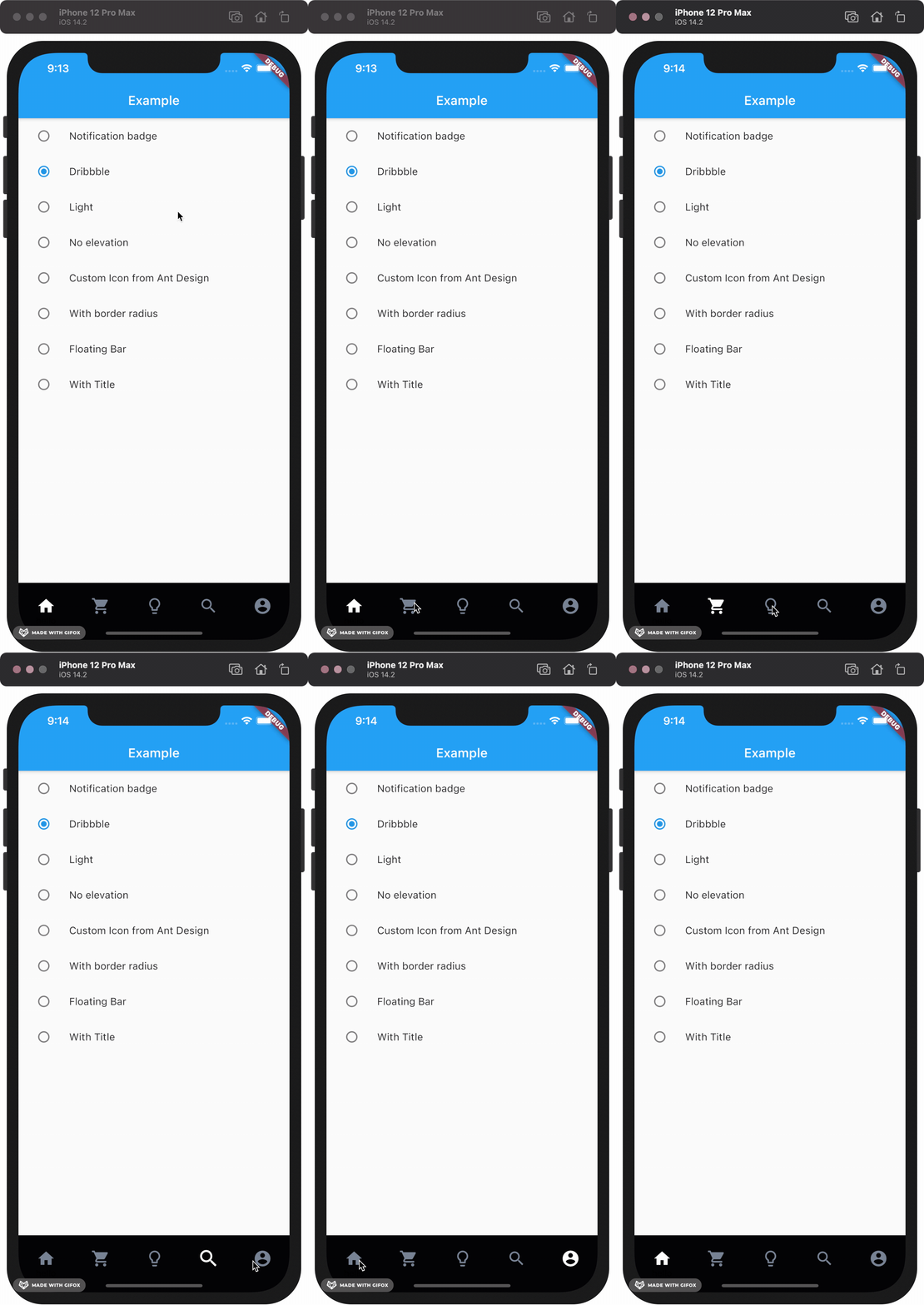
Implemented:

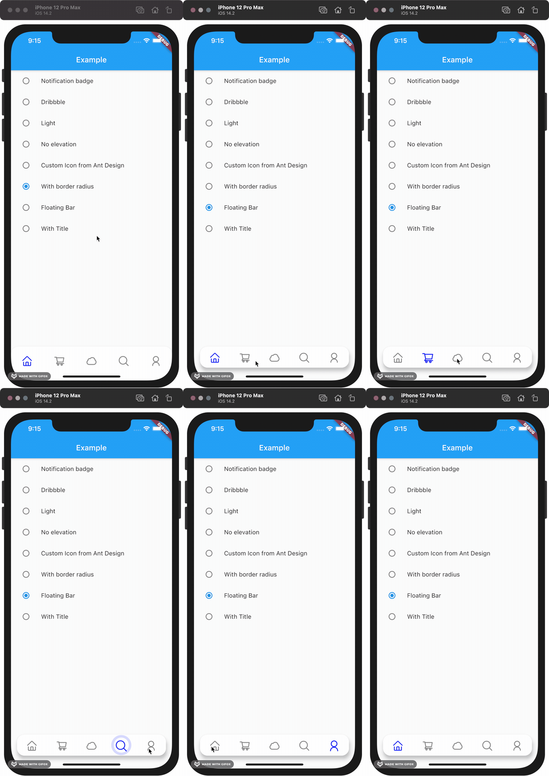
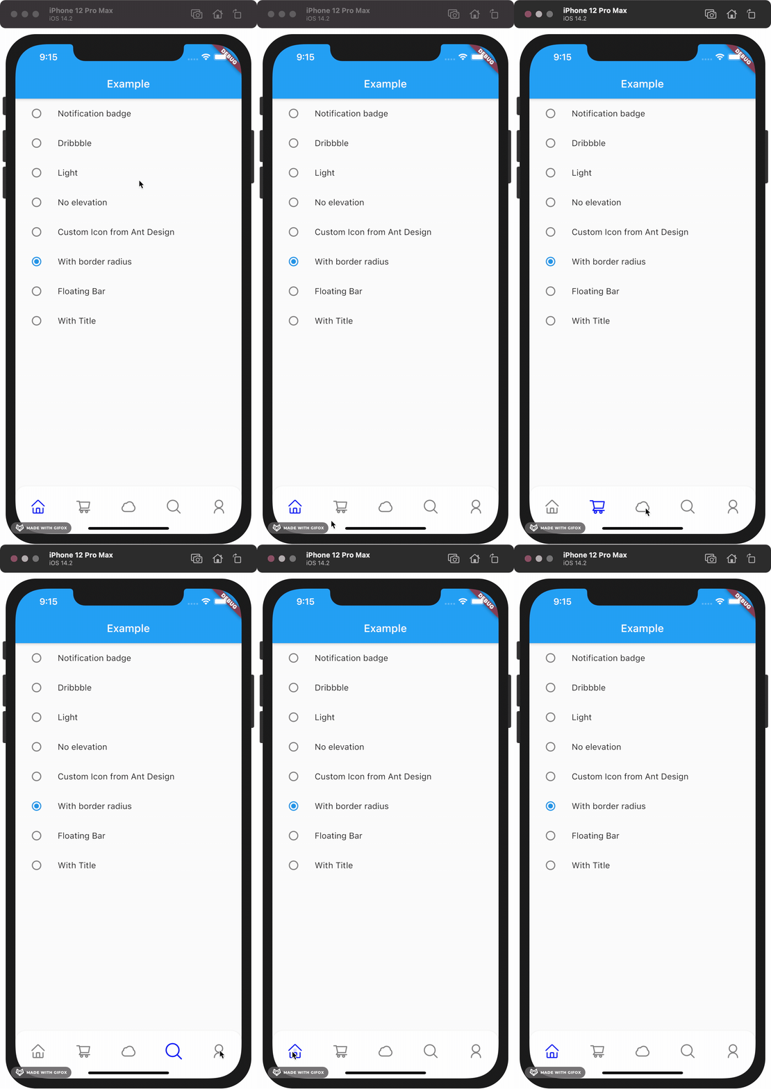
Gallery

How to install

Add this to your package's pubspec.yaml file:

dependencies:
  custom_navigation_bar: lastest version

Documentation

Attention

If you update from version under 0.6.0, there are some breaking changes in the version 0.6.0. The icon in CustomNavigationBarItem has changed from IconData to Widget.

old version

CustomNavigationBarItem(
      {@required this.icon,
      IconData selectedIcon,
      this.selectedTitle,
      this.unSelectedTitle,
      this.badgeCount = 0,
      this.showBadge = true})
      : selectedIcon = selectedIcon ?? icon;

  ///
  /// The icon of the item
  /// Typically the icon is an [Icon].
  ///
  final IconData icon;

new version

CustomNavigationBarItem(
      {@required this.icon,
      Widget selectedIcon,
      this.title,
      Text selectedTitle,
      this.badgeCount = 0,
      this.showBadge = false})
      : selectedIcon = selectedIcon ?? icon,
        selectedTitle = selectedTitle ?? title;

  ///
  /// The icon of the item
  /// Typically the icon is an [Icon].
  ///

  final Widget icon;      
You can customize these attributes in the navigation bar.
Attributes Type Description Default
scaleFactor double scale factor for the icon scale animation. 0.2
elevation double The z-coordinate of this CustomNavigationBar 8.0
items List item data in CustomNavigationBar required
selectedColor Color [Color] when [CustomNavigationBarItem] is selected [blueAccent]
unSelectedColor Color [Color] when [CustomNavigationBarItem] is not selected. grey[600]
onTap Function(int) callback function when item tapped null
currentIndex int current index of navigation bar. 0
iconSize double size of icon. also represent the max radius of bubble effect animation. 24.0
backgroundColor Color Background color of [CustomNavigationBar] Colors.white
strokeColor Color stroke color blueAccent
bubbleCurve Curve animation curve of bubble effect linear
scaleCurve Curve animation curve of scale effect linear
borderRadius Radius border radius of navigation bar Radius.zero
isFloating bool control if CustomNavigationBar is floating false
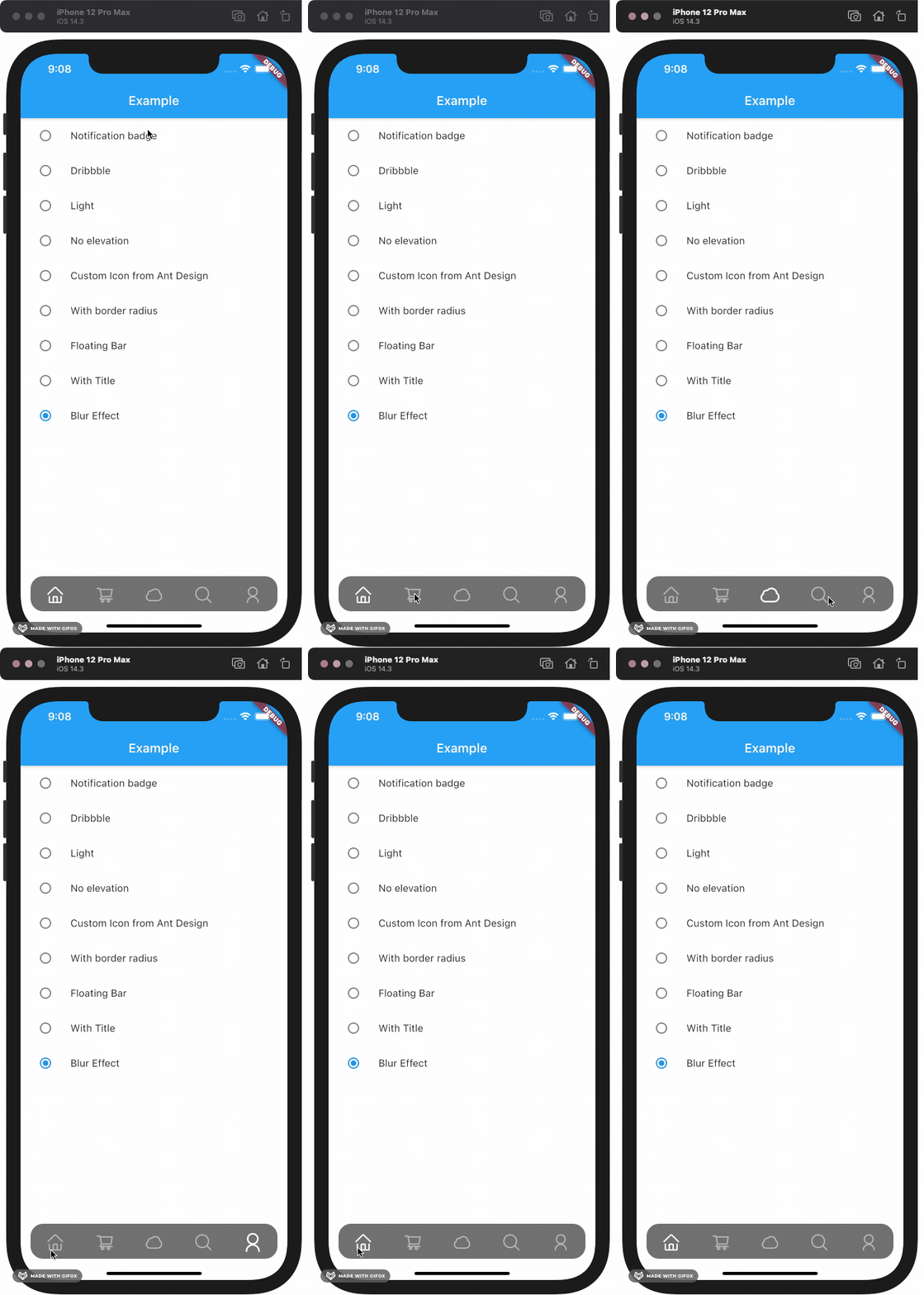
blurEffect bool control if CustomNavigationBar show blur effect false
opacity double control CustomNavigationBar blur effect opacity when blurEffect is true 0.8
brightness Brightness describes the contrast of a theme or color palette. If you want adaptive system display setting like iOS dark mode , you should set Brightness.dark or Brightness.light . if this attribute be set , other attributes with "*Color" (like selectedColor) will not take effect , should use lightThemeData or darkThemeData null
lightThemeData CustomNavigationBarThemeData when brightnessis light,you can custom the light theme color if you want it null
darkThemeData CustomNavigationBarThemeData when brightnessis dark,you can custom the dark theme color if you want it null

Attention: If you set isFloating to true, I would recommand you to set extendBody to true in Scaffold for a better performance.

And for customize icon in the navigation bar, just put the icons you want in the CustomNavigationBarItem like this.

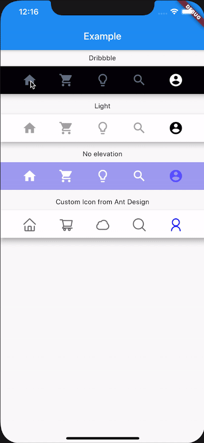
CustomNavigationBar(
        ...
        items: [
          CustomNavigationBarItem(
          icon: Icon(Icons.home),
          title: Text("hello"),
        ),
        CustomNavigationBarItem(
          icon: Icon(Icons.shopping_cart),
        ),
        CustomNavigationBarItem(
          icon: Icon(Icons.lightbulb_outline),
        ),
        CustomNavigationBarItem(
          icon: Icon(Icons.search),
        ),
        CustomNavigationBarItem(
          icon: Icon(Icons.account_circle),
        ),
        ],
        ...
      )

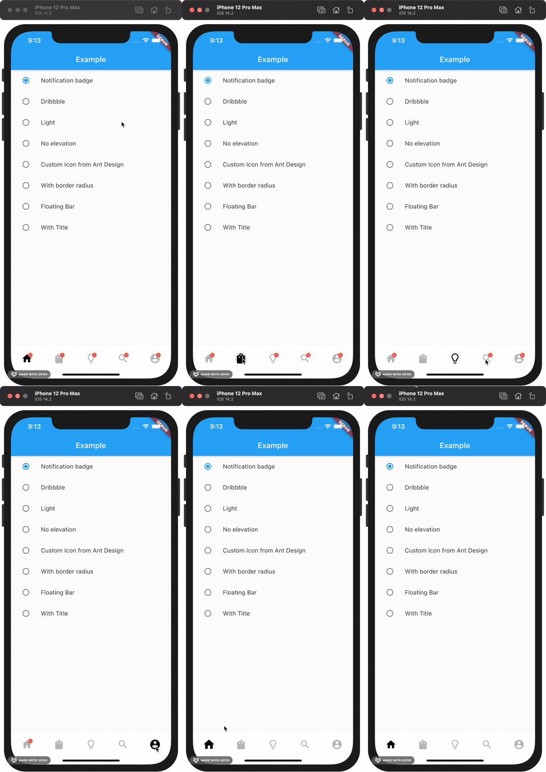
If you want add notification badge, just use like this

CustomNavigationBar(
        ...
        items: [
        CustomNavigationBarItem(
          icon: Icon(Icons.home),
          badgeCount: _badgeCounts[0],
          showBadge: _badgeShows[0],
        ),
        CustomNavigationBarItem(
          icon: Icon(Icons.shopping_bag),
          badgeCount: _badgeCounts[1],
          showBadge: _badgeShows[1],
        ),
        CustomNavigationBarItem(
          icon: Icon(Icons.lightbulb_outline),
          badgeCount: _badgeCounts[2],
          showBadge: _badgeShows[2],
        ),
        CustomNavigationBarItem(
          icon: Icon(Icons.search),
          badgeCount: _badgeCounts[3],
          showBadge: _badgeShows[3],
        ),
        CustomNavigationBarItem(
          icon: Icon(Icons.account_circle),
          badgeCount: _badgeCounts[4],
          showBadge: _badgeShows[4],
        ),
      ],
        ...
      )

To clear a badge, set showBadge to false

If you want add title under icon, just use like this

CustomNavigationBar(
      iconSize: 30.0,
      selectedColor: Color(0xff040307),
      strokeColor: Color(0x30040307),
      unSelectedColor: Color(0xffacacac),
      backgroundColor: Colors.white,
      items: [
        CustomNavigationBarItem(
          icon: Icon(Icons.home),
          title: Text("Home"),
        ),
        CustomNavigationBarItem(
          icon: Icon(Icons.shopping_cart),
          title: Text("Cart"),
        ),
        CustomNavigationBarItem(
          icon: Icon(Icons.lightbulb_outline),
          title: Text("Explore"),
        ),
        CustomNavigationBarItem(
          icon: Icon(Icons.search),
          title: Text("Search"),
        ),
        CustomNavigationBarItem(
          icon: Icon(Icons.account_circle),
          title: Text("Me"),
        ),
      ],
      currentIndex: _currentIndex,
      onTap: (index) {
        setState(() {
          _currentIndex = index;
        });
      },
    );

Example

Check example app for more details.

Contribute

Issues and pull requests are welcomed!!

Future Plans
  • [x] Code format
  • [x] Make it more like native navigation bar in Flutter.
  • [x] Better documentation
  • [ ] More customizations!! And more...

所屬分類

原始碼儲存庫

使用此套件的專案

暫無相關資料。