
 v2.0.9
select2dot1
Select2dot1 為您提供一個完全可自定義的單選/多選方塊,支援搜尋、分組選項、額外資訊和頭像。使用覆蓋層和模態框實現。
46喜歡 423近 30 天下載150Pub 分數
AndroidiOSWebmacOSWindowsLinux
Select2 Flutter 套件可在 pub.dev/packages/select2dot1 找到

{"sdk":"flutter"}>=4.20.0 <6.0.0>=2.0.0 <4.0.0{"sdk":"flutter"}>=0.0.2 <2.0.0以下為英文專案原文快照,最新內容請造訪 GitHub。
platform build pub package pub points License: MIT Buy Me A Coffee
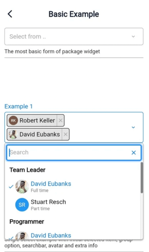
Select2dot1 gives you a customizable single/multiple select box with support for searching, group option, extra info and avatar. Select2dot1 utilizes overlays on (web, desktop) and modal for mobile. Its entirely customizable through settings and builder.
| Desktop Example | Mobile Example |
|---|---|
| https://github.com/romanjrdykyj/select2dot1/blob/main/img/desktop_example.webp?raw=true | https://github.com/romanjrdykyj/select2dot1/blob/main/img/mobile_example.webp?raw=true |
| Android | iOS | Web | Linux | macOS | Windows |
|---|---|---|---|---|---|
| ✔ | ✔ | ✔ | ✔ | ✔ | ✔ |
flutter pub add select2dot1
import 'package:select2dot1/select2dot1.dart';
static const List<SingleCategoryModel> exampleData = [
    SingleCategoryModel(
      nameCategory: 'Team Leader',
      singleItemCategoryList: [
        SingleItemCategoryModel(
          nameSingleItem: 'David Eubanks',
          extraInfoSingleItem: 'Full time',
          avatarSingleItem: CircleAvatar(
            backgroundColor: Colors.transparent,
            foregroundColor: Colors.transparent,
            backgroundImage: AssetImage('assets/images/avatar1.jpg'),
          ),
        ),
        SingleItemCategoryModel(
          nameSingleItem: 'Stuart Resch',
          extraInfoSingleItem: 'Part time',
          avatarSingleItem: CircleAvatar(
            backgroundColor: Colors.blue,
            child: Text('SR', style: TextStyle(color: Colors.white)),
          ),
        ),
      ],
    ),
  ];
Select2dot1(
    selectDataController: SelectDataController(data: exampleData),
    scrollController: scrollController,
),
ScrollController is used to control anchor position of dropdown menu. You can pass your own ScrollController to Select2dot1 widget.
https://github.com/romanjrdykyj/select2dot1/blob/main/img/scroll_controller.gif?raw=true
If you want to change something that is not available in settings, you will have to make your own component through using the builder option. Check the customization section for more information.
In this section you can see how the components of Select2dot1 widget look like as well as their hierarchy. You can also see how to customize them by settings and builder. For more details hierarchy of components , go to Tree View Components with Settings section.
https://github.com/romanjrdykyj/select2dot1/blob/main/img/pillbox_configuration_1.png?raw=true
https://github.com/romanjrdykyj/select2dot1/blob/main/img/pillbox_configuration_2.png?raw=true
https://github.com/romanjrdykyj/select2dot1/blob/main/img/pillbox_configuration_3.png?raw=true
https://github.com/romanjrdykyj/select2dot1/blob/main/img/pillbox_configuration_4.png?raw=true
https://github.com/romanjrdykyj/select2dot1/blob/main/img/overlay_configuration_1.png?raw=true
https://github.com/romanjrdykyj/select2dot1/blob/main/img/overlay_configuration_2.png?raw=true
https://github.com/romanjrdykyj/select2dot1/blob/main/img/overlay_configuration_3.png?raw=true
https://github.com/romanjrdykyj/select2dot1/blob/main/img/modal_configuration_1.png?raw=true
https://github.com/romanjrdykyj/select2dot1/blob/main/img/modal_configuration_2.png?raw=true
https://github.com/romanjrdykyj/select2dot1/blob/main/img/modal_configuration_3.png?raw=true
If you want to see treeview components with all settings you can access here.
Miro is an absolutely wonderful app that im familiar with, i would highly recommend you checking it outTree View was created by . If you want to customize any of the components of Select2dot1 widget, you can use Tree View to see all the components and settings.
If you want to customize Select2dot1 widget you can do it through utilizing the settings and builder. The first option you can try to use is to use settings to customize, if you have a hard time with that you can use builder.
You can pass global settings to Select2dot1 widget. Global settings will be used by the components of Select2dot1 widget.
In the following example you will be shown how to customize mainColor and fontFamily for all the components of Select2dot1 widget.
Select2dot1(
  selectDataController: SelectDataController(data: exampleData),
  globalSettings: const GlobalSettings(
    fontFamily: 'Roboto',
    mainColor: Colors.blue,
  ),
);
You can pass the single component settings to Select2dot1 widget. Single component settings will be used only by one component of Select2dot1 widget.
In the following example you will be shown how to customize the CategoryNameOverlay component and CategoryItemOverlay component in Dropdown (modification of the design only be done through desktop overlay).
Select2dot1(
  selectDataController: SelectDataController(data: exampleData),
  categoryNameOverlaySettings: CategoryNameOverlaySettings(
    constraints: const BoxConstraints(minHeight: 27),
    textStyle: const TextStyle(
      color: Color(0xFF6B7893),
      fontSize: 14,
      fontWeight: FontWeight.w500,
     ),
    defaultDecoration: const BoxDecoration(color: Colors.transparent),
    hoverDecoration:
        BoxDecoration(color: const Color(0xFF00183D).withOpacity(0.5)),
  ),
  categoryItemOverlaySettings: CategoryItemOverlaySettings(
    constraints: const BoxConstraints(minHeight: 35),
    defaultTextStyle: const TextStyle(
      color: Colors.white,
      fontSize: 14,
      fontWeight: FontWeight.w500,
    ),
    selectedTextStyle: const TextStyle(
      color: Color(0xFF1DEDB2),
      fontSize: 14,
      fontWeight: FontWeight.w500,
    ),
    iconSize: 14,
    iconSelectedColor: const Color(0xFF1DEDB2),
    defaultDecoration: const BoxDecoration(color: Colors.transparent),
    hoverDecoration:
        BoxDecoration(color: const Color(0xFF00183D).withOpacity(0.5)),
    showExtraInfo: extraInfoInDropdown,
  ),
);
Using builder you can customize all components of Select2dot1 widget. You can use your own components or you can use the default components that are available in Select2dot1 widget.
You can create your own component by using Select2dot1Builder class. You have to pass your own component to Select2dot1Builder class and then pass this class to Select2dot1 widget. When you are using builder you have access to all data that you need to create your own component.
Select2dot1(
    selectDataController: SelectDataController(data: exampleData),
    selectChipBuilder: (context, selectChipDetails) {
          return Container(
            height: 29,
            padding: const EdgeInsets.symmetric(horizontal: 12, vertical: 6),
            constraints: const BoxConstraints(maxWidth: 200),
            decoration: BoxDecoration(
              color: const Color(0xFF001029),
              borderRadius: BorderRadius.circular(16),
              border: Border.all(color: Colors.white),
            ),
            child: Row(
              mainAxisSize: MainAxisSize.min,
              children: [
                Flexible(
                  child: Text(
                    selectChipDetails.singleItemCategory.getNameSingleItem,
                    softWrap: false,
                    overflow: TextOverflow.ellipsis,
                    style: const TextStyle(color: Colors.white),
                  ),
                ),
                Padding(
                  padding: const EdgeInsets.only(top: 1.0, left: 2.0),
                  child: MouseRegion(
                    cursor: SystemMouseCursors.click,
                    child: GestureDetector(
                      onTap: () {
                        selectChipDetails.selectDataController
                            .removeSingleSelectedChip(
                          selectChipDetails.singleItemCategory,
                        );
                      },
                      child: const Icon(
                        Icons.clear,
                        color: Colors.white,
                        size: 14,
                      ),
                    ),
                  ),
                )
              ],
            ),
          );
        },
    ),
If you want to change the layout of your component you can utilize other component templates, so you can use the default components that are available. Remember that when using this builder, you must make sure that the code thats written is correct before you do anything else.
Select2dot1(
  selectDataController: SelectDataController(data: exampleData),
  pillboxTitleSettings:
      const PillboxTitleSettings(title: 'Example use builder'),
  pillboxBuilder: (context, pillboxDetails) => Material(
    color: Colors.transparent,
    child: InkWell(
      onTap: pillboxDetails.showDropdown,
      mouseCursor: SystemMouseCursors.click,
      onHover: (hoverState) => mounted
          ? setState(() => pillboxDetails.hover = hoverState)
          : null,
      splashColor: Colors.transparent,
      highlightColor: Colors.transparent,
      hoverColor: Colors.transparent,
      focusColor: Colors.transparent,
      child: Row( // In this builder I changed layout of pillbox (Column to Row)
        mainAxisSize: MainAxisSize.min,
        children: [
          pillboxDetails.pillboxTitle(),
          const SizedBox(width: 8),
          Expanded(child: pillboxDetails.pillboxContent()),
        ],
      ),
    ),
  ),
);
To use Select2dot1 widget you have to pass data to SelectDataController. Data must be on the list of SingleCategoryModel.
The SingleCategoryModel is a model which contains data about single category. Parameters:
SingleItemCategoryModel is a model which contains data about single item in category. Parameters:
It's used to get the specific id of a single item. It's necessary when you want to distinguish between single items with the same nameSingleItem.
static const List<SingleCategoryModel> exampleData = [
  SingleCategoryModel(
    singleItemCategoryList: [
      SingleItemCategoryModel(nameSingleItem: 'Alabama', value: 'Alabama1'),
      SingleItemCategoryModel(nameSingleItem: 'Alabama', value: 'Alabama2'),
      SingleItemCategoryModel(nameSingleItem: 'Arkansas'),
      SingleItemCategoryModel(nameSingleItem: 'Illonois'),
    ],
  ),
];
static const List<SingleCategoryModel> exampleData = [
    SingleCategoryModel(
      nameCategory: 'Team Leader',
      singleItemCategoryList: [
        SingleItemCategoryModel(
          nameSingleItem: 'David Eubanks',
          extraInfoSingleItem: 'Full time',
          avatarSingleItem: CircleAvatar(
            backgroundColor: Colors.transparent,
            foregroundColor: Colors.transparent,
            backgroundImage: AssetImage('assets/images/avatar1.jpg'),
          ),
        ),
        SingleItemCategoryModel(
          nameSingleItem: 'Stuart Resch',
          extraInfoSingleItem: 'Part time',
          avatarSingleItem: CircleAvatar(
            backgroundColor: Colors.blue,
            child: Text('SR', style: TextStyle(color: Colors.white)),
          ),
        ),
      ],
    ),
    SingleCategoryModel(
      nameCategory: 'UX Designer',
      singleItemCategoryList: [
        SingleItemCategoryModel(
          nameSingleItem: 'Jan Foxstein',
          extraInfoSingleItem: 'Full time',
        ),
        SingleItemCategoryModel(
          nameSingleItem: 'Jhony Steward',
          extraInfoSingleItem: 'Part time',
          avatarSingleItem: CircleAvatar(
            backgroundColor: Colors.blue,
            child: Text('JS', style: TextStyle(color: Colors.white)),
          ),
        ),
      ],
    ),
  ];
ATTENTION: For better performance create SelectDataController as field in class not in build
class _BasicExample1State extends State<BasicExample1> {
  final SelectDataController selectDataController = SelectDataController(
    data: ExampleData.exampleData1,
  );

    @override
  Widget build(BuildContext context) {
    // Do not create SelectDataController in build method!
    // return Select2dot1(selectDataController: SelectDataController(data: ExampleData.exampleData1))
    return Select2dot1(selectDataController: selectDataController);
  }
}
SelectDataController is a controller that is used to manage the data in Select2dot1 widget. You can use it to add, remove, select and deselect data. All the data that you want to display in Select2dot1 widget must be added to SelectDataController Remember that when isMultiple is false, you can add only one position to initialSelectedData.
In SelectDataController you can also set:
Select2dot1(
  selectDataController:
    SelectDataController(
      data: exampleData,
      isMultiple: false,
      initialSelectedData: [ // Remember that when isMultiple is false, you can add only one position to initialSelectedData.
        SingleItemCategoryModel(
          nameSingleItem: 'Stuart Resch',
          value: 'Stuart Resch 1',
        ),
      ],
    ),
);
Pull requests (the pull request template is available for use) are welcome. For major changes, please open an issue first to discuss what you would like to change. More information about contributing you can find here. Remember to follow the code of conduct.
If you find any issues (bug, feature, performance or other), please report them here.
Please do not ask questions in the issue tracker. Use Q&A section instead.
Please do not report security vulnerabilities on the public issue tracker. The SECURITY page details the procedure for disclosing security issues.
If you discover any security related issues, please go to SECURITY page.
If you have any questions, feel free to ask them here.
Use 'onChanged' Callback Function
You can pass callback function to Select2dot1 widget. This function will be called every time when user select an item.
Select2dot1(
    selectDataController: SelectDataController(data: exampleData),
    onChanged: (value) {
        print(value); // value is a list of selected items
    },
),
Select2dot1(
    selectDataController: SelectDataController(data: exampleData,
    initialSelectedData: [
        SingleItemCategoryModel(
          nameSingleItem: 'Alabama',
        ),
        SingleItemCategoryModel(
          nameSingleItem: 'California',
        ),
      ],
    ),
),
It is not possible to use only overlay or modal mode on all platforms. It is automatically set by the package. Overlay mode is used on desktop and modal mode is used on mobile.
If you dont want to group select, you dont need to use name parameter in SingleCategoryModel.
static const List<SingleCategoryModel> exampleData3 = [
  SingleCategoryModel(
    nameCategory: null, // If you dont want to group select, you dont need to use name parameter in SingleCategoryModel or set it to null.
    singleItemCategoryList: [
      SingleItemCategoryModel(nameSingleItem: 'Alabama',),
      SingleItemCategoryModel(nameSingleItem: 'Arkansas'),
      SingleItemCategoryModel(nameSingleItem: 'Illonois'),
    ],
  ),
];
https://github.com/romanjrdykyj/select2dot1/blob/main/img/no_group_example.png?raw=true
This package is licensed under the MIT license. To see the full license text, see the LICENSE file.