

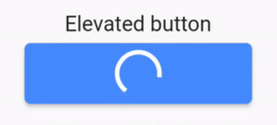
 v0.4.0
easy_loading_button
一個簡單、易於使用且可自訂的進度/載入 _Material Flutter 按鈕_,支援多種按鈕樣式(浮起、輪廓、文字)。
70喜歡 787近 30 天下載150Pub 分數
AndroidiOSWebmacOSWindowsLinux
簡單、易於使用且可自定義的 Flutter 載入/進度按鈕

以下為英文專案原文快照,最新內容請造訪 GitHub。


easy_loading_button is a simple, easy to use, and customizeable progress/loading Material Flutter Button that supports variety of button styles (elevated, outlined, text).
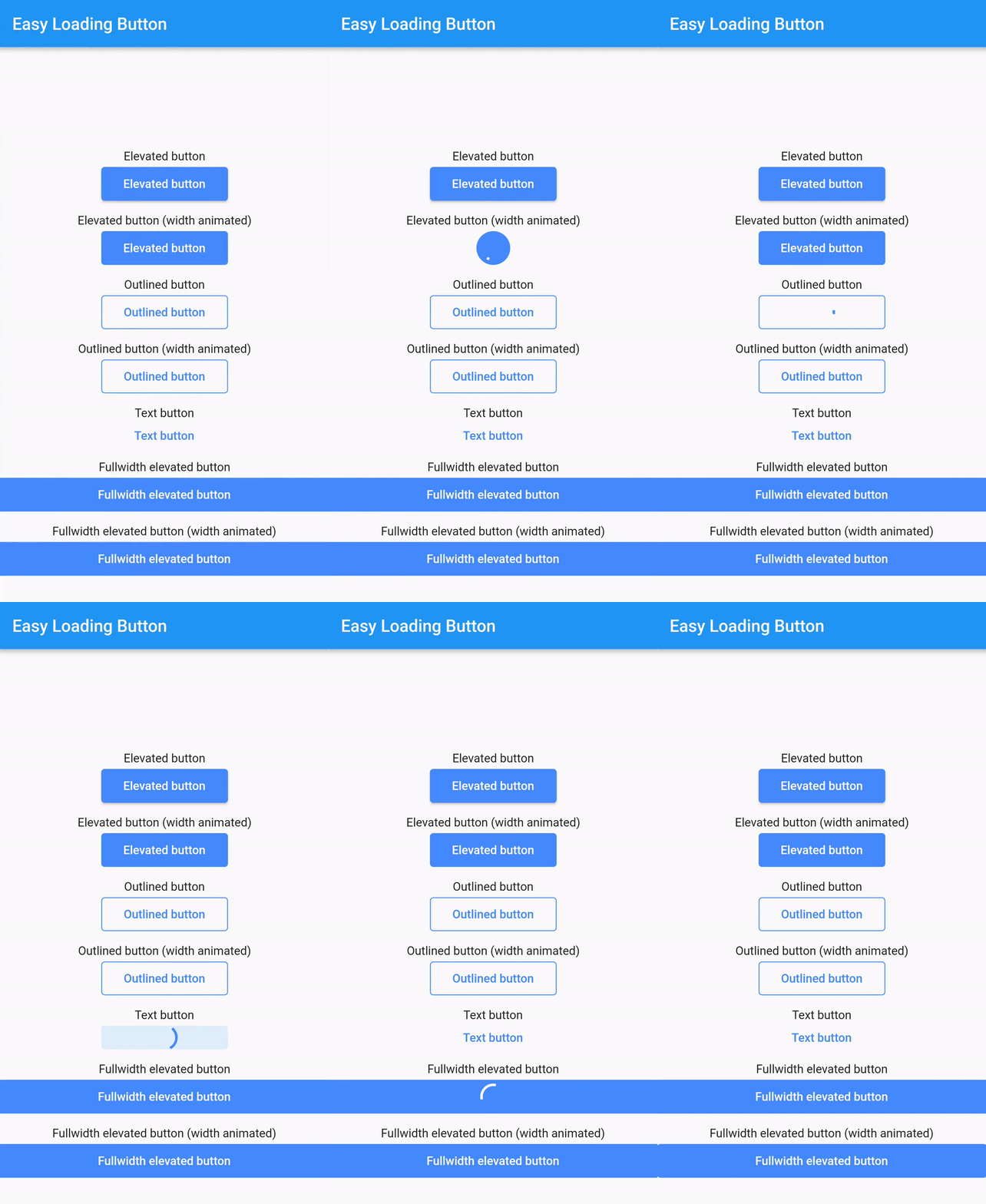
Or try the demo on DartPad
Add this to your package's pubspec.yaml file:
easy_loading_button: ^0.3.2
You can install packages from the command line:
$ flutter pub get
Alternatively, your editor might support flutter pub get.
Now in your Dart code, you can use:
import 'package:easy_loading_button/easy_loading_button.dart';
Add EasyButton to your widget tree:
EasyButton(
  type: EasyButtonType.elevated,

  // Content inside the button when the button state is idle.
  idleStateWidget: const Text(
    'Elevated Button',
    style: TextStyle(
      color: Colors.white,
    ),
  ),

  // Content inside of the button when the button state is loading.
  loadingStateWidget: const CircularProgressIndicator(
    strokeWidth: 3.0,
    valueColor: AlwaysStoppedAnimation<Color>(
      Colors.white,
    ),
  ),

  // Whether or not to animate the width of the button. Default is `true`.
  // If this is set to `false`, you might want to set the `useEqualLoadingStateWidgetDimension` parameter to `true`.
  useWidthAnimation: true,

  // Whether or not to force the `loadingStateWidget` to have equal dimension. Default is `true`.
  // This is useful when you are using `CircularProgressIndicator` as the `loadingStateWidget`.
  // This parameter might also be useful when you set the `useWidthAnimation` parameter to `true` combined with `CircularProgressIndicator` as the value for `loadingStateWidget`.
  useEqualLoadingStateWidgetDimension: true,

  // If you want a fullwidth size, set this to double.infinity
  width: 150.0,

  height: 40.0,
  borderRadius: 4.0,

  // The elevation of the button.
  // This will only be applied when the type parameter value is EasyButtonType.elevated
  elevation: 0.0,

  // The gap between button and it's content.
  // This will be ignored when the `type` parameter value is set to `EasyButtonType.text`
  contentGap: 6.0,

  // Color for the button.
  // For [EasyButtonType.elevated]: This will be the background color.
  // For [EasyButtonType.outlined]: This will be the border color.
  // For [EasyButtonType.text]: This will be the text color.
  buttonColor: Colors.blueAccent,

  onPressed: () {},
),
More parameters:
const EasyButton({
  Key? key,
  required this.idleStateWidget,
  required this.loadingStateWidget,
  this.type = EasyButtonType.elevated,
  this.useWidthAnimation = true,
  this.useEqualLoadingStateWidgetDimension = true,
  this.width = double.infinity,
  this.height = 40.0,
  this.contentGap = 0.0,
  this.borderRadius = 0.0,
  this.elevation = 0.0,
  this.buttonColor = Colors.blueAccent,
  this.onPressed,
}) : super(key: key);
Three types supported:
enum EasyButtonType {
    elevated,
    outlined,
    text,
}
Source code and example of this library can be found in git:
$ git clone https://github.com/usefulteam/easy_loading_button.git
Thanks to Yang JIANG for the flutter_progress_button package.
My package was based on it. You can also visit their package pub.dev page.
依賴清單 3 項
{"sdk":"flutter"}{"sdk":"flutter"}^2.0.1先依使用情境篩選,再比較專案活躍情況,最後到原始儲存庫確認使用要求。
“A repository is the most basic element of GitHub.”
GitHub Docs — About repositories ↗