搜尋套件、儲存庫與 APP 分類

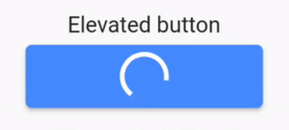
easy_loading_button 封面
套件詳情v0.4.0

easy_loading_button

一個簡單、易於使用且可自訂的進度/載入 _Material Flutter 按鈕_,支援多種按鈕樣式(浮起、輪廓、文字)。

AndroidiOSWebmacOSWindowsLinux
近 30 天下載
787
喜歡數
70
Pub 分數
150

安裝套件

flutter pub add easy_loading_button

套件介紹

根據套件公開資料產生的選型評估,僅供參考。

EasyLoadingButton 是一個 Flutter 套件,提供簡單、可自訂的進度/載入按鈕,支援多種樣式,包括浮起、輪廓和文字按鈕。它透過在非同步操作期間順暢顯示載入狀態來增強使用者體驗。此按鈕易於整合與設定,能在正常狀態與載入狀態之間實現平滑過渡。非常適合用於表單、動作以及任何需要在處理過程中提供回饋的 UI 元素。

適用情境

  • 表單提交
  • 非同步操作觸發
  • 登入/註冊按鈕
  • 支付處理
  • 數據保存操作

主要特色

  • 多種按鈕樣式
  • 可自定義的載入指示器
  • 平滑的狀態轉換
  • 輕鬆整合
  • 支援所有 Flutter 平台
  • 可設定的顏色和尺寸

適合對象

  • 初學者 Flutter 開發者
  • 簡單的應用介面
  • 快速原型設計
  • 使用者友善的表單
  • 需要在非同步任務期間提供明確回饋的應用程式

使用建議

  • 有限的高級自訂選項
  • 可能需要額外的樣式設定以實現複雜設計
  • 不適合高度動態或動畫按鈕
  • 依賴於 Material 設計原則
  • 最適合用於基於標準 Material 的應用

原始 README

以下為關聯原始碼儲存庫的 README 原文快照,最新內容請造訪原始碼儲存庫。

easy_loading_button

GitHub repo size GitHub code size in bytes GitHub top language GitHub issues GitHub license

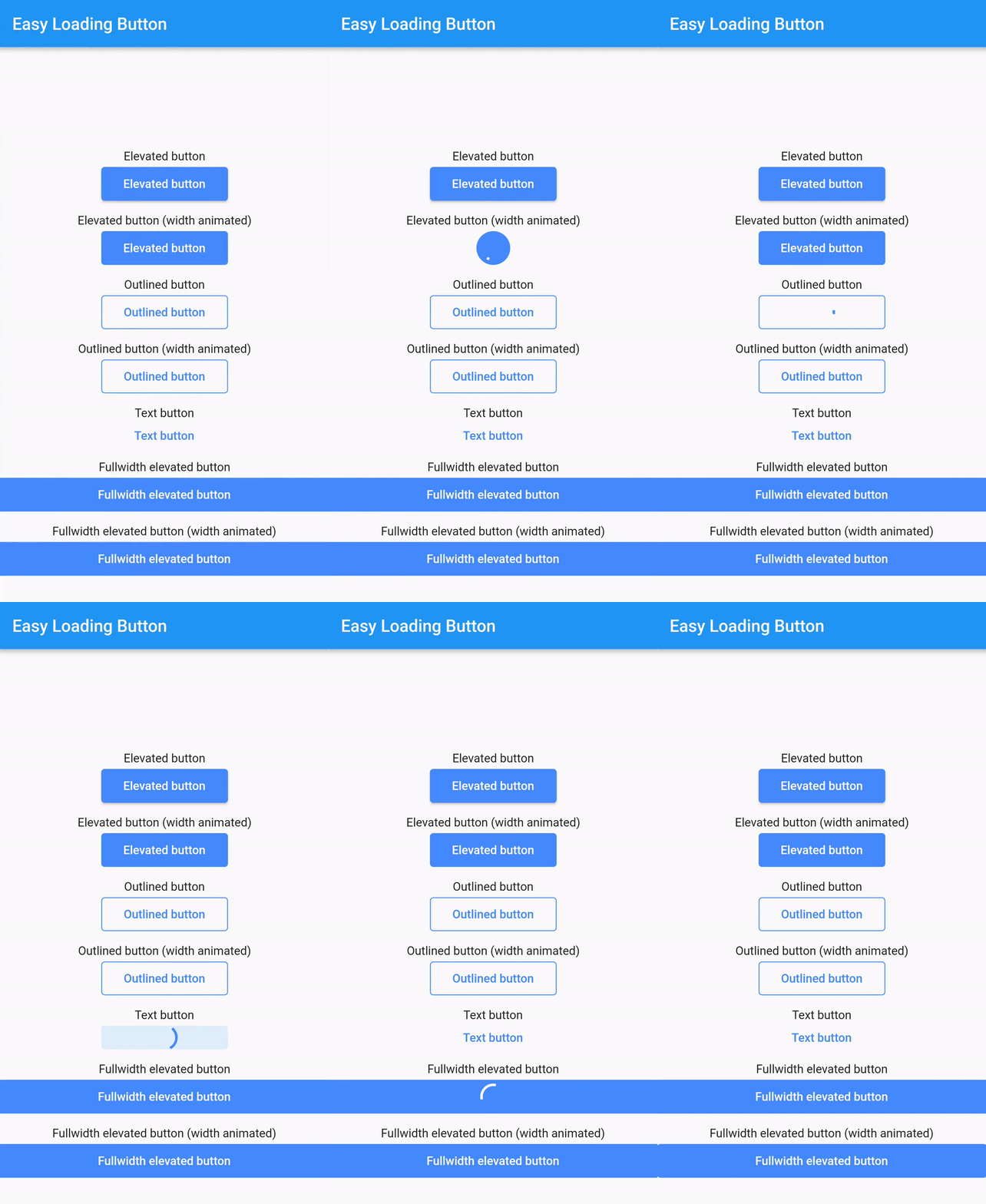
easy_loading_button is a simple, easy to use, and customizeable progress/loading Material Flutter Button that supports variety of button styles (elevated, outlined, text).

Or try the demo on DartPad

Get started

Depend on it

Add this to your package's pubspec.yaml file:

easy_loading_button: ^0.3.2
Install it

You can install packages from the command line:

$ flutter pub get

Alternatively, your editor might support flutter pub get.

Import it

Now in your Dart code, you can use:

import 'package:easy_loading_button/easy_loading_button.dart';

How to use

Add EasyButton to your widget tree:

EasyButton(
  type: EasyButtonType.elevated,

  // Content inside the button when the button state is idle.
  idleStateWidget: const Text(
    'Elevated Button',
    style: TextStyle(
      color: Colors.white,
    ),
  ),

  // Content inside of the button when the button state is loading.
  loadingStateWidget: const CircularProgressIndicator(
    strokeWidth: 3.0,
    valueColor: AlwaysStoppedAnimation<Color>(
      Colors.white,
    ),
  ),

  // Whether or not to animate the width of the button. Default is `true`.
  // If this is set to `false`, you might want to set the `useEqualLoadingStateWidgetDimension` parameter to `true`.
  useWidthAnimation: true,

  // Whether or not to force the `loadingStateWidget` to have equal dimension. Default is `true`.
  // This is useful when you are using `CircularProgressIndicator` as the `loadingStateWidget`.
  // This parameter might also be useful when you set the `useWidthAnimation` parameter to `true` combined with `CircularProgressIndicator` as the value for `loadingStateWidget`.
  useEqualLoadingStateWidgetDimension: true,

  // If you want a fullwidth size, set this to double.infinity
  width: 150.0,

  height: 40.0,
  borderRadius: 4.0,

  // The elevation of the button.
  // This will only be applied when the type parameter value is EasyButtonType.elevated
  elevation: 0.0,

  // The gap between button and it's content.
  // This will be ignored when the `type` parameter value is set to `EasyButtonType.text`
  contentGap: 6.0,

  // Color for the button.
  // For [EasyButtonType.elevated]: This will be the background color.
  // For [EasyButtonType.outlined]: This will be the border color.
  // For [EasyButtonType.text]: This will be the text color.
  buttonColor: Colors.blueAccent,

  onPressed: () {},
),

More parameters:

const EasyButton({
  Key? key,
  required this.idleStateWidget,
  required this.loadingStateWidget,
  this.type = EasyButtonType.elevated,
  this.useWidthAnimation = true,
  this.useEqualLoadingStateWidgetDimension = true,
  this.width = double.infinity,
  this.height = 40.0,
  this.contentGap = 0.0,
  this.borderRadius = 0.0,
  this.elevation = 0.0,
  this.buttonColor = Colors.blueAccent,
  this.onPressed,
}) : super(key: key);

Three types supported:

enum EasyButtonType {
    elevated,
    outlined,
    text,
}

Source

Source code and example of this library can be found in git:

$ git clone https://github.com/usefulteam/easy_loading_button.git

License

MIT License

Credits

Thanks to Yang JIANG for the flutter_progress_button package.

My package was based on it. You can also visit their package pub.dev page.

所屬分類

原始碼儲存庫

使用此套件的專案

暫無相關資料。