
 v3.1.1
sliding_clipped_nav_bar
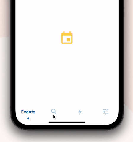
帶有滑動菜單圖標和文字剪裁效果的底端導航欄,點擊時還具有漣漪效果。
339喜歡 693近 30 天下載150Pub 分數
AndroidiOSWebmacOSWindowsLinux
帶有滑動裁剪效果的底部導航欄。

{"sdk":"flutter"}{"sdk":"flutter"}^1.0.0以下為英文專案原文快照,最新內容請造訪 GitHub。
Loading Animation Widget
Add sliding_clipped_nav_bar: to your pubspec.yaml dependencies then run flutter pub get
Add from git [Latest and experimental version]
 dependencies:
  sliding_clipped_nav_bar:
    git:
      url: https://github.com/watery-desert/sliding_clipped_nav_bar
Add from pub [Stable]
 dependencies:
  sliding_clipped_nav_bar:
Then import the package to use
import 'package:sliding_clipped_nav_bar/sliding_clipped_nav_bar.dart';
Add SlidingClippedNavBar() to bottomNavigationBar property of Scaffold() and add PageView() to body with NeverScrollableScrollPhysics() don't try to upate the seleted index from onPageChanged or will see some weird behaviour. You can use Stack() or AnimatedSwitcher() for custom page transition animation.
barItems → List<BarItem>
selectedIndex → int
iconSize → double
fontSize → double
fontWeight → FontWeight
fontStyle → FontStyle
activeColor → Color
inactiveColor → Color?
onButtonPressed → OnButtonPressCallback
backgroundColor → Color
Toolbar icons animation by Cuberto
https://raw.githubusercontent.com/watery-desert/assets/main/sliding_clipped_nav_bar/demo_recording.gifDon't make icon size too big.
Using SlidingClippedNavBar() when you want global active and inactive color.
 return Scaffold(

      body: PageView(
      physics: NeverScrollableScrollPhysics(),
      controller: controller,
...
      ),
      bottomNavigationBar: SlidingClippedNavBar(
        backgroundColor: Colors.white,
        onButtonPressed: (index) {
          setState(() {
            selectedIndex = index;
          });
          controller.animateToPage(selectedIndex,
              duration: const Duration(milliseconds: 400),
              curve: Curves.easeOutQuad);
        },
        iconSize: 30,
        activeColor: Color(0xFF01579B),
        selectedIndex: selectedIndex,
        barItems: [
          BarItem(
            icon: Icons.event,
            title: 'Events',
          ),
          BarItem(
            icon: Icons.search_rounded,
            title: 'Search',
          ),
           /// Add more BarItem if you want
        ],
      ),
    );
SlidingClippedNavBar.colorful() when you want to set individual item active & inactive color.return Scaffold(
body: PageView(
physics: NeverScrollableScrollPhysics(),
controller: controller,
...
),
bottomNavigationBar: SlidingClippedNavBar.colorful(
backgroundColor: Colors.white,
onButtonPressed: (index) {
setState(() {
selectedIndex = index;
});
controller.animateToPage(selectedIndex,
duration: const Duration(milliseconds: 400),
curve: Curves.easeOutQuad);
},
iconSize: 30,
selectedIndex: selectedIndex,
barItems: [
BarItem(
icon: Icons.event,
title: 'Events',
activeColor: Colors.amber,
inactiveColor: Colors.red,
),
BarItem(
icon: Icons.search_rounded,
title: 'Search',
activeColor: Colors.red,
inactiveColor: Colors.green,
),
/// Add more BarItem if you want
],
),
);
The height must be constant because the animation is in vertical direction. According to me 60 is perfect. But if you think needs to be reduced then please create an issue with a screenshot. I will see if I can do something.
Wrap SlidingClippedNavBar with DecoratedBox or Container and pass BoxDecoration to decoration property. BoxDecoration takes list of boxShadow there you can pass your drop shadow.
DecoratedBox(
    decoration: BoxDecoration(
      boxShadow: [
        BoxShadow(
            color: Colors.black.withOpacity(0.2),
            offset: Offset(0, 4),
            blurRadius: 8.0)
      ],
    ),
    child: SlidingClippedNavBar()
)
Wrap SlidingClippedNavBar with ClipRRect and pass BorderRadius to borderRadius property.
  ClipRRect(
      borderRadius: const BorderRadius.vertical(
        top: Radius.circular(16),
      ),
      child: SlidingClippedNavBar(
    )
➜ Sliding Clipped Nav Bar
● Water Drop Nav Bar
● Swipeable Tile
● Loading Animation Widget