搜尋套件、儲存庫與 APP 分類

sliding_clipped_nav_bar 封面
套件詳情v3.1.1

sliding_clipped_nav_bar

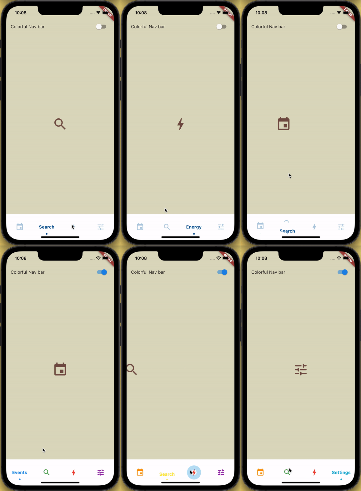
帶有滑動菜單圖標和文字剪裁效果的底端導航欄,點擊時還具有漣漪效果。

AndroidiOSWebmacOSWindowsLinux
近 30 天下載
233
喜歡數
339
Pub 分數
150

安裝套件

flutter pub add sliding_clipped_nav_bar

套件介紹

根據套件公開資料產生的選型評估,僅供參考。

一個可自訂的底部落導航列,具備圖示與標籤的滑動動畫,並透過裁切效果與點擊時的波紋反饋加以強化。專為現代互動式UI設計,支援Android、iOS、Web、macOS、Windows及Linux等多個平台。此套件提供流暢的過渡效果與視覺精緻度,非常適合需要直覺導航與動態回饋的應用程式。可透過pub.dev輕鬆整合至Flutter專案中。

適用情境

  • 行動應用程式導航
  • Web 應用程式介面
  • 跨平台UI設計
  • 互動式底部欄
  • 現代應用程式美學

主要特色

  • 滑動圖標和文字動畫
  • 剪裁效果以實現視覺深度
  • 點擊時的漣漪效應
  • 跨平台相容性
  • 可自定外觀
  • 平滑過渡動畫

適合對象

  • 尋求動畫底部導航欄的Flutter開發者
  • 注重設計的應用程式
  • 使用者互動高的應用
  • 面向多個平台的開發者
  • UI/UX增強專案

使用建議

  • 可能需要在舊設備上進行效能調校
  • 超出核心功能的客製化有限
  • 複雜組件中的潛在佈局衝突
  • 未針對非常大的導航集進行優化
  • 依賴於 Flutter 的渲染管道

原始 README

以下為關聯原始碼儲存庫的 README 原文快照,最新內容請造訪原始碼儲存庫。

Loading Animation Widget

YouTube Badge Twitter Badge Patreon Badge BMC Badge pub package WateryDesert


How to use?

Add sliding_clipped_nav_bar: to your pubspec.yaml dependencies then run flutter pub get

Add from git [Latest and experimental version]

 dependencies:
  sliding_clipped_nav_bar:
    git:
      url: https://github.com/watery-desert/sliding_clipped_nav_bar  

Add from pub [Stable]

 dependencies:
  sliding_clipped_nav_bar:

Then import the package to use

import 'package:sliding_clipped_nav_bar/sliding_clipped_nav_bar.dart';

Add SlidingClippedNavBar() to bottomNavigationBar property of Scaffold() and add PageView() to body with NeverScrollableScrollPhysics() don't try to upate the seleted index from onPageChanged or will see some weird behaviour. You can use Stack() or AnimatedSwitcher() for custom page transition animation.

API reference

barItems → List<BarItem>

  • List of bar items that shows horizontally, Minimum 2 and maximum 4 items.
    required

selectedIndex → int

  • Selected index of the bar items.
    required

iconSize → double

  • Size of all icons (inactive items), don't make it too big or will be clipped.
    optional [30]

fontSize → double

  • FontSize of the text.
    optional [16]

fontWeight → FontWeight

  • FontWeight of the text.
    optional [FontWeight.bold]

fontStyle → FontStyle

  • FontStyle of the text.
    optional [null]

activeColor → Color

  • Color of the selected item which indicate selected.
    required

inactiveColor → Color?

  • Inactive color of item, which actually color icons.
    nullable

onButtonPressed → OnButtonPressCallback

  • Callback when item is pressed.
    required

backgroundColor → Color

  • background color of the bar.
    optional [Colors.white]

Design Credit & screen recording

Toolbar icons animation by Cuberto

Do and don't
  • Don't make icon size too big.

    • FontAwesomeIcons: 24
    • MaterialIcons: 30
  • Using SlidingClippedNavBar() when you want global active and inactive color.

 return Scaffold(
     
      body: PageView(
      physics: NeverScrollableScrollPhysics(),       
      controller: controller,
...
      ),
      bottomNavigationBar: SlidingClippedNavBar(
        backgroundColor: Colors.white,
        onButtonPressed: (index) {
          setState(() {
            selectedIndex = index;
          });
          controller.animateToPage(selectedIndex,
              duration: const Duration(milliseconds: 400),
              curve: Curves.easeOutQuad);
        },
        iconSize: 30,
        activeColor: Color(0xFF01579B),
        selectedIndex: selectedIndex,
        barItems: [
          BarItem(
            icon: Icons.event,
            title: 'Events',
          ),
          BarItem(
            icon: Icons.search_rounded,
            title: 'Search',
          ),
           /// Add more BarItem if you want
        ],
      ),
    );
  • Using SlidingClippedNavBar.colorful() when you want to set individual item active & inactive color.
return Scaffold(
    
     body: PageView(
     physics: NeverScrollableScrollPhysics(),
     controller: controller,
...
     ),
     bottomNavigationBar: SlidingClippedNavBar.colorful(
       backgroundColor: Colors.white,
       onButtonPressed: (index) {
         setState(() {
           selectedIndex = index;
         });
         controller.animateToPage(selectedIndex,
             duration: const Duration(milliseconds: 400),
             curve: Curves.easeOutQuad);
       },
       iconSize: 30,
       selectedIndex: selectedIndex,
       barItems: [
         BarItem(
           icon: Icons.event,
           title: 'Events',
           activeColor: Colors.amber,
           inactiveColor: Colors.red,
         ),
         BarItem(
           icon: Icons.search_rounded,
           title: 'Search',
           activeColor: Colors.red,
           inactiveColor: Colors.green,
         ),
        /// Add more BarItem if you want

       ],
     ),
   );
FAQ
  • How do I change the height?

The height must be constant because the animation is in vertical direction. According to me 60 is perfect. But if you think needs to be reduced then please create an issue with a screenshot. I will see if I can do something.

  • How do I add drop shadow?

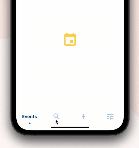
Wrap SlidingClippedNavBar with DecoratedBox or Container and pass BoxDecoration to decoration property. BoxDecoration takes list of boxShadow there you can pass your drop shadow.

DecoratedBox(
    decoration: BoxDecoration(
      boxShadow: [
        BoxShadow(
            color: Colors.black.withOpacity(0.2),
            offset: Offset(0, 4),
            blurRadius: 8.0)
      ],
    ),
    child: SlidingClippedNavBar()
)
  • How do I change the corner radius of the navigation bar?

Wrap SlidingClippedNavBar with ClipRRect and pass BorderRadius to borderRadius property.

  ClipRRect(
      borderRadius: const BorderRadius.vertical(
        top: Radius.circular(16),
      ),
      child: SlidingClippedNavBar(
    )                

All flutter packages

➜ Sliding Clipped Nav Bar
● Water Drop Nav Bar
● Swipeable Tile
● Loading Animation Widget


所屬分類

原始碼儲存庫

使用此套件的專案

暫無相關資料。