


 v1.1.6
number_pagination
使用數字進行分頁,類似於經典的網頁樣式分頁。透過數字探索頁面,而非無限滾動!
74喜歡 4550近 30 天下載160Pub 分數
AndroidiOSWebmacOSWindowsLinux
網頁分頁

以下為英文專案原文快照,最新內容請造訪 GitHub。


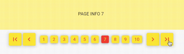
Implementing Flutter Number Pagination using a Popular Web Approach.
This package is very simple. Without depending on other packages.
Its usage is also simple and easy.
A customizable pagination widget for Flutter applications.
NumberPagination is a Flutter widget that provides an intuitive and flexible way to implement pagination in your applications. It displays page numbers and navigation controls, allowing users to easily navigate through multiple pages of content.
Add this to your package's pubspec.yaml file:
dependencies:
  number_pagination: ^1.1.0
The NumberPagination widget offers a wide range of customization options to tailor its appearance and behavior to your needs. Below is a comprehensive list of these options:
| Option | Type | Description | Default |
|---|---|---|---|
visiblePagesCount |
int |
Number of page numbers to display at once | 10 |
currentPage |
int |
Currently displayed page number | Required |
totalPages |
int |
Total number of pages available | Required |
| Option | Type | Description | Default |
|---|---|---|---|
fontSize |
double |
Font size for the page numbers | 15 |
fontFamily |
String? |
Font family for the page numbers | null |
| Option | Type | Description | Default |
|---|---|---|---|
buttonElevation |
double |
Elevation of the buttons | 5 |
buttonRadius |
double |
Radius of the buttons | 0 |
controlButtonSize |
Size |
Size of the control buttons | Size(48, 48) |
numberButtonSize |
Size |
Size of the number buttons | Size(48, 48) |
| Option | Type | Description | Default |
|---|---|---|---|
selectedTextColor |
Color |
Text color for the selected page button | Colors.white |
unSelectedTextColor |
Color |
Text color for unselected page buttons | Colors.black |
selectedButtonColor |
Color |
Background color of the selected page button | Colors.black |
unSelectedButtonColor |
Color |
Background color of unselected page buttons | Colors.white |
controlButtonColor |
Color |
Background color of control buttons | Colors.white |
| Option | Type | Description | Default |
|---|---|---|---|
firstPageIcon |
Widget |
Icon for the "first page" button | Icon(Icons.first_page) |
previousPageIcon |
Widget |
Icon for the "previous page" button | Icon(Icons.keyboard_arrow_left) |
nextPageIcon |
Widget |
Icon for the "next page" button | Icon(Icons.keyboard_arrow_right) |
lastPageIcon |
Widget |
Icon for the "last page" button | Icon(Icons.last_page) |
| Option | Type | Description | Default |
|---|---|---|---|
navigationButtonSpacing |
double |
Spacing between navigation buttons | 4.0 |
sectionSpacing |
double |
Spacing between navigation buttons and page number buttons | 10.0 |
betweenNumberButtonSpacing |
double |
Spacing between individual number buttons | 3 |
| Option | Type | Description |
|---|---|---|
onPageChanged |
Function(int) |
Callback function triggered when the page changes |
These customization options allow you to fine-tune the appearance and behavior of the NumberPagination widget to seamlessly integrate with your app's design and functionality.
依賴清單 3 項
{"sdk":"flutter"}{"sdk":"flutter"}^4.0.0先依使用情境篩選,再比較專案活躍情況,最後到原始儲存庫確認使用要求。
“A repository is the most basic element of GitHub.”
GitHub Docs — About repositories ↗