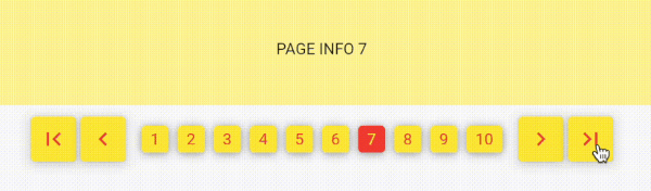
Implementing Flutter Number Pagination using a Popular Web Approach.
This package is very simple. Without depending on other packages.
Its usage is also simple and easy.
NumberPagination
A customizable pagination widget for Flutter applications.
Overview
NumberPagination is a Flutter widget that provides an intuitive and flexible way to implement pagination in your applications. It displays page numbers and navigation controls, allowing users to easily navigate through multiple pages of content.
Features
Page number buttons
Navigation controls (first, previous, next, last)
Customizable appearance
Responsive design
Installation
Add this to your package's pubspec.yaml file:
dependencies:number_pagination:^1.1.0
Customization Options for NumberPagination Widget
The NumberPagination widget offers a wide range of customization options to tailor its appearance and behavior to your needs. Below is a comprehensive list of these options:
Page Display
Option
Type
Description
Default
visiblePagesCount
int
Number of page numbers to display at once
10
currentPage
int
Currently displayed page number
Required
totalPages
int
Total number of pages available
Required
Text Styling
Option
Type
Description
Default
fontSize
double
Font size for the page numbers
15
fontFamily
String?
Font family for the page numbers
null
Button Styling
Option
Type
Description
Default
buttonElevation
double
Elevation of the buttons
5
buttonRadius
double
Radius of the buttons
0
controlButtonSize
Size
Size of the control buttons
Size(48, 48)
numberButtonSize
Size
Size of the number buttons
Size(48, 48)
Colors
Option
Type
Description
Default
selectedTextColor
Color
Text color for the selected page button
Colors.white
unSelectedTextColor
Color
Text color for unselected page buttons
Colors.black
selectedButtonColor
Color
Background color of the selected page button
Colors.black
unSelectedButtonColor
Color
Background color of unselected page buttons
Colors.white
controlButtonColor
Color
Background color of control buttons
Colors.white
Icons
Option
Type
Description
Default
firstPageIcon
Widget
Icon for the "first page" button
Icon(Icons.first_page)
previousPageIcon
Widget
Icon for the "previous page" button
Icon(Icons.keyboard_arrow_left)
nextPageIcon
Widget
Icon for the "next page" button
Icon(Icons.keyboard_arrow_right)
lastPageIcon
Widget
Icon for the "last page" button
Icon(Icons.last_page)
Spacing
Option
Type
Description
Default
navigationButtonSpacing
double
Spacing between navigation buttons
4.0
sectionSpacing
double
Spacing between navigation buttons and page number buttons
10.0
betweenNumberButtonSpacing
double
Spacing between individual number buttons
3
Callback
Option
Type
Description
onPageChanged
Function(int)
Callback function triggered when the page changes
These customization options allow you to fine-tune the appearance and behavior of the NumberPagination widget to seamlessly integrate with your app's design and functionality.