
 v1.0.0
custom_accordion
Custom Accordion 套件允許建立可展開的 Flutter 小部件,只需點擊標題即可展開或摺疊每個項目或項目清單。
28喜歡 313近 30 天下載160Pub 分數
AndroidiOSWebmacOSWindowsLinux
具有大量自訂選項的自訂摺疊面板小部件。

{"sdk":"flutter"}{"sdk":"flutter"}^2.0.0以下為英文專案原文快照,最新內容請造訪 GitHub。
Supported platforms
Pub package version.
Open Source Love.
Custom Accordion is released under the MIT license.
Create dynamic, interactive, and visually appealing accordions in your Flutter app with ease using the "Custom Accordion" package. This powerful library simplifies the process of adding collapsible sections to your UI, making it a breeze to manage and customize accordions to suit your design and functionality needs.
dependencies:
  custom_accordion: ^version
or simply run the command in your terminal at project root directory
flutter pub add custom_accordion
import 'package:custom_accordion/custom_accordion.dart';
Basic Accordion
    CustomAccordion(
        title: 'Accordion',
        ),
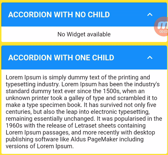
Accordion with no child
    CustomAccordion(
        title: 'Accordion with no child',
        subTitle: 'Accordion Sub Title',
        headerBackgroundColor: Colors.blue,
        titleStyle: const TextStyle(
          fontSize: 18,
          fontWeight: FontWeight.bold,
          color: Colors.white,
        ),
        subTitleStyle: const TextStyle(
          fontSize: 16,
          fontWeight: FontWeight.normal,
          color: Colors.white,
        ),
        toggleIconOpen: Icons.keyboard_arrow_down_sharp,
        toggleIconClose: Icons.keyboard_arrow_up_sharp,
        headerIconColor: Colors.white,
        accordionElevation: 0,
        showContent: true,
        ),
Accordion with one child
    CustomAccordion(
        title: 'Accordion with one child',
        subTitle: 'Accordion Sub Title',
        headerBackgroundColor: Colors.blue,
        titleStyle: const TextStyle(
          fontSize: 18,
          fontWeight: FontWeight.bold,
          color: Colors.white,
        ),
          subTitleStyle: const TextStyle(
          fontSize: 16,
          fontWeight: FontWeight.normal,
          color: Colors.white,
        ),
        toggleIconOpen: Icons.keyboard_arrow_down_sharp,
        toggleIconClose: Icons.keyboard_arrow_up_sharp,
        headerIconColor: Colors.white,
        accordionElevation: 0,
        widgetItems: const Text(
          'Lorem Ipsum is simply dummy text of the printing and typesetting industry. Lorem Ipsum has been the industry\'s standard dummy text ever since the 1500s, when an unknown printer took a galley of type and scrambled it to make a type specimen book. It has survived not only five centuries, but also the leap into electronic typesetting, remaining essentially unchanged. It was popularised in the 1960s with the release of Letraset sheets containing Lorem Ipsum passages, and more recently with desktop publishing software like Aldus PageMaker including versions of Lorem Ipsum.',
          ),
        ),
Accordion with many child
    CustomAccordion(
        title: 'Accordion with many child',
        headerBackgroundColor: Colors.blue,
        titleStyle: const TextStyle(
          fontSize: 18,
          fontWeight: FontWeight.bold,
          color: Colors.white,
        ),
        toggleIconOpen: Icons.keyboard_arrow_down_sharp,
        toggleIconClose: Icons.keyboard_arrow_up_sharp,
        headerIconColor: Colors.white,
        accordionElevation: 0,
        widgetItems: Column(
            crossAxisAlignment: CrossAxisAlignment.stretch,
            children: [
              Text(
                'Lorem Ipsum',
                style: Theme.of(context).textTheme.titleMedium,
              ),
              ElevatedButton(
                onPressed: () {},
                child: const Text(
                  'ELEVATED BUTTON',
                ),
              )
            ],
          ),
        ),
Accordion with List Items and disabled toggle example
        CustomAccordion(
            title: 'Accordion with List Items',
            subTitle: 'Accordion toggle disabled',
            headerBackgroundColor: Colors.blue,
            titleStyle: const TextStyle(
              fontSize: 18,
              fontWeight: FontWeight.bold,
              color: Colors.white,
            ),
            subTitleStyle: const TextStyle(
              fontSize: 16,
              fontWeight: FontWeight.normal,
              color: Colors.white,
            ),
            toggleIconOpen: Icons.keyboard_arrow_down_sharp,
            toggleIconClose: Icons.keyboard_arrow_up_sharp,
            headerIconColor: Colors.white,
            accordionElevation: 0,
            disableToggle: true,
            widgetItems: Column(
                crossAxisAlignment: CrossAxisAlignment.stretch,
                children: List<Widget>.generate(5, (int index) {
                return Text('Item $index');
                }),
            ),
        ),
Please see example project for code.
The following properties can be set for the widget.
| Property | Description | Type | Required | Default value |
|---|---|---|---|---|
| title | Title of Accordion | String | Yes | |
| subTitle | Sub Title of Accordion | String | No | |
| headerBackgroundColor | Header background color | Color | No | Theme.of(context).splashColor |
| titleStyle | Header text style | TextStyle | No | Theme.of(context).textTheme.titleLarge |
| subTitleStyle | Sub Title text style | TextStyle | No | Theme.of(context).textTheme.titleSmall |
| toggleIconOpen | Toggle icon to expand/open widgets | IconData | No | Icons.arrow_drop_down |
| toggleIconClose | Toggle icon to collapse/close widgets | IconData | No | Icons.arrow_drop_up |
| headerIconColor | Icon Color | Color | No | Theme.of(context).iconTheme.color |
| backgroundColor | Background color of widget | Color | No | Theme.of(context).cardColor |
| accordionElevation | Elevation of accordion widget | double | No | Theme.of(context).cardTheme.elevation |
| widgetItems | Child Widget(s) of accordion | Widget | No | Text() |
| widgetItemsPadding | Padding arround children of accordion | EdgeInsetsGeometry | No | EdgeInsets.all(10) |
| showContent | Make default behaviour of accordion children visible or hidden | bool | No | false |
| disableToggle | Make default behaviour of accordion toggle | bool | No | false |
🚀 We believe in the power of collaboration and welcome contributions from our amazing community to make Custom Accordion even more awesome!
Whether you're a developer, designer, or just an enthusiast, you can contribute in various ways:
Dig into CONTRIBUTING.MD, which covers submitting bugs, requesting new features, preparing your code for a pull request, etc.
Please don't forget to like, follow, and star our repo!.
If you find this package useful, you can support it for free by giving it a thumbs up at the top of this page.
If you encounter any problems feel free to open an issue. If you feel the library is missing a feature, please raise a ticket. Pull request are also welcome.
This package is available under the MIT License.