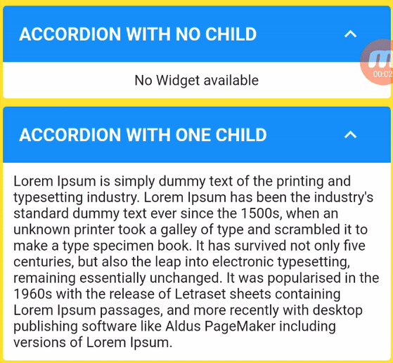
Custom Accordion 套件提供了一個靈活且可自定義的可擴展小部件,適用於 Flutter,讓使用者能夠透過簡單的標題點擊建立可摺疊區段。每個項目或項目群組可以動態地展開或收起,非常適合以乾淨、互動的方式組織內容。該套件支援 Android、iOS、Web、macOS、Windows 及 Linux 多個平台,適用於跨平台應用。此套件輕量且易於整合,並透過可自定義的屬性,讓開發者能完全掌控樣式與行為。
適用情境
可摺疊的常見問題部分
互動式表單向導
動態內容導航
嵌套可展開列表
行動友善的資料組織
主要特色
頭部觸發展開
對多個項目支援
可自訂動畫
跨平台相容性
與現有組件的輕鬆整合
適合對象
開發互動式 UI 的開發者
需要可摺疊內容的應用程式
需要響應式設計的專案
使用 Flutter 開發多平台應用的團隊
尋求可重用組件的UI設計師
使用建議
需要手動處理狀態管理
有限的內建主題選項
複雜版面可能需要額外的樣式
不適用於非常大的資料集
依賴外部相依性以實現進階功能
原始 README
以下為關聯原始碼儲存庫的 README 原文快照,最新內容請造訪原始碼儲存庫。
Custom Accordion
Create dynamic, interactive, and visually appealing accordions in your Flutter app with ease using the "Custom Accordion" package. This powerful library simplifies the process of adding collapsible sections to your UI, making it a breeze to manage and customize accordions to suit your design and functionality needs.
CustomAccordion(
title: 'Accordion with one child',
subTitle: 'Accordion Sub Title',
headerBackgroundColor: Colors.blue,
titleStyle: constTextStyle(
fontSize: 18,
fontWeight: FontWeight.bold,
color: Colors.white,
),
subTitleStyle: constTextStyle(
fontSize: 16,
fontWeight: FontWeight.normal,
color: Colors.white,
),
toggleIconOpen: Icons.keyboard_arrow_down_sharp,
toggleIconClose: Icons.keyboard_arrow_up_sharp,
headerIconColor: Colors.white,
accordionElevation: 0,
widgetItems: constText(
'Lorem Ipsum is simply dummy text of the printing and typesetting industry. Lorem Ipsum has been the industry\'s standard dummy text ever since the 1500s, when an unknown printer took a galley of type and scrambled it to make a type specimen book. It has survived not only five centuries, but also the leap into electronic typesetting, remaining essentially unchanged. It was popularised in the 1960s with the release of Letraset sheets containing Lorem Ipsum passages, and more recently with desktop publishing software like Aldus PageMaker including versions of Lorem Ipsum.',
),
),
The following properties can be set for the widget.
Property
Description
Type
Required
Default value
title
Title of Accordion
String
Yes
subTitle
Sub Title of Accordion
String
No
headerBackgroundColor
Header background color
Color
No
Theme.of(context).splashColor
titleStyle
Header text style
TextStyle
No
Theme.of(context).textTheme.titleLarge
subTitleStyle
Sub Title text style
TextStyle
No
Theme.of(context).textTheme.titleSmall
toggleIconOpen
Toggle icon to expand/open widgets
IconData
No
Icons.arrow_drop_down
toggleIconClose
Toggle icon to collapse/close widgets
IconData
No
Icons.arrow_drop_up
headerIconColor
Icon Color
Color
No
Theme.of(context).iconTheme.color
backgroundColor
Background color of widget
Color
No
Theme.of(context).cardColor
accordionElevation
Elevation of accordion widget
double
No
Theme.of(context).cardTheme.elevation
widgetItems
Child Widget(s) of accordion
Widget
No
Text()
widgetItemsPadding
Padding arround children of accordion
EdgeInsetsGeometry
No
EdgeInsets.all(10)
showContent
Make default behaviour of accordion children visible or hidden
bool
No
false
disableToggle
Make default behaviour of accordion toggle
bool
No
false
Contribution
🚀 We believe in the power of collaboration and welcome contributions from our amazing community to make Custom Accordion even more awesome!
Whether you're a developer, designer, or just an enthusiast, you can contribute in various ways:
💡 Feature Ideas: Have a cool feature in mind? Share your ideas with us. We love fresh perspectives!
🐛 Bug Reports: Spotted a bug? Let us know! Help us squash those pesky little critters.
📖 Documentation: Improve our documentation. Clear and concise docs make a world of difference.
🛠 Code Contributions: If you're a developer, dive into the codebase. Tackle open issues or implement new features.
💬 Community Support: Share your knowledge! Help others by answering questions and engaging in discussions.
✏️ Design: If you have design skills, contribute by enhancing our UI/UX.
Dig into CONTRIBUTING.MD, which covers submitting bugs, requesting new features, preparing your code for a pull request, etc.
Please don't forget to like, follow, and star our repo!.
Support the package (optional)
If you find this package useful, you can support it for free by giving it a thumbs up at the top of this page.
Bugs or Requests
If you encounter any problems feel free to open an issue. If you feel the library is missing a feature, please raise a ticket. Pull request are also welcome.