


 v1.0.25
spoiler_widget
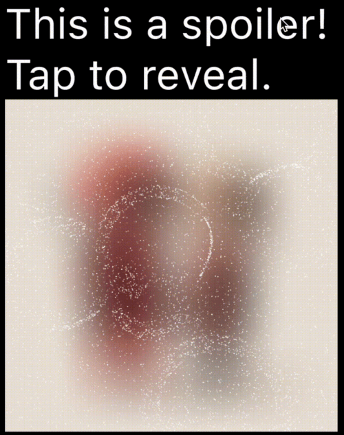
一個 Flutter 套件,用於建立類似 Telegram 使用的Spoiler動畫,讓您能夠隱藏敏感或包含劇透的內容,直到被點擊或觸碰才顯示。
97喜歡 1090近 30 天下載160Pub 分數
AndroidiOSWebmacOSWindowsLinux
一個 Flutter 套件,用於建立類似 Telegram 使用的Spoiler動畫,讓您能夠隱藏敏感或包含劇透的內容,直到被點擊或觸碰才顯示。

以下為英文專案原文快照,最新內容請造訪 GitHub。





A Flutter package to create spoiler animations similar to the one used in Telegram, allowing you to hide sensitive or spoiler-filled content until it's tapped or clicked.
| Mask Operation | Demo | Mask Operation | Demo |
|---|---|---|---|
PathOperation.intersect |
 |
PathOperation.difference |
 |
PathOperation.union |
 |
PathOperation.xor |
 |
Spoiler Animation: Blur effect to hide content until tapped or hidden
Wave Effects: Optional wave/ripple expansions with SpoilerSpotsController
Particle System: Configure particle density (0–1 coverage), size, speed, color, and shape paths/presets.
Fade Animation: Smooth circular reveal/cover transitions
Gesture Control: Enable or disable gestures to users can tap toggle the spoiler.
Masking Support: Use custom Path + PathOperation via maskConfig.
Platform Agnostic: Works on iOS, Android, Web, Tizen and more
In your pubspec.yaml:
dependencies:
  spoiler_widget: ^1.0.25
Then run:
flutter pub get
Import the package:
import 'package:spoiler_widget/spoiler_widget.dart';
Wrap any widget you want to hide in a spoiler:
SpoilerOverlay(
  config: WidgetSpoilerConfig(
    isEnabled: true,
    fadeConfig: const FadeConfig(padding: 3.0, edgeThickness: 20.0),
    enableGestureReveal: true,
    imageFilter: ImageFilter.blur(sigmaX: 30, sigmaY: 30),
    onSpoilerVisibilityChanged: (isVisible) {
      debugPrint('Spoiler is now: ${isVisible ? 'Visible' : 'Hidden'}');
    },
  ),
  child: const Text('Hidden content'),
);
For text-only content, use SpoilerTextWrapper (preferred over deprecated SpoilerText):
SpoilerTextWrapper(
  config: TextSpoilerConfig(
    isEnabled: true,
    fadeConfig: const FadeConfig(padding: 3.0, edgeThickness: 20.0),
    enableGestureReveal: true,
    onSpoilerVisibilityChanged: (isVisible) {
      debugPrint('Spoiler is now: ${isVisible ? 'Visible' : 'Hidden'}');
    },
  ),
  child: const Text(
    'Tap me to reveal secret text!',
    style: TextStyle(fontSize: 16, color: Colors.black),
  ),
);
If you already have a text subtree and just need to hide it with particles, use SpoilerTextWrapper:
SpoilerTextWrapper(
  config: TextSpoilerConfig(
    isEnabled: true,
    fadeConfig: const FadeConfig(padding: 10.0, edgeThickness: 20.0),
    enableGestureReveal: true,
  ),
  child: Column(
    crossAxisAlignment: CrossAxisAlignment.start,
    children: const [
      Text('Sensitive line 1'),
      Text('Sensitive line 2'),
    ],
  ),
);
Use SpoilerTextFieldWrapper to keep the native context menu/cursor while hiding parts of the input:
final controller = TextEditingController(text: 'Type here...');

SpoilerTextFieldWrapper(
  controller: controller,
  focusNode: FocusNode(),
  config: const TextSpoilerConfig(
    isEnabled: true,
    fadeConfig: FadeConfig(padding: 10.0, edgeThickness: 20.0),
    enableGestureReveal: true,
    textSelection: TextSelection(baseOffset: 0, extentOffset: 5),
    textStyle: TextStyle(fontSize: 18, color: Colors.white),
  ),
  cursorColor: Colors.deepPurple,
  maxLines: 3,
);
For dynamic "wave" effects:
class WaveDemo extends StatelessWidget {
  @override
  Widget build(BuildContext context) {
    return SpoilerOverlay(
      config: WidgetSpoilerConfig(
        isEnabled: true,
        maxActiveWaves: 3,
        fadeConfig: const FadeConfig(padding: 10.0, edgeThickness: 20.0),
        enableGestureReveal: true,
        imageFilter: ImageFilter.blur(sigmaX: 30, sigmaY: 20),
        onSpoilerVisibilityChanged: (isVisible) {
          debugPrint('Spoiler is now: ${isVisible ? 'Visible' : 'Hidden'}');
        },
      ),
      child: Image.network('https://your-image-url'),
    );
  }
}
You can apply a custom-shaped mask using maskConfig in both TextSpoilerConfig and WidgetSpoilerConfig.
This allows the spoiler effect to only appear inside specific areas defined by a Path.
SpoilerTextWrapper(
  config: TextSpoilerConfig(
    isEnabled: true,
    enableGestureReveal: true,
    particleConfig: const ParticleConfig(
      density: 0.1,
      speed: 0.2,
      color: Colors.white,
      maxParticleSize: 1.0,
    ),
    maskConfig: SpoilerMask(
      maskPath: myCustomPath,
      maskOperation: PathOperation.intersect,
      offset: Offset(50, 30),
    ),
    onSpoilerVisibilityChanged: (isVisible) {
      debugPrint('Spoiler is now: ${isVisible ? 'Visible' : 'Hidden'}');
    },
  ),
  child: const Text(
    'Masked spoiler!',
    style: TextStyle(fontSize: 24, color: Colors.white),
  ),
);
You can find a complete, runnable example in the example/lib/main.dart file. It demonstrates various configuration options and both text and widget-based spoilers.
Table showing common config parameters for both TextSpoilerConfig and WidgetSpoilerConfig.
| Field | Type | Description |
|---|---|---|
isEnabled |
bool | Whether the spoiler starts enabled (hidden). |
enableGestureReveal |
bool | Whether tap should toggle visibility. |
particleConfig |
ParticleConfig | Particle system parameters (density, speed, color, size, shape). |
fadeConfig |
FadeConfig? | Fade parameters (padding, edgeThickness). |
shaderConfig |
ShaderConfig? | Custom fragment shader configuration for particles. |
maskConfig |
SpoilerMask? | Optional mask to apply using a Path. |
onSpoilerVisibilityChanged |
ValueChanged? | Callback fired when spoiler becomes visible/hidden. |
These fields are kept for backward compatibility; prefer particleConfig and fadeConfig.
enableFadeAnimationfadeRadius (maps to FadeConfig.padding)fadeEdgeThicknessparticleDensityparticleSpeedparticleColormaxParticleSize| Field | Type | Description |
|---|---|---|
density |
double | Area coverage percentage in the range 0..1 (0 = 0%, 1 = 100%). Values are clamped. |
speed |
double | Particle speed (px/frame). |
color |
Color | Base particle color. |
maxParticleSize |
double | Particle diameter in pixels. |
shapePreset |
ParticlePathPreset? | Built-in shapes or ParticlePathPreset.custom(...) for your own path. |
enableWaves |
bool | Enables ripple waves that push particles. |
maxWaveRadius |
double | Wave radius limit in pixels. |
maxWaveCount |
int | Maximum number of simultaneous waves. |
| Field | Type | Description |
|---|---|---|
textStyle |
TextStyle? | The text style applied to the spoiler text. |
textSelection |
TextSelection? | Range of text to apply the spoiler. |
textAlign |
TextAlign? | Text alignment inside the widget. |
maxLines |
int? | An optional maximum number of lines for the text to span, wrapping if necessary. |
isEllipsis |
bool? | Determines whether overflowing text should display an ellipsis ("…") at the end. |
| Field | Type | Description |
|---|---|---|
imageFilter |
ImageFilter? | Blur filter used to hide the child. |
maxActiveWaves |
int | Max concurrent waves for wave-based effects. |
How can I animate the blur or wave concurrency? Adjust the properties in your configuration object at runtime. For instance, set a new imageFilter or call methods on the wave controller to dynamically tune the effect.
Can I skip the wave logic? Yes—by default, you get a basic spoiler with fade. Use SpoilerSpotsController only if you want wave animations.
Does this work on the web? Yes! It’s entirely in Flutter/Dart. Just ensure you handle any platform quirks with gesture input.
spoiler_widget now supports two modes of rendering particles:
drawRawAtlas. This is a CPU-driven approach that is highly efficient for most standard spoiler effects.To enable Shader Rendering, simply provide a ShaderConfig to your spoiler configuration.
Pick a shape once in ParticleConfig, and it works for both atlas and shader modes. Leave shapePreset null for the default circle (fastest path).
particleConfig: ParticleConfig(
  density: 0.1,
  shapePreset: ParticlePathPreset.snowflake,
),
If you need full control, provide a custom Path for particles:
final starPath = Path()
  ..moveTo(0.0, -1.0)
  ..lineTo(0.2, -0.2)
  ..lineTo(1.0, -0.2)
  ..lineTo(0.35, 0.15)
  ..lineTo(0.6, 0.9)
  ..lineTo(0.0, 0.4)
  ..lineTo(-0.6, 0.9)
  ..lineTo(-0.35, 0.15)
  ..lineTo(-1.0, -0.2)
  ..lineTo(-0.2, -0.2)
  ..close();

particleConfig: ParticleConfig(
  density: 0.1,
  shapePreset: ParticlePathPreset.custom(starPath),
),
You can use the default high-performance shader for particle rendering:
SpoilerTextWrapper(
  config: TextSpoilerConfig(
    isEnabled: true,
    enableGestureReveal: true,
    particleConfig: const ParticleConfig(
      density: 0.15,
      speed: 0.25,
      color: Colors.white,
      maxParticleSize: 1.0,
      shapePreset: ParticlePathPreset.star,
    ),
    shaderConfig: ShaderConfig.particles(),
  ),
  child: const Text('GPU-driven particles!'),
);
Contributions are welcome! Whether it’s bug fixes, new features, or documentation improvements, open a Pull Request or Issue.
Licensed under the MIT License. Enjoy building your spoiler effects!
依賴清單 3 項
{"sdk":"flutter"}{"sdk":"flutter"}^2.0.0先依使用情境篩選,再比較專案活躍情況,最後到原始儲存庫確認使用要求。
“A repository is the most basic element of GitHub.”
GitHub Docs — About repositories ↗