搜尋套件、儲存庫與 APP 分類

spoiler_widget 封面
套件詳情v1.0.25

spoiler_widget

一個 Flutter 套件,用於建立類似 Telegram 使用的Spoiler動畫,讓您能夠隱藏敏感或包含劇透的內容,直到被點擊或觸碰才顯示。

AndroidiOSWebmacOSWindowsLinux
近 30 天下載
1090
喜歡數
97
Pub 分數
160

安裝套件

flutter pub add spoiler_widget

套件介紹

根據套件公開資料產生的選型評估,僅供參考。

spoiler_widget 套件讓開發者能在 Flutter 中建立互動式劇透動畫,模擬流行的 Telegram 風格揭露效果。它允許將敏感或令人驚訝的內容最初隱藏,並在使用者互動(例如點擊或按壓)後顯示。非常適合用於隱藏訊息、圖片或文字中的劇透內容,透過跨多個平台的平滑過渡提升使用者體驗。此套件輕巧且能順暢整合至現有的 Flutter 應用程式中。

適用情境

  • 在聊天應用中隱藏劇透
  • 輕觸顯示圖像內容
  • 創建互動式故事元素
  • 保護使用者介面中的敏感資訊
  • 在遊戲中的趣味揭示

主要特色

  • Telegram風格動畫
  • 輕觸顯示互動
  • 平滑過渡效果
  • 跨平台支援
  • 與現有小部件的輕鬆整合
  • 可自定的顯示持續時間

適合對象

  • 聊天和訊息應用
  • 互動敘事
  • 遊戲化介面
  • 需要受控可見性的內容
  • 尋求簡單而有效的動畫的開發者

使用建議

  • 可能影響多個實例的效能
  • 超出基本動畫的自定功能有限
  • 需要用戶互動以揭露
  • 不適用於靜態內容
  • 最好少量使用,以保持驚喜效果

原始 README

以下為關聯原始碼儲存庫的 README 原文快照,最新內容請造訪原始碼儲存庫。

Spoiler Animation for Flutter

Spoiler Widget

Pub Likes Pub Points Pub Version License: MIT Flutter GitHub stars

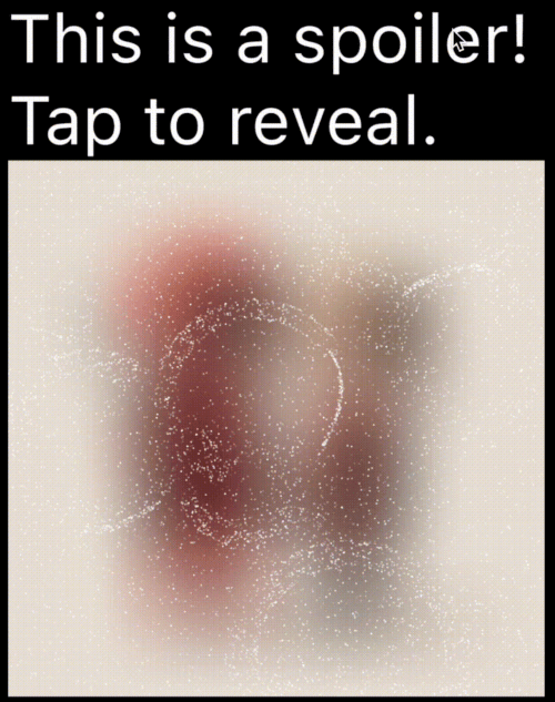
A Flutter package to create spoiler animations similar to the one used in Telegram, allowing you to hide sensitive or spoiler-filled content until it's tapped or clicked.

Demo

Mask Operation Demo Mask Operation Demo
PathOperation.intersect PathOperation.difference
PathOperation.union PathOperation.xor

Features

  • Spoiler Animation: Blur effect to hide content until tapped or hidden

  • Wave Effects: Optional wave/ripple expansions with SpoilerSpotsController

  • Particle System: Configure particle density (0–1 coverage), size, speed, color, and shape paths/presets.

  • Fade Animation: Smooth circular reveal/cover transitions

  • Gesture Control: Enable or disable gestures to users can tap toggle the spoiler.

  • Masking Support: Use custom Path + PathOperation via maskConfig.

  • Platform Agnostic: Works on iOS, Android, Web, Tizen and more


Installation

In your pubspec.yaml:

dependencies:
  spoiler_widget: ^1.0.25

Then run:

flutter pub get

Usage

1. Basic Spoiler Usage

Import the package:

import 'package:spoiler_widget/spoiler_widget.dart';

Wrap any widget you want to hide in a spoiler:

SpoilerOverlay(
  config: WidgetSpoilerConfig(
    isEnabled: true,
    fadeConfig: const FadeConfig(padding: 3.0, edgeThickness: 20.0),
    enableGestureReveal: true,
    imageFilter: ImageFilter.blur(sigmaX: 30, sigmaY: 30),
    onSpoilerVisibilityChanged: (isVisible) {
      debugPrint('Spoiler is now: ${isVisible ? 'Visible' : 'Hidden'}');
    },
  ),
  child: const Text('Hidden content'),
);

For text-only content, use SpoilerTextWrapper (preferred over deprecated SpoilerText):

SpoilerTextWrapper(
  config: TextSpoilerConfig(
    isEnabled: true,
    fadeConfig: const FadeConfig(padding: 3.0, edgeThickness: 20.0),
    enableGestureReveal: true,
    onSpoilerVisibilityChanged: (isVisible) {
      debugPrint('Spoiler is now: ${isVisible ? 'Visible' : 'Hidden'}');
    },
  ),
  child: const Text(
    'Tap me to reveal secret text!',
    style: TextStyle(fontSize: 16, color: Colors.black),
  ),
);

1.1 Wrap existing text widgets

If you already have a text subtree and just need to hide it with particles, use SpoilerTextWrapper:

SpoilerTextWrapper(
  config: TextSpoilerConfig(
    isEnabled: true,
    fadeConfig: const FadeConfig(padding: 10.0, edgeThickness: 20.0),
    enableGestureReveal: true,
  ),
  child: Column(
    crossAxisAlignment: CrossAxisAlignment.start,
    children: const [
      Text('Sensitive line 1'),
      Text('Sensitive line 2'),
    ],
  ),
);
1.2 Form field integration

Use SpoilerTextFieldWrapper to keep the native context menu/cursor while hiding parts of the input:

final controller = TextEditingController(text: 'Type here...');

SpoilerTextFieldWrapper(
  controller: controller,
  focusNode: FocusNode(),
  config: const TextSpoilerConfig(
    isEnabled: true,
    fadeConfig: FadeConfig(padding: 10.0, edgeThickness: 20.0),
    enableGestureReveal: true,
    textSelection: TextSelection(baseOffset: 0, extentOffset: 5),
    textStyle: TextStyle(fontSize: 18, color: Colors.white),
  ),
  cursorColor: Colors.deepPurple,
  maxLines: 3,
);
2. Wave Animations (SpoilerSpotsController)

For dynamic "wave" effects:

class WaveDemo extends StatelessWidget {
  @override
  Widget build(BuildContext context) {
    return SpoilerOverlay(
      config: WidgetSpoilerConfig( 
        isEnabled: true,
        maxActiveWaves: 3,
        fadeConfig: const FadeConfig(padding: 10.0, edgeThickness: 20.0),
        enableGestureReveal: true,
        imageFilter: ImageFilter.blur(sigmaX: 30, sigmaY: 20),
        onSpoilerVisibilityChanged: (isVisible) {
          debugPrint('Spoiler is now: ${isVisible ? 'Visible' : 'Hidden'}');
        },
      ),
      child: Image.network('https://your-image-url'),
    );
  }
}

3. Custom Path Masking

You can apply a custom-shaped mask using maskConfig in both TextSpoilerConfig and WidgetSpoilerConfig. This allows the spoiler effect to only appear inside specific areas defined by a Path.

SpoilerTextWrapper(
  config: TextSpoilerConfig(
    isEnabled: true,
    enableGestureReveal: true,
    particleConfig: const ParticleConfig(
      density: 0.1,
      speed: 0.2,
      color: Colors.white,
      maxParticleSize: 1.0,
    ),
    maskConfig: SpoilerMask(
      maskPath: myCustomPath,
      maskOperation: PathOperation.intersect,
      offset: Offset(50, 30),
    ),
    onSpoilerVisibilityChanged: (isVisible) {
      debugPrint('Spoiler is now: ${isVisible ? 'Visible' : 'Hidden'}');
    },
  ),
  child: const Text(
    'Masked spoiler!',
    style: TextStyle(fontSize: 24, color: Colors.white),
  ),
);

3. Full Example

You can find a complete, runnable example in the example/lib/main.dart file. It demonstrates various configuration options and both text and widget-based spoilers.

Configuration
Common Fields

Table showing common config parameters for both TextSpoilerConfig and WidgetSpoilerConfig.

Field Type Description
isEnabled bool Whether the spoiler starts enabled (hidden).
enableGestureReveal bool Whether tap should toggle visibility.
particleConfig ParticleConfig Particle system parameters (density, speed, color, size, shape).
fadeConfig FadeConfig? Fade parameters (padding, edgeThickness).
shaderConfig ShaderConfig? Custom fragment shader configuration for particles.
maskConfig SpoilerMask? Optional mask to apply using a Path.
onSpoilerVisibilityChanged ValueChanged? Callback fired when spoiler becomes visible/hidden.
Legacy fields (deprecated)

These fields are kept for backward compatibility; prefer particleConfig and fadeConfig.

  • enableFadeAnimation
  • fadeRadius (maps to FadeConfig.padding)
  • fadeEdgeThickness
  • particleDensity
  • particleSpeed
  • particleColor
  • maxParticleSize
ParticleConfig
Field Type Description
density double Area coverage percentage in the range 0..1 (0 = 0%, 1 = 100%). Values are clamped.
speed double Particle speed (px/frame).
color Color Base particle color.
maxParticleSize double Particle diameter in pixels.
shapePreset ParticlePathPreset? Built-in shapes or ParticlePathPreset.custom(...) for your own path.
enableWaves bool Enables ripple waves that push particles.
maxWaveRadius double Wave radius limit in pixels.
maxWaveCount int Maximum number of simultaneous waves.
TextSpoilerConfig
Field Type Description
textStyle TextStyle? The text style applied to the spoiler text.
textSelection TextSelection? Range of text to apply the spoiler.
textAlign TextAlign? Text alignment inside the widget.
maxLines int? An optional maximum number of lines for the text to span, wrapping if necessary.
isEllipsis bool? Determines whether overflowing text should display an ellipsis ("…") at the end.
WidgetSpoilerConfig
Field Type Description
imageFilter ImageFilter? Blur filter used to hide the child.
maxActiveWaves int Max concurrent waves for wave-based effects.
FAQ
  1. How can I animate the blur or wave concurrency? Adjust the properties in your configuration object at runtime. For instance, set a new imageFilter or call methods on the wave controller to dynamically tune the effect.

  2. Can I skip the wave logic? Yes—by default, you get a basic spoiler with fade. Use SpoilerSpotsController only if you want wave animations.

  3. Does this work on the web? Yes! It’s entirely in Flutter/Dart. Just ensure you handle any platform quirks with gesture input.

Dual Rendering Modes

spoiler_widget now supports two modes of rendering particles:

  1. Atlas Rendering (Default): Uses Flutter's drawRawAtlas. This is a CPU-driven approach that is highly efficient for most standard spoiler effects.
  2. Shader Rendering (GPU): Uses custom fragment shaders to render particles. This is ideal for complex visual effects and leverages GPU power for smoother performance on high-end devices.

To enable Shader Rendering, simply provide a ShaderConfig to your spoiler configuration.

Particle Shapes

Pick a shape once in ParticleConfig, and it works for both atlas and shader modes. Leave shapePreset null for the default circle (fastest path).

particleConfig: ParticleConfig(
  density: 0.1,
  shapePreset: ParticlePathPreset.snowflake,
),

If you need full control, provide a custom Path for particles:

final starPath = Path()
  ..moveTo(0.0, -1.0)
  ..lineTo(0.2, -0.2)
  ..lineTo(1.0, -0.2)
  ..lineTo(0.35, 0.15)
  ..lineTo(0.6, 0.9)
  ..lineTo(0.0, 0.4)
  ..lineTo(-0.6, 0.9)
  ..lineTo(-0.35, 0.15)
  ..lineTo(-1.0, -0.2)
  ..lineTo(-0.2, -0.2)
  ..close();

particleConfig: ParticleConfig(
  density: 0.1,
  shapePreset: ParticlePathPreset.custom(starPath),
),
4. Custom Fragment Shader (particles.frag)

You can use the default high-performance shader for particle rendering:

SpoilerTextWrapper(
  config: TextSpoilerConfig(
    isEnabled: true,
    enableGestureReveal: true,
    particleConfig: const ParticleConfig(
      density: 0.15,
      speed: 0.25,
      color: Colors.white,
      maxParticleSize: 1.0,
      shapePreset: ParticlePathPreset.star,
    ),
    shaderConfig: ShaderConfig.particles(),
  ),
  child: const Text('GPU-driven particles!'),
);
Contributing

Contributions are welcome! Whether it’s bug fixes, new features, or documentation improvements, open a Pull Request or Issue.


License

Licensed under the MIT License. Enjoy building your spoiler effects!

所屬分類

原始碼儲存庫

使用此套件的專案

暫無相關資料。