
 v2.0.0
dynamic_color_theme
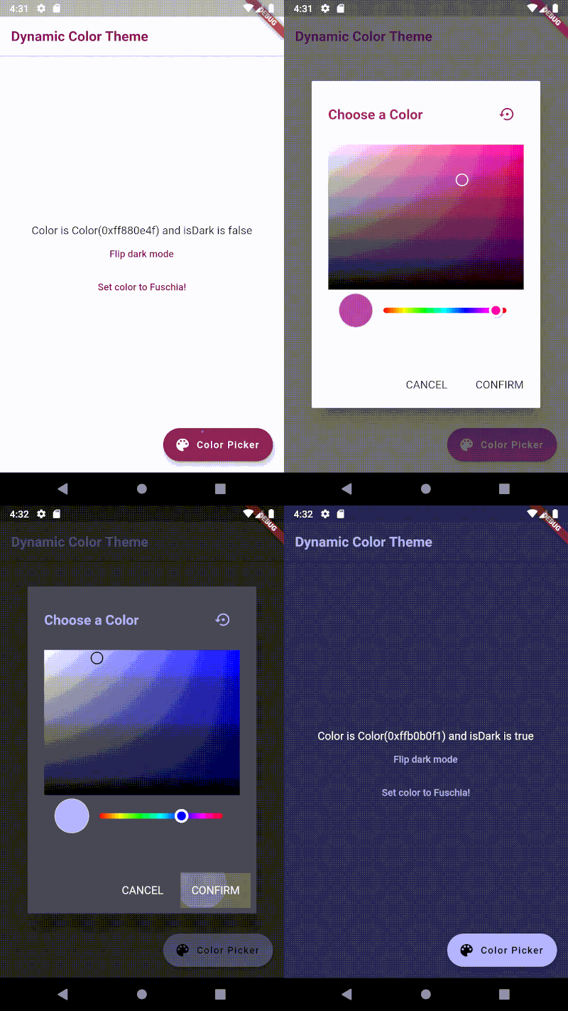
Dynamically change your color theme, including light and dark mode. Persist the colors across restarts.
29Likes 7730-day downloads140Pub points
AndroidiOSWebmacOSWindowsLinux
Dynamically change your color theme, including light and dark mode. Persist the colors across restarts.

{"sdk":"flutter"}^0.4.0^2.0.6{"sdk":"flutter"}English project snapshot. Visit GitHub for the latest content.
https://github.com/DFreds/dynamic_color_theme/blob/master/assets/demo.gif
This package allows you to dynamically change your color theme and will automatically switch between light and dark mode based on the new color. Additionally, the color values can be persisted across restarts by saving both the color and dark mode to shared preferences.
dependencies:
    dynamic_color_theme: ^2.0.0
Import the theme as shown below.
import 'package:dynamic_color_theme/dynamic_color_theme.dart';
You can also utilize the built-in color picker dialog by importing as shown below.
import 'package:dynamic_color_theme/color_picker_dialog.dart';
To use it, wrap your main widget like so:
const kFuchsia = const Color(0xFF880E4F);
const kWhite = Colors.white;
const kLightGrey = const Color(0xFFE8E8E8);
const kDarkGrey = const Color(0xFF303030);

void main() => runApp(MyApp());

class MyApp extends StatelessWidget {
  @override
  Widget build(BuildContext context) {
    return DynamicColorTheme(
      data: (Color color, bool isDark) {
        return _buildTheme(color, isDark); // TODO define your own buildTheme method here
      },
      defaultColor: kFuchsia,
      defaultIsDark: false,
      themedWidgetBuilder: (BuildContext context, ThemeData theme) {
        return MaterialApp(
          home: MyHomePage(title: 'Dynamic Color Theme'),
          theme: theme,
          title: 'Flutter Demo',
        );
      },
    );
  }

  // Example buildTheme method
  ThemeData _buildTheme(Color accentColor, bool isDark) {
    final ThemeData base = isDark ? ThemeData.dark() : ThemeData.light();
    final Color primaryColor = isDark ? kDarkGrey : kWhite;

    return base.copyWith(
      accentColor: accentColor,
      accentTextTheme: _buildTextTheme(base.accentTextTheme, accentColor),
      cardColor: primaryColor,
      floatingActionButtonTheme: base.floatingActionButtonTheme.copyWith(
        backgroundColor: accentColor,
      ),
      iconTheme: base.iconTheme.copyWith(
        color: accentColor,
      ),
      primaryColor: primaryColor,
      primaryIconTheme: base.primaryIconTheme.copyWith(
        color: accentColor,
      ),
      primaryTextTheme: _buildTextTheme(base.primaryTextTheme, accentColor),
      scaffoldBackgroundColor: primaryColor,
      textSelectionTheme: _buildTextSelectionTheme(base.textSelectionTheme, accentColor, isDark),
      textTheme: _buildTextTheme(base.textTheme, accentColor),
    );
  }

  TextTheme _buildTextTheme(TextTheme base, Color color) {
    return base.copyWith(
      bodyText2: base.bodyText2.copyWith(
        fontSize: 16,
      ),
      bodyText1: base.bodyText1.copyWith(
        color: color,
        fontSize: 16,
        fontWeight: FontWeight.bold,
      ),
      button: base.button.copyWith(
        color: color,
      ),
      caption: base.caption.copyWith(
        color: color,
        fontSize: 14,
      ),
      headline5: base.headline5.copyWith(
        color: color,
        fontSize: 24,
      ),
      subtitle1: base.subtitle1.copyWith(
        color: color,
        fontSize: 18,
      ),
      headline6: base.headline6.copyWith(
        color: color,
        fontSize: 20,
        fontWeight: FontWeight.bold,
      ),
    );
  }

  TextSelectionThemeData _buildTextSelectionTheme(TextSelectionThemeData base, Color accentColor, bool isDark) {
    return base.copyWith(
      cursorColor: accentColor,
      selectionColor: isDark ? kDarkGrey : kLightGrey,
      selectionHandleColor: accentColor,
    );
  }
}
You can change the theme yourself by utilizing the provided functions as shown below.
void changeColor(Color newColor) {
  DynamicColorTheme.of(context).setColor(
    color: newColor,
    shouldSave: true, // saves it to shared preferences
  );
}

void changeIsDark(bool isDark) {
  DynamicColorTheme.of(context).setIsDark(
    isDark: isDark,
    shouldSave: true, // saves it to shared preferences
  );
}

void resetTheme() {
  DynamicColorTheme.of(context).resetToSharedPrefsValues();
}
https://github.com/DFreds/dynamic_color_theme/blob/master/assets/dialog.png
Alternatively, a color picker dialog widget is included that will do this for you. Use it like so:
// With the barrier dismissible

showDialog(
  barrierDismissible: false,
  builder: (BuildContext context) {
    return ColorPickerDialog(
      defaultColor: kFuchsia,
      defaultIsDark: false,
    );
  },
  context: context,
);

// Without the barrier dismissible

showDialog(
  builder: (BuildContext context) {
    return WillPopScope(
      child: ColorPickerDialog(
        defaultColor: kFuchsia,
        defaultIsDark: false,
      ),
      onWillPop: () async {
        // Handles resetting if user taps off dialog
        DynamicColorTheme.of(context).resetToSharedPrefsValues();
        return true;
      },
    );
  },
  context: context,
);