Search packages, repositories and app categories

dynamic_color_theme cover
Package detailsv2.0.0

dynamic_color_theme

Dynamically change your color theme, including light and dark mode. Persist the colors across restarts.

AndroidiOSWebmacOSWindowsLinux
30-day downloads
205
Likes
29
Pub points
140

Install package

flutter pub add dynamic_color_theme

Package Overview

Package selection guidance compiled from public package information, community data, and project usage.

A Flutter package that enables dynamic theme switching between light and dark modes, with persistent color preferences across app restarts. It simplifies theme management by automatically adapting to system preferences or allowing user-defined custom themes. The package supports all major platforms, ensuring consistent UI experiences on Android, iOS, Web, macOS, Windows, and Linux. Developers can easily integrate and customize color schemes while maintaining state even after the app is closed and reopened.

Use cases

  • Dynamic light/dark mode switching
  • Persisting user theme preferences
  • Custom color theme implementation
  • Cross-platform theme consistency
  • System theme auto-detection
  • Theme customization in apps

Key features

  • Light and dark mode support
  • Persistent theme storage
  • Customizable color schemes
  • Automatic system theme detection
  • Cross-platform compatibility
  • Easy integration with MaterialApp

Suitable for

  • Apps requiring theme persistence
  • Developers building cross-platform apps
  • UI-heavy applications
  • Apps with user preference settings
  • Design systems needing dynamic theming

Considerations

  • Requires proper state management
  • May need additional logic for complex theme transitions
  • Limited to color theme only (not full UI components)
  • Depends on platform-specific storage mechanisms
  • Not suitable for highly complex theming workflows

Original README

Original README snapshot from the linked source repository. Visit the repository for the latest content.

dynamic_color_theme

This package allows you to dynamically change your color theme and will automatically switch between light and dark mode based on the new color. Additionally, the color values can be persisted across restarts by saving both the color and dark mode to shared preferences.

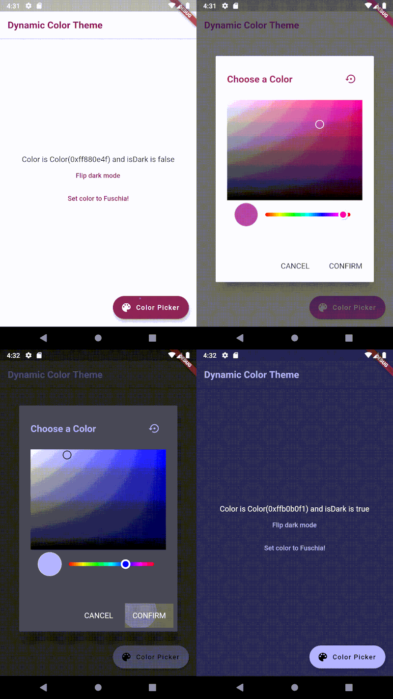
Installation

dependencies:
    dynamic_color_theme: ^2.0.0

Import the theme as shown below.

import 'package:dynamic_color_theme/dynamic_color_theme.dart';

You can also utilize the built-in color picker dialog by importing as shown below.

import 'package:dynamic_color_theme/color_picker_dialog.dart';

Usage

To use it, wrap your main widget like so:

const kFuchsia = const Color(0xFF880E4F);
const kWhite = Colors.white;
const kLightGrey = const Color(0xFFE8E8E8);
const kDarkGrey = const Color(0xFF303030);

void main() => runApp(MyApp());

class MyApp extends StatelessWidget {
  @override
  Widget build(BuildContext context) {
    return DynamicColorTheme(
      data: (Color color, bool isDark) {
        return _buildTheme(color, isDark); // TODO define your own buildTheme method here
      },
      defaultColor: kFuchsia,
      defaultIsDark: false,
      themedWidgetBuilder: (BuildContext context, ThemeData theme) {
        return MaterialApp(
          home: MyHomePage(title: 'Dynamic Color Theme'),
          theme: theme,
          title: 'Flutter Demo',
        );
      },
    );
  }

  // Example buildTheme method
  ThemeData _buildTheme(Color accentColor, bool isDark) {
    final ThemeData base = isDark ? ThemeData.dark() : ThemeData.light();
    final Color primaryColor = isDark ? kDarkGrey : kWhite;

    return base.copyWith(
      accentColor: accentColor,
      accentTextTheme: _buildTextTheme(base.accentTextTheme, accentColor),
      cardColor: primaryColor,
      floatingActionButtonTheme: base.floatingActionButtonTheme.copyWith(
        backgroundColor: accentColor,
      ),
      iconTheme: base.iconTheme.copyWith(
        color: accentColor,
      ),
      primaryColor: primaryColor,
      primaryIconTheme: base.primaryIconTheme.copyWith(
        color: accentColor,
      ),
      primaryTextTheme: _buildTextTheme(base.primaryTextTheme, accentColor),
      scaffoldBackgroundColor: primaryColor,
      textSelectionTheme: _buildTextSelectionTheme(base.textSelectionTheme, accentColor, isDark),
      textTheme: _buildTextTheme(base.textTheme, accentColor),
    );
  }

  TextTheme _buildTextTheme(TextTheme base, Color color) {
    return base.copyWith(
      bodyText2: base.bodyText2.copyWith(
        fontSize: 16,
      ),
      bodyText1: base.bodyText1.copyWith(
        color: color,
        fontSize: 16,
        fontWeight: FontWeight.bold,
      ),
      button: base.button.copyWith(
        color: color,
      ),
      caption: base.caption.copyWith(
        color: color,
        fontSize: 14,
      ),
      headline5: base.headline5.copyWith(
        color: color,
        fontSize: 24,
      ),
      subtitle1: base.subtitle1.copyWith(
        color: color,
        fontSize: 18,
      ),
      headline6: base.headline6.copyWith(
        color: color,
        fontSize: 20,
        fontWeight: FontWeight.bold,
      ),
    );
  }

  TextSelectionThemeData _buildTextSelectionTheme(TextSelectionThemeData base, Color accentColor, bool isDark) {
    return base.copyWith(
      cursorColor: accentColor,
      selectionColor: isDark ? kDarkGrey : kLightGrey,
      selectionHandleColor: accentColor,
    );
  }
}

You can change the theme yourself by utilizing the provided functions as shown below.

void changeColor(Color newColor) {
  DynamicColorTheme.of(context).setColor(
    color: newColor,
    shouldSave: true, // saves it to shared preferences
  );
}

void changeIsDark(bool isDark) {
  DynamicColorTheme.of(context).setIsDark(
    isDark: isDark,
    shouldSave: true, // saves it to shared preferences
  );
}

void resetTheme() {
  DynamicColorTheme.of(context).resetToSharedPrefsValues();
}

Dialog Widget

Alternatively, a color picker dialog widget is included that will do this for you. Use it like so:


// With the barrier dismissible

showDialog(
  barrierDismissible: false,
  builder: (BuildContext context) {
    return ColorPickerDialog(
      defaultColor: kFuchsia,
      defaultIsDark: false,
    );
  },
  context: context,
);

// Without the barrier dismissible

showDialog(
  builder: (BuildContext context) {
    return WillPopScope(
      child: ColorPickerDialog(
        defaultColor: kFuchsia,
        defaultIsDark: false,
      ),
      onWillPop: () async {
        // Handles resetting if user taps off dialog
        DynamicColorTheme.of(context).resetToSharedPrefsValues();
        return true;
      },
    );
  },
  context: context,
);

Categories

Dependencies

Dependency list 2 items

Source repository

Projects using this package

No data available yet.