
 v1.5.1
m_calendar
A customizable and lightweight Flutter calendar widget package supporting day and list-based selections with user-defined decorations.
12Likes 16230-day downloads160Pub points
AndroidiOSWebmacOSWindowsLinux
m_calendar is a flexible Flutter package for creating customizable calendar widgets. It supports both single and range date selections, with easy-to-apply custom decorations and event markings. Ideal for scheduling apps, event management systems, and date pickers, it works seamlessly across iOS and Android.

{"sdk":"flutter"}^0.20.2^6.1.5{"sdk":"flutter"}^3.0.0^1.25.15English project snapshot. Visit GitHub for the latest content.
A customizable, lightweight Flutter calendar package with monthly, weekly, and horizontal layouts, single/range date selection, marked dates, and a built-in month/year picker.
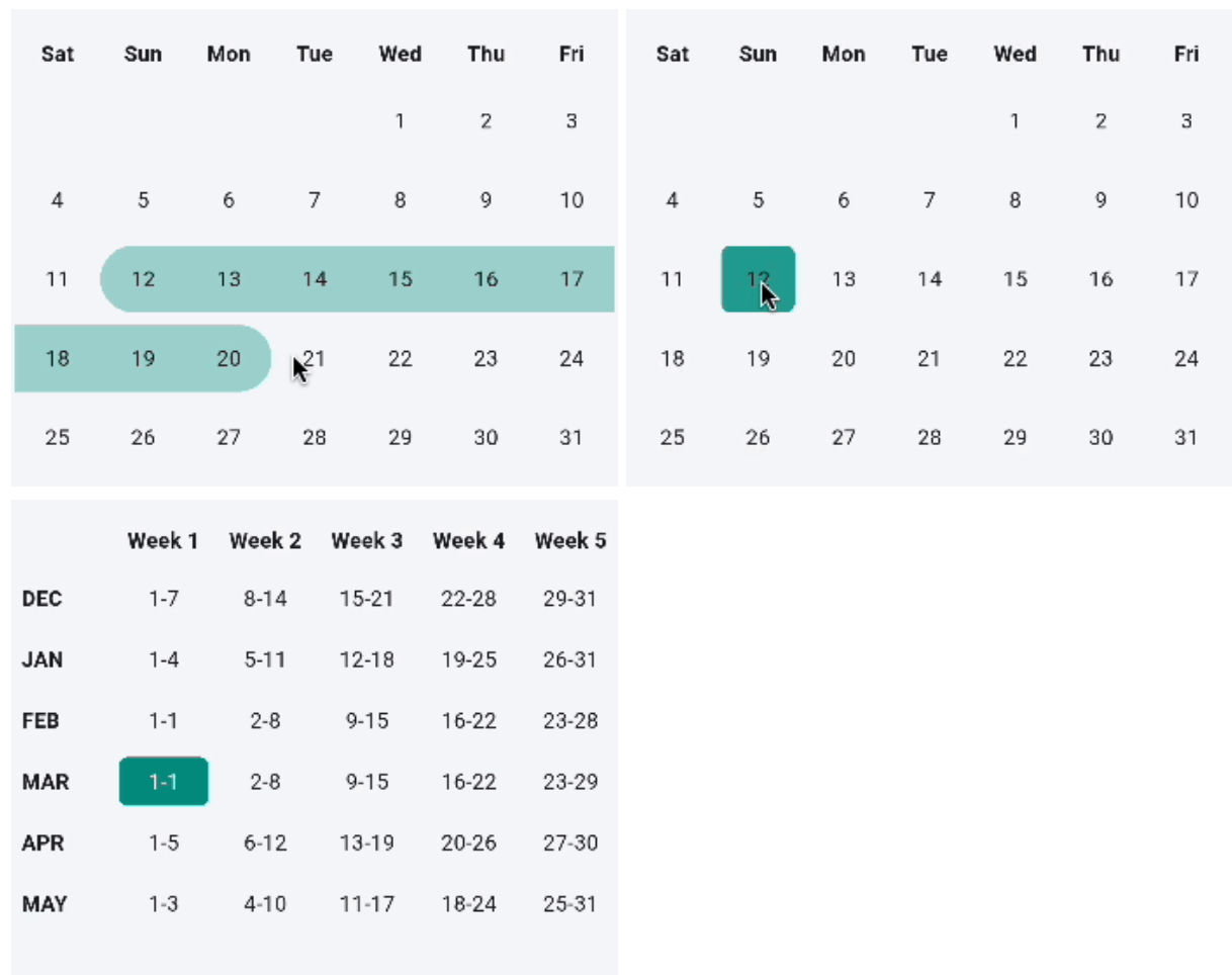
Monthly range selection Monthly single selection Weekly calendar
Horizontal calendar| Feature | Monthly | Weekly | Horizontal |
|---|---|---|---|
| Single-date selection | ✅ | ✅ | ✅ |
| Range selection | ✅ | — | — |
| Marked dates | ✅ | — | ✅ |
| Month/year picker | ✅ | — | ✅ |
| Custom cell decoration | ✅ | ✅ | ✅ |
| Custom cell widget | ✅ | ✅ | ✅ |
| Auto-scroll to date | — | — | ✅ |
startDay (e.g. Day.monday) to change it.isRangeSelection flag is accepted for API symmetry, but
weekly range selection is not implemented yet.selectedDay is initialized
to today before any interaction — so controller.selectedDates returns
[today] until the user (or controller) picks another date.controller.selectRange(start, end) is truncated
to the end of the start month.MCalendarController per MCalendar widget. Attaching the same
controller to multiple calendars is not supported.Add to your pubspec.yaml:
dependencies:
  m_calendar: ^1.4.0
Then run:
flutter pub get
Import in your Dart file:
import 'package:m_calendar/m_calendar.dart';
MCalendar(
  selectedMonth: DateTime.now(),
  onUserPicked: (List<DateTime> dates) {
    // Single selection → list contains one date.
    print(dates);
  },
)
MCalendar(
  selectedMonth: DateTime.now(),
  isRangeSelection: true,
  onUserPicked: (List<DateTime> dates) {
    // Range → list contains every date in the selected range.
    // The callback fires only once both range endpoints are picked.
    print('From ${dates.first} to ${dates.last}');
  },
)
MCalendar(
  selectedMonth: DateTime.now(),
  markedDaysList: [
    MarkedDaysModel(
      selectedDateList: [
        DateTime(2025, 6, 10),
        DateTime(2025, 6, 15),
      ],
      decoration: BoxDecoration(
        color: Colors.blue.withOpacity(0.3),
        shape: BoxShape.circle,
      ),
    ),
  ],
  onUserPicked: (dates) => print(dates),
)
MCalendar(
  selectedMonth: DateTime.now(),
  showMonthYearPicker: true, // tap the header to open the picker
  onUserPicked: (dates) => print(dates),
)
Note:
MCalendar.monthly(...)defaultsshowMonthYearPickertotrue.
TheMCalendar(...)shorthand defaults it tofalse. Explicitly set it to your preference.
MCalendarControllerControl navigation and programmatic selections from outside the calendar:
final controller = MCalendarController();

MCalendar(
  controller: controller,
  selectedMonth: DateTime(2026, 3),
  onUserPicked: (dates) => print(dates),
)

// Imperative controls:
controller.nextMonth();
controller.previousMonth();
controller.setMonth(DateTime(2026, 6));
controller.selectDate(DateTime(2026, 6, 15));
controller.selectRange(DateTime(2026, 6, 10), DateTime(2026, 6, 18));
controller.clearSelection();

// Query selection:
print(controller.selectedDates);
dayBuilder)Render custom widgets with event dots, badges, or icons inside day cells:
MCalendar(
  selectedMonth: DateTime.now(),
  dayBuilder: (context, date, state) {
    if (state.isDisabled) {
      return Center(child: Text('${date.day}', style: const TextStyle(color: Colors.grey)));
    }
    if (state.isToday) {
      return Column(
        mainAxisAlignment: MainAxisAlignment.center,
        children: [
          Text('${date.day}', style: const TextStyle(fontWeight: FontWeight.bold)),
          const Icon(Icons.circle, size: 4, color: Colors.blue),
        ],
      );
    }
    return null; // return null to fall back to default rendering
  },
  onUserPicked: (dates) => print(dates),
)
minDate, maxDate, isDateDisabled)Prevent selection of past dates, weekends, or specific days:
MCalendar(
  selectedMonth: DateTime.now(),
  minDate: DateTime.now(), // past dates disabled
  maxDate: DateTime.now().add(const Duration(days: 60)), // max 60 days ahead
  isDateDisabled: (date) => date.weekday == DateTime.sunday, // disable Sundays
  disabledDecoration: BoxDecoration(
    color: Colors.grey.shade200,
    borderRadius: BorderRadius.circular(6),
  ),
  onUserPicked: (dates) => print(dates),
)
Animations are off by default to keep existing behavior unchanged. Pass a
[CalendarAnimations] configuration to any calendar to enable them:
MCalendar(
  selectedMonth: DateTime.now(),
  animations: const CalendarAnimations(), // opt in
  onUserPicked: (dates) => print(dates),
)
This animates:
Tune the timings and curves, or disable specific parts:
const CalendarAnimations(
  selectionDuration: Duration(milliseconds: 150),
  monthTransitionDuration: Duration(milliseconds: 250),
  sizeDuration: Duration.zero, // keep the height change instant
)

MCalendar(
  selectedMonth: DateTime.now(),
  animations: CalendarAnimations.none, // explicitly disable
  onUserPicked: (dates) => print(dates),
)
Animations automatically become instant when the platform requests reduced motion (
MediaQueryData.disableAnimations).
MCalendar.weekly(
  selectedMonth: DateTime.now(),
  startDay: Day.sunday, // first day of the week; defaults to Day.saturday
  onUserPicked: (List<DateTime> dates) {
    // Returns [firstDayOfSelectedWeek].
    print(dates);
  },
)
The weekly view shows a scrollable table with one row per month (last 6 months) and up to 6 week columns. Months that span 6 calendar weeks (e.g. September 2023 with a Saturday week start) are displayed correctly without data loss.
// Wrap in a SizedBox or Expanded to give the view a bounded height.
SizedBox(
  width: double.infinity,
  height: 120,
  child: MCalendar.horizontal(
    selectedMonth: DateTime.now(),
    onUserPicked: (DateTime date) {
      // Always a single date.
      print(date);
    },
  ),
)
The horizontal view callback is
void Function(DateTime)— not aList— because the horizontal view only supports single-date selection.
SizedBox(
  width: double.infinity,
  height: 120,
  child: MCalendar.horizontal(
    selectedMonth: DateTime.now(),
    initialDate: DateTime.now(),                       // scroll-to target
    endDate: DateTime.now().add(const Duration(days: 30)), // last selectable day
    autoScroll: true,                                  // default: true
    onUserPicked: (date) => print(date),
  ),
)
initialDate is also the first selectable date. Dates before initialDate
and after endDate are shown greyed-out and cannot be tapped.
Assertion: passing
initialDateafterendDatethrows an assertion error in debug mode with a clear message.
MCalendar(
  selectedMonth: DateTime.now(),
  // Default (unselected) cell decoration
  decoration: BoxDecoration(
    color: Colors.grey.shade100,
    borderRadius: BorderRadius.circular(8),
  ),
  // Selected cell decoration
  userPickedDecoration: BoxDecoration(
    color: Colors.teal,
    borderRadius: BorderRadius.circular(8),
  ),
  // Custom widget inside the selected cell (overrides the default day number)
  userPickedChild: const Icon(Icons.check, color: Colors.white),
  // Cell padding
  cellPadding: const EdgeInsets.all(8),
  onUserPicked: (dates) => print(dates),
)
MCalendar(
  selectedMonth: DateTime.now(),
  showMonthYearPicker: true,
  // Header text (month + year label)
  weekNameHeaderStyle: const TextStyle(
    fontWeight: FontWeight.bold,
    color: Colors.indigo,
  ),
  onUserPicked: (dates) => print(dates),
)
MCalendar.horizontal(
  selectedMonth: DateTime.now(),
  showMonthYearPicker: true,
  monthYearPickerSelectedMonthColor: Colors.teal,
  monthYearPickerUnselectedMonthColor: Colors.grey.shade200,
  monthYearPickerCrossAxisCount: 4,
  monthYearPickerChildAspectRatio: 2.0,
  onUserPicked: (date) => print(date),
)
MCalendar (monthly, default)| Parameter | Type | Default | Description |
|---|---|---|---|
selectedMonth |
DateTime |
required | Month to display. Day/time components are ignored. |
onUserPicked |
void Function(List<DateTime>) |
required | Fires with selected dates. |
isRangeSelection |
bool |
false |
Enables range selection. |
showMonthYearPicker |
bool |
false |
Shows the month/year picker header. |
markedDaysList |
List<MarkedDaysModel>? |
null |
Dates to visually mark. |
decoration |
BoxDecoration? |
null |
Default cell decoration. |
userPickedDecoration |
BoxDecoration? |
null |
Selected-cell decoration. |
userPickedChild |
Widget? |
null |
Widget inside the selected cell. |
defaultChild |
Widget? |
null |
Widget inside unselected cells. |
cellPadding |
EdgeInsets? |
null |
Padding inside each cell. |
controller |
MCalendarController? |
null |
Controller for programmatic navigation and selection. |
dayBuilder |
CalendarDayBuilder? |
null |
Custom widget builder for day cells. |
minDate |
DateTime? |
null |
Earliest selectable date. |
maxDate |
DateTime? |
null |
Latest selectable date. |
isDateDisabled |
bool Function(DateTime)? |
null |
Predicate to disable specific dates. |
disabledDecoration |
BoxDecoration? |
null |
Decoration for disabled day cells. |
disabledTextStyle |
TextStyle? |
null |
Text style for disabled day cell numbers. |
startDay |
Day |
Day.saturday |
First day of the week; changes cell alignment and header labels. |
animations |
CalendarAnimations? |
null |
Opt-in animation config; null = instant updates. |
MCalendar.weeklySame as above plus:
| Parameter | Type | Default | Description |
|---|---|---|---|
startDay |
Day |
Day.saturday |
First day of the week. |
MCalendar.horizontal| Parameter | Type | Default | Description |
|---|---|---|---|
selectedMonth |
DateTime |
required | Month to display. |
onUserPicked |
void Function(DateTime) |
required | Fires with selected date. |
initialDate |
DateTime? |
null |
First selectable date; auto-scroll target. |
endDate |
DateTime? |
null |
Last selectable date. |
autoScroll |
bool |
true |
Scroll to initialDate on first build. |
showMonthYearPicker |
bool |
false |
Shows the month/year picker header. |
showWeekDays |
bool |
true |
Show weekday labels under dates. |
markedDaysList |
List<MarkedDaysModel>? |
null |
Dates to visually mark. |
decoration |
BoxDecoration? |
null |
Default cell decoration. |
userPickedDecoration |
BoxDecoration? |
null |
Selected-cell decoration. |
headerHeight |
double? |
320 |
Height of the picker bottom sheet. |
headerIconColor |
Color? |
null |
Color for header arrow icons. |
headerTextStyle |
TextStyle? |
null |
Style for header month/year text. |
dateTextStyle |
TextStyle? |
null |
Style for the day number. |
weekDaysTextStyle |
TextStyle? |
null |
Style for the weekday label. |
selectedDateTextStyle |
TextStyle? |
null |
Day number style when selected. |
selectedWeekDaysTextStyle |
TextStyle? |
null |
Weekday label style when selected. |
animations |
CalendarAnimations? |
null |
Opt-in animation config; null = instant updates. |
MarkedDaysModelMarkedDaysModel(
selectedDateList: [DateTime(2025, 6, 10)],
decoration: BoxDecoration(color: Colors.amber, shape: BoxShape.circle),
child: const Icon(Icons.star, size: 12), // optional overlay widget
)
Day enumUsed for MCalendar.weekly(startDay: ...):
Day.monday  Day.tuesday  Day.wednesday  Day.thursday
Day.friday  Day.saturday  Day.sunday
CalendarAnimations| Field | Default | Description |
|---|---|---|
selectionDuration |
180ms |
Duration of selection/range highlight transitions. |
selectionCurve |
Curves.easeOut |
Curve for selection transitions. |
monthTransitionDuration |
250ms |
Duration of the month-change fade + slide. |
monthTransitionCurve |
Curves.easeOutCubic |
Curve for the month-change transition. |
sizeDuration |
200ms |
Duration of grid resizes between row counts. |
CalendarAnimations.none disables all of them. Any duration is forced to
Duration.zero when the platform requests reduced motion.
No breaking changes. All existing code continues to work.
The internal providers were misspelled. The corrected names are now exported:
| Old name (deprecated) | New name |
|---|---|
MonthlyCalenderTableProvider |
MonthlyCalendarTableProvider |
WeeklyCalenderTableProvider |
WeeklyCalendarTableProvider |
The old names still compile (they are @Deprecated typedef aliases) but will
be removed in a future major release. Migrate by renaming:
// Before
MonthlyCalenderTableProvider()

// After
MonthlyCalendarTableProvider()
MarkedDaysModel and Day are now re-exported from m_calendar.dart.
You can remove separate imports if you had them:
// Before
import 'package:m_calendar/m_calendar.dart';
import 'package:m_calendar/model/marked_date_model.dart';
import 'package:m_calendar/provider/weekly_calendar_table_provider.dart';

// After
import 'package:m_calendar/m_calendar.dart'; // MarkedDaysModel and Day included
Q: Why does the range callback fire only when both endpoints are selected?
A: The callback fires once the range is complete (two taps). During the first tap,
rangeStart is set internally; the callback fires on the second tap with the full
sorted date list.
Q: What happens if I tap the same date twice in range mode?
A: A single-date range is returned: [date].
Q: What happens if I tap a third date after completing a range?
A: The old range is cleared and a new range starts from the third tap.
Q: Can I use DateTime values with time components for markedDaysList?
A: Yes. Date matching always ignores the time component — only year, month,
and day are compared.
Q: Can I show more than one decoration model on the same date?
A: The first matching MarkedDaysModel wins. Ensure no two models share the
same date if you want distinct decorations.
Q: Why does MCalendar.weekly show up to 6 week columns?
A: Depending on startDay, some months span 6 calendar weeks (e.g. September
2023 with a Saturday start). Previous versions silently dropped the 6th week;
1.4.0 renders it correctly.
MIT © Muntasir Asif