
 v3.8.3
pie_menu
A Flutter package providing a highly customizable circular/radial context menu
247Likes 1.6K30-day downloads150Pub points
AndroidiOSWebmacOSWindowsLinux
A Flutter package providing a highly customizable circular/radial context menu

{"sdk":"flutter"}^2.1.4^6.0.0{"sdk":"flutter"}English project snapshot. Visit GitHub for the latest content.
pub pub likes web apk app github buy me a coffee
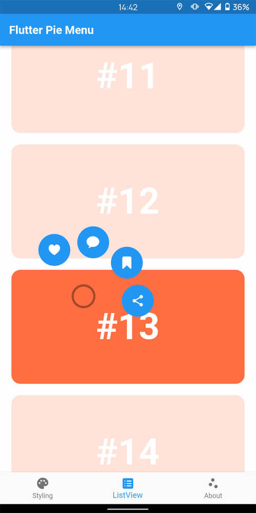
A Flutter package providing a highly customizable circular/radial context menu, similar to Pinterest's.
Click here to try Flutter Pie Menu online!
| https://raw.githubusercontent.com/rasitayaz/flutter-pie-menu/showcase/preview/screenshot-1.jpg | https://raw.githubusercontent.com/rasitayaz/flutter-pie-menu/showcase/preview/example-1.gif | https://raw.githubusercontent.com/rasitayaz/flutter-pie-menu/showcase/preview/example-2.gif |
|---|
Wrap the widget that should respond to gestures with the PieMenu widget, and provide the menu with a list of PieActions to display as circular buttons.
PieMenu(
  onPressed: () => print('pressed'),
  actions: [
    PieAction(
      tooltip: const Text('like'),
      onSelect: () => print('liked'),
      child: const Icon(Icons.favorite), // Can be any widget
    ),
  ],
  child: ChildWidget(),
),
💡 Note that
PieMenumust be a descendant of aPieCanvaswidget.
Wrap your page, or any other desired widget for drawing the menu and the background overlay, with the PieCanvas widget.
For instance, if you want the menu to be displayed at the forefront, wrap your Scaffold with a PieCanvas as follows:
PieCanvas(
  child: Scaffold(
    body: YourScaffoldBody(
      ...
        PieMenu(),
      ...
    ),
  ),
),
💡 You can use the
onPressedcallback defined inPieMenuto handle tap events without needing an extra widget likeGestureDetector.
You can customize the appearance and behavior of menus using PieTheme.
Using the theme attribute of the PieCanvas widget, you can specify a theme for all descendant PieMenu widgets.
PieCanvas(
  theme: PieTheme(),
  ...
    PieMenu(), // Uses the canvas theme
  ...
    PieMenu(), // Uses the canvas theme
  ...
),
If you want to specify menu-specific themes, you can use the theme attribute of the PieMenu widget.
PieMenu(
  theme: PieTheme(), // Overrides the canvas theme
),
It is also possible to copy the canvas theme with additional parameters, but ensure you are accessing it with the correct context.
PieMenu(
  theme: PieTheme.of(context).copyWith(
    ...
  ),
),
Button background and icon colors are defined by the theme's buttonTheme and buttonThemeHovered properties. You can create custom PieButtonTheme instances for your canvas and menu themes.
PieTheme(
  buttonTheme: PieButtonTheme(),
  buttonThemeHovered: PieButtonTheme(),
),
You can also style the buttons using the decoration property of PieButtonTheme.
PieButtonTheme(
  decoration: BoxDecoration(),
),
If you wish to use custom widgets inside buttons instead of just icons, use PieAction.builder(). Its builder provides the hover state as a parameter.
PieAction.builder(
  tooltip: const Text('like'),
  onSelect: () => print('liked'),
  builder: (hovered) {
    return Text(
      '<3',
      style: TextStyle(
        color: hovered ? Colors.green : Colors.red,
      ),
    );
  },
),
To disable dynamic angle calculation and have the menu appear at a fixed angle, set the customAngle and customAngleAnchor attributes of PieTheme.
PieTheme(
  customAngle: 90, // In degrees
  customAngleAnchor: PieAnchor.center, // start, center, end
),
You can also use customAngleDiff or spacing to adjust the angle between buttons, and angleOffset to rotate the menu.
Use the menuAlignment attribute of PieTheme to make the menu appear at a specific position regardless of the press location. Combine it with menuDisplacement to fine-tune the position.
PieTheme(
  menuAlignment: Alignment.center,
  menuDisplacement: Offset(0, 0),
),
Use the regularPressShowsMenu, longPressShowsMenu, and longPressDuration attributes of PieTheme to customize the menu opening behavior.
PieTheme(
  regularPressShowsMenu: true,
  longPressShowsMenu: true,
  longPressDuration: const Duration(milliseconds: 500),
),
Use the rightClickShowsMenu and leftClickShowsMenu attributes of PieTheme to customize mouse button behavior.
PieTheme(
  rightClickShowsMenu: true,
  leftClickShowsMenu: false,
),
To open, close, or toggle a menu programmatically, assign a PieMenuController to it.
// Create a controller inside a stateful widget.
final _pieMenuController = PieMenuController();

// Assign the controller to a PieMenu.
PieMenu(
  controller: _pieMenuController,
  ...
),

// Control the menu using the controller.
_pieMenuController.open(
  menuAlignment: Alignment.center,
);
If you need to perform actions when the menu is toggled, use the onToggle callback of PieMenu or the onMenuToggle callback of PieCanvas.
PieMenu(
  onToggle: (menuOpen) => print('Menu ${menuOpen ? 'opened' : 'closed'}'),
  ...
),

PieCanvas(
  onMenuToggle: (menuOpen) => print('A menu ${menuOpen ? 'opened' : 'closed'}'),
  ...
),
Pull requests are welcome. For major changes, please open an issue first to discuss what you would like to change.
If you find this package useful, please consider donating to support the project.