Package selection guidance compiled from public package information, community data, and project usage.
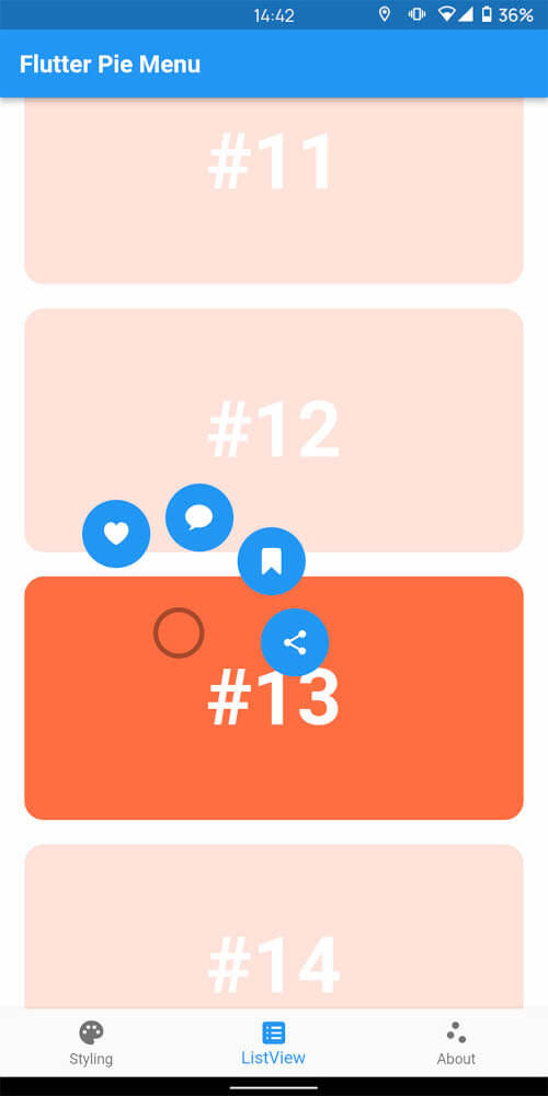
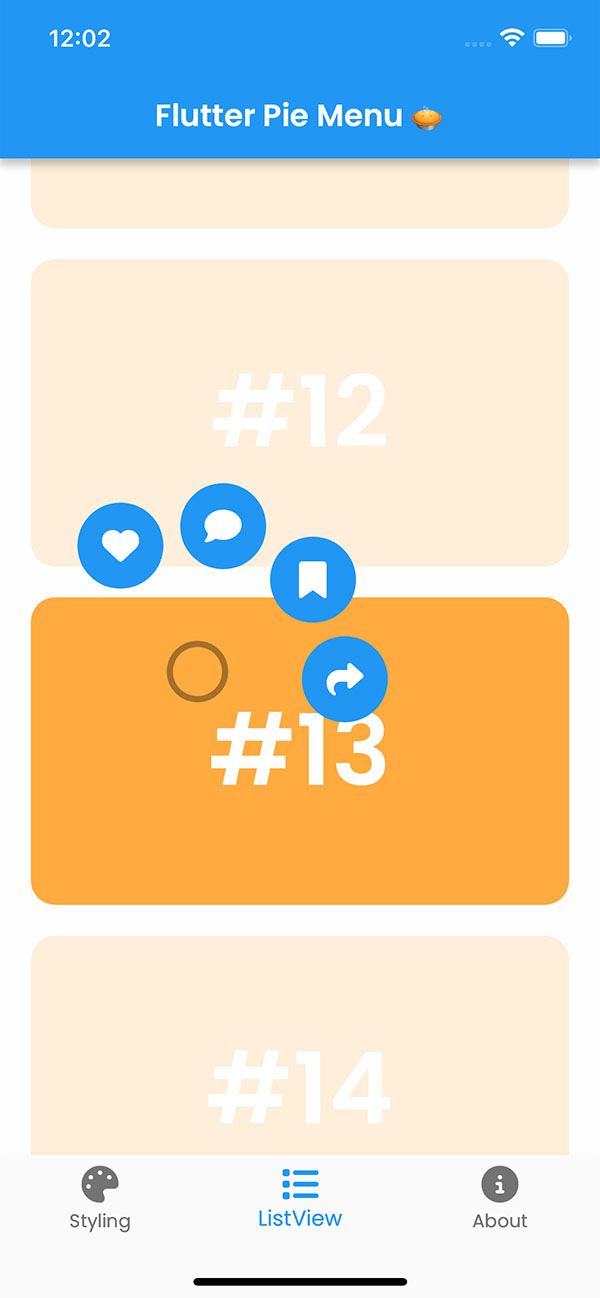
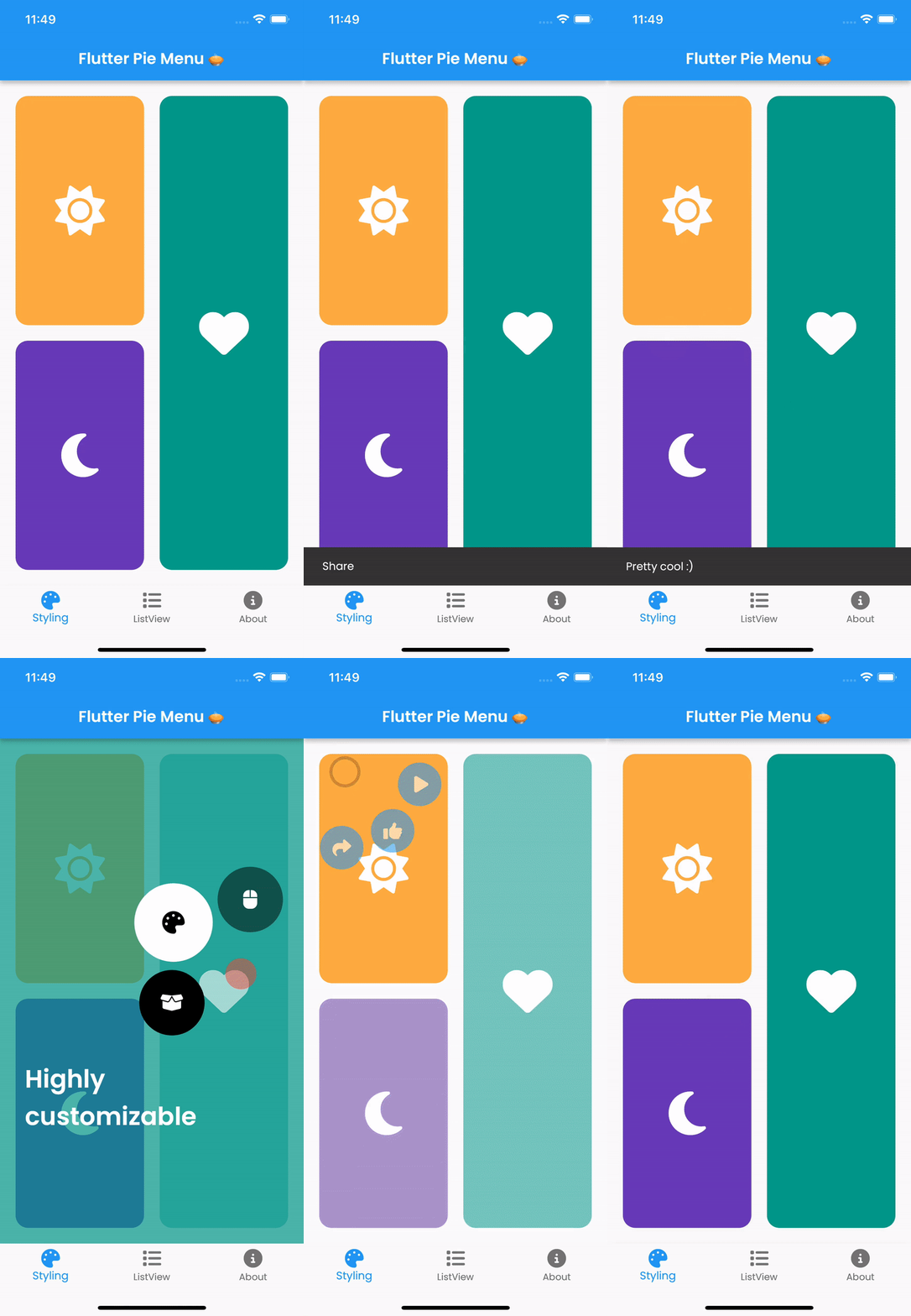
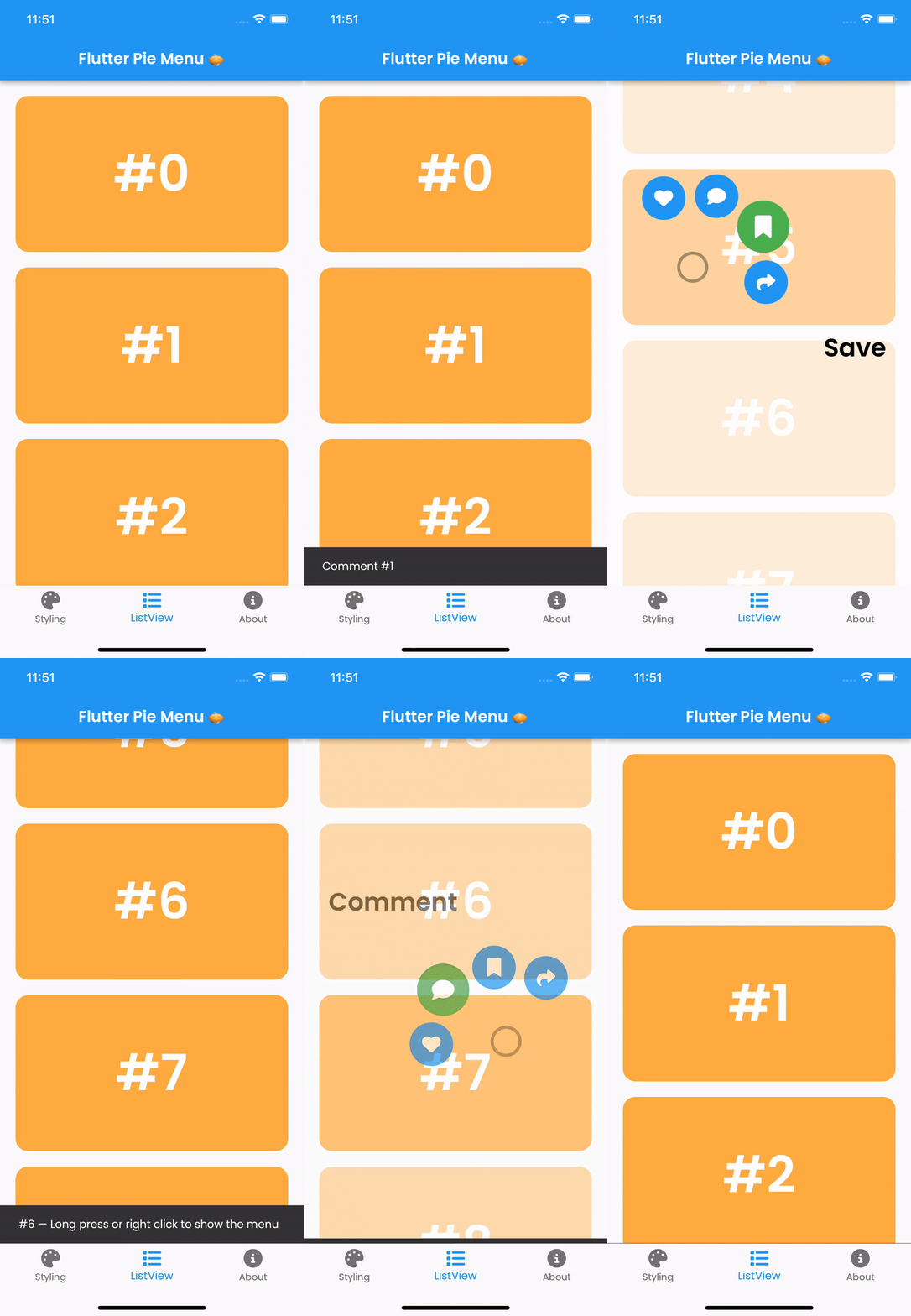
Pie_menu is a Flutter package that delivers a customizable circular or radial context menu, ideal for intuitive and space-efficient user interactions. It allows developers to create interactive pie-shaped menus with configurable slices, animations, and gestures. The package supports multiple platforms including Android, iOS, Web, macOS, Windows, and Linux, ensuring consistent behavior across devices. With extensive customization options for colors, sizes, and behaviors, it enhances UI design in apps requiring quick access to multiple actions.
Use cases
Quick action selection in mobile apps
Intuitive navigation in creative tools
Enhancing UI in gaming interfaces
Streamlining workflows in productivity apps
Providing gesture-based controls in AR/VR applications
Key features
Highly customizable radial layout
Support for touch, tap, and drag gestures
Smooth animations and transitions
Cross-platform compatibility
Configurable slice size and spacing
Extensible event handling
Suitable for
Developers building gesture-rich interfaces
UI designers seeking modern menu alternatives
Apps requiring compact action panels
Interactive educational or gaming applications
Projects targeting multiple device platforms
Considerations
May require careful UX testing for accessibility
Performance impact with many menu items
Potential learning curve for complex configurations
Not ideal for simple linear menus
Requires attention to touch target sizing on small screens
Original README
Original README snapshot from the linked source repository. Visit the repository for the latest content.
Flutter Pie Menu 🥧
A Flutter package providing a highly customizable circular/radial context menu, similar to Pinterest's.
Wrap the widget that should respond to gestures with the PieMenu widget, and provide the menu with a list of PieActions to display as circular buttons.
PieMenu(
onPressed: () => print('pressed'),
actions: [
PieAction(
tooltip: constText('like'),
onSelect: () => print('liked'),
child: constIcon(Icons.favorite), // Can be any widget
),
],
child: ChildWidget(),
),
💡 Note that PieMenu must be a descendant of a PieCanvas widget.
Wrap your page, or any other desired widget for drawing the menu and the background overlay, with the PieCanvas widget.
For instance, if you want the menu to be displayed at the forefront, wrap your Scaffold with a PieCanvas as follows:
Button background and icon colors are defined by the theme's buttonTheme and buttonThemeHovered properties. You can create custom PieButtonTheme instances for your canvas and menu themes.
To disable dynamic angle calculation and have the menu appear at a fixed angle, set the customAngle and customAngleAnchor attributes of PieTheme.
PieTheme(
  customAngle: 90, // In degrees
  customAngleAnchor: PieAnchor.center, // start, center, end
),
You can also use customAngleDiff or spacing to adjust the angle between buttons, and angleOffset to rotate the menu.
Specific menu position
Use the menuAlignment attribute of PieTheme to make the menu appear at a specific position regardless of the press location. Combine it with menuDisplacement to fine-tune the position.
To open, close, or toggle a menu programmatically, assign a PieMenuController to it.
// Create a controller inside a stateful widget.final _pieMenuController = PieMenuController();
// Assign the controller to a PieMenu.PieMenu(
controller: _pieMenuController,
...
),
// Control the menu using the controller.
_pieMenuController.open(
menuAlignment: Alignment.center,
);
If you need to perform actions when the menu is toggled, use the onToggle callback of PieMenu or the onMenuToggle callback of PieCanvas.