Package selection guidance compiled from public package information, community data, and project usage.
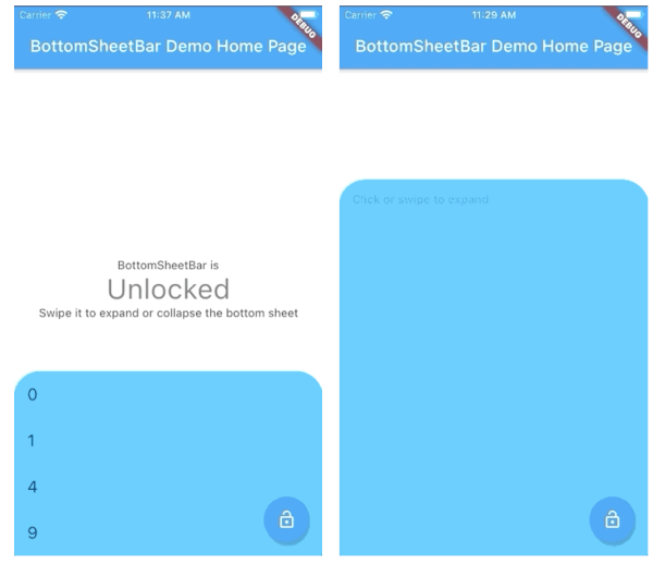
BottomSheetBar is a Flutter package that provides a toolbar anchored to the bottom of a screen, which can expand into a full bottom sheet. It offers a smooth transition between compact and expanded states, ideal for navigation, controls, or additional content access. The widget is customizable and works across all major platforms including Android, iOS, Web, macOS, Windows, and Linux. Designed for intuitive user interaction, it enhances UI flow by keeping key actions accessible without cluttering the main interface.
Use cases
Quick access to controls
Navigation with collapsible menu
Form input with expandable panel
Media playback controls
Dynamic content filtering
Key features
Bottom-aligned toolbar
Smooth expansion to bottom sheet
Cross-platform compatibility
Customizable appearance
Gesture-driven open/close
Responsive design
Suitable for
Mobile-first apps
Interactive dashboards
Content-heavy interfaces
User-centric navigation
Apps needing collapsible toolbars
Considerations
May conflict with other bottom overlays
Requires careful layout planning
Performance impact with heavy content
Limited customization in default state
Not suitable for full-screen modal use
Original README
Original README snapshot from the linked source repository. Visit the repository for the latest content.
bottom_sheet_bar
A toolbar that aligns to the bottom of a widget and expands into a bottom sheet.
Widget body - The toolbar will be aligned to the bottom of the body Widget. Padding equal to height is added to the bottom of this widget.
Function(ScrollController) expandedBuilder - A function to build the widget displayed when the bottom sheet is expanded. If the expanded content is scrollable, pass the provided ScrollController to the scrollable widget.
Optional
Widget collapsed - A Widget to be displayed on the toolbar in its collapsed state
BottomSheetBarController controller - A controller can be used to listen to events, and expand and collapse the bottom sheet.
Color color - The background color of the toolbar and bottom sheet. Defaults to Colors.white
Color backdropColor - The backdrop color that overlays the [body] widget when the bottom sheet is expanded. Defaults to Colors.transparent (no backdrop)
BorderRadius borderRadius - Provide a border-radius to adjust the shape of the toolbar
BorderRadius borderRadiusExpanded - Provide a border-radius to adjust the shape of the bottom-sheet when expanded
List<BoxShadow> boxShadows - Provide shadow decoration to the bottom sheet
double height - The height of the collapsed toolbar. Default to kToolbarHeight (56.0)
bool isDismissable - If true, the bottom sheet can be dismissed by tapping elsewhere. Defaults to true
bool locked - If true, the bottom sheet cannot be opened or closed with a swipe gesture. Defaults to true
bool willPopScope - If true, the bottom sheet widget will be wrapped in a WillPopScope widget to handle back-gestures. Defaults to false
bool backButtonListener - If true, the bottom sheet widget will be wrapped in a BackButtonListener widget to handle back-gestures. Defaults to false
BottomSheetBarController
A controller used to expand or collapse the bottom sheet of a BottomSheetBar. Listeners can be added to respond to expand and collapse events. The expanded or collapsed state can also be determined through this controller.
bool get isCollapsed - Only returns [true] if the bottom sheet if fully collapsed
bool get isExpanded - Only returns [true] if the bottom sheet if fully expanded
TickerFuture collapse() - Collapse the bottom sheet built by BottomSheetBar.expandedBuilder
TickerFuture expand() - Expand the bottom sheet built by BottomSheetBar.expandedBuilder
void addListener(Function listener) - Adds a function to be called on every animation frame
void removeListener(Function listener) - Removes a previously added listener
void dispose() - Removes all previously added listeners
void attach(AnimationController animationController) - Used internally to assign the AnimationController created by BottomSheetBar to the controller. Unless you're using advanced animation techniques, you probably won't ever need to use this method.
Example
A quick demonstration can be found in the example directory. To run the example: