
Overview
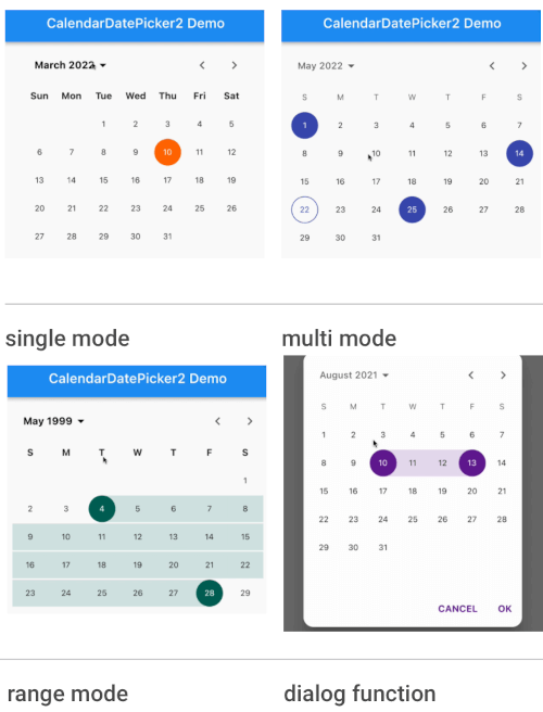
A lightweight and customizable calendar picker built on Flutter's CalendarDatePicker, offering support for single date selection, date range picking, and multiple date selection. It provides a clean, intuitive interface with extensive customization options for themes, styling, and behavior. Designed for seamless integration across all major platforms including Android, iOS, Web, macOS, Windows, and Linux. Ideal for apps requiring flexible date input with minimal overhead.
Use cases
- Single date selection
- Date range selection
- Multiple date selection
- Form inputs with date constraints
- Calendar-based scheduling tools
Key features
- Supports single, range, and multi-date selection
- Highly customizable UI and styling
- Cross-platform compatibility
- Lightweight and performant
- Configurable date ranges and validation
- Built-in localization support
Suitable for
- Mobile and web applications
- Forms requiring date input
- Scheduling and booking systems
- Customizable date pickers in Flutter apps
- Developers seeking alternatives to built-in date pickers
Considerations
- Requires manual handling of date validation
- Limited built-in internationalization beyond basic locales
- May need additional styling for complex themes
- Not optimized for very large date ranges
- Depends on Flutter's Material or Cupertino themes for default appearance