Package selection guidance compiled from public package information, community data, and project usage.
ContainedTabBarView is a customizable Flutter widget that combines TabController, TabBar, and TabBarView into a single cohesive component. It simplifies the implementation of tabbed interfaces by handling state management and layout automatically, allowing developers to focus on design and content. The package supports all major platforms including Android, iOS, Web, macOS, Windows, and Linux, making it ideal for cross-platform applications. With clean, intuitive APIs, it enhances code readability and reduces boilerplate. It’s particularly useful for creating navigation-heavy UIs with multiple tabs.
Use cases
Creating tabbed navigation in mobile and web apps
Simplifying complex tab interface implementations
Building reusable tab components across projects
Implementing dynamic tab layouts
Designing responsive tabbed dashboards
Key features
Single widget encapsulation of TabController, TabBar, and TabBarView
Built-in state management for tabs
Customizable appearance and behavior
Cross-platform support
Minimal boilerplate required
Supports dynamic tab addition/removal
Suitable for
Developers seeking streamlined tab UIs
Projects requiring consistent tab navigation
Cross-platform Flutter applications
UI components needing reusable tab logic
Teams prioritizing maintainable code
Considerations
May require additional styling for advanced customizations
Limited to standard tab patterns without deep customization
Depends on Flutter's built-in tab widgets
Not ideal for highly non-standard tab behaviors
Best suited for typical tab-based navigation flows
Original README
Original README snapshot from the linked source repository. Visit the repository for the latest content.
ContainedTabBarView
ContainedTabBarView encapsulates TabController, TabBar and TabBarView into a single, easy to use Widget and lets you customize its appearance without worrying about internal workings of "TabBar ecosystem".
All of the below examples can be found under example, each written as a simple StatelessWidget.
Basic
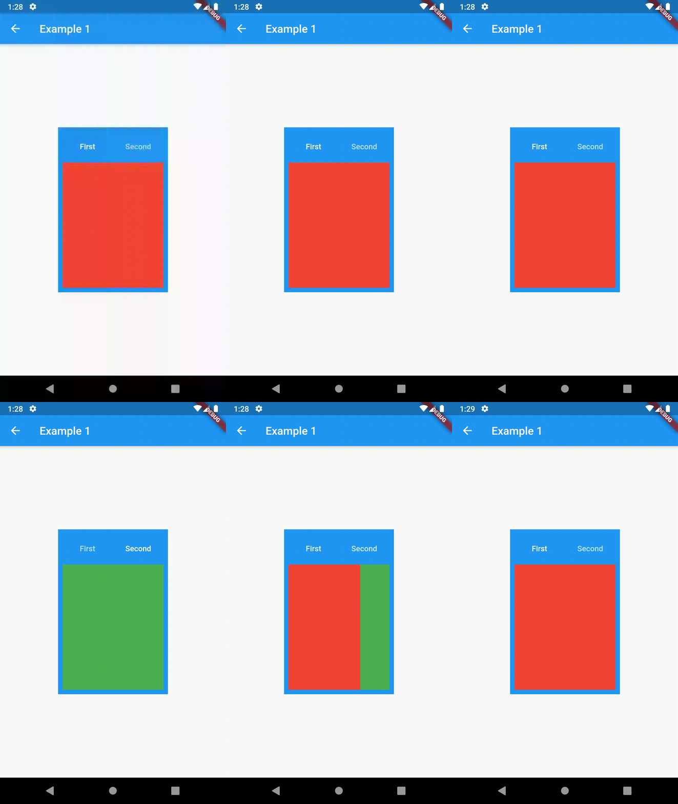
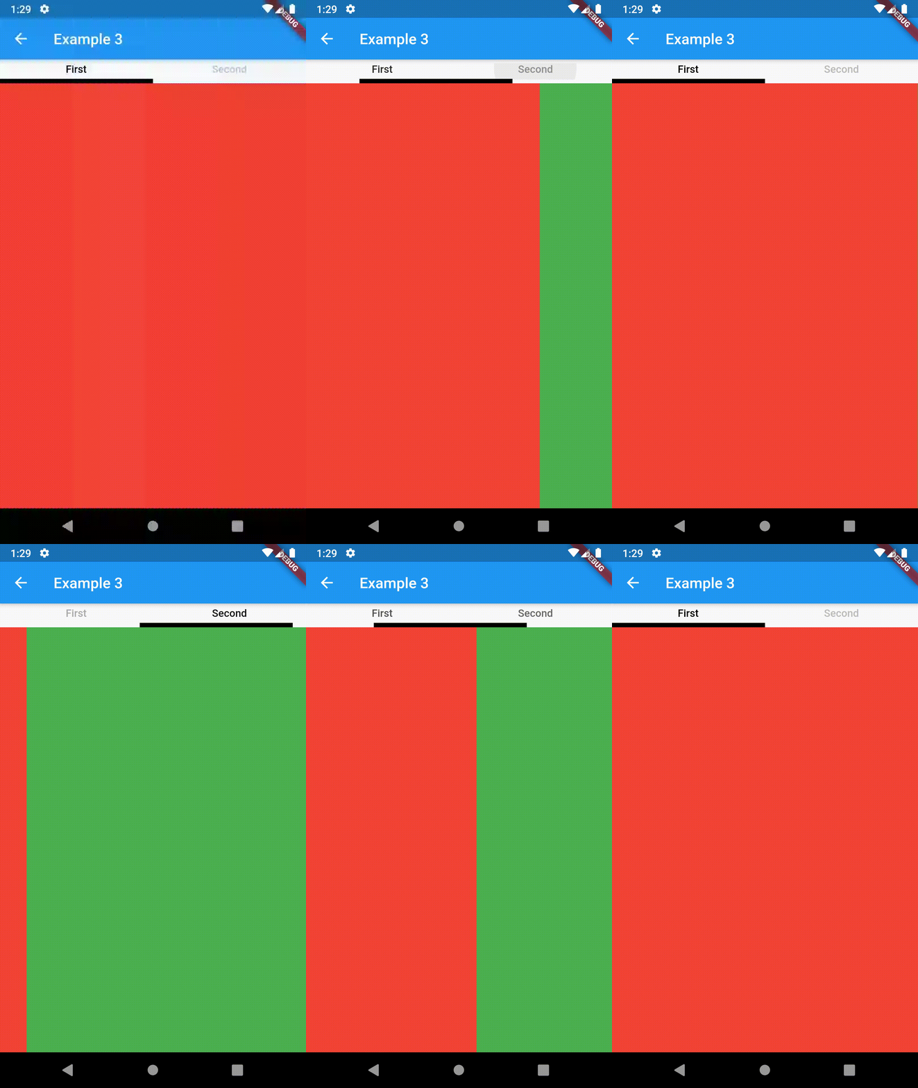
Basic usage includes putting a ContainedTabBarView into a Container whose constraints it will obey. Putting a ContainedTabBarView directly into a body of a Scaffold will, expectedly, draw it full-screen.
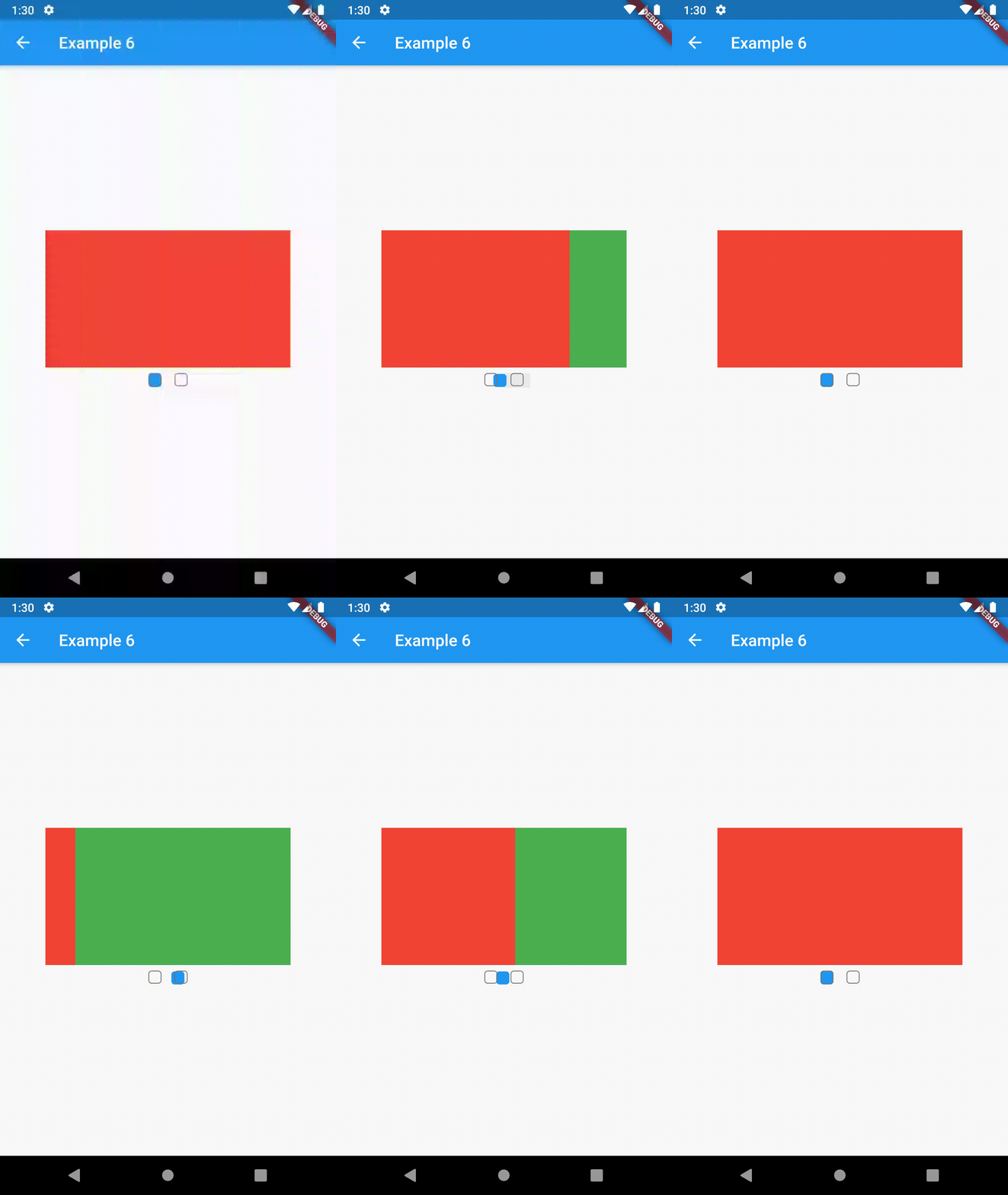
All the properties that can be set for a TabBar are accessible for setting via tabBarProperties. Also, there are many more for the customization of TabBar's appearance. To create your own ("container-based") indicator, you can use ContainerTabIndicator decoration (see examples 4 and 6) which is a part of this package, but also a separate package whose documentation can be found here. Of course, you can use any other tab bar indicator of your liking.
Property
Type
Default value
Description
width
double
/
The width of TabBar. If not set, it's full available width.
height
double
kToolbarHeight
The height of TabBar. The TabBarView takes the available height minus this value.
background
Container
/
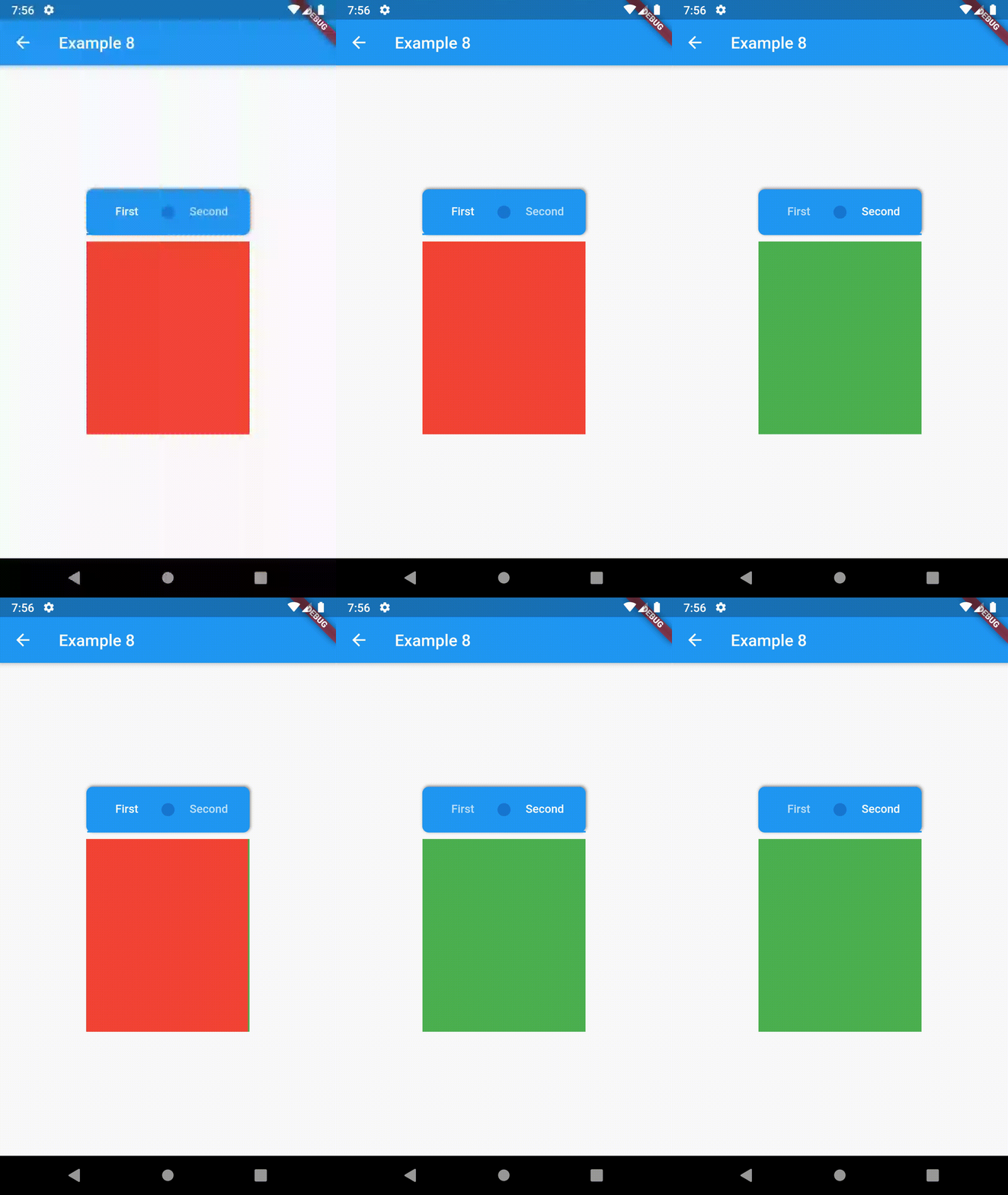
Container that is behind the tabs. See example 8.
position
TabBarPosition
TabBarPosition.top
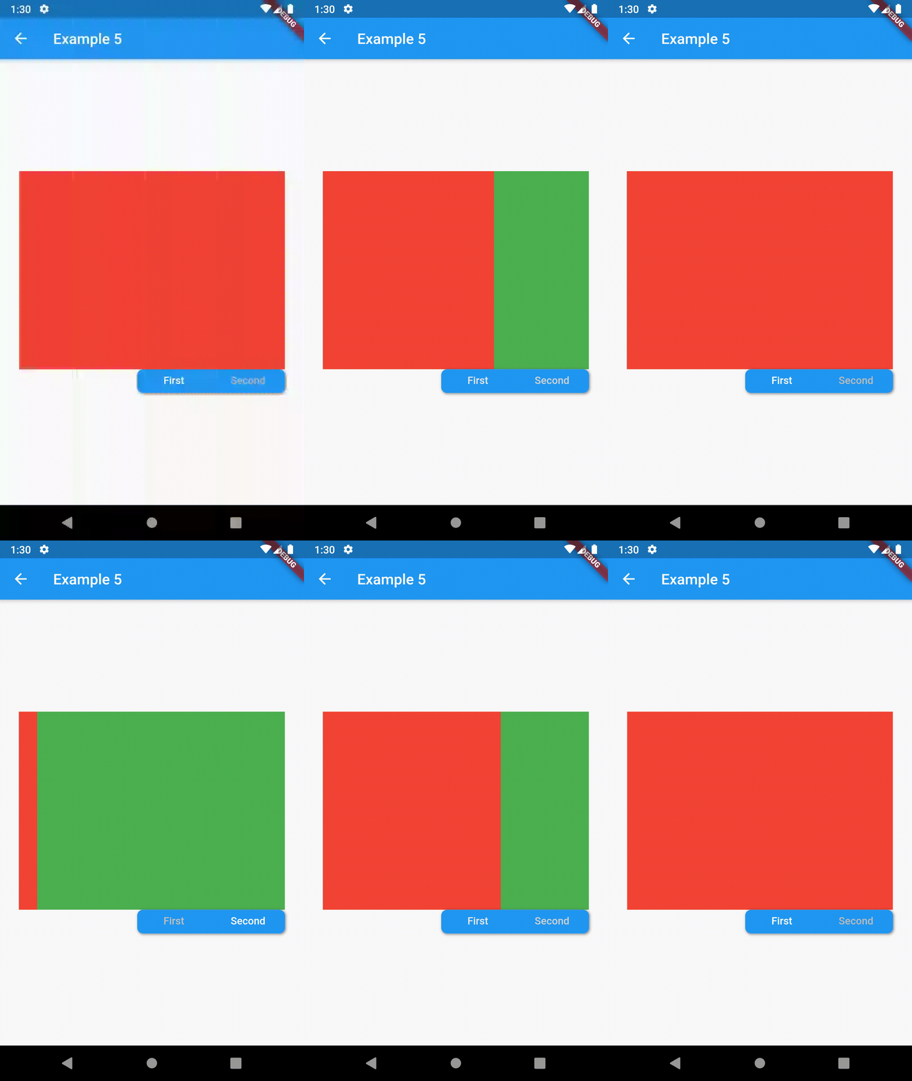
Position of TabBar in respect to it's TabBarView. See example 5.
alignment
TabBarAlignment
TabBarAlignment.center
Alignment of TabBar (if it's width is not full available) within TabBar-TabBarView flex. See example 5.
padding
EdgeInsets
const EdgeInsets.all(0.0)
The TabBars padding. See example 4.
margin
EdgeInsets
const EdgeInsets.all(0.0)
The TabBars margin. See example 8.
indicator
Decoration
/
The decoration for the active tab. You can use ContainerTabIndicator for various customization. See example 4. Also, see TabBar documentation
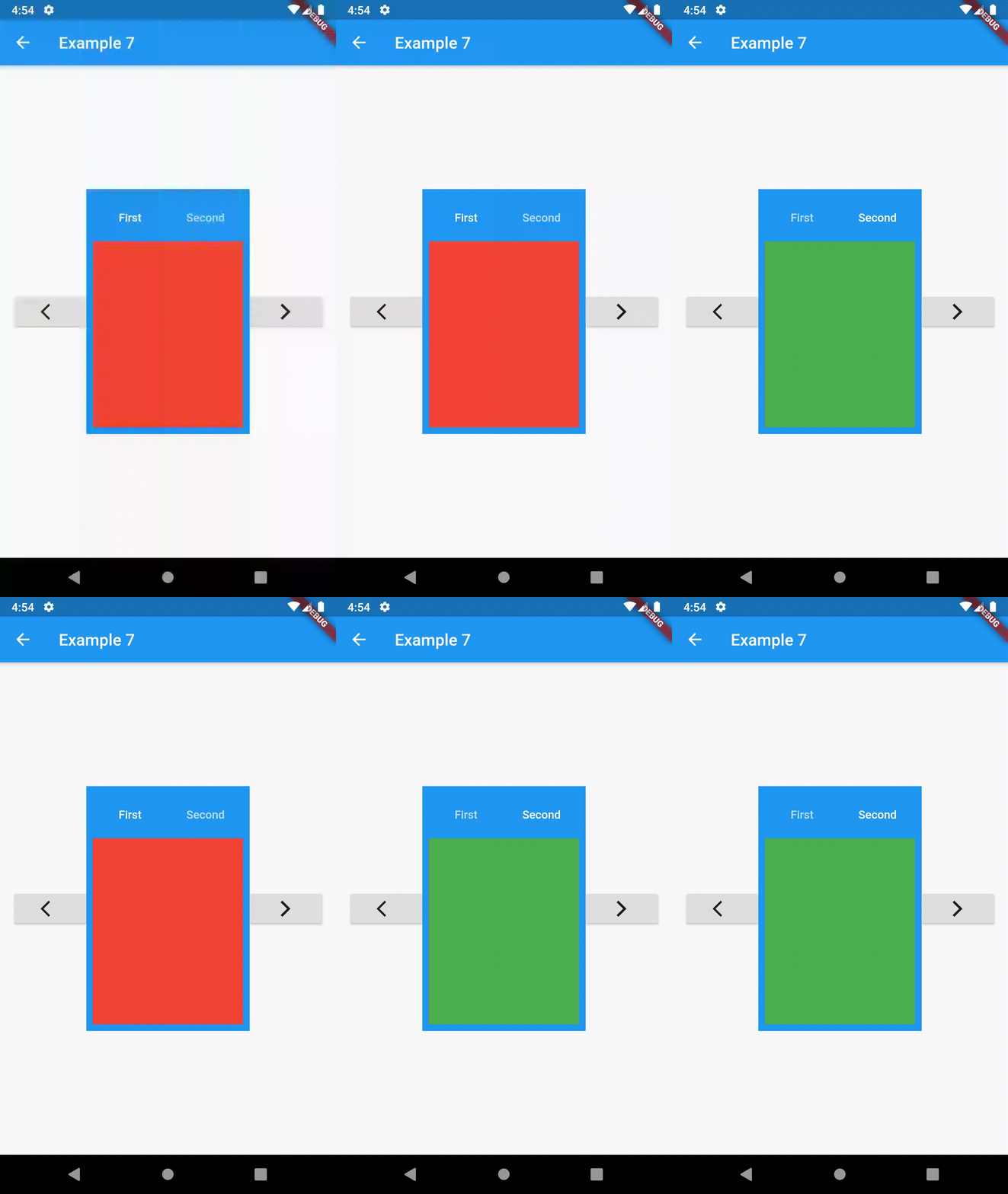
To control the state, i.e. move to another tab, from outside of ContainedTabBarView create it with a GlobalKey and then use methods exposed from state: animateTo(), next() and previous().
This package is still in early stages. If you notice any bugs, please file an issue. If you are willing to fix or enhance things yourself, you are very welcome to make a pull request.