Search packages, repositories and app categories

custom_sliding_segmented_control cover
Package detailsv2.0.0

custom_sliding_segmented_control

Allows you to flexibly configure the widget for displaying controls. You can add color, speed, size, initial value, animation and more.

AndroidiOSWebmacOSWindowsLinux
30-day downloads
59.6K
Likes
232
Pub points
150

Install package

flutter pub add custom_sliding_segmented_control

Package Overview

Package selection guidance compiled from public package information, community data, and project usage.

A flexible Flutter widget for creating sliding segmented controls with customizable appearance and behavior. It supports adjustable colors, animation speed, size, initial selection, and smooth transitions between segments. Ideal for enhancing user interfaces with interactive, visually appealing tab-like navigation. The control is highly configurable and works across all major platforms including Android, iOS, Web, macOS, Windows, and Linux.

Use cases

  • Custom tab navigation
  • Interactive form filters
  • Dynamic content switching
  • User preference selectors
  • Animated UI transitions

Key features

  • Configurable colors
  • Adjustable animation speed
  • Resizable segments
  • Initial value setting
  • Smooth sliding animations
  • Cross-platform support

Suitable for

  • Developers needing custom tab interfaces
  • Designers wanting animated controls
  • Apps with dynamic content filtering
  • UI-heavy applications
  • Multi-platform Flutter projects

Considerations

  • Requires careful handling of state management
  • May need performance tuning for large segment counts
  • Limited documentation in some areas
  • Best used with clear visual feedback

Original README

Original README snapshot from the linked source repository. Visit the repository for the latest content.

CustomSlidingSegmentedControl

Allows you to flexibly configure the widget for displaying controls. You can add color, speed, size, initial value, animation and more.

Example
import 'package:custom_sliding_segmented_control/custom_sliding_segmented_control.dart';

CustomSlidingSegmentedControl<int>(
  initialValue: 2,
  children: {
    1: Text('News daily portal'),
    2: Text('Map'),
    3: Text('Paper'),
  },
  decoration: BoxDecoration(
    color: CupertinoColors.lightBackgroundGray,
    borderRadius: BorderRadius.circular(8),
  ),
  thumbDecoration: BoxDecoration(
    color: Colors.white,
    borderRadius: BorderRadius.circular(6),
    boxShadow: [
      BoxShadow(
        color: Colors.black.withOpacity(.3),
        blurRadius: 4.0,
        spreadRadius: 1.0,
        offset: Offset(
          0.0,
          2.0,
        ),
      ),
    ],
  ),
  duration: Duration(milliseconds: 300),
  curve: Curves.easeInToLinear,
  onValueChanged: (v) {
    print(v);
  },
),

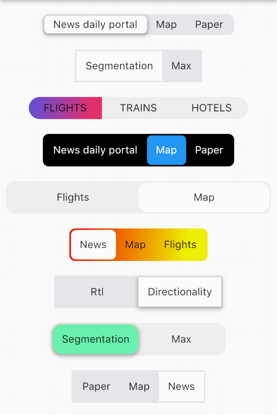
More examples

Categories

Dependencies

Dependency list 2 items

Source repository

Projects using this package