Search packages, repositories and app categories

date_time_picker cover
Package detailsv2.1.0

date_time_picker

A Flutter widget to display a date time form field to show a date or clock dialog.

AndroidiOSWebmacOSWindowsLinux
30-day downloads
23.2K
Likes
375
Pub points
130

Install package

flutter pub add date_time_picker

Package Overview

Package selection guidance compiled from public package information, community data, and project usage.

A Flutter widget that provides a date and time form field, displaying a dialog for selecting dates or times. It supports both date-only and time-only pickers, offering a consistent UI across Android, iOS, Web, macOS, Windows, and Linux. The package is designed to integrate seamlessly into forms, enhancing user experience with intuitive time and date selection. It leverages native dialogs where available, ensuring platform-appropriate behavior.

Use cases

  • Form inputs requiring date selection
  • Time entry in scheduling apps
  • Date and time input in booking systems
  • User profile setup with birth date
  • Event creation with time constraints

Key features

  • Cross-platform compatibility
  • Native-like dialog interfaces
  • Support for date and time modes
  • Easy integration with Form widgets
  • Customizable appearance and behavior

Suitable for

  • Mobile and web applications needing date/time input
  • Developers seeking simple, reliable date pickers
  • Apps requiring consistent UX across platforms
  • Form-heavy applications with time-sensitive data

Considerations

  • Limited customization beyond basic styling
  • No built-in validation logic
  • Requires manual handling of date parsing
  • Depends on underlying platform's date/time formats
  • May need additional localization setup

Original README

Original README snapshot from the linked source repository. Visit the repository for the latest content.

date_time_picker

pub package

Buy Me A Beer

A Flutter widget to show a text form field to display a date or clock dialog.
This widget extend TextField and has a similar behavior as TextFormField

Usage

In the pubspec.yaml of your flutter project, add the following dependency:

dependencies:
  ...
  date_time_picker: "^2.1.0"

In your library add the following import:

import 'package:date_time_picker/date_time_picker.dart';

For help getting started with Flutter, view the online documentation.

Example

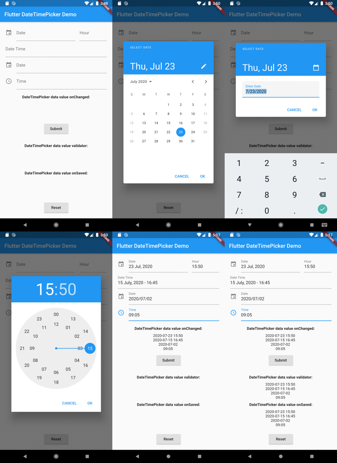
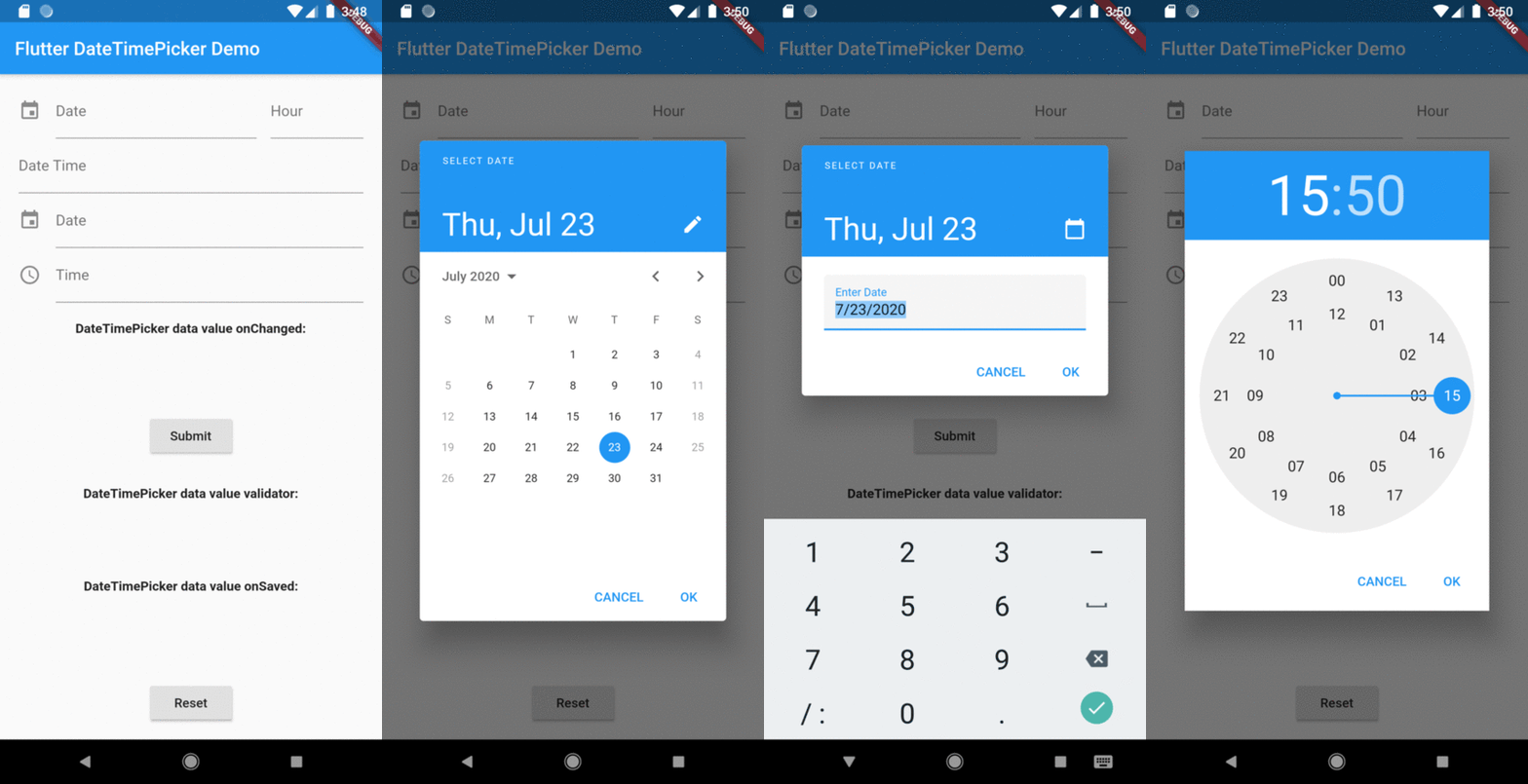
There are four presentations for DateTimePicker and can be defined in the type parameter:

  • DateTimePickerType.date will present a text field with the action tap showing a datePicker dialog box;
  • DateTimePickerType.time will present a text field with the action tap showing a timePicker dialog box;
  • DateTimePickerType.dateTime will present a text field with the action tap showing a datePicker dialog box then a timePicker dialog box;
  • DateTimePickerType.dateTimeSeparated will display two text fields side by side, the first for date and the second for time. Each displaying their respective dialog box, datePicker and timePicker in the tap action;
DateTimePicker(
  type: date, // options: [date | time | dateTime | dateTimeSeparated], default is date
  ...
)

initialValue or controller.text can be null, empty or a DateTime string otherwise it will throw an error.

DateTimePicker(
  initialValue: '',
  firstDate: DateTime(2000),
  lastDate: DateTime(2100),
  dateLabelText: 'Date',
  onChanged: (val) => print(val),
  validator: (val) {
    print(val);
    return null;
  },
  onSaved: (val) => print(val),
);

More complete example:

DateTimePicker(
  type: DateTimePickerType.dateTimeSeparate,
  dateMask: 'd MMM, yyyy',
  initialValue: DateTime.now().toString(),
  firstDate: DateTime(2000),
  lastDate: DateTime(2100),
  icon: Icon(Icons.event),
  dateLabelText: 'Date',
  timeLabelText: "Hour",
  selectableDayPredicate: (date) {
    // Disable weekend days to select from the calendar
    if (date.weekday == 6 || date.weekday == 7) {
      return false;
    }

    return true;
  },
  onChanged: (val) => print(val),
  validator: (val) {
    print(val);
    return null;
  },
  onSaved: (val) => print(val),
);

The result of val in onChanged, validator and onSaved will be a DateTime String or just a Time String:

  • ex.: [2020-07-20 14:30] or [15:30] DateTimePickerType.time;
  • month, day, hour and minute will be 2 digits and time always be in 24 hours mode;
  • but the presentation in text field can be formated by the dateMask parameter.

Preview

Overview

Categories

Dependencies

Dependency list 1 items

Source repository

Projects using this package