Package selection guidance compiled from public package information, community data, and project usage.
Easy Dashboard is a Flutter package designed to simplify the creation of responsive dashboard layouts and navigation interfaces. It streamlines the process of building adaptable UIs that work seamlessly across devices, from mobile to web and desktop. With built-in support for responsive design patterns, it enables developers to quickly structure dashboards with consistent layouts and navigation flows. The package focuses on reducing boilerplate code and enhancing developer productivity when implementing complex dashboard systems.
Use cases
Building admin panels
Creating responsive data dashboards
Designing multi-screen navigation
Developing cross-platform monitoring apps
Implementing layout-based dashboards
Key features
Responsive layout support
Built-in navigation utilities
Cross-platform compatibility
Minimal setup required
Flexible widget composition
Suitable for
Flutter developers building admin interfaces
Teams needing rapid dashboard prototyping
Projects requiring responsive UIs across devices
Developers focused on UI consistency
Apps with complex navigation structures
Considerations
May require customization for highly unique layouts
Limited documentation beyond basic examples
Best suited for standard dashboard patterns
Not ideal for non-dashboard UIs
Depends on Flutter's rendering performance
Original README
Original README snapshot from the linked source repository. Visit the repository for the latest content.
Easy Dashboard
Provides an easy way to build dashboard layout for your app , but still yet very customizable .
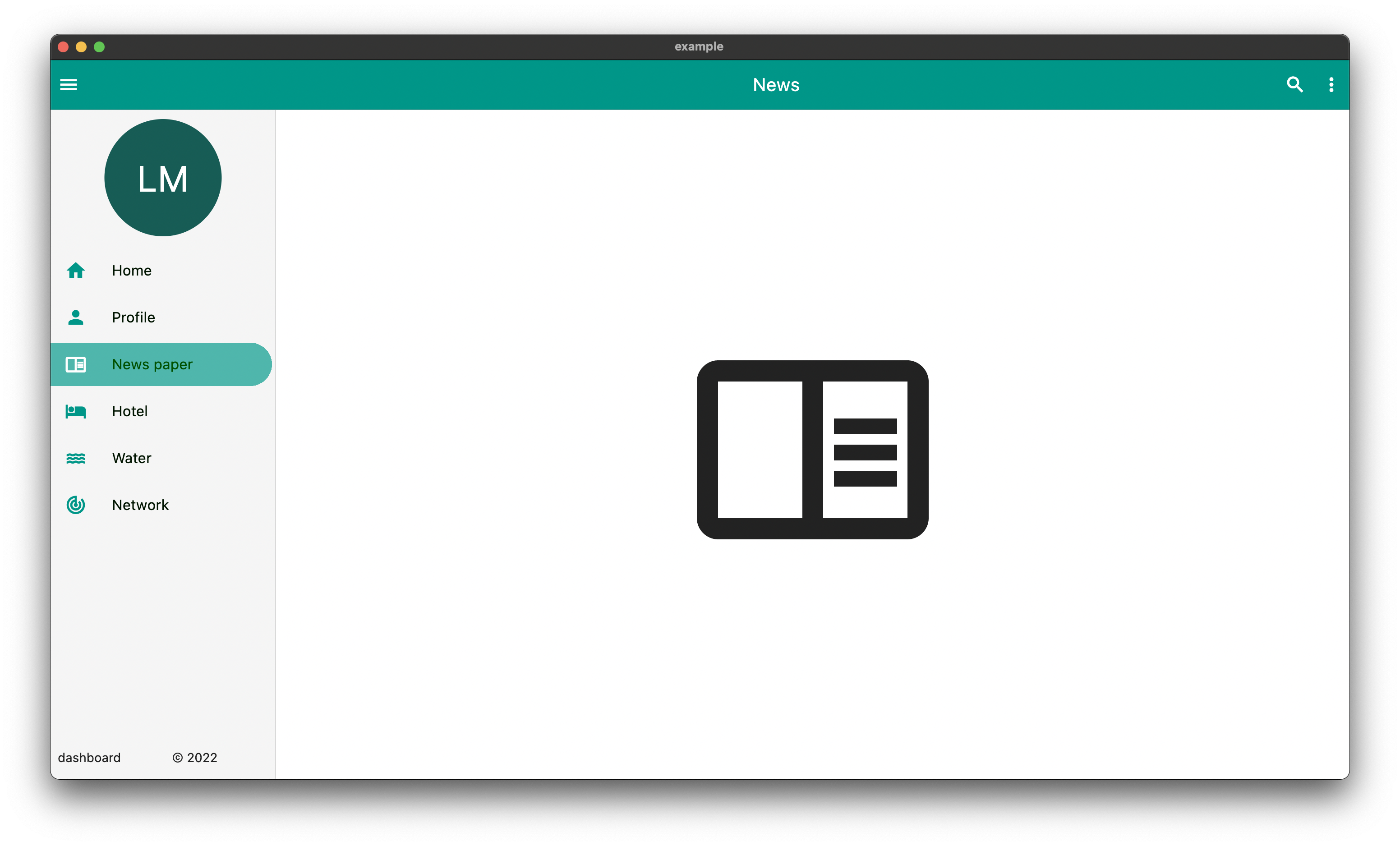
DeskTop
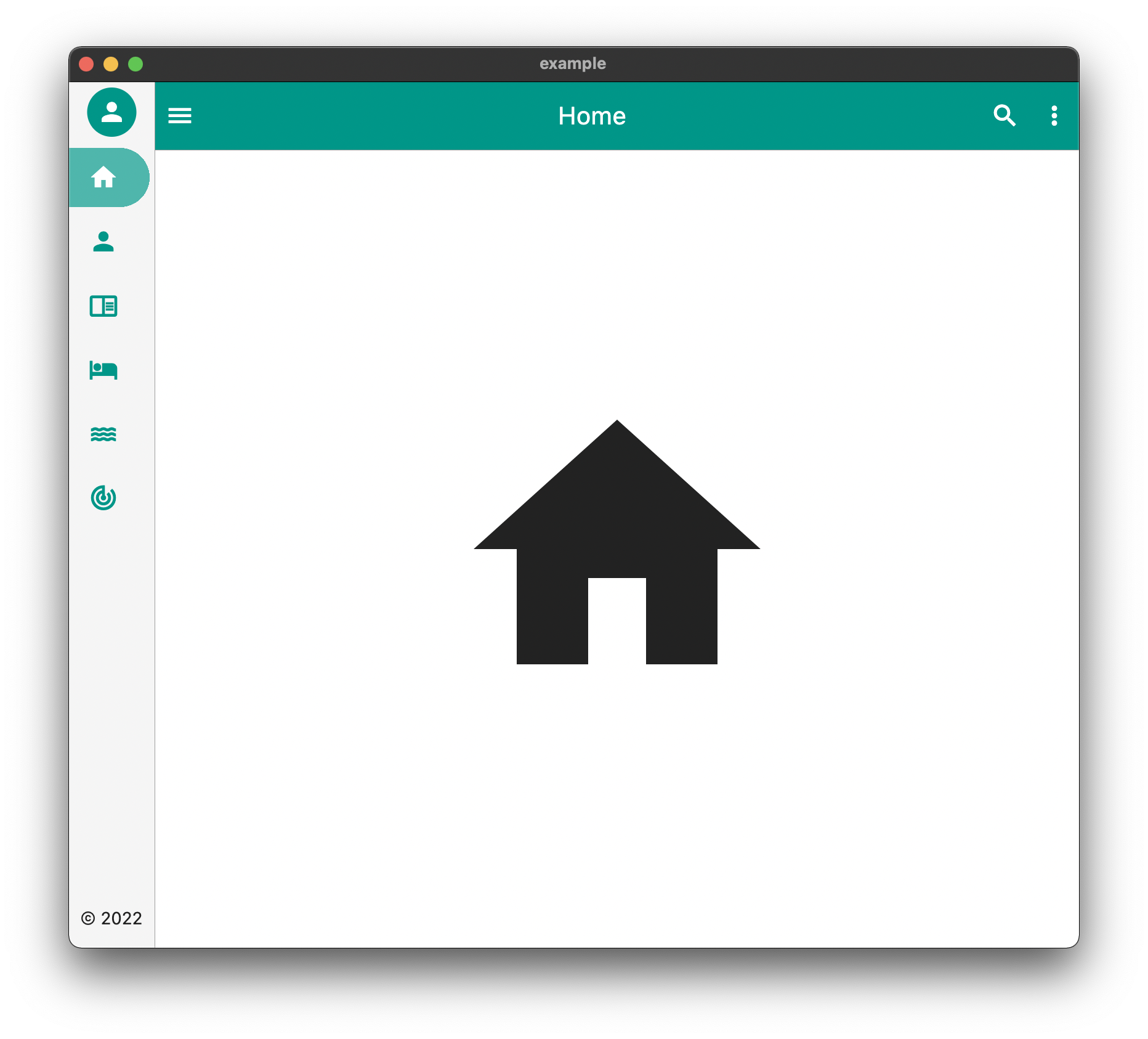
Tablet
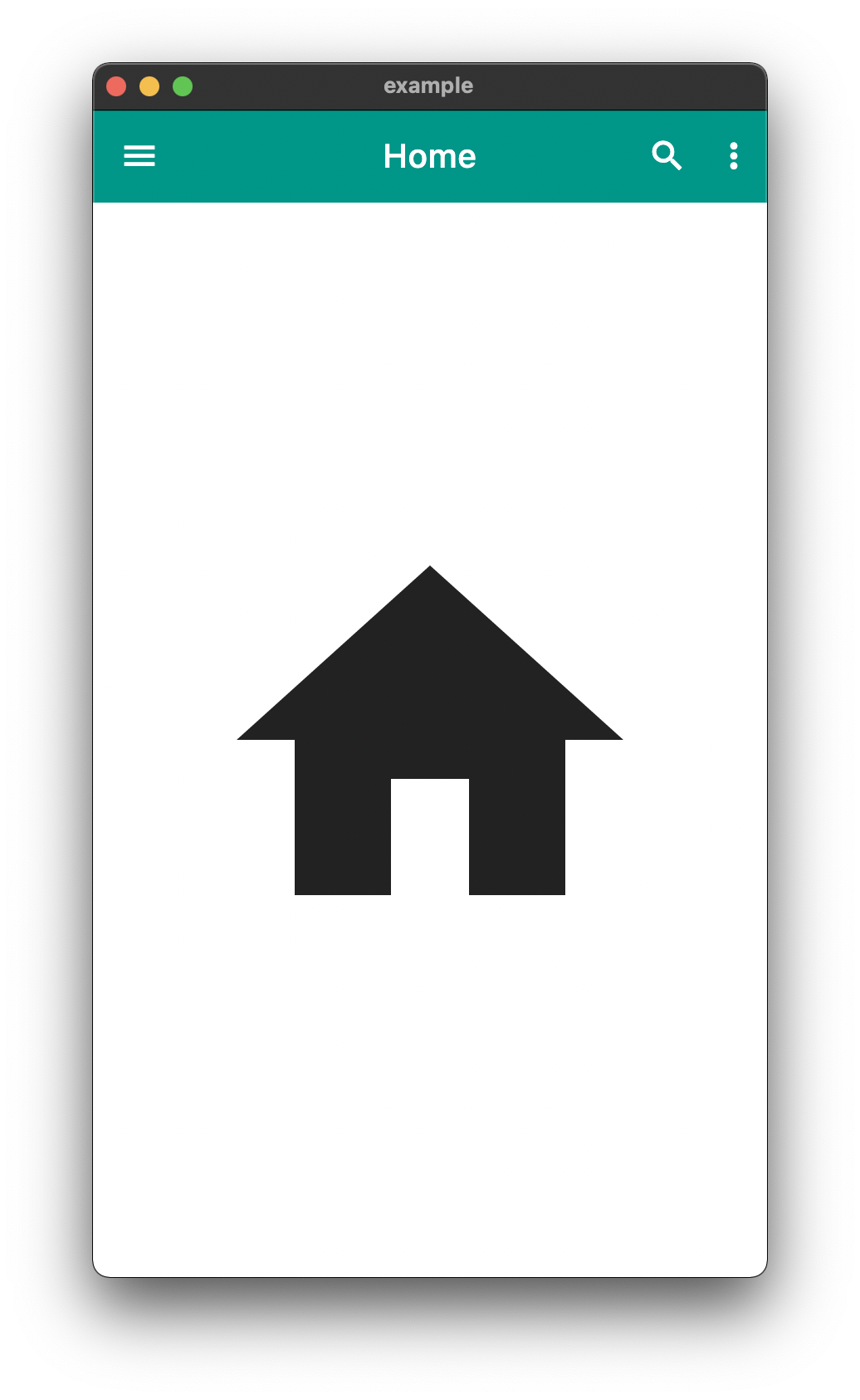
Mobile
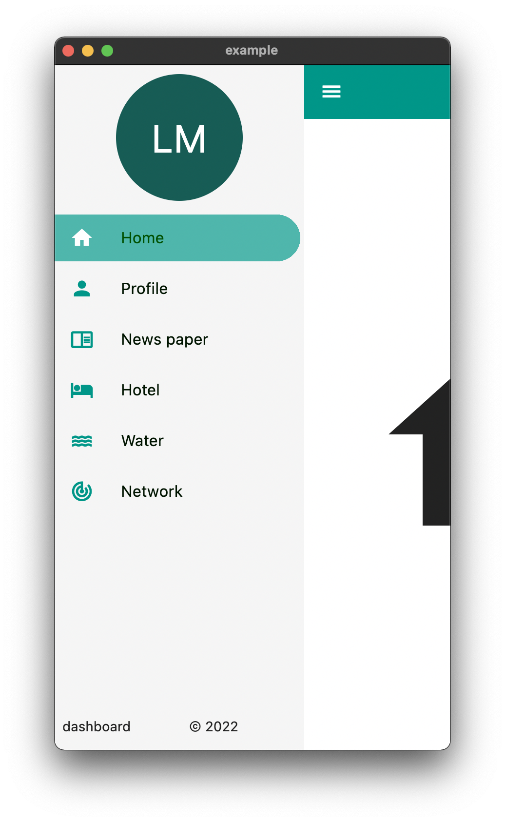
The above is an example of an app created with the package
The above example can be found in the /example folder
API
component
usage
body
The default body for the dashboard
duration
The Duration of the animation when the [EasyDashboard] is opened or closed among others.
mobileBreakpoint
The pixels at which the ui breaks into the mobile view
tabletBreakpoint
The pixels at which the ui breaks into the tablet view
mobileView
Display properties while in tablet view such as dashboard style
tabletView
Display properties while in tablet view such as dashboard style
desktopView
Display properties while in desktop view such as dashboard style
tabletMode
What to show when the mobile break point is reached,
mobileMode
What to show when the tablet break point is reached
desktopMode
What to show when the desktop break point is reached
floatingActionButtonLocation
Floating Action Button Location
floatingActionButton
Floating Action Button
systemOverlayStyle
System Overlay Style
floatingActionButtonAnimator
Floating Action Button Animator
appBarHeight
The height of the app bar
centerTitle
Whether or not the appbar title is centered
backgroundColor
General background color of the [EasyDashboard]
navigationIcon
The icon that will control the responsive navigation of the [EasyDashboard]
navigationIconSplashRadius
The splash radius of the navigation icon when pressed
appBarColor
The color of the app bar
sideBarColor
The color of the sidebar navigation
appBarActions
A list of Widgets for the [AppBar]actions
drawer
An drawer widget that will be displayed on the left side of the [EasyDashboard]. You can use the pre-built [EasyDrawer] to create a faster easier drawer .
Issues and Feedback
This is a fairly new package
Please feel free to report any issues you face
Also PR's and additional feedback is appreciated