Search packages, repositories and app categories

easy_sidemenu cover
Package detailsv1.0.0

easy_sidemenu

An easy to use side menu (navigation rail) in flutter and can used for navigation

AndroidiOSWebmacOSWindowsLinux
30-day downloads
20.9K
Likes
459
Pub points
160

Install package

flutter pub add easy_sidemenu

Package Overview

Package selection guidance compiled from public package information, community data, and project usage.

EasySideMenu is a Flutter package that provides a simple and customizable side menu (navigation rail) for building responsive navigation interfaces. It supports multiple platforms including Android, iOS, Web, macOS, Windows, and Linux. Designed for ease of use, it enables developers to quickly implement navigation rails with minimal setup, making it ideal for apps requiring consistent and accessible navigation across devices. The package integrates seamlessly into Flutter projects via pub.dev.

Use cases

  • Mobile app navigation
  • Web dashboard layouts
  • Desktop application navigation
  • Responsive UI design
  • Cross-platform navigation
  • Customizable sidebar menus

Key features

  • Simple API integration
  • Responsive layout support
  • Customizable menu items
  • Platform-agnostic design
  • Built-in animations
  • Supports dark mode

Suitable for

  • Beginner Flutter developers
  • Cross-platform app builders
  • UI-focused developers
  • Dashboard and admin panel creators
  • Apps needing consistent navigation

Considerations

  • Limited customization beyond basic styling
  • May require additional styling for complex designs
  • Not optimized for very large menu item lists
  • Depends on external GitHub repository for updates

Original README

Original README snapshot from the linked source repository. Visit the repository for the latest content.

Easy Sidemenu

logo

License Pub Version GitHub repo size

A highly customisable side navigation menu for Flutter. Supports Material 3 theming, glassmorphism, floating card panels, expansion items, badges, and responsive auto-collapse — with zero external dependencies.


Screenshots

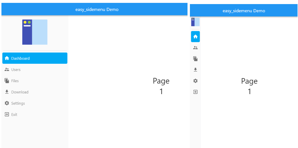
Open Compact
Open Compact
Auto
Auto

Live demo

https://jamalianpour.github.io/easy_sidemenu


Getting started

Add the dependency:

dependencies:
  easy_sidemenu: ^1.0.0
import 'package:easy_sidemenu/easy_sidemenu.dart';

Basic usage

import 'package:easy_sidemenu/easy_sidemenu.dart';
import 'package:flutter/material.dart';

class MyHomePage extends StatefulWidget {
  const MyHomePage({super.key});

  @override
  State<MyHomePage> createState() => _MyHomePageState();
}

class _MyHomePageState extends State<MyHomePage> {
  final _controller = SideMenuController();
  final _pageController = PageController();

  @override
  void initState() {
    super.initState();
    // Mirror selections to a PageView (or any router)
    _controller.addListener(() {
      _pageController.jumpToPage(_controller.currentIndex);
    });
  }

  @override
  void dispose() {
    _controller.dispose();
    _pageController.dispose();
    super.dispose();
  }

  @override
  Widget build(BuildContext context) {
    return Scaffold(
      body: Row(
        children: [
          SideMenu(
            controller: _controller,
            items: [
              SideMenuItem(
                title: 'Dashboard',
                icon: const Icon(Icons.dashboard_rounded),
                onTap: (index, controller) => controller.goTo(index),
              ),
              SideMenuItem(
                title: 'Settings',
                icon: const Icon(Icons.settings_rounded),
                onTap: (index, controller) => controller.goTo(index),
              ),
            ],
          ),
          Expanded(
            child: PageView(
              controller: _pageController,
              physics: const NeverScrollableScrollPhysics(),
              children: const [
                Center(child: Text('Dashboard')),
                Center(child: Text('Settings')),
              ],
            ),
          ),
        ],
      ),
    );
  }
}

Items

SideMenuItem
SideMenuItem(
  title: 'Dashboard',
  icon: const Icon(Icons.dashboard_rounded),
  // Optional badge overlaid on the icon
  badge: const Text('3', style: TextStyle(color: Colors.white, fontSize: 10)),
  // Tooltip shown in compact mode
  tooltipContent: 'Dashboard',
  // Widget shown at the trailing edge in open mode
  trailing: const Icon(Icons.chevron_right, size: 16),
  onTap: (index, controller) => controller.goTo(index),
),
Custom builder

Replace the default layout entirely for a single item:

SideMenuItem(
  builder: (context, displayMode) {
    return const Divider(height: 24, indent: 8, endIndent: 8);
  },
),
SideMenuExpansionItem
SideMenuExpansionItem(
  title: 'Projects',
  icon: const Icon(Icons.folder_rounded),
  initiallyExpanded: false,
  children: [
    SideMenuItem(
      title: 'Active',
      icon: const Icon(Icons.circle, size: 10),
      onTap: (index, controller) => controller.goTo(index),
    ),
    SideMenuItem(
      title: 'Archived',
      icon: const Icon(Icons.circle_outlined, size: 10),
      onTap: (index, controller) => controller.goTo(index),
    ),
  ],
),

Controller

SideMenuController extends ChangeNotifier:

final controller = SideMenuController(initialIndex: 0);

// Navigate to an item
controller.goTo(2);

// Read the current index
print(controller.currentIndex);

// Listen for changes
controller.addListener(() {
  print('Selected: ${controller.currentIndex}');
});

// Always dispose
controller.dispose();

Theming

SideMenuThemeData is a Material 3 ThemeExtension. Register it once for the whole app, or pass it directly to a single SideMenu.

App-wide (recommended)
MaterialApp(
  theme: ThemeData(
    colorScheme: ColorScheme.fromSeed(seedColor: Colors.blue),
    useMaterial3: true,
    extensions: const [
      SideMenuThemeData(
        openWidth: 260,
        selectedColor: Color(0xFF2563EB),
        selectedIconColor: Colors.white,
        selectedTitleStyle: TextStyle(color: Colors.white, fontWeight: FontWeight.w600),
      ),
    ],
  ),
)
Per-widget override
SideMenu(
  controller: controller,
  theme: const SideMenuThemeData(
    displayMode: SideMenuDisplayMode.compact,
    compactWidth: 72,
  ),
  items: [...],
)
SideMenuThemeData properties
Property Type Default Description
displayMode SideMenuDisplayMode auto auto / open / compact
openWidth double 300 Width in open mode
compactWidth double 70 Width in compact mode
collapseWidth double 600 Screen width at which auto switches to compact
menuDecoration BoxDecoration? null Full decoration for the menu container (overrides backgroundColor)
backdropSigma double? null Blur sigma for glassmorphism — wraps the menu in BackdropFilter
backgroundColor Color? ColorScheme.surface Menu background (ignored when menuDecoration is set)
selectedItemDecoration BoxDecoration? null Full decoration for the selected item (overrides selectedColor)
selectedColor Color? ColorScheme.primaryContainer Selected item highlight
hoverColor Color? onSurface 8% Hover highlight
selectedHoverColor Color? primaryContainer 80% Hover colour when item is also selected
selectedIconColor Color? ColorScheme.onPrimaryContainer Icon colour when selected
unselectedIconColor Color? ColorScheme.onSurfaceVariant Icon colour when unselected
iconSize double 24 Icon size
selectedTitleStyle TextStyle? labelLarge / onPrimaryContainer Title text style when selected
unselectedTitleStyle TextStyle? labelLarge / onSurfaceVariant Title text style when unselected
itemHeight double 50 Item row height
itemBorderRadius BorderRadius circular(8) Item corner radius
itemOuterPadding EdgeInsetsGeometry symmetric(h: 5) Padding around each item
itemInnerSpacing double 8 Spacing between icon and title
showTooltip bool true Show item title as tooltip in compact mode
showHamburger bool false Show a hamburger button that collapses the menu
toggleColor Color? onSurfaceVariant Expand/collapse toggle icon colour
expansionArrowColor Color? onSurfaceVariant Expansion arrow in collapsed state
expansionArrowOpenColor Color? ColorScheme.primary Expansion arrow in open state
SideMenu properties
Property Type Default Description
controller SideMenuController required Manages the selected index
items List<SideMenuItemBase> required Items to display
theme SideMenuThemeData? null Per-widget theme override
title Widget? null Widget shown above items
footer Widget? null Widget pinned to the bottom
alwaysShowFooter bool false Keep footer visible in compact mode
showToggle bool false Show collapse/expand toggle button
collapseWidth double 600 Screen width threshold for auto mode
displayModeToggleDuration Duration 350 ms Open ↔ compact animation duration
onDisplayModeChanged ValueChanged<SideMenuDisplayMode>? null Called when display mode changes

Advanced customisation

Gradient sidebar
SideMenu(
  controller: controller,
  theme: const SideMenuThemeData(
    menuDecoration: BoxDecoration(
      gradient: LinearGradient(
        colors: [Color(0xFF667EEA), Color(0xFF764BA2)],
        begin: Alignment.topCenter,
        end: Alignment.bottomCenter,
      ),
    ),
    selectedColor: Color(0x33FFFFFF),
    selectedIconColor: Colors.white,
  ),
  items: [...],
)
Left-border selected indicator (Minimal style)
SideMenu(
  controller: controller,
  theme: const SideMenuThemeData(
    selectedItemDecoration: BoxDecoration(
      color: Color(0xFFEFF6FF),
      border: Border(left: BorderSide(color: Color(0xFF2563EB), width: 3)),
    ),
    itemBorderRadius: BorderRadius.zero,
    itemOuterPadding: EdgeInsets.zero,
  ),
  items: [...],
)
Glassmorphism

Requires a backdropSigma and a semi-transparent menuDecoration. Place the SideMenu inside a widget that has a visible background (image, gradient) behind it.

// 1. Wrap the whole layout in a gradient container
Container(
  decoration: const BoxDecoration(
    gradient: LinearGradient(
      colors: [Color(0xFF1A1A2E), Color(0xFF0F3460)],
    ),
  ),
  child: Row(
    children: [
      // 2. The SideMenu renders as a frosted panel
      SideMenu(
        controller: controller,
        theme: SideMenuThemeData(
          backdropSigma: 18,
          menuDecoration: BoxDecoration(
            color: Colors.white.withValues(alpha: 0.15),
            border: Border(
              right: BorderSide(color: Colors.white.withValues(alpha: 0.25)),
            ),
          ),
          selectedIconColor: Colors.white,
          unselectedIconColor: Colors.white70,
        ),
        items: [...],
      ),
      Expanded(child: ...),
    ],
  ),
)
Floating card (rounded + shadow)

Wrap the SideMenu in a Padding and set menuDecoration with a borderRadius and boxShadow:

Row(
  children: [
    Padding(
      padding: const EdgeInsets.all(8),
      child: SideMenu(
        controller: controller,
        theme: SideMenuThemeData(
          menuDecoration: BoxDecoration(
            color: Colors.white,
            borderRadius: const BorderRadius.all(Radius.circular(16)),
            border: Border.all(color: const Color(0xFFE2E8F0)),
            boxShadow: [
              BoxShadow(
                color: Colors.black.withValues(alpha: 0.08),
                blurRadius: 24,
                offset: const Offset(4, 0),
              ),
            ],
          ),
        ),
        items: [...],
      ),
    ),
    Expanded(child: ...),
  ],
)

Migrating from v0.7

See MIGRATION.md for a complete before/after guide covering every breaking change.

Quick summary:

v0.7 v1.0
SideMenuStyle(...) SideMenuThemeData(...)
style: param on SideMenu theme: param on SideMenu
openSideMenuWidth openWidth
compactSideMenuWidth compactWidth
controller.changePage(i) controller.goTo(i)
controller.currentPage controller.currentIndex
controller.addListener((i) {...}) controller.addListener(() { use controller.currentIndex })
SideMenuItemType SideMenuItemBase
badgeContent: badge:
initialExpanded: initiallyExpanded:

Contributing

Issues and pull requests are welcome on GitHub.


License

MIT — see LICENSE for details.

Categories

Source repository

Projects using this package