Search categories, packages and repositories

elegant_notification cover
Package detailsv2.5.3

elegant_notification

A new flutter package to display notifications on top of the screen, full customizable with built-in themes

AndroidiOSWebmacOSWindowsLinux
30-day downloads
12.9K
Likes
523
Pub points
160

Install package

flutter pub add elegant_notification

Package Overview

Package selection guidance compiled from public package information, community data, and project usage.

Elegant Notification is a Flutter package designed to display highly customizable, visually appealing notifications at the top of the screen. It offers built-in themes and full control over appearance, positioning, and behavior. Ideal for enhancing user experience with smooth, modern toast-like alerts across multiple platforms. The package supports Android, iOS, Web, macOS, Windows, and Linux, making it versatile for cross-platform applications. With simple integration via pub add, developers can quickly implement elegant, responsive notifications without extensive configuration.

Use cases

  • Displaying user feedback messages
  • Showing success or error alerts
  • Enhancing app UX with animated notifications
  • Providing real-time updates
  • Implementing custom notification layouts

Key features

  • Built-in themes
  • Full customization options
  • Cross-platform support
  • Animated transitions
  • Easy integration via pub
  • Configurable positioning

Suitable for

  • Mobile and web apps
  • Apps needing rich UI feedback
  • Developers prioritizing aesthetics
  • Projects requiring lightweight notifications
  • Teams seeking quick implementation

Considerations

  • May require additional styling for complex designs
  • Performance impact with high-frequency notifications
  • Limited native OS-level notification features
  • Custom animations may need tuning on all platforms
  • Depends on Flutter's overlay system

Original README

Original README snapshot from the linked source repository. Visit the repository for the latest content.

Elegant Notification

An elegant notification to display important messages to users

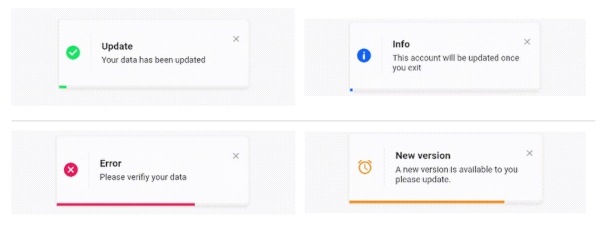
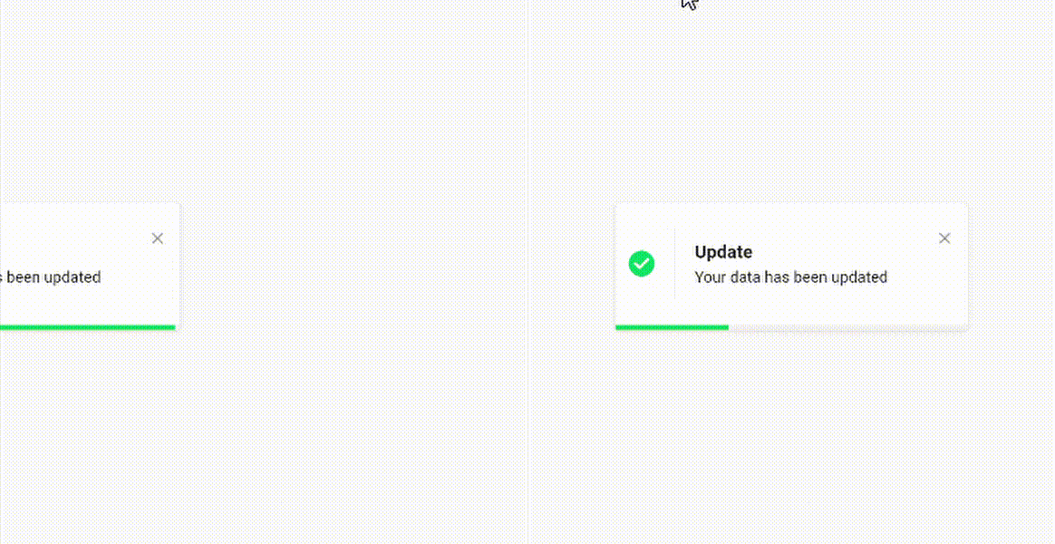
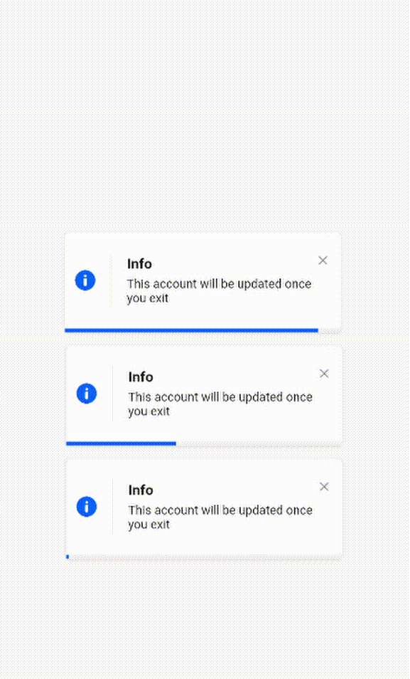
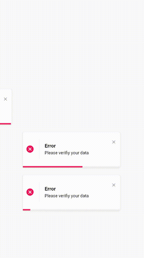
success_notification.gif info_notification.gif
error_notification.gif custom_notification.gif

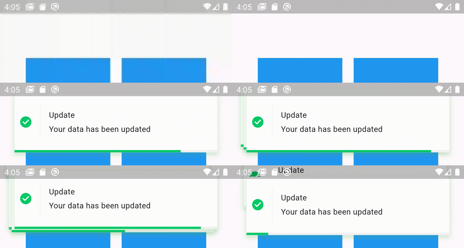
Stacked elegant notification custom_notification.gif

Features

  • Display a top notification with animation
  • A-stacked friendly toast
  • Built-in themes (Success, Error, Info)
  • Different display animations (fromTop, fromBottom, fromLeft, fromRight)
  • Support for all display alignment positions (TopLeft, TopCenter, TopRight, CenterLeft, Center, CenterRight, BottomLeft, BottomCenter, BottomRight)
  • Support custom theme implementation
  • on close and on progress finished callback handlers
  • Animated progress bar indicator
  • Customizable dismiss direction
  • Background customization
  • Animation duration customization
  • Notification position customization
  • Add clickable action widget to notification
  • Notification dismiss customization
  • Customizable notification dimensions (height and width)
  • Customizable barrier dismission and on dismiss action
  • Slide back animation
  • Customizable close button
  • Customizable border and border radius
  • RTL support

Getting Started

To use this elegant notification package you need to add the dependency in pubspec.yaml file.

dependencies:
	elegant_notification: ^2.5.1

Parameters

`

  /// The toast title widget
  final Widget? title;

  /// The toast description widget
  final Widget description;

  /// A secondary widget displayed under the description widget
  /// by default `action == null`
  final Widget? action;

  /// The color of the vertical divider between the icon and content
  /// By default it's null, which means it will use the default divider color = Color(0xffF3F3F3)
  /// You can customize the color by providing a specific [Color] value
  final Color verticalDividerColor;

  /// The notification icon, by default it's null.
  /// When it's null and using success, info and error the default icon is displayed
  /// When using the default constructor and icon is null nothing is rendered
  Widget? icon;

  /// The size of the icon, by default it's 20px.
  final double iconSize;

  /// The type of the animation set on the notification
  /// possible values
  /// ```dart
  /// {
  /// fromLeft,
  /// fromRight,
  /// fromTop,
  /// fromBottom,
  /// }
  /// ```
  /// default value `fromLeft`
  final AnimationType animation;

  /// The duration of the animation
  /// Default value `Duration(milliseconds: 600)`
  final Duration animationDuration;

  /// The toast animation curve by default the curve is set to [Curves.ease]
  final Curve animationCurve;

  /// The background color of the notification.
  /// By default it's set to white.
  /// For types constructors (Success, Info, Delete) this parameter is unchangeable.
  late Color background;

  /// The border radius of the notification widget
  final BorderRadius? borderRadius;

  /// The notification widget border
  final BoxBorder? border;

  /// How much the notification will take time,
  /// by default the duration is `3000 milliseconds`
  final Duration toastDuration;

  /// The notification shadow
  final BoxShadow? shadow;

  /// Enable or disable the progress indicator rendering.
  /// By default the indicator is displayed,
  /// for types constructors (Success, Info, Delete) this parameter is unchangeable.
  late bool showProgressIndicator;

  /// The color of the progress.
  /// By default it's blue
  /// for types constructors (Success, Info, Delete) this parameter is unchangeable
  late Color progressIndicatorColor;

  /// Progress bar indicator width, by default it's null so it takes the widget's width
  final double? progressBarWidth;

  /// Progress bar indicator height, by default it's null so it takes the widget's height
  final double? progressBarHeight;

  /// Progress bar indicator padding constraints
  final EdgeInsetsGeometry? progressBarPadding;

  /// The progress indicator background color
  /// by default it's grey
  final Color progressIndicatorBackground;

  /// Display or hide the close button
  /// by default the close button is displayed
  /// for types constructors (Success, Info, Delete) this parameter is unchangeable
  ///
  final bool displayCloseButton;

  /// Close widget rendered as the close function
  /// by default the close button is displayed, if you don't want it set `closeButton` to null
  /// for types constructors (Success, Info, Delete) this parameter is unchangeable
  final Widget Function(void Function() dismissNotification)? closeButton;

  /// Function invoked when user press on the close button
  final void Function()? onCloseButtonPressed;

  /// Function invoked when the notification is closed after the finish of the progress indicator
  final void Function()? onProgressFinished;

  /// Function invoked when the user taps on the notification
  final void Function()? onNotificationPressed;

  /// Function invoked when the user taps on the notification
  final void Function()? onLongPress;

  /// The long press duration of the notification
  /// By default it's set to `Duration(seconds: 2)`
  final Duration longPressDuration;

  /// Function invoked when tapping outside the notification
  /// Or when pressing the back button of the phone
  /// Or when tapping on the screen
  final Function()? onDismiss;

  /// Define whether the notification will be dismissed automatically or not
  /// By default `autoDismiss = true`
  final bool autoDismiss;

  /// The direction of the dismissible widget
  /// By default it's `DismissDirection.horizontal`
  final DismissDirection dismissDirection;

  /// The notification position in the screen
  /// By default the position is set to `Alignment.topRight`
  final Alignment position;

  /// The width of the notification widget
  final double? width;

  /// The height of the notification widget
  final double? height;

  /// If the notification is dismissible or not
  /// by default it's true
  final bool isDismissable;

  /// The margin between the notification and the edge of the screen
  final double notificationMargin;

  /// The options for the stacked mode
  final StackedOptions? stackedOptions;
`

Examples

  • Success theme animation example
ElegantNotification.success(
	title:  Text("Update"),
	description:  Text("Your data has been updated"),
  onDismiss: () {
      print('Message when the notification is dismissed');
  },
  onTap: () {
      print('Message when the notification is pressed');
  },
  closeOnTap: true,
).show(context);


  • Stacked notifications Example 1
ElegantNotification.success(
  width: 360,
  isDismissable: false,
  animationCurve: Curves.bounceOut,
  stackedOptions: StackedOptions(
    key: 'top',
    type: StackedType.same,
    itemOffset: Offset(-5, -5),
  ),
  position: Alignment.topCenter,
  nimation: AnimationType.fromTop,
  title: Text('Update'),
  description: Text('Your data has been updated'),
  onDismiss: () {},
  onNotificationPressed: () {},
).show(context);

  • Stacked notifications Example 2
ElegantNotification.error(
  width: 360,
  stackedOptions: StackedOptions(
    key: 'topRight',
    type: StackedType.below,
    itemOffset: Offset(0, 5),
  ),
  position: Alignment.topRight,
  animation: AnimationType.fromRight,
  title: Text('Error'),
  description: Text('Error example notification'),
  onDismiss: () {},
).show(context);

  • With box shadow example
ElegantNotification.success(
  width: 360,
  isDismissable: false,
  animationCurve: Curves.bounceOut,
  position: Alignment.topCenter,
  animation: AnimationType.fromTop,
  title: Text('Update'),
  description: Text('Your data has been updated'),
  onDismiss: () {},
  onNotificationPressed: () {},
  shadow: BoxShadow(
    color: Colors.green.withOpacity(0.2),
    spreadRadius: 2,
    blurRadius: 5,
    offset: const Offset(0, 4),
    ),
).show(context);


  • Info theme animation with custom icon
ElegantNotification.info(
	title:  Text("Info"),
	description:  Text("This account will be updated once you exit"),
  icon: Icon(
		Icons.access_alarm,
		color: Colors.orange,
	),
).show(context);


  • Easiest way to display elegant notification
ElegantNotification(
	description:  Text("Please verifiy your data")
).show(context);

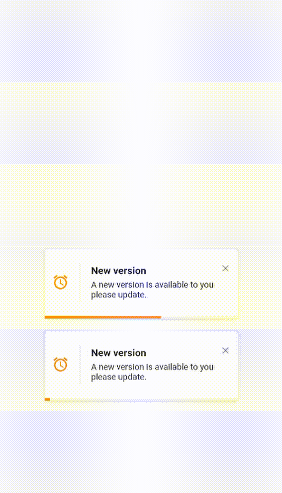
  • Custom theme animation example
ElegantNotification(
	title:  ("New version"),
	description:  Text("A new version is available to you please update."),
	icon: Icon(
		Icons.access_alarm,
		color: Colors.orange,
	),
	progressIndicatorColor: Colors.orange,
).show(context);

  • Without title
ElegantNotification.error(
	description:  Text("Please verifiy your data")
).show(context);
  • With Action
ElegantNotification.info(
	description:  Text('This account will be updated once you exit',),
	action: InkWell(
    onTap: (){
      print('Link pressed')
    }
    child:Text( 'Link',
      style:  TextStyle(
        decoration:  TextDecoration.underline,
        color:  Colors.blue,
      ),
    )
  ),
).show(context);
  • Using dismissDirection attribute
ElegantNotification.success(
  width: 360,
  position: Alignment.topCenter,
  animation: AnimationType.fromTop,
  title: Text('Update'),
  description: Text('Your data has been updated'),
  onDismiss: () {
    print('Message when the notification is dismissed');
  },
  onNotificationPressed: () {
    print('Message when the notification is pressed');
  },
  isDismissible: true,
  dismissDirection: DismissDirection.up,
).show(context);

Contribution

Of course the project is open source, and you can contribute to it repository link

  • If you found a bug, open an issue.
  • If you have a feature request, open an issue.
  • If you want to contribute, submit a pull request.

Contributors

Categories

Dependencies

Dependency list 1 items

Source repository

Projects using this package