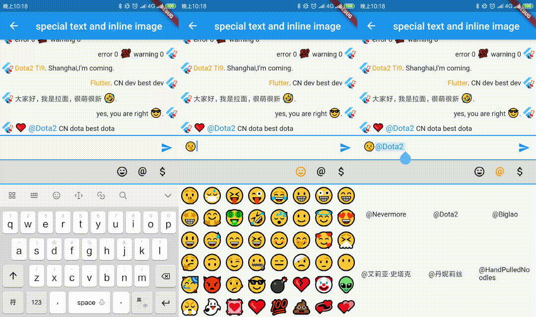
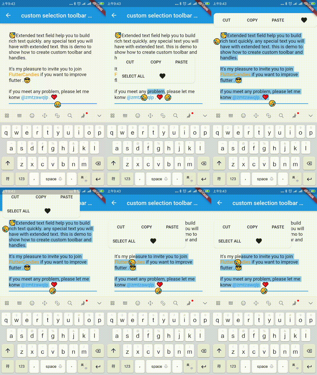
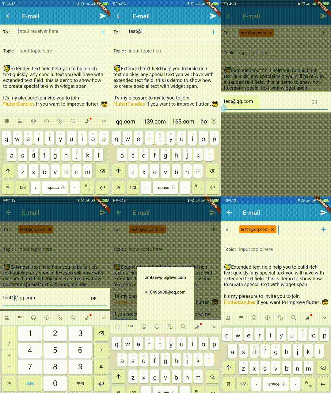
Extended official text field to build special text like inline image, @somebody, custom background etc quickly.It also support to build custom seleciton toolbar and handles.
Package selection guidance compiled from public package information, community data, and project usage.
ExtendedTextField is a powerful Flutter package that enhances the standard text field by enabling rich text features such as inline images, mentions (@somebody), and custom backgrounds. It supports building custom selection toolbars and touch handles, offering greater control over user interactions. Designed for developers seeking advanced text editing capabilities, it simplifies the creation of interactive and visually rich text inputs across multiple platforms.
Use cases
Creating chat interfaces with mentions
Embedding images within text
Building rich note-taking apps
Implementing custom text selection menus
Developing social media text fields
Adding dynamic text formatting
Key features
Supports inline images
Handles @mentions and hashtags
Customizable selection toolbar
Extensible text span types
Cross-platform compatibility
Configurable touch handles
Suitable for
Developers building rich text editors
Apps requiring interactive text input
Chat or messaging applications
Content creation tools
UI-heavy text components
Considerations
Requires understanding of TextSpan and RichText
May increase app complexity
Needs careful handling of text selection logic
Limited documentation compared to core widgets
Potential performance impact with many spans
Original README
Original README snapshot from the linked source repository. Visit the repository for the latest content.
Extended official text field to build special text like inline image, @somebody, custom background etc quickly.It also support to build custom seleciton toolbar and handles.
The scale to place in the [ImageInfo] object of the image.
1.0
headers
The HTTP headers that will be used with [HttpClient.get] to fetch image from network.
-
cache
whether cache image to local
false
retries
the time to retry to request
3
timeLimit
time limit to request image
-
timeRetry
the time duration to retry to request
milliseconds: 100
cancelToken
token to cancel network request
CancellationToken()
/// Clear the disk cache directory then return if it succeed./// <param name="duration">timespan to compute whether file has expired or not</param>Future<bool> clearDiskCachedImages({Duration duration}) async
TextSelectionControls
override [ExtendedTextField.extendedContextMenuBuilder] and [TextSelectionControls] to custom your toolbar widget or handle widget
constdouble _kHandleSize = 22.0;
/// Android Material styled text selection controls.classMyTextSelectionControlsextendsTextSelectionControlswithTextSelectionHandleControls{
staticWidgetdefaultContextMenuBuilder(
BuildContext context, ExtendedEditableTextState editableTextState) {
returnAdaptiveTextSelectionToolbar.buttonItems(
buttonItems: <ContextMenuButtonItem>[
...editableTextState.contextMenuButtonItems,
ContextMenuButtonItem(
onPressed: () {
launchUrl(
Uri.parse(
'mailto:xxx@live.com?subject=extended_text_share&body=${editableTextState.textEditingValue.text}',
),
);
editableTextState.hideToolbar(true);
editableTextState.textEditingValue
.copyWith(selection: constTextSelection.collapsed(offset: 0));
},
type: ContextMenuButtonType.custom,
label: 'like',
),
],
anchors: editableTextState.contextMenuAnchors,
);
// return AdaptiveTextSelectionToolbar.editableText(// editableTextState: editableTextState,// );
}
/// Returns the size of the Material handle.@overrideSizegetHandleSize(double textLineHeight) =>
constSize(_kHandleSize, _kHandleSize);
/// Builder for material-style text selection handles.@overrideWidgetbuildHandle(
BuildContext context, TextSelectionHandleType type, double textLineHeight,
[VoidCallback? onTap, double? startGlyphHeight, double? endGlyphHeight]) {
finalWidget handle = SizedBox(
width: _kHandleSize,
height: _kHandleSize,
child: Image.asset(
'assets/40.png',
),
);
// [handle] is a circle, with a rectangle in the top left quadrant of that// circle (an onion pointing to 10:30). We rotate [handle] to point// straight up or up-right depending on the handle type.switch (type) {
caseTextSelectionHandleType.left: // points up-rightreturnTransform.rotate(
angle: math.pi / 4.0,
child: handle,
);
caseTextSelectionHandleType.right: // points up-leftreturnTransform.rotate(
angle: -math.pi / 4.0,
child: handle,
);
caseTextSelectionHandleType.collapsed: // points upreturn handle;
}
}
/// Gets anchor for material-style text selection handles.////// See [TextSelectionControls.getHandleAnchor].@overrideOffsetgetHandleAnchor(TextSelectionHandleType type, double textLineHeight,
[double? startGlyphHeight, double? endGlyphHeight]) {
switch (type) {
caseTextSelectionHandleType.left:
returnconstOffset(_kHandleSize, 0);
caseTextSelectionHandleType.right:
returnOffset.zero;
default:
returnconstOffset(_kHandleSize / 2, -4);
}
}
@overrideboolcanSelectAll(TextSelectionDelegate delegate) {
// Android allows SelectAll when selection is not collapsed, unless// everything has already been selected.finalTextEditingValue value = delegate.textEditingValue;
return delegate.selectAllEnabled &&
value.text.isNotEmpty &&
!(value.selection.start == 0 &&
value.selection.end == value.text.length);
}
}
WidgetSpan
support to select and hitTest ExtendedWidgetSpan, you can create any widget in ExtendedTextField.
or you need to override ignoreTextInputShow, you can do as following.
classYourBindingextendsTextInputBinding{
@override// ignore: unnecessary_overridesboolignoreTextInputShow() {
// you can override it base on your case// if NoKeyboardFocusNode is not enoughreturnsuper.ignoreTextInputShow();
}
}
voidmain() {
YourBinding();
runApp(constMyApp());
}
TextInputFocusNode
you should pass the [TextInputFocusNode] into [ExtendedTextField] or [TextField].
finalTextInputFocusNode _focusNode = TextInputFocusNode();
@overrideWidgetbuild(BuildContext context) {
returnExtendedTextField(
// request keyboard if need
focusNode: _focusNode..debugLabel = 'ExtendedTextField',
);
}
@overrideWidgetbuild(BuildContext context) {
returnTextField(
// request keyboard if need
focusNode: _focusNode..debugLabel = 'CustomTextField',
);
}
we prevent system keyboard show base on current focus is [TextInputFocusNode] and ignoreSystemKeyboardShow is true。
finalFocusNode? focus = FocusManager.instance.primaryFocus;
if (focus != null &&
focus isTextInputFocusNode &&
focus.ignoreSystemKeyboardShow) {
returntrue;
}
### CustomKeyboardshow/hide your custom keyboard on [TextInputFocusNode] focus is changed.
if your custom keyboard can be close without unFocus, you need also handle
show custom keyboard when [ExtendedTextField] or [TextField] `onTap`.
``` dart
@overridevoidinitState() {
super.initState();
_focusNode.addListener(_handleFocusChanged);
}
void_onTextFiledTap() {
if (_bottomSheetController == null) {
_handleFocusChanged();
}
}
void_handleFocusChanged() {
if (_focusNode.hasFocus) {
// just demo, you can define your custom keyboard as you want
_bottomSheetController = showBottomSheet<void>(
context: FocusManager.instance.primaryFocus!.context!,
// set false, if don't want to drag to close custom keyboard
enableDrag: true,
builder: (BuildContext b) {
// your custom keyboardreturnContainer();
});
// maybe drag close
_bottomSheetController?.closed.whenComplete(() {
_bottomSheetController = null;
});
} else {
_bottomSheetController?.close();
_bottomSheetController = null;
}
}
@overridevoiddispose() {
_focusNode.removeListener(_handleFocusChanged);
super.dispose();
}