Package selection guidance compiled from public package information, community data, and project usage.
A Flutter package that enables developers to create customizable scrollbars with predefined behaviors. It offers flexibility in styling and functionality, allowing for unique scrollbar designs across different platforms. Ideal for apps requiring tailored scrolling experiences, it supports all major platforms including Android, iOS, Web, macOS, Windows, and Linux. The package enhances user interaction by providing visual feedback during scrolling while maintaining a clean, responsive interface.
Use cases
Custom scrollbar design in web applications
Enhancing UX in mobile scrollable lists
Tailoring scroll indicators for desktop apps
Improving accessibility in long content screens
Creating platform-specific scrollbar styles
Adding visual feedback in scrollable widgets
Key features
Configurable scrollbar appearance
Predefined behavior modes
Cross-platform compatibility
Support for custom animations
Easy integration with ScrollViews
Responsive design across devices
Suitable for
UI designers seeking visual customization
Developers building scroll-heavy interfaces
Apps targeting multiple platforms
Projects requiring accessible scrolling
Teams focused on polished user experience
Considerations
May require additional styling for optimal performance
Behavior customization needs understanding of ScrollController
Not suitable for minimalistic designs without scroll feedback
Potential layout conflicts in nested scroll views
Limited built-in themes compared to native scrollbars
Original README
Original README snapshot from the linked source repository. Visit the repository for the latest content.
A Flexible Scrollbar for Flutter
A flexible solution for custom scroll bars.
Foreword
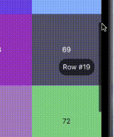
A package has been designed to allow the creation of complex scroll bars. You can customize the scroll thumb, scroll line and add a label, that is positioned by the center of the scroll thumb by default, but you can customize its position as well. As those three things are created by builders called every time the scroll state is changed, you can add custom animations.
How to use
The usage is as simple as a built-in Scrollbar, only you can customize it a lot more.
Install
To install this package simply add the flexible_scrollbar to your dependencies in pubspec.yaml
To get a scrollbar simply wrap a scrollable widget with FlexibleScrollbar and pass a ScrollController to both FlexibleScrollbar and a scrollable widget:
But it's very simple and we are here to make complex scroll bars so let's see how.
Customization
For the main customization the FlexibleScrollbar widget has three builders: scrollThumbBuilder, scrollLineBuilder and scrollLabelBuilder. Each one of them has a ScrollbarInfo as a parameter and rebuild each time any of the fields of the ScrollbarInfo model has changed.
ScrollbarInfo model has the following properties:
Properties
Description
bool isScrolling
Changes when the user starts/strops the scroll body scrolling. The isDragging is not affected by it.
bool isDragging
Changes when the user starts/strops to drag the scroll thumb. The isScrolling is not affected by it.
double thumbMainAxisSize
Contains the calculated depending on the scroll body size thumb length.
double thumbMainAxisOffset
Contains the offset in pixels of the scroll thumb from the starting position.
AxisDirection scrollDirection
Has the scroll body scroll direction in it (up/down/left/right)
Using those builders you can make custom scrollbars such as the one shown in the example at the beginning. The scroll thumb from the example has been created with the following code: