Package selection guidance compiled from public package information, community data, and project usage.
A Flutter package that enables developers to create floating, freely draggable widgets within the app interface. This allows users to move a widget anywhere on the screen with intuitive touch or pointer interactions. Ideal for interactive UI elements like floating panels, quick-access tools, or customizable overlays. The package supports all major platforms including Android, iOS, Web, macOS, Windows, and Linux, ensuring consistent behavior across devices.
Use cases
Creating movable floating panels
Implementing drag-and-drop quick action tools
Designing customizable user interface overlays
Building interactive dashboard components
Enabling user-controlled widget positioning
Key features
Freeform screen dragging
Cross-platform compatibility
Simple integration with existing widgets
Smooth drag animations
Support for multiple platforms
Suitable for
Developers building interactive UIs
Apps requiring movable floating elements
Projects targeting multiple platforms
UX designers prototyping dynamic layouts
Considerations
May require additional logic for boundary constraints
Performance impact with complex nested widgets
Limited built-in gesture customization
Not optimized for high-frequency drag scenarios
Requires careful handling of widget lifecycle during drag
Original README
Original README snapshot from the linked source repository. Visit the repository for the latest content.
Features
Support Android, IOS, Web etc.
This package is used to make a widget movable or draggable around the screen freely;
Works fine for any Widget;
Does not affect the functionality or performance of the particular widget;
Used physics law supported animation to make it more attractive;
Demo
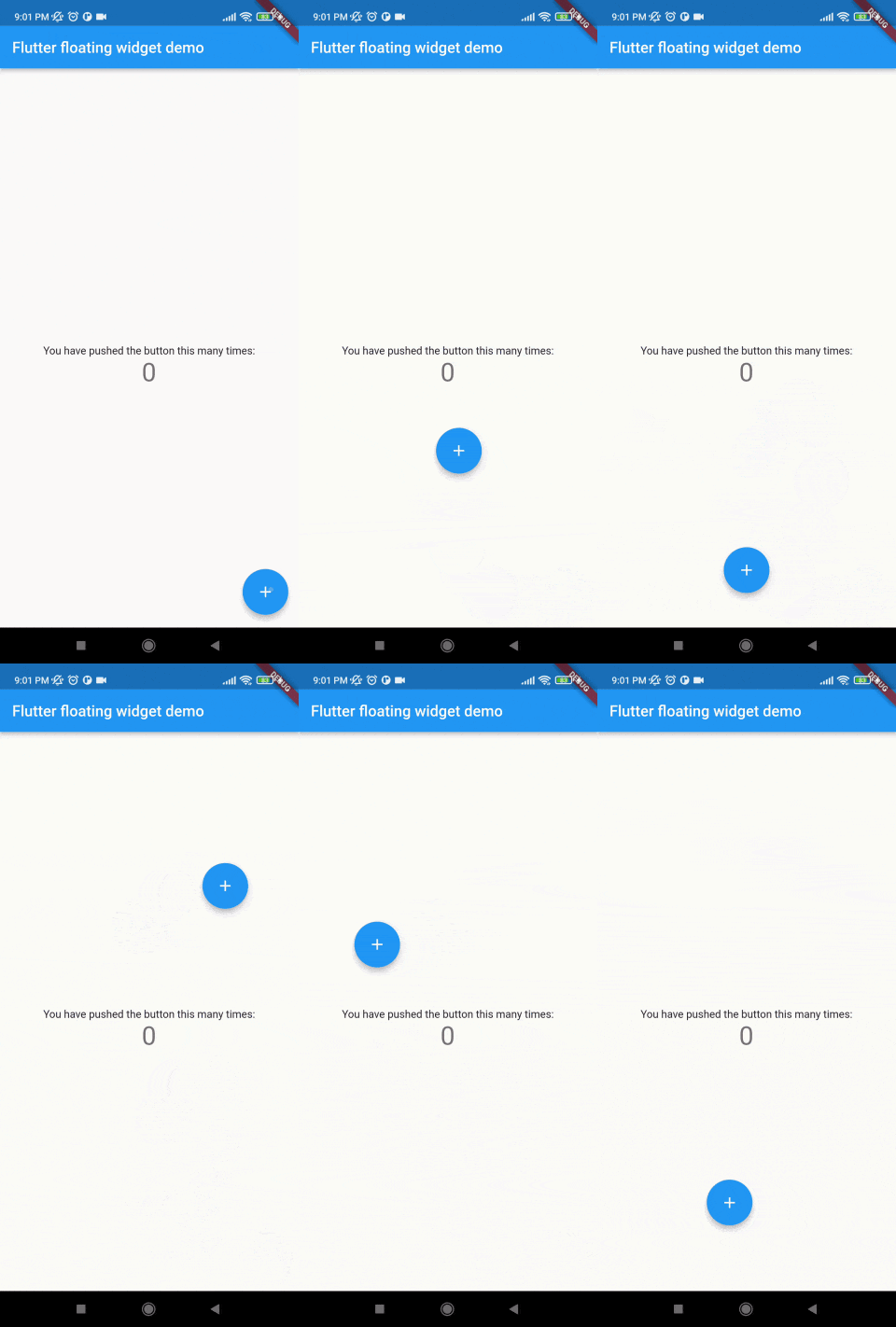
Without auto align
Initially "autoAlign" is false.
autoAlign = false
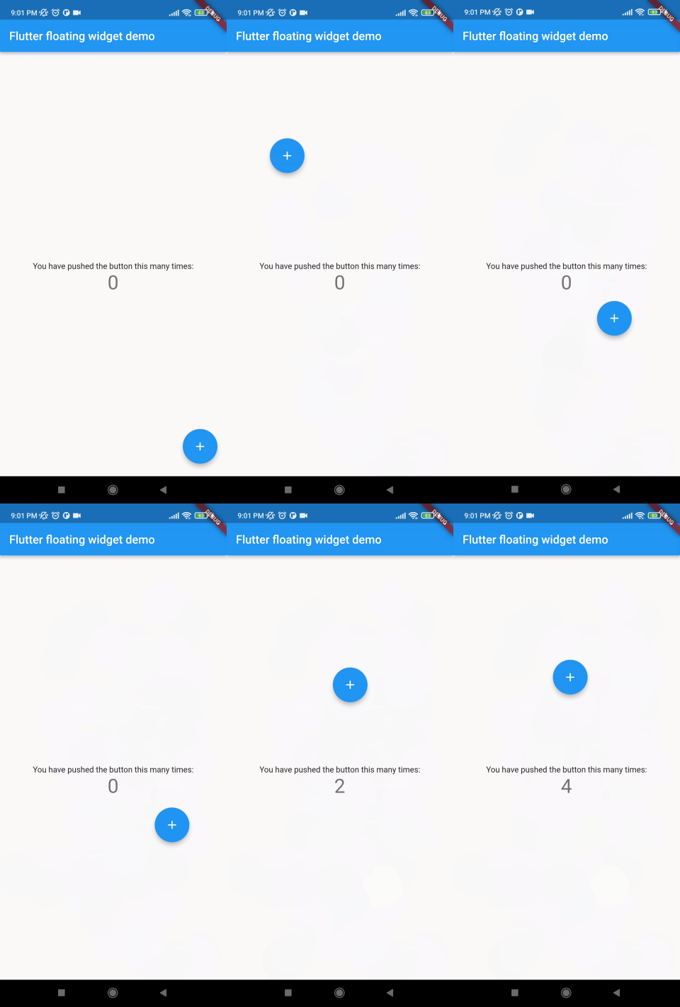
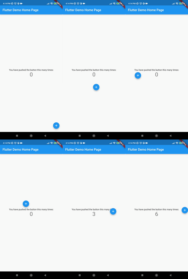
Auto align activated
Add this to your code.
autoAlign = true
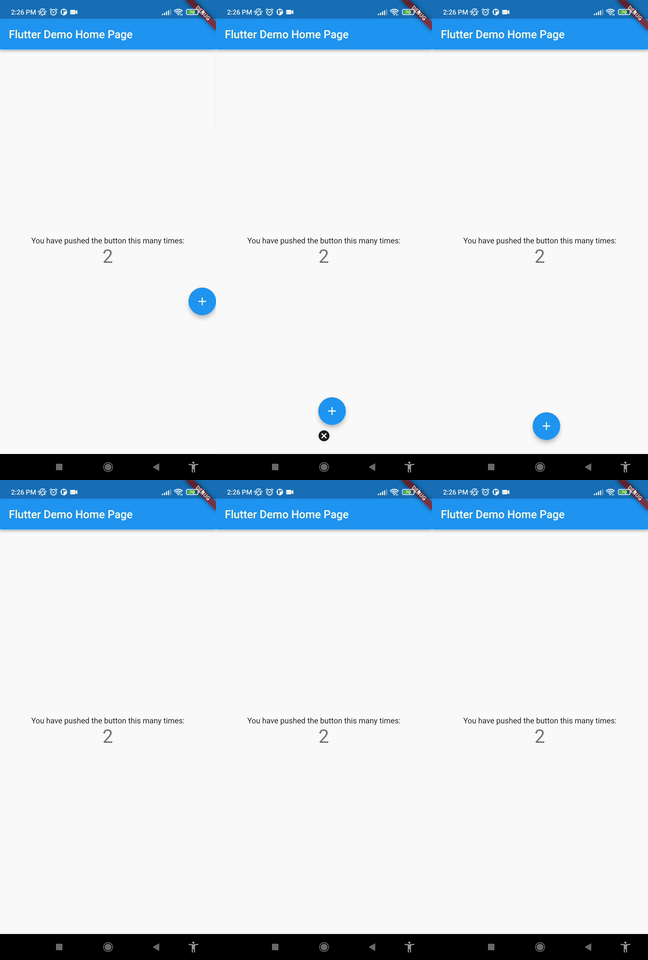
Deletion of the widget
Add this to your code.
deleteWidget: Icon(Icons.cancel),
Getting started
Install
add this in your pubspec.yaml
floating_draggable_widget: ^latest_version
mainScreenWidget is required and it accept any widget. This is actually the base Widget or the parent widget on where the floating widget will be dragged or moved.
floatingWidget is also required and it accept any widget. This is actually the particular widget which will be floated and can be mode or dragged around the screen.
floatingWidgetWidth is also required and it accepts a double value which is the width of the floating widget above mentioned.
floatingWidgetHeight is also required and it accepts a double value which is the height of the floating widget above mentioned.
onDragEvent is a function is not required, which is a event listener of the current position of floating widget, which provides only the x axis as dx and y axis as xy.
autoAlignType is a enum type. which has 3 type. onlyRight, onlyLeft, both. by default it is both. if autoAlign is true then this determines the on which side the floating widget will land after dragging ends.
disableBounceAnimation is a bool type. if autoAlign is true then then setting true to disableBounceAnimation can disable the bounce animation.
dy accepts a double value which is the distance from the top of the screen where floating widget will be positioned initially.
dx accepts a double value which is the distance from the left of the screen where floating widget will be positioned initially.
screenHeight accepts a double value which is the height of the screen initially.
screenWidth accepts a double value which is the width of the screen initially.
speed accepts a double value which is the speed factor of the floating widget after it will be let go. The more speed will be provided the slower the object will move after the user let the widget go freely.
isDraggable accepts a boolean value which determines if the widget is draggable or not.
autoAlign accepts a boolean value which determines if the widget will be auto aligns on the left or right after it is being dragged.
deleteWidget accepts a widget which is used to delete the floating widget.
onDeleteWidget accepts a function which is used to delete the floating widget.
deleteWidgetAlignment accepts an alignment value which is used to align the delete widget.
deleteWidgetAnimationCurve accepts an animation curve value which is used to animate the delete widget.
deleteWidgetAnimationDuration accepts an animation duration value which is used to animate the delete widget
hasDeleteWidgetAnimationDuration accepts an animation duration value which is used to animate the delete widget when it is dragging with the delete widget.
deleteWidgetHeight accepts a double value which is used to set the height of the delete widget.
deleteWidgetWidth accepts a double value which is used to set the width of the delete widget.
isCollidingDeleteWidgetHeight accepts a double value which is used to set the height of the delete widget.
isCollidingDeleteWidgetWidth accepts a double value which is used to set the width of the delete widget.
boxDecoration optionally accepts a box decoration value which is used to set the decoration of the delete widget.
deleteWidgetPadding optionally accepts a padding value which is used to set the padding of the delete widget.