Search packages, repositories and app categories

flutter_datetime_picker_plus cover
Package detailsv3.0.1

flutter_datetime_picker_plus

A date time picker for flutter, you can choose date / time / date&time in English Dutch and Chinese, and you can also customize your own picker content

AndroidiOSWebmacOSWindowsLinux
30-day downloads
52.7K
Likes
171
Pub points
140

Install package

flutter pub add flutter_datetime_picker_plus

Package Overview

Package selection guidance compiled from public package information, community data, and project usage.

A customizable date and time picker for Flutter that supports selecting dates, times, or both in English, Dutch, and Chinese. It offers localized interfaces and allows developers to tailor the picker's content to fit specific app needs. Compatible across Android, iOS, Web, macOS, Windows, and Linux, it provides a seamless user experience on all platforms. The package is designed for ease of integration and flexibility in UI customization.

Use cases

  • Form inputs requiring date/time selection
  • Multilingual applications
  • Customizable date/time pickers
  • Cross-platform date/time input
  • User-friendly calendar interfaces
  • Localized app experiences

Key features

  • Supports date, time, and combined selection
  • Available in English, Dutch, and Chinese
  • Highly customizable UI
  • Cross-platform compatibility
  • Easy integration via pub.dev
  • Localization-ready

Suitable for

  • Developers building multilingual apps
  • Apps needing flexible date/time inputs
  • Projects requiring platform-wide consistency
  • Teams wanting customizable pickers
  • UX-focused form design
  • Internationalized mobile and web apps

Considerations

  • Requires manual setup for non-supported languages
  • Customization may increase complexity
  • Limited to predefined locales unless extended
  • Performance impact with heavy customizations
  • May need additional styling for consistent appearance
  • Dependent on Flutter version compatibility

Original README

Original README snapshot from the linked source repository. Visit the repository for the latest content.

Flutter Datetime Picker Plus

Forked from (Pub) flutter_datetime_picker as it had issues with dart 3.0/Flutter 3.10.

This package only works on Flutter >=3.10.0. If you need an older version, please use the original package.

(Pub) flutter_datetime_picker_plus

Documentation

A flutter date time picker inspired by flutter-cupertino-date-picker

you can choose date / time / date&time in multiple languages:

  • Albanian(sq)
  • Arabic(ar)
  • Armenian(hy)
  • Azerbaijani(az)
  • Basque(eu)
  • Bengali(bn)
  • Bosnian(bs)
  • Bulgarian(bg)
  • Catalan(cat)
  • Chinese(zh)
  • Chinese, Traditional(tw)
  • Croatian(hr)
  • Czech(cs)
  • Danish(da)
  • Dutch(nl)
  • English(en)
  • Finnish(fi)
  • French(fr)
  • German(de)
  • Greek(gr, el)
  • Hebrew(he)
  • Hindi(hi)
  • Indonesian(id)
  • Italian(it)
  • Japanese(jp)
  • Kazakh(kk)
  • Khmer(kh)
  • Korean(ko)
  • Mongolian(mn)
  • Norwegian(no)
  • Persian(fa)
  • Polish(pl)
  • Portuguese(pt)
  • Russian(ru)
  • Serbian(sr)
  • Slovak(sk)
  • Slovenian(si, sl)
  • Spanish(es)
  • Swedish(sv)
  • Tamil(ta)
  • Thai(th)
  • Turkish(tr)
  • Ukrainian(uk)
  • Vietnamese(vi)

and you can also custom your own picker content

Date picker Time picker Date Time picker

International:

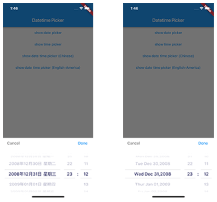
Date Time picker (Chinese) Date Time picker (America) Date Time picker (Dutch) Date Time picker (Russian)

Demo App

main page

Usage

TextButton(
    onPressed: () {
        DatePicker.showDatePicker(context,
                              showTitleActions: true,
                              minTime: DateTime(2018, 3, 5),
                              maxTime: DateTime(2019, 6, 7), onChanged: (date) {
                            print('change $date');
                          }, onConfirm: (date) {
                            print('confirm $date');
                          }, currentTime: DateTime.now(), locale: LocaleType.zh);
    },
    child: Text(
        'show date time picker (Chinese)',
        style: TextStyle(color: Colors.blue),
    ));

Customize

If you want to customize your own style of date time picker, there is a class called CommonPickerModel, every type of date time picker is extended from this class, you can refer to other picker model (eg. DatePickerModel), and write your custom one, then pass this model to showPicker method, so that your own date time picker will appear, it’s easy, and will perfectly meet your demand

How to customize your own picker model:

class CustomPicker extends CommonPickerModel {
  String digits(int value, int length) {
    return '$value'.padLeft(length, "0");
  }

  CustomPicker({DateTime currentTime, LocaleType locale}) : super(locale: locale) {
    this.currentTime = currentTime ?? DateTime.now();
    this.setLeftIndex(this.currentTime.hour);
    this.setMiddleIndex(this.currentTime.minute);
    this.setRightIndex(this.currentTime.second);
  }

  @override
  String leftStringAtIndex(int index) {
    if (index >= 0 && index < 24) {
      return this.digits(index, 2);
    } else {
      return null;
    }
  }

  @override
  String middleStringAtIndex(int index) {
    if (index >= 0 && index < 60) {
      return this.digits(index, 2);
    } else {
      return null;
    }
  }

  @override
  String rightStringAtIndex(int index) {
    if (index >= 0 && index < 60) {
      return this.digits(index, 2);
    } else {
      return null;
    }
  }

  @override
  String leftDivider() {
    return "|";
  }

  @override
  String rightDivider() {
    return "|";
  }

  @override
  List<int> layoutProportions() {
    return [1, 2, 1];
  }

  @override
  DateTime finalTime() {
    return currentTime.isUtc
        ? DateTime.utc(currentTime.year, currentTime.month, currentTime.day,
            this.currentLeftIndex(), this.currentMiddleIndex(), this.currentRightIndex())
        : DateTime(currentTime.year, currentTime.month, currentTime.day, this.currentLeftIndex(),
            this.currentMiddleIndex(), this.currentRightIndex());
  }
}
Custom title bar

By default every picker shows a Cancel/Done bar above the wheels. Pass a titleActionsBuilder to any DatePicker.show* method to replace it with your own widget. The builder receives onCancel / onConfirm callbacks (which dismiss the picker the same way the default buttons do) and the currently selected DateTime:

DatePicker.showDatePicker(
  context,
  titleActionsBuilder: (context, onCancel, onConfirm, currentTime) {
    return Row(
      mainAxisAlignment: MainAxisAlignment.spaceBetween,
      children: [
        TextButton(onPressed: onCancel, child: const Text('Close')),
        Text('${currentTime.year}-${currentTime.month}-${currentTime.day}'),
        TextButton(onPressed: onConfirm, child: const Text('Pick')),
      ],
    );
  },
);

The bar is laid out within the theme's titleHeight, so keep your widget within that height (or raise titleHeight via a custom DatePickerTheme). The builder is only used when showTitleActions is true (the default).

Getting Started

For help getting started with Flutter, view our online documentation.

For help on editing package code, view the documentation.

Categories

Dependencies

Dependency list 2 items

Source repository

Projects using this package