
Overview
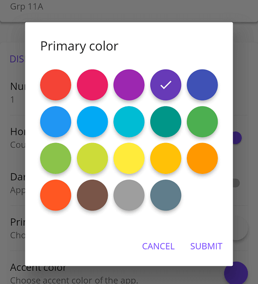
A Flutter package that provides a Material-style color picker with customizable options for use in Flutter applications. It enables users to select colors from a visually appealing, material-designed interface, supporting integration across multiple platforms including Android, iOS, Web, macOS, Windows, and Linux. The picker offers flexibility through various customization settings, making it suitable for apps requiring intuitive color selection. It is built with Flutter's Material design principles for consistent UI experiences.
Use cases
- Color selection in app themes
- Customizing UI element colors
- Design tool integrations
- User preference settings
- Interactive color palettes
- Prototyping color schemes
Key features
- Material design aesthetic
- Cross-platform compatibility
- Customizable appearance
- Easy integration with Flutter
- Supports color swatches
- Responsive UI
Suitable for
- UI/UX developers
- App designers
- Theme customization tools
- Interactive prototyping
- Color-sensitive applications
Considerations
- Limited to Material design style
- Requires manual handling of color state
- No built-in color history
- May need additional styling for non-Material themes
- Depends on Flutter's Material library
- Not optimized for complex color models