
Overview
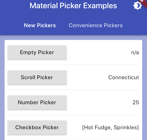
A Flutter package that provides consistent, material-themed picker dialogs for Android, iOS, Web, macOS, Windows, and Linux. It simplifies the integration of native-like date, time, and custom pickers with a unified API. The package ensures visual harmony across platforms while maintaining Material Design principles. Developers can easily implement pickers for dates, times, and custom options without writing boilerplate code. It supports both light and dark themes and adapts to platform-specific behaviors where applicable.
Use cases
- Selecting dates in forms
- Choosing times for appointments
- Customizing picker UIs
- Building form inputs with consistent styling
- Creating cross-platform date/time pickers
Key features
- Material Design compliant
- Cross-platform support
- Easy integration
- Theme-aware rendering
- Customizable picker content
- Consistent UX across platforms
Suitable for
- Form builders
- Date/time selection features
- Cross-platform apps
- UI consistency projects
- Developers seeking simple picker solutions
Considerations
- Requires Material app context
- Limited customization beyond theme
- May need additional styling for complex use cases
- Not ideal for non-material design systems
- Platform-specific behavior may vary slightly