Search packages, repositories and app categories

gradient_borders cover
Package detailsv1.0.4

gradient_borders

Gradient borders for inputs and containers. Borders package integrated with a basic flutter widgets as a container and input decorations. Easy in use, platform independent.

AndroidiOSWebmacOSWindowsLinux
30-day downloads
193K
Likes
333
Pub points
160

Install package

flutter pub add gradient_borders

Package Overview

Package selection guidance compiled from public package information, community data, and project usage.

A Flutter package that adds gradient borders to containers and input fields, enhancing visual appeal with smooth color transitions. Designed for simplicity and compatibility across all major platforms—Android, iOS, Web, macOS, Windows, and Linux. Integrates seamlessly with standard Flutter widgets like Container and InputDecoration, requiring minimal setup. Ideal for modern UI designs where subtle gradients improve user experience without complexity.

Use cases

  • Adding stylish borders to form inputs
  • Enhancing card or container visuals
  • Creating modern UI elements in apps
  • Designing responsive layouts with gradients
  • Customizing button or field borders
  • Improving app aesthetics with minimal code

Key features

  • Easy integration with Container and InputDecoration
  • Supports smooth gradient transitions
  • Cross-platform compatibility
  • Minimal configuration required
  • Works with existing Flutter widgets
  • No additional dependencies needed

Suitable for

  • UI designers seeking visual enhancements
  • Developers building modern mobile or web apps
  • Projects requiring elegant border effects
  • Apps focused on user interface polish
  • Beginners exploring Flutter decoration options
  • Teams wanting platform-agnostic styling

Considerations

  • May impact performance on low-end devices with many gradient borders
  • Limited customization beyond gradient direction and colors
  • Not suitable for complex border patterns
  • Requires careful contrast consideration for readability
  • Best used sparingly to avoid visual clutter
  • Depends on Flutter's rendering pipeline for consistency

Original README

Original README snapshot from the linked source repository. Visit the repository for the latest content.

Gradient borders

style: very good analysis

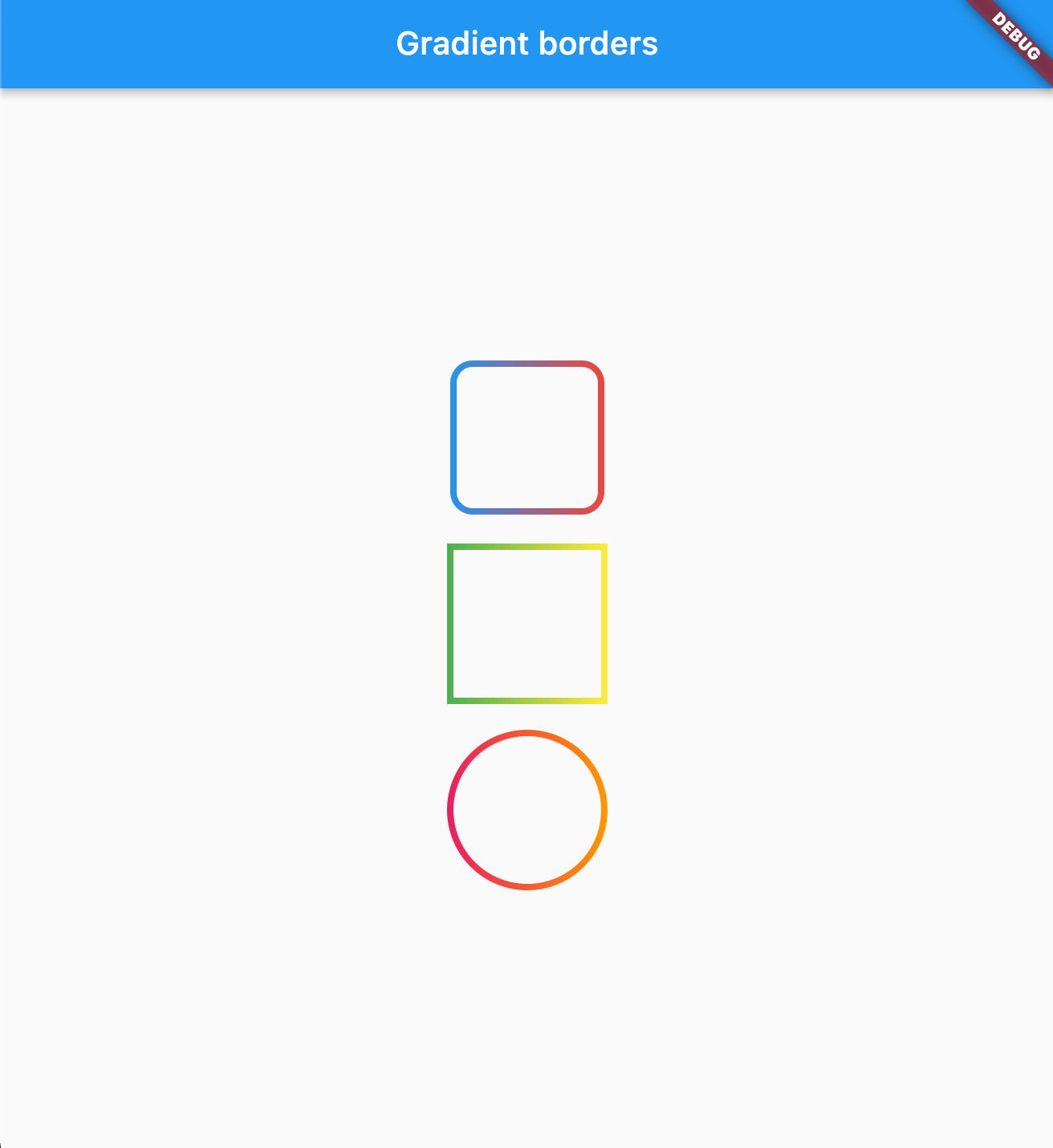
Various borders that use gradient instead of boring plain colors.

Usage

Box borders:

Change your container borders to use fancy gradients:

Container(
  width: 100,
  height: 100,
  decoration: BoxDecoration(
    border: const GradientBoxBorder(
      gradient: LinearGradient(colors: [Colors.blue, Colors.red]),
      width: 4,
    ),
    borderRadius: BorderRadius.circular(16)
  ),
),

Works with both: border radius, and with BoxShape.circle

Parameters
Parameter Type Default Description
gradient Gradient required The gradient to use for the border color.
width double 1.0 The width of the border.
strokeAlign double BorderSide.strokeAlignInside The alignment of the stroke relative to the border edge. Use BorderSide.strokeAlignInside (-1), BorderSide.strokeAlignCenter (0), or BorderSide.strokeAlignOutside (1).

image

Input borders

You can use GradientOutlineInputBorder as a part of your input decoration:

TextField(
  decoration: InputDecoration(
    border: GradientOutlineInputBorder(
      gradient: LinearGradient(colors: [Colors.red, Colors.blue]),
      width: 2,
    ),
    focusedBorder: GradientOutlineInputBorder(
     gradient: LinearGradient(colors: [Colors.yellow, Colors.green]),
      width: 2
    ),
    label: Text("Example"),
  ),
),
Parameters
Parameter Type Default Description
gradient Gradient required The gradient to use for the border color.
width double 1.0 The width of the border.
gapPadding double 4.0 Horizontal padding around the label cutout in the border.
borderRadius BorderRadius BorderRadius.all(Radius.circular(4)) The border radius of the rounded corners.
borderAlignment OutlineBorderAlignment OutlineBorderAlignment.onEdge Controls where the stroke is drawn relative to the widget edge. onEdge draws the border centered on the widget boundary; inside draws it fully inside.

image

You can also use GradientUnderlineInputBorder as part of your input decoration:

TextField(
  decoration: InputDecoration(
    border: GradientOutlineInputBorder(
      gradient: LinearGradient(colors: [Colors.red, Colors.blue]),
      width: 2,
    ),
    focusedBorder: GradientUnderlineInputBorder(
     gradient: LinearGradient(colors: [Colors.yellow, Colors.green]),
      width: 2
    ),
    label: Text("Example"),
  ),
),
Sponsored by

The Code Brothers

Categories

Source repository

Projects using this package