Search packages, repositories and app categories

Package detailsv1.0.1

responsive_scaffold_nullsafe

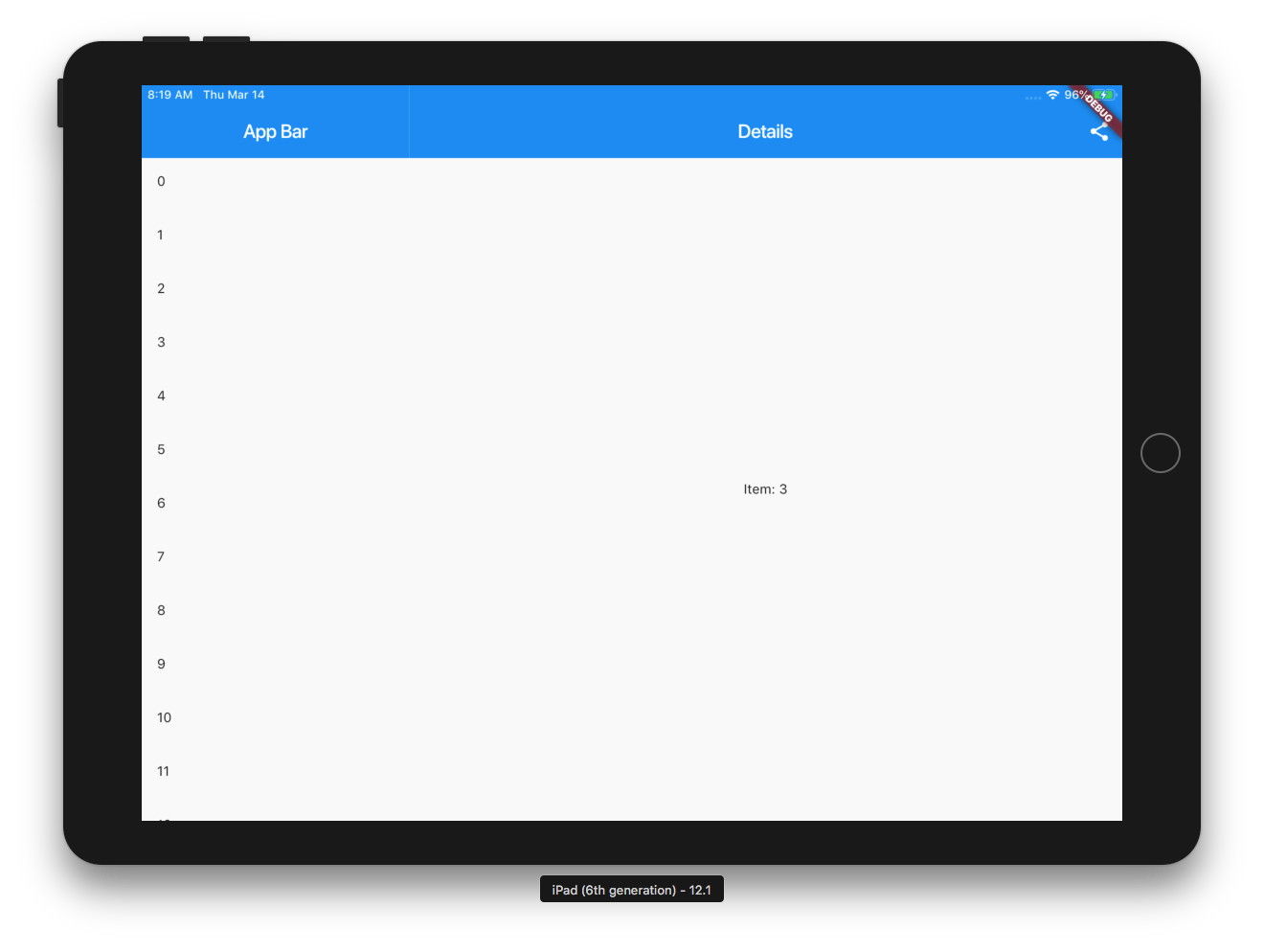
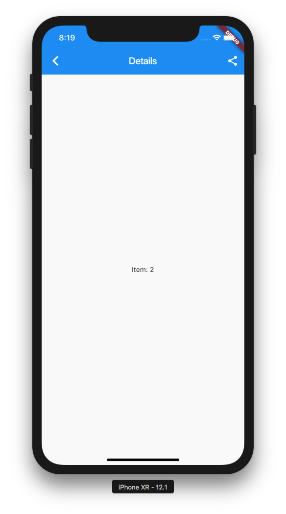
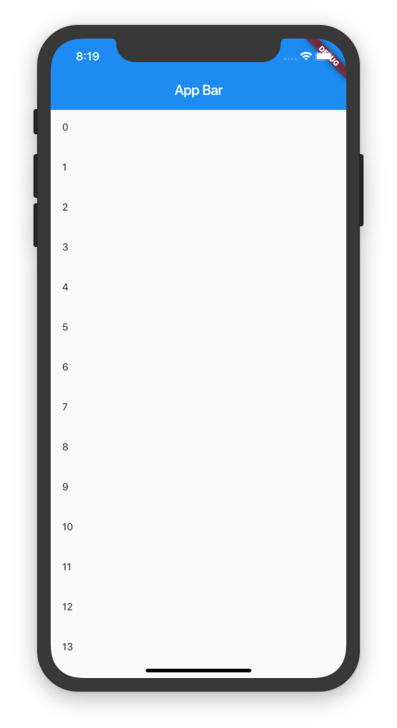
On mobile it shows a list and pushes to details and on tablet it shows the List and the selected item.

AndroidiOSWebmacOSWindowsLinux
30-day downloads
128
Likes
23
Pub points
120

Install package

flutter pub add responsive_scaffold_nullsafe

Package Overview

Package selection guidance compiled from public package information, community data, and project usage.

ResponsiveScaffoldNullSafe is a Flutter package designed to create adaptive UI layouts that automatically adjust based on screen size. On mobile devices, it displays a list and navigates to a detail view via push, while on tablets it shows both the list and the selected item side-by-side. Built with null safety, it simplifies responsive design across Android, iOS, Web, macOS, Windows, and Linux platforms. The package enhances user experience by optimizing layout for different form factors without requiring custom logic.

Use cases

  • Building responsive list-detail interfaces
  • Adapting UI for mobile and tablet screens
  • Creating multi-platform apps with consistent layout
  • Simplifying navigation in responsive apps
  • Designing scalable dashboard layouts

Key features

  • Automatic layout adaptation by device size
  • Supports list and detail display on tablets
  • Null-safe implementation
  • Cross-platform compatibility
  • Built-in navigation handling
  • Easy integration with existing Flutter projects

Suitable for

  • Developers building responsive Flutter apps
  • Teams targeting multiple device types
  • Projects requiring list-detail patterns
  • Apps needing tablet-optimized layouts
  • UI-focused developers seeking reusable components

Considerations

  • Requires Flutter 2.5 or higher
  • Best suited for list-detail use cases
  • May need customization for complex layouts
  • Limited to horizontal/vertical split patterns
  • Not ideal for non-list-based UIs

Original README

Original README snapshot from the linked source repository. Visit the repository for the latest content.

Null-Safe Version of Responsive Scaffold

responsive_scaffold_nullsafe

View the online demo here!

On mobile it shows a list and pushes to details and on tablet it shows the List and the selected item.

Online Demo: https://fluttercommunity.github.io/responsive_scaffold/

Getting Started

3 Column Layout

example

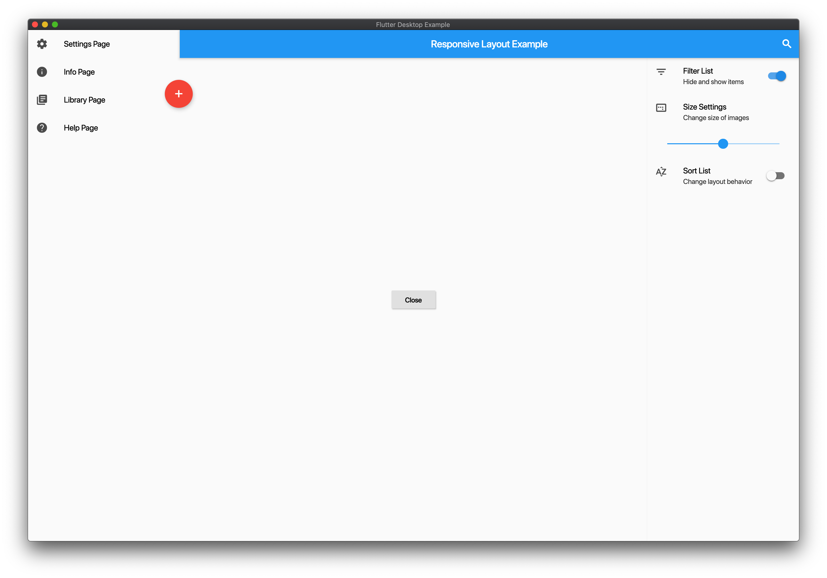
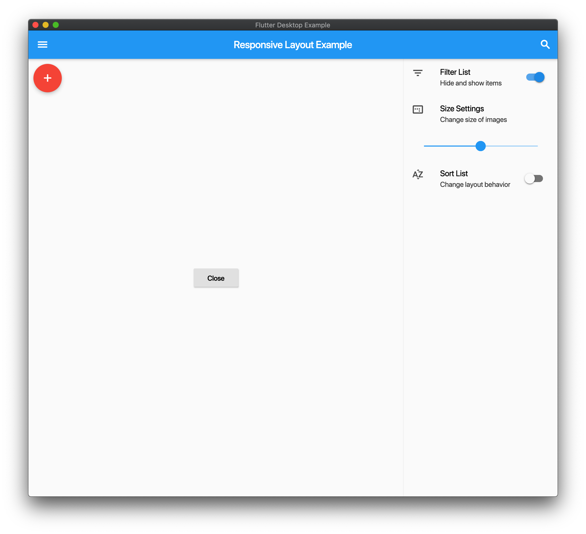
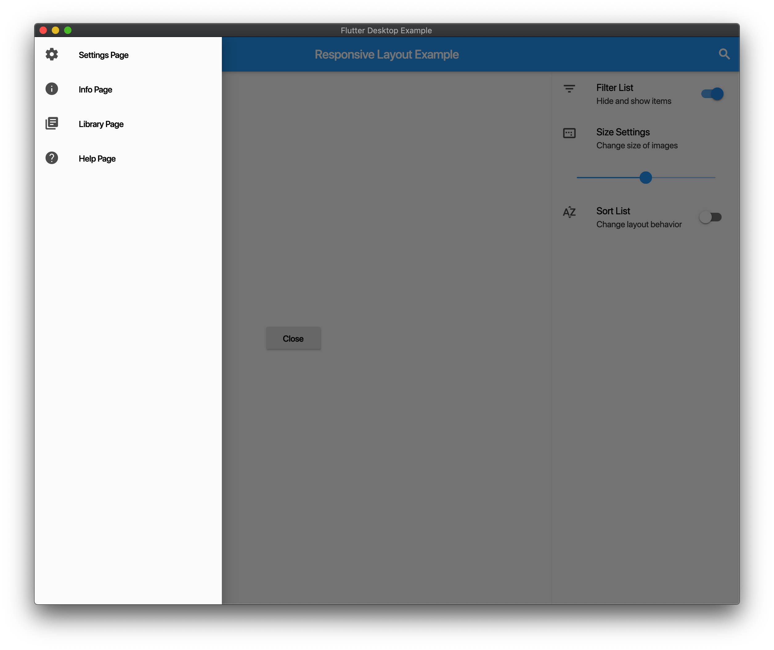
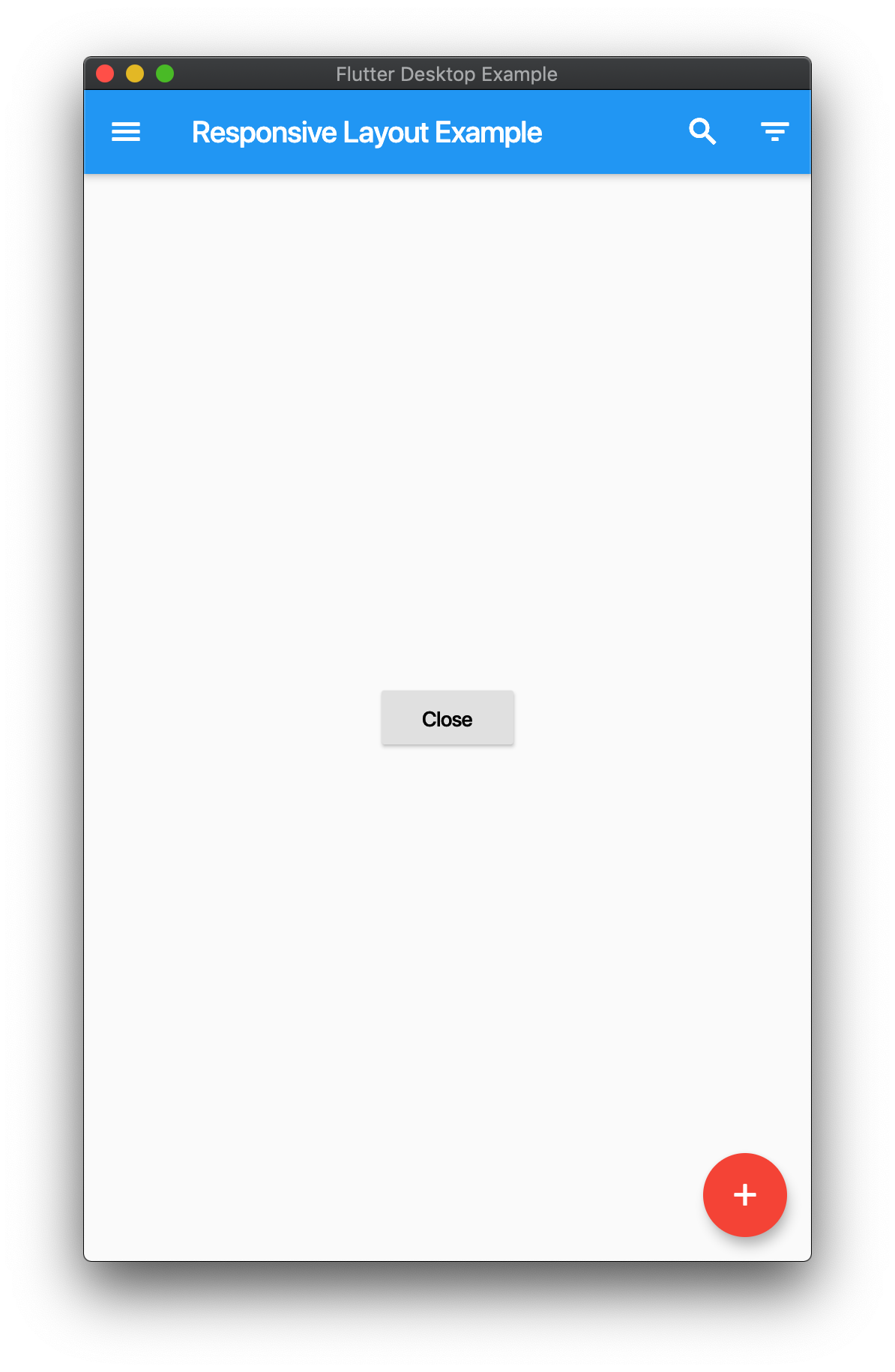
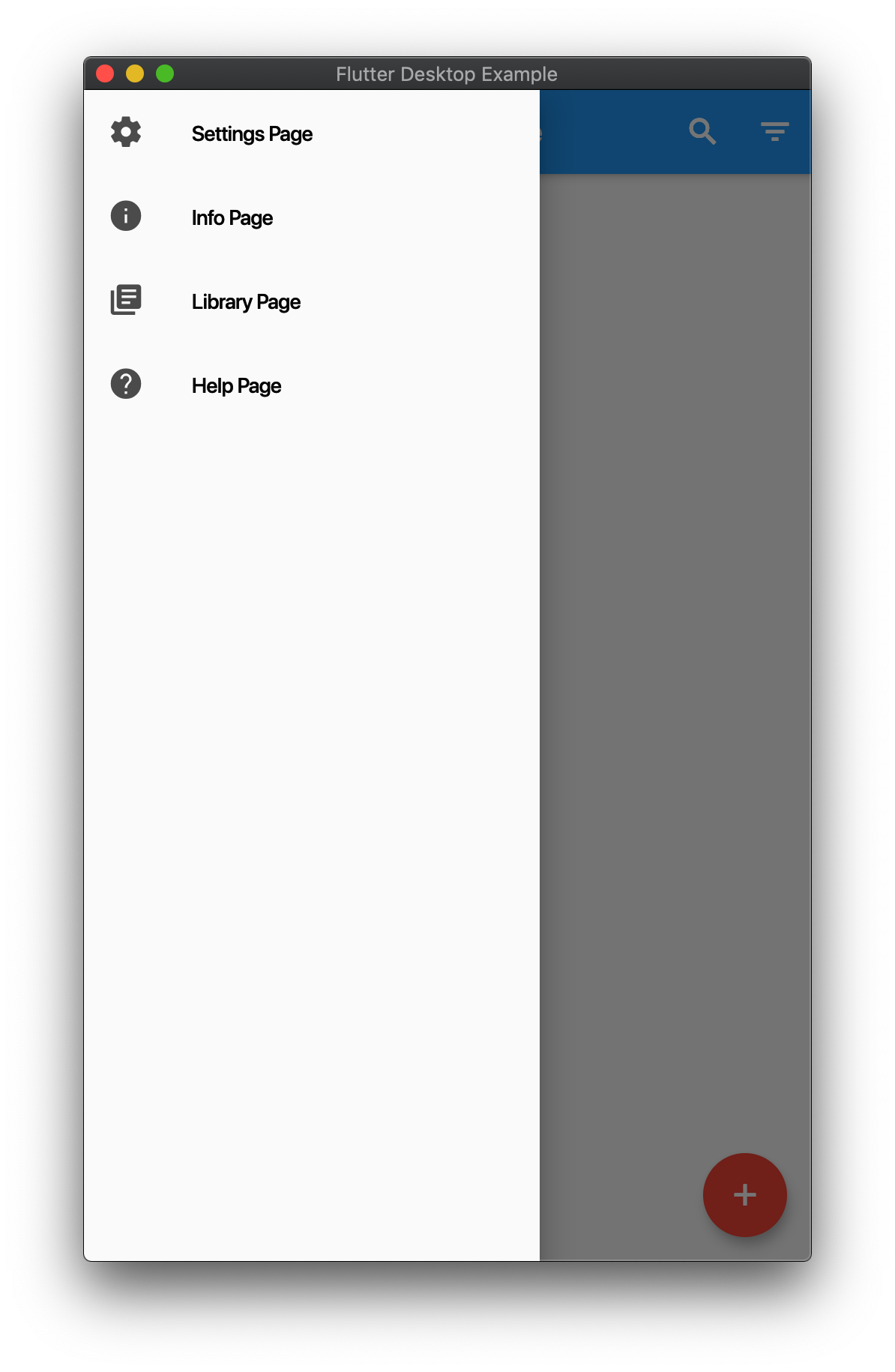
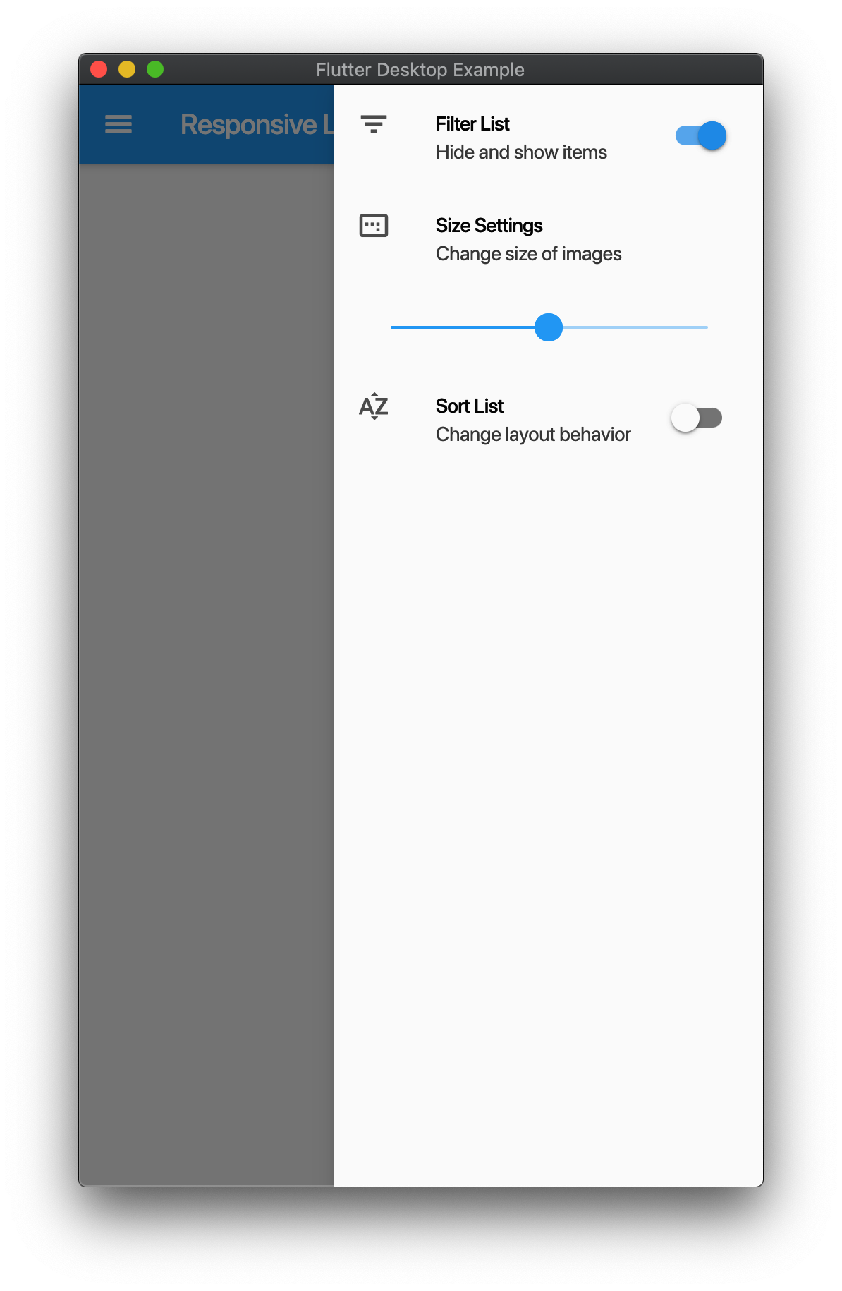
Responsive Layout

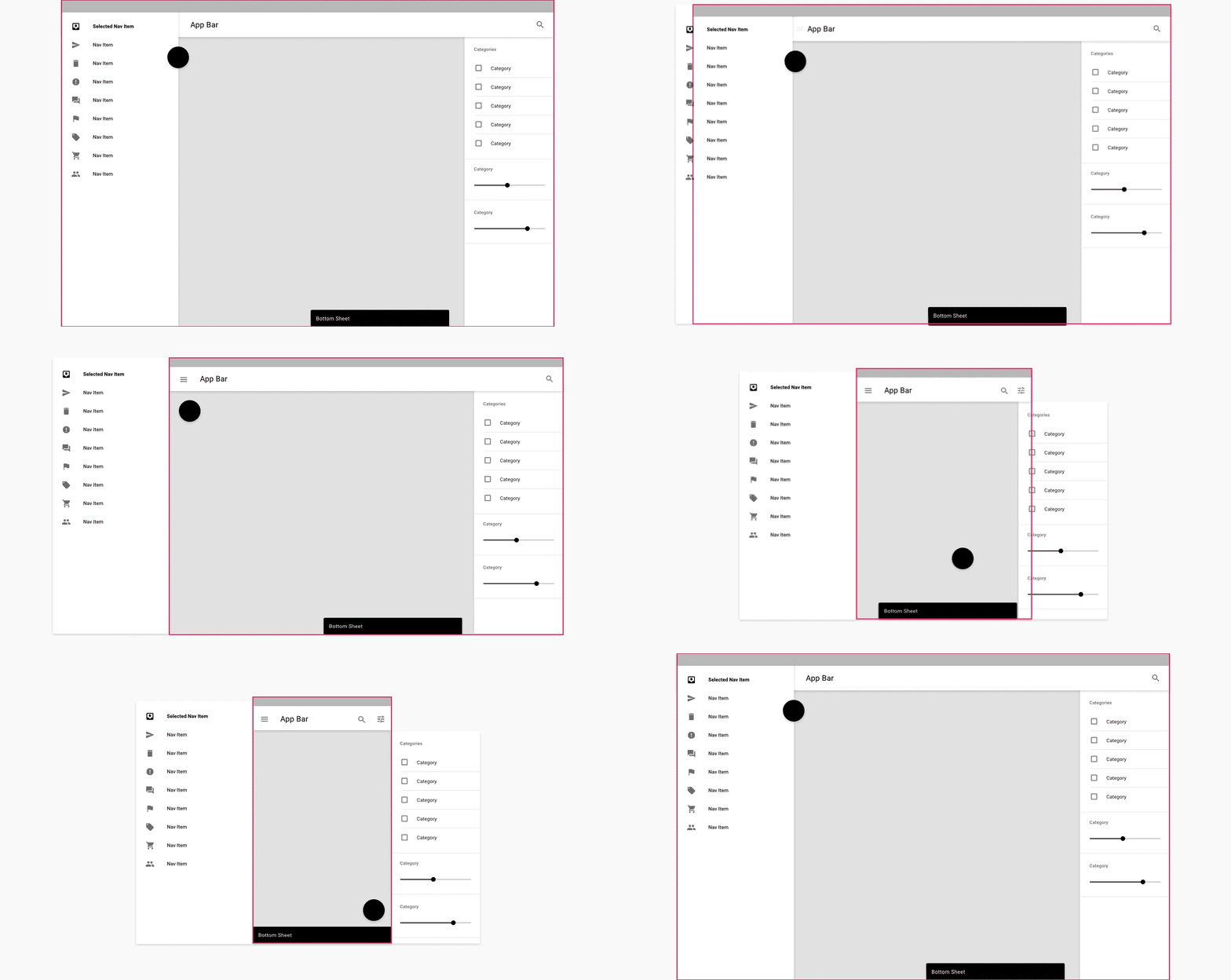
Follows Material Design Layout Docs.

md-layout

Here is a demo on various sizes.

image image image image image image

Example
import 'package:flutter/material.dart';
import 'package:responsive_scaffold/responsive_scaffold.dart';

class LayoutExample extends StatelessWidget {
  const LayoutExample({Key? key}) : super(key: key);

  @override
  Widget build(BuildContext context) {
    return ResponsiveScaffold(
      title: const Text('Responsive Layout Example'),
      drawer: ListView(
        children: const <Widget>[
          ListTile(
            leading: Icon(Icons.settings),
            title: Text('Settings Page'),
          ),
          ListTile(
            leading: Icon(Icons.info),
            title: Text('Info Page'),
          ),
          ListTile(
            leading: Icon(Icons.library_books),
            title: Text('Library Page'),
          ),
          ListTile(
            leading: Icon(Icons.help),
            title: Text('Help Page'),
          ),
        ],
      ),
      endIcon: Icons.filter_list,
      endDrawer: ListView(
        children: <Widget>[
          ListTile(
            leading: const Icon(Icons.filter_list),
            title: const Text('Filter List'),
            subtitle: const Text('Hide and show items'),
            trailing: Switch(
              value: true,
              onChanged: (val) {},
            ),
          ),
          const ListTile(
            leading: Icon(Icons.image_aspect_ratio),
            title: Text('Size Settings'),
            subtitle: Text('Change size of images'),
          ),
          ListTile(
            title: Slider(
              value: 0.5,
              onChanged: (val) {},
            ),
          ),
          ListTile(
            leading: const Icon(Icons.sort_by_alpha),
            title: const Text('Sort List'),
            subtitle: const Text('Change layout behavior'),
            trailing: Switch(
              value: false,
              onChanged: (val) {},
            ),
          ),
        ],
      ),
      trailing: IconButton(
        icon: const Icon(Icons.search),
        onPressed: () {},
      ),
      body: Center(
        child: ElevatedButton(
          onPressed: () {
            Navigator.pop(context);
          },
          child: const Text('Close'),
        ),
      ),
      floatingActionButton: FloatingActionButton(
        backgroundColor: Theme.of(context).accentColor,
        onPressed: () {},
        child: const Icon(Icons.add),
      ),
    );
  }
}

Responsive List
  • You can use this in two modes ResponsiveListScaffold and ResponsiveListScaffold.builder.
  • On Mobile the ListView will push to the details screen

tablet push mobile

  • On Tablet it will show a Master Detail View.
  • You can add additional Slivers to the Scrollview and the AppBar is optional.
Example
import 'package:flutter/material.dart';
import 'package:responsive_scaffold/responsive_scaffold.dart';

class ListExample extends StatefulWidget {
  const ListExample({Key? key}) : super(key: key);

  @override
  _ListExampleState createState() => _ListExampleState();
}

class _ListExampleState extends State<ListExample> {
  final _scaffoldKey = GlobalKey<ScaffoldState>();

  late List<String> _items;

  @override
  void initState() {
    _items = List.generate(20, (int index) => "test_$index");
    super.initState();
  }

  @override
  Widget build(BuildContext context) {
    return ResponsiveListScaffold.builder(
      scaffoldKey: _scaffoldKey,
      detailBuilder: (BuildContext context, int? index, bool tablet) {
        final i = _items[index!];
        return DetailsScreen(
          body: ExampleDetailsScreen(
            items: _items,
            row: i,
            tablet: tablet,
            onDelete: () {
              setState(() {
                _items.removeAt(index);
              });
              if (!tablet) Navigator.of(context).pop();
            },
            onChanged: (String value) {
              setState(() {
                _items[index] = value;
              });
            },
          ),
        );
      },
      nullItems: const Center(child: CircularProgressIndicator()),
      emptyItems: const Center(child: Text("No Items Found")),
      slivers: const <Widget>[
        SliverAppBar(
          title: Text("App Bar"),
        ),
      ],
      itemCount: _items.length,
      itemBuilder: (BuildContext context, int index) {
        final i = _items[index];
        return ListTile(
          leading: Text(i),
        );
      },
      bottomNavigationBar: BottomAppBar(
        elevation: 0.0,
        child: IconButton(
          icon: const Icon(Icons.share),
          onPressed: () {},
        ),
      ),
      floatingActionButton: FloatingActionButton(
        onPressed: () {
          ScaffoldMessenger.of(context).showSnackBar(
            const SnackBar(
              content: Text("Snackbar!"),
            ),
          );
        },
        child: const Icon(Icons.add),
      ),
    );
  }
}

class ExampleDetailsScreen extends StatelessWidget {
  const ExampleDetailsScreen({
    Key? key,
    required List<String> items,
    required this.row,
    required this.tablet,
    required this.onDelete,
    required this.onChanged,
  })   : _items = items,
        super(key: key);

  final List<String> _items;
  final String row;
  final bool tablet;
  final VoidCallback onDelete;
  final ValueChanged<String> onChanged;

  @override
  Widget build(BuildContext context) {
    return Scaffold(
      appBar: AppBar(
        elevation: 0.0,
        automaticallyImplyLeading: !tablet,
        title: const Text("Details"),
        actions: [
          IconButton(
            icon: const Icon(Icons.share),
            onPressed: () {
              onChanged("$row ${DateTime.now().toString()}");
            },
          ),
          IconButton(
            icon: const Icon(Icons.delete),
            onPressed: onDelete,
          ),
        ],
      ),
      bottomNavigationBar: BottomAppBar(
        elevation: 0.0,
        child: IconButton(
          icon: const Icon(Icons.share),
          onPressed: () {},
        ),
      ),
      body: Center(
        child: Text("Item: $row"),
      ),
    );
  }
}

Categories

Dependencies

Dependency list 1 items

Source repository

Projects using this package

No data available yet.