
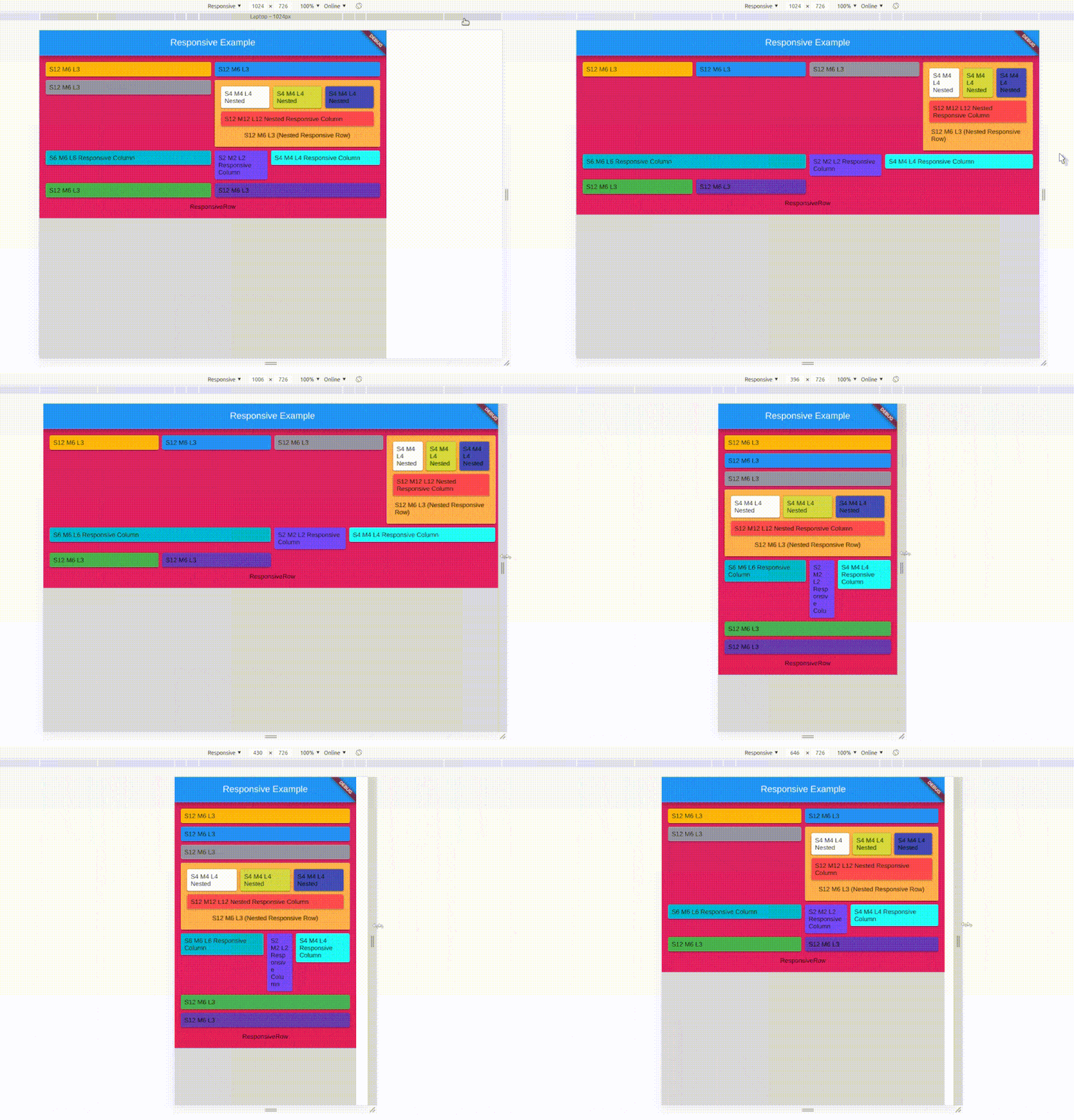
Overview
The responsive_ui package simplifies creating adaptive layouts in Flutter across multiple platforms and screen orientations. It enables developers to build responsive and nested responsive widgets that automatically adjust to different device sizes, including Android, iOS, Web, macOS, Windows, and Linux. With built-in support for both portrait and landscape modes, it ensures consistent UI experiences without manual media query handling. The package is ideal for apps requiring flexible, scalable designs.
Use cases
- Cross-platform mobile and web apps
- Adaptive layouts for tablets and desktops
- Nested responsive components
- Dynamic UI adjustments by screen size
- Apps supporting multiple orientations
- Responsive dashboards
Key features
- Supports all major platforms
- Automatic orientation adaptation
- Nested responsive widget structure
- Simplified responsive design logic
- Works with media queries
- Consistent UI across devices
Suitable for
- Developers building multi-platform apps
- Teams needing responsive layouts without complex code
- Projects targeting diverse screen sizes
- UI-heavy applications
- Design systems requiring scalability
Considerations
- May require learning new widget patterns
- Limited customization beyond built-in responsive logic
- Potential performance impact with deeply nested structures
- Not optimized for highly dynamic runtime layout changes
- Best suited for static or predictable responsive needs