
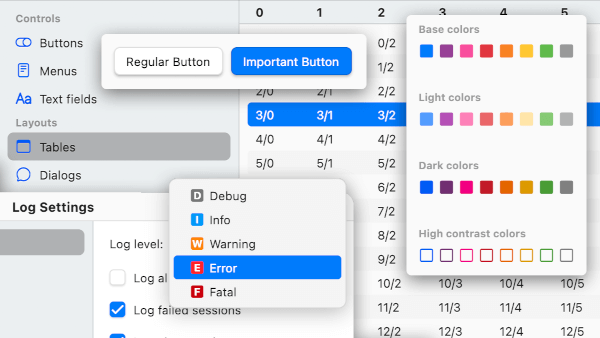
Overview
Stockholm is a desktop-first widget library and theme collection tailored for Mac and Windows, delivering a polished, native-like experience across platforms. It provides consistent, aesthetically refined UI components that adapt seamlessly to desktop environments while maintaining cross-platform compatibility with Android, iOS, Web, macOS, Windows, and Linux. Designed with usability and visual harmony in mind, it helps developers build intuitive desktop applications with minimal effort. The package emphasizes modern design principles and responsive layouts optimized for larger screens and input methods like mouse and keyboard.
Use cases
- Building cross-platform desktop apps
- Creating native-looking interfaces on Windows and macOS
- Enhancing UI consistency across multiple platforms
- Developing productivity tools with polished visuals
- Designing applications with desktop-specific interactions
Key features
- Desktop-optimized widgets
- Native-like appearance on Mac and Windows
- Cross-platform support (including Linux)
- Built-in themes and styling
- Responsive layouts for large screens
- Keyboard and mouse-friendly components
Suitable for
- Desktop application developers
- UI designers seeking consistency
- Teams building multi-platform apps
- Developers targeting Mac and Windows users
- Projects requiring polished, professional UIs
Considerations
- Best suited for desktop-focused projects
- May require additional customization for mobile use
- Limited mobile-specific optimizations
- Not ideal for highly specialized or non-desktop UI patterns