Search packages, repositories and app categories

story_maker cover
Package detailsv1.2.0

story_maker

A package for creating instagram like story, you can use this package to edit images and make it story ready by adding other contents over it like text, stickers, and filters.

AndroidiOSmacOSWindowsLinux
30-day downloads
69
Likes
69
Pub points
140

Install package

flutter pub add story_maker

Package Overview

Package selection guidance compiled from public package information, community data, and project usage.

Story_Maker is a Flutter package designed to create Instagram-like stories with ease. It enables users to edit images and enhance them with text, stickers, and filters, making content ready for social media sharing. Built for cross-platform use, it supports Android, iOS, macOS, Windows, and Linux, offering a seamless experience across devices. The package provides intuitive tools for customizing story visuals, ideal for apps requiring dynamic, interactive story creation features.

Use cases

  • Creating social media stories
  • Adding text overlays to images
  • Applying filters and stickers
  • Building interactive story content
  • Designing user-generated story templates

Key features

  • Image editing capabilities
  • Text addition tools
  • Sticker integration
  • Filter application
  • Cross-platform support

Suitable for

  • Social media apps
  • User-generated content platforms
  • Creative design tools
  • Mobile-first storytelling apps
  • Interactive image editors

Considerations

  • Requires image asset management
  • Limited built-in sticker library
  • Custom sticker implementation needed
  • Performance on low-end devices
  • Needs UI customization for branding

Original README

Original README snapshot from the linked source repository. Visit the repository for the latest content.

story_maker License: MIT

A package for creating instagram like story, you can use this package to edit images and make it story ready by adding other contents over it like text, stickers, gradients, and color filters.

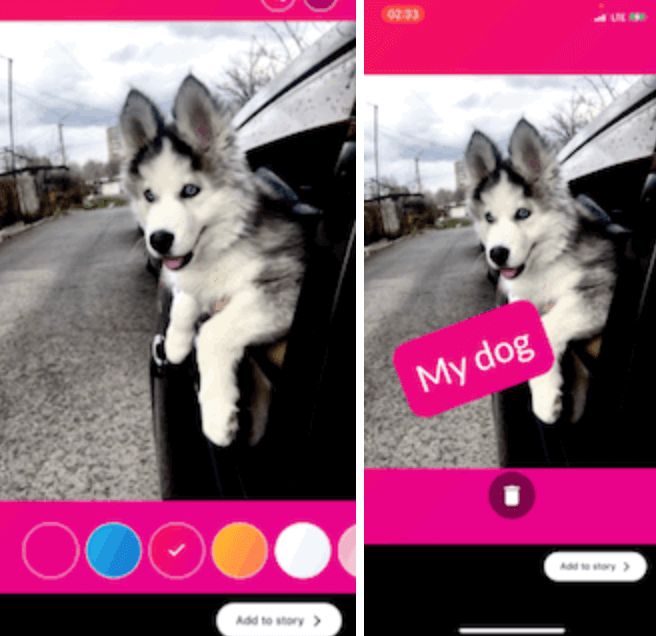
GIF 1 GIF 2

Getting Started

Add this to your package's pubspec.yaml file:

dependencies:
  story_maker: ^1.2.0

Example

import 'package:story_maker/story_maker.dart';

class _MyAppState extends State<MyApp> {
  File? image;

  @override
  Widget build(BuildContext context) {
    return Scaffold(
      appBar: AppBar(
        title: const Text('Story Designer Example'),
      ),
      body: Center(
        child: Column(
          mainAxisAlignment: MainAxisAlignment.center,
          children: [
            ElevatedButton(
              onPressed: () async {
                await [
                  Permission.photos,
                  Permission.storage,
                ].request();
                final picker = ImagePicker();
                await picker
                    .pickImage(source: ImageSource.gallery)
                    .then((file) async {
                  final File editedFile = await Navigator.of(context).push(
                    MaterialPageRoute(
                      builder: (context) => StoryMaker(
                        filePath: file!.path,
                      ),
                    ),
                  );
                  setState(() {
                    image = editedFile;
                  });
                  print('editedFile: ${image!.path}');
                });
              },
              child: const Text('Pick Image'),
            ),
            if (image != null)
              Expanded(
                child: Image.file(image!),
              ),
          ],
        ),
      ),
    );
  }
}

Advanced Usage with Customization
import 'package:story_maker/story_maker.dart';

// Example with custom theme, stickers, and done button
StoryMaker(
  filePath: imagePath,
  theme: StoryMakerTheme.dark(), // or StoryMakerTheme.light()
  customStickers: [
    StickerItem.emoji('🎉'),
    StickerItem.emoji('🔥'),
    StickerItem.image('/path/to/sticker.png'),
  ],
  customFontList: ['Roboto', 'Open Sans', 'Lato'],
  customTextColors: [
    Colors.red,
    Colors.blue,
    Colors.green,
  ],
  customGradients: [
    [Colors.purple, Colors.pink],
    [Colors.blue, Colors.cyan],
  ],
  doneButtonBuilder: (theme, onDone, isLoading) {
    return ElevatedButton(
      onPressed: isLoading ? null : onDone,
      style: ButtonStyle(
        backgroundColor: WidgetStateProperty.all(theme.buttonColor),
      ),
      child: isLoading
          ? CircularProgressIndicator()
          : Text('Save Story', style: TextStyle(color: theme.buttonTextColor)),
    );
  },
)
Available Features
Core Features
  • [x] Image Editing:

    • Image scaling and rotation
    • Pinch-to-zoom and pan gestures
    • Photo view with rotation support
  • [x] Text Editing:

    • Adding text to images with customizable:
      • Font family (with 50+ Google Fonts via google_fonts package)
      • Font size (adjustable slider from 14-74px)
      • Text color (extensive color palette with 20+ default colors)
      • Text background gradients (60+ gradient options)
    • Real-time text preview
    • Drag, rotate, and scale text items
    • Multiple text items support
  • [x] Background Gradients:

    • 60+ pre-built gradient options
    • Custom gradient support via customGradients parameter
    • Gradient selector with visual preview
  • [x] Stickers Support:

    • Emoji stickers (50+ default emojis)
    • Custom image/GIF stickers via StickerItem.image()
    • Customizable sticker list via customStickers parameter
    • Sticker selector with horizontal scrolling interface
    • Drag, rotate, and scale sticker items
  • [x] Color Filters:

    • 8 color filter options: None, Sepia, Grayscale, Vintage, Cool, Warm, Bright, Dark
    • Swipe left/right gestures for quick filter navigation
    • Filter name overlay display when selecting filters
    • Color filter picker with visual preview
    • Real-time filter application
  • [x] Theme Customization:

    • Complete UI theming system via StoryMakerTheme
    • Pre-built dark and light theme variants
    • Customizable colors (background, buttons, icons, text, borders)
    • Customizable border radius and shadows
    • Theme provider system for easy access throughout widget tree
    • Support for custom button styles and decorations
  • [x] Customization Options:

    • Custom done button builder with theme, callback, and loading state access
    • Customizable font lists via customFontList parameter
    • Customizable text color lists via customTextColors parameter
    • Customizable gradient color lists via customGradients parameter
    • Customizable animation duration via animationsDuration parameter
  • [x] User Experience:

    • Haptic feedback on interactions
    • Style name overlay when changing font families
    • Filter name overlay when changing color filters
    • Delete item by dragging to bottom area
    • Smooth animations and transitions
    • Loading state during image export
  • [x] Developer Experience:

    • Barrel files for organized imports
    • Comprehensive documentation
    • Type-safe APIs
    • Backward compatible updates

"Buy Me A Coffee"

Categories

Dependencies

Dependency list 3 items

Source repository

Projects using this package

No data available yet.