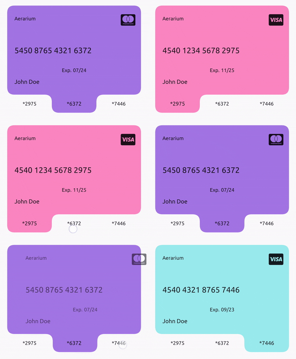
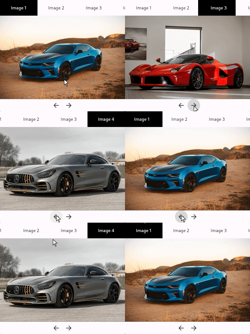
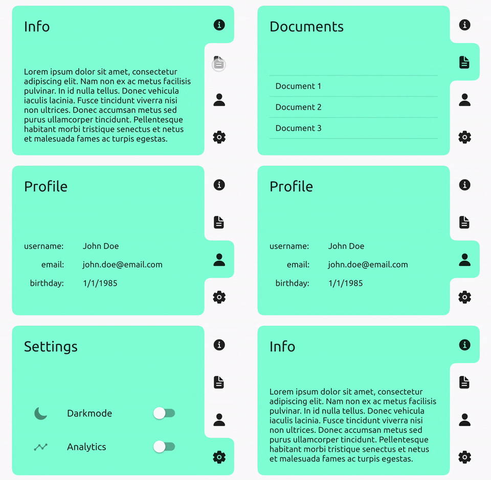
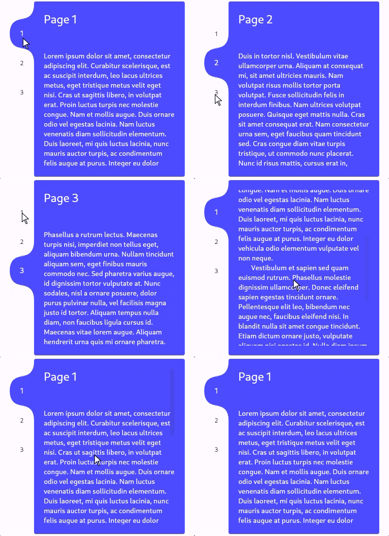
Customisable tab view/carousel with animated indicator. Just pass in children and tabs, or use a TabController, change the tab side, add color(s), and more.
Package selection guidance compiled from public package information, community data, and project usage.
TabContainer is a customizable tab view and carousel widget for Flutter, featuring an animated indicator that smoothly transitions between tabs. It supports both manual tab switching via a TabController and direct child-based navigation. Users can customize the tab position (top, bottom, left, right), apply colors, and tailor the visual style to match their app's design. Ideal for creating dynamic, interactive interfaces with multiple content sections.
Use cases
Creating swipeable tabbed interfaces
Building custom tab carousels
Implementing animated tab indicators
Designing responsive layouts with multiple views
Adding interactive navigation in forms or dashboards
Key features
Animated tab indicator
Support for TabController
Customizable tab position
Color customization
Flexible child composition
Cross-platform compatibility
Suitable for
Developers building tabbed UIs
Designers needing animated transitions
Apps requiring responsive tab layouts
Projects with multi-view navigation
Flutter apps targeting Android, iOS, Web, macOS, Windows, and Linux
Considerations
Requires understanding of TabController for advanced use
May need additional styling for complex themes
Performance impact with large numbers of tabs
Limited built-in accessibility features
Not optimized for extremely long tab lists
Original README
Original README snapshot from the linked source repository. Visit the repository for the latest content.
Tab view/carousel widget with a beautifully animated indicator and simple usage.
Just pass in a list of children and a list of tabs and it will handle the rest, or you can customise
by using a TabController, changing the tab side, adding color(s), and much more.
TabContainer intentionally has no built-in focus implementation. Create your own or,
to add one that maps arrow keys to the index, you can wrap your TabContainer with TabContainerFocus:
By default, TabContainer will no longer impose any additional semantic information onto the tabs or children.
It will just describe its own semantics configuration using onIncrease and onDecrease to change the tab index.
You can completely override this by supplying your own SemanticsConfiguration in the semanticsConfiguration: property.
If you want to prevent accessibility tools from getting stuck in your tab bar, you can wrap each tab in ExcludeSemantics or,
if you do want them to be accessed, you can wrap each one similarly to below:
classTabContainerextendsStatefulWidget{
constTabContainer({
super.key,
this.duration = constDuration(milliseconds: 300),
this.curve = Curves.easeInOut,
this.controller,
this.children,
this.child,
requiredthis.tabs,
this.childPadding = EdgeInsets.zero,
this.borderRadius = constBorderRadius.all(Radius.circular(12.0)),
this.tabBorderRadius = constBorderRadius.all(Radius.circular(12.0)),
this.tabExtent = 50.0,
this.tabEdge = TabEdge.top,
this.tabsStart = 0.0,
this.tabsEnd = 1.0,
this.tabMinLength = 0.0,
this.tabMaxLength = double.infinity,
this.color,
this.colors,
this.transitionBuilder,
this.semanticsConfiguration,
this.overrideTextProperties = false,
this.selectedTextStyle,
this.unselectedTextStyle,
this.textDirection,
this.enabled = true,
this.enableFeedback = true,
this.childDuration,
this.childCurve,
}) : assert((children == null) != (child == null)),
assert((children != null) ? children.length == tabs.length : true),
assert(controller == null ? true : controller.length == tabs.length),
assert(!(color != null && colors != null)),
assert((colors ?? tabs).length == tabs.length),
assert(tabExtent >= 0),
assert(0.0 <= tabsStart && tabsStart < tabsEnd && tabsEnd <= 1.0),
assert(tabMinLength >= 0),
assert(tabMaxLength >= tabMinLength),
assert((selectedTextStyle == null) == (unselectedTextStyle == null));
/// Changes tab selection from elsewhere in your app.////// If you provide one, you must dispose of it.finalTabController? controller;
/// The list of children you want to tab through, in order.////// Must be equal in length to [tabs] and [colors] (if provided)./// Must be null if [child] is supplied.finalList<Widget>? children;
/// Supply this if you want to control the child view yourself using [TabController].////// Must be equal in length to [tabs] and [colors] (if provided)./// Must be null if [children] is supplied;finalWidget? child;
/// What will be displayed in each tab, in order.////// Must be equal in length to [children] and [colors] (if provided).finalList<Widget> tabs;
/// Sets the border radius surrounding the children////// Defaults to [BorderRadius.all(Radius.circular(12.0))]finalBorderRadius borderRadius;
/// Sets the border radius surrounding each tab////// Defaults to [BorderRadius.all(Radius.circular(12.0))]finalBorderRadius tabBorderRadius;
/// Sets the padding to be applied around all [children].////// Defaults to [EdgeInsets.zero].finalEdgeInsets childPadding;
/// Height of the tabs perpendicular to the [TabEdge].////// If the [tabs] are on the left/right then this will be the their visual width, otherwise it will be their visual height./// Defaults to 50.0.finaldouble tabExtent;
/// Determines which side the [tabs] will be on.////// Defaults to [TabEdge.top].finalTabEdge tabEdge;
/// Fraction of the way down the [TabEdge] that the first tab should begin.////// Defaults to 0.0.finaldouble tabsStart;
/// Fraction of the way down the [TabEdge] that the last tab should end.////// Defaults to 1.0.finaldouble tabsEnd;
/// Minimum width of each tab parallel to the [TabEdge].////// Defaults to 0.0finaldouble tabMinLength;
/// Maximum width of each tab parallel to the [TabEdge].////// Defaults to [double.infinity].finaldouble tabMaxLength;
/// The background color of this widget.////// Must not be set if [colors] is provided.finalColor? color;
/// The list of colors used for each tab, in order.////// The first color in the list will be the background color when tab 1 is selected and so on./// Must not be set if [color] is provided.finalList<Color>? colors;
/// Duration used by [controller] to animate tab changes.////// Defaults to Duration(milliseconds: 300).finalDuration duration;
/// Curve used by [controller] to animate tab changes.////// Defaults to Curves.easeInOut.finalCurve curve;
/// Duration of the child transition animation when the tab selection changes.////// Defaults to [duration]./// Not used if [child] is supplied.finalDuration? childDuration;
/// The curve of the child transition animation when the tab selection changes.////// Defaults to [curve]./// Not used if [child] is supplied.finalCurve? childCurve;
/// Sets the child transition animation when the tab selection changes.////// Defaults to [AnimatedSwitcher.defaultTransitionBuilder]./// Not used if [child] is supplied.finalWidgetFunction(Widget, Animation<double>)? transitionBuilder;
/// The [SemanticsConfiguration] for the [RenderObject] of [TabContainer] itself, not its children or tabs./// You can completely control the accessibility behaviour by supplying this and wrapping your child and tabs in their own semantics.////// If non-null, this will be used instead of the default implementation.finalSemanticsConfiguration? semanticsConfiguration;
/// Set to true if each [Text] tabs given properties should be used instead of the implicitly animated ones.////// Defaults to false.finalbool overrideTextProperties;
/// The [TextStyle] applied to the text of the currently selected tab.////// Must specify values for the same properties as [unselectedTextStyle]./// Defaults to Theme.of(context).textTheme.bodyMedium.finalTextStyle? selectedTextStyle;
/// The [TextStyle] applied to the text of currently unselected tabs.////// Must specify values for the same properties as [selectedTextStyle]./// Defaults to Theme.of(context).textTheme.bodyMedium.finalTextStyle? unselectedTextStyle;
/// The [TextDirection] for tabs and semantics.////// Defaults to Directionality.of(context).finalTextDirection? textDirection;
/// Whether tab selection changes on tap.////// Defaults to true.finalbool enabled;
/// Whether detected gestures on tabs should provide acoustic and/or haptic feedback.////// Defaults to true.finalbool enableFeedback;
}