Package selection guidance compiled from public package information, community data, and project usage.
TableCalendar is a highly customizable and feature-rich calendar widget for Flutter, designed to support a wide range of use cases with extensive configuration options. It provides a clean, responsive table-based layout across all major platforms including Android, iOS, Web, macOS, Windows, and Linux. The package supports event marking, date selection, navigation controls, and dynamic styling, making it ideal for apps requiring interactive calendar functionality. Its modular design allows developers to tailor the appearance and behavior to match app-specific needs.
Use cases
Event scheduling apps
Task management tools
Booking and reservation systems
Daily planner applications
Date picker integrations
Custom calendar views
Key features
Fully customizable UI
Multiple date selection modes
Event highlighting
Built-in navigation controls
Responsive design across platforms
Extensible event and date handling
Suitable for
Developers building calendar-heavy apps
Teams needing cross-platform calendar consistency
Apps requiring advanced date interaction
Designers wanting flexible visual customization
Considerations
May require additional styling for complex layouts
Performance impact with large datasets
Learning curve for advanced features
Limited built-in localization support
Dependent on external state management for events
Original README
Original README snapshot from the linked source repository. Visit the repository for the latest content.
TableCalendar
Highly customizable, feature-packed calendar widget for Flutter.
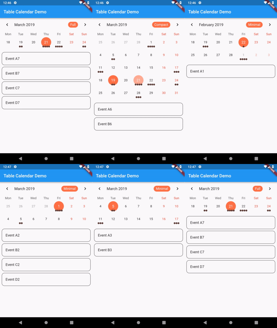
TableCalendar with custom styles
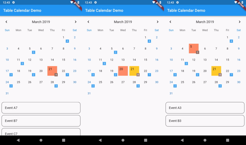
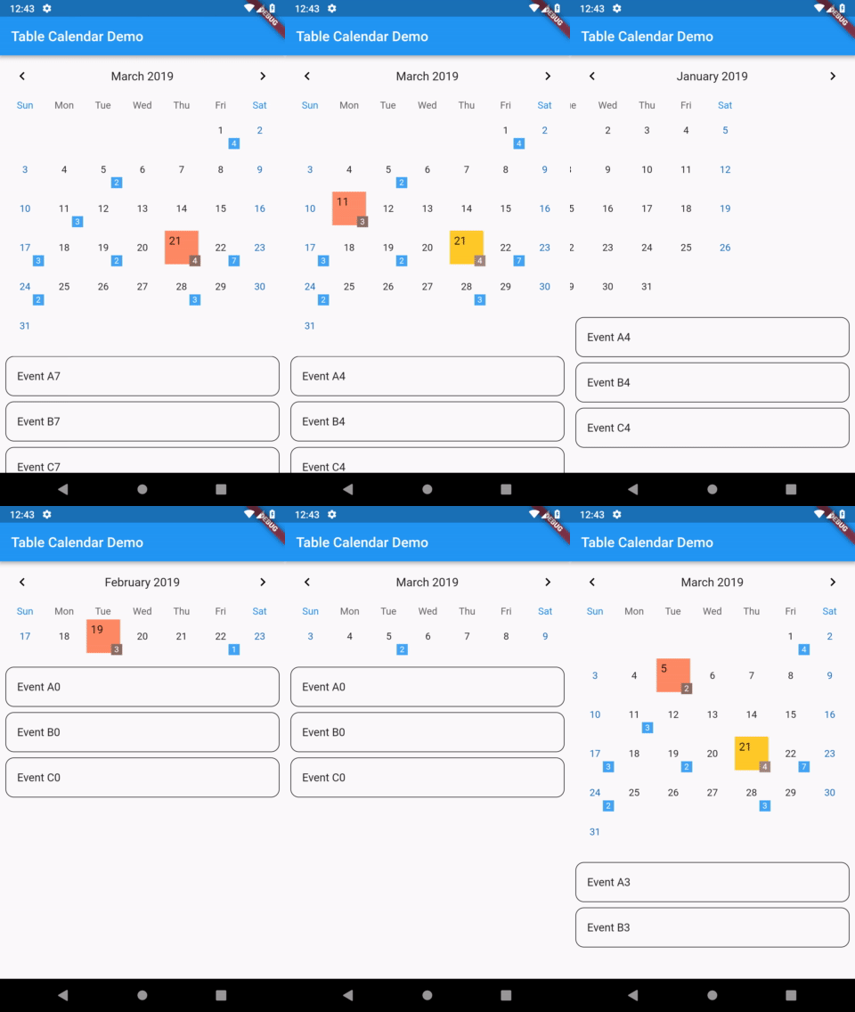
TableCalendar with custom builders
Features
Extensive, yet easy to use API
Preconfigured UI with customizable styling
Custom selective builders for unlimited UI design
Locale support
Range selection support
Multiple selection support
Dynamic events and holidays
Vertical autosizing - fit the content, or fill the viewport
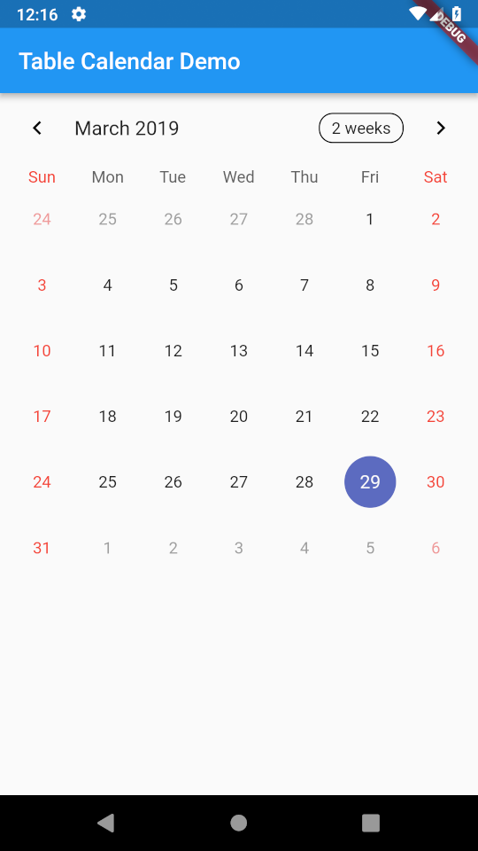
Multiple calendar formats (month, two weeks, week)
You will surely notice that previously set up calendar widget isn't quite interactive - you can only swipe it horizontally, to change the currently visible month. While it may be sufficient in certain situations, you can easily bring it to life by specifying a couple of callbacks.
Adding the following code to the calendar widget will allow it to respond to user's taps, marking the tapped day as selected:
selectedDayPredicate: (day) {
returnisSameDay(_selectedDay, day);
},
onDaySelected: (selectedDay, focusedDay) {
setState(() {
_selectedDay = selectedDay;
_focusedDay = focusedDay; // update `_focusedDay` here as well
});
},
In order to dynamically update visible calendar format, add those lines to the widget:
Those two changes will make the calendar interactive and responsive to user's input.
Updating focusedDay
Setting focusedDay to a static value means that whenever TableCalendar widget rebuilds, it will use that specific focusedDay. You can quickly test it by using hot reload: set focusedDay to DateTime.now(), swipe to next month and trigger a hot reload - the calendar will "reset" to its initial state. To prevent this from happening, you should store and update focusedDay whenever any callback exposes it.
Add this one callback to complete the basic setup:
It is worth noting that you don't need to call setState() inside onPageChanged() callback. You should just update the stored value, so that if the widget gets rebuilt later on, it will use the proper focusedDay.
The complete example is available here. You can find other examples here.
You can supply custom events to TableCalendar widget. To do so, use eventLoader property - you will be given a DateTime object, to which you need to assign a list of events.
One thing worth remembering is that DateTime objects consist of both date and time parts. In many cases this time part is redundant for calendar related aspects.
If you decide to use a Map, I suggest making it a LinkedHashMap - this will allow you to override equality comparison for two DateTime objects, comparing them just by their date parts:
final events = LinkedHashMap(
  equals: isSameDay,
  hashCode: getHashCode,
)..addAll(eventSource);
Cyclic events
eventLoader allows you to easily add events that repeat in a pattern. For example, this will add an event to every Monday:
Often times having a sublist of events that are selected by tapping on a day is desired. You can achieve that by using the same method you provided to eventLoader inside of onDaySelected callback:
To customize the UI with your own widgets, use CalendarBuilders. Each builder can be used to selectively override the UI, allowing you to implement highly specific designs with minimal hassle.
You can return null from any builder to use the default style. For example, the following snippet will override only the Sunday's day of the week label (Sun), leaving other dow labels unchanged:
calendarBuilders: CalendarBuilders(
dowBuilder: (context, day) {
if (day.weekday == DateTime.sunday) {
final text = DateFormat.E().format(day);
returnCenter(
child: Text(
text,
style: TextStyle(color: Colors.red),
),
);
}
},
),
Locale
To display the calendar in desired language, use locale property.
If you don't specify it, a default locale will be used.
Initialization
Before you can use a locale, you might need to initialize date formatting.
A simple way of doing it is as follows:
First of all, add intl package to your pubspec.yaml file
After those two steps your app should be ready to use TableCalendar with different languages.
Specifying a language
To specify a language, simply pass it as a String code to locale property.
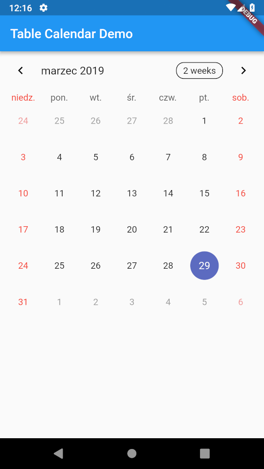
For example, this will make TableCalendar use Polish language:
TableCalendar(
  locale: 'pl_PL',
),
'en_US'
'pl_PL'
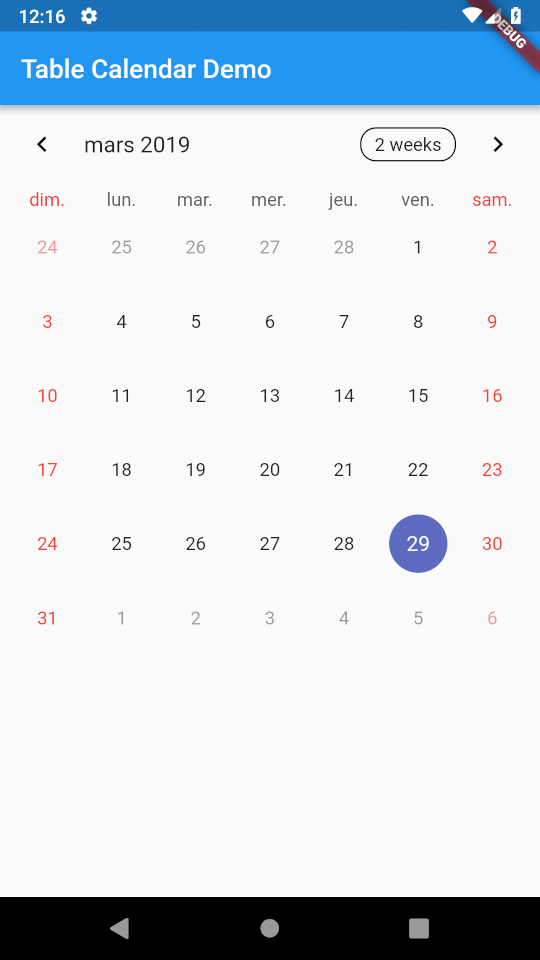
'fr_FR'
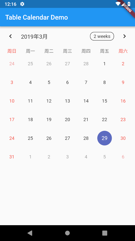
'zh_CN'
Note, that if you want to change the language of FormatButton's text, you have to do this yourself. Use availableCalendarFormats property and pass the translated Strings there. Use i18n method of your choice.
You can also hide the button altogether by setting formatButtonVisible to false.