Search packages, repositories and app categories

time_range_picker cover
Package detailsv2.3.1

time_range_picker

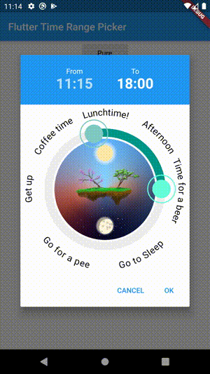
A time range picker for flutter. This widget let's you open a dialog to choose a timeframe with start and end time.

AndroidiOSWebmacOSWindowsLinux
30-day downloads
6K
Likes
186
Pub points
140

Install package

flutter pub add time_range_picker

Package Overview

Package selection guidance compiled from public package information, community data, and project usage.

A Flutter package that provides a customizable time range picker widget, enabling users to select a start and end time within a specified timeframe through an intuitive dialog interface. Designed for cross-platform use, it supports Android, iOS, Web, macOS, Windows, and Linux. The picker is ideal for scheduling, booking, or any application requiring precise time interval selection. It integrates seamlessly with existing Flutter apps and offers a clean, responsive UI.

Use cases

  • Scheduling appointments
  • Booking time slots
  • Setting timers
  • Configuring event durations
  • Tracking work hours

Key features

  • Dialog-based time selection
  • Start and end time picker
  • Cross-platform compatibility
  • Customizable UI
  • Responsive design

Suitable for

  • Calendar and scheduling apps
  • Time-tracking tools
  • Booking systems
  • Event management platforms
  • Productivity applications

Considerations

  • Requires Flutter SDK 2.0 or higher
  • Limited customization of time step intervals
  • No built-in validation for overlapping times
  • May need additional styling for dark mode
  • Depends on external GitHub repository for updates

Original README

Original README snapshot from the linked source repository. Visit the repository for the latest content.

Time Range Picker

A time range picker for flutter.

Getting Started

Installation

Add


time_range_picker : any

to your pubspec.yaml, and run

flutter packages get

in your project's root directory.

Basic Usage
import 'package:flutter/material.dart';

import 'package:time_range_picker/time_range_picker.dart';

void main() => runApp(MyApp());

class MyApp extends StatelessWidget {
  @override
  Widget build(BuildContext context) {
    return MaterialApp(
      theme: ThemeData(
        primarySwatch: Colors.blue,
      ),
      home: MyHomePage(),
    );
  }
}

class MyHomePage extends StatelessWidget {
  @override
  Widget build(BuildContext context) {
    return Scaffold(
        backgroundColor: Colors.blueGrey,
        body: Center(
          child: RaisedButton(
            onPressed: () async {
              TimeRange result = await showTimeRangePicker(
                context: context,
              );
              print("result " + result.toString());
            },
            child: Text("Pure"),
          ),
        ));
  }
}
Examples
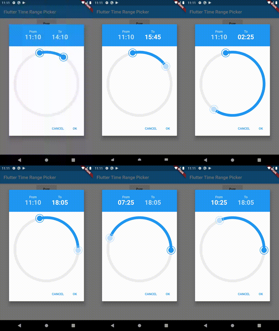
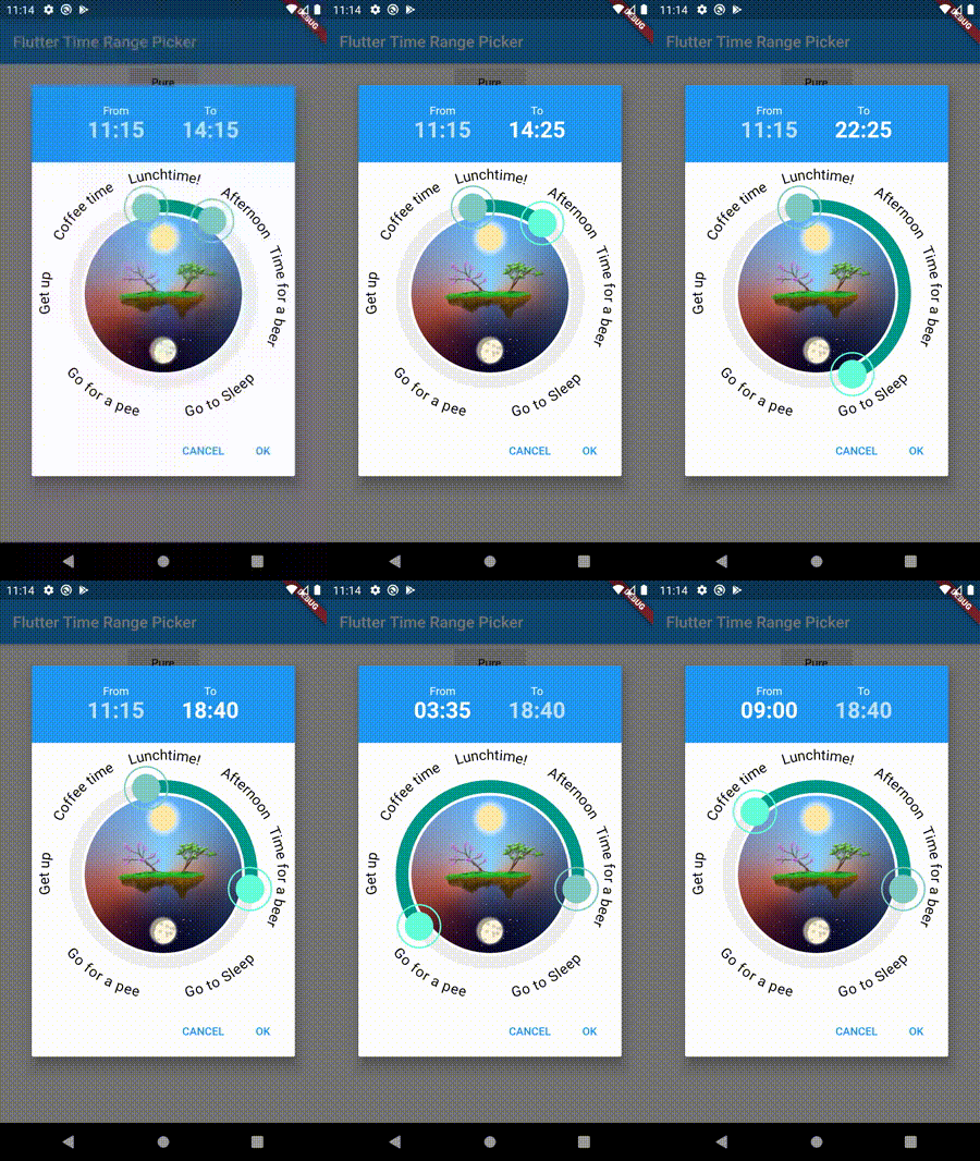
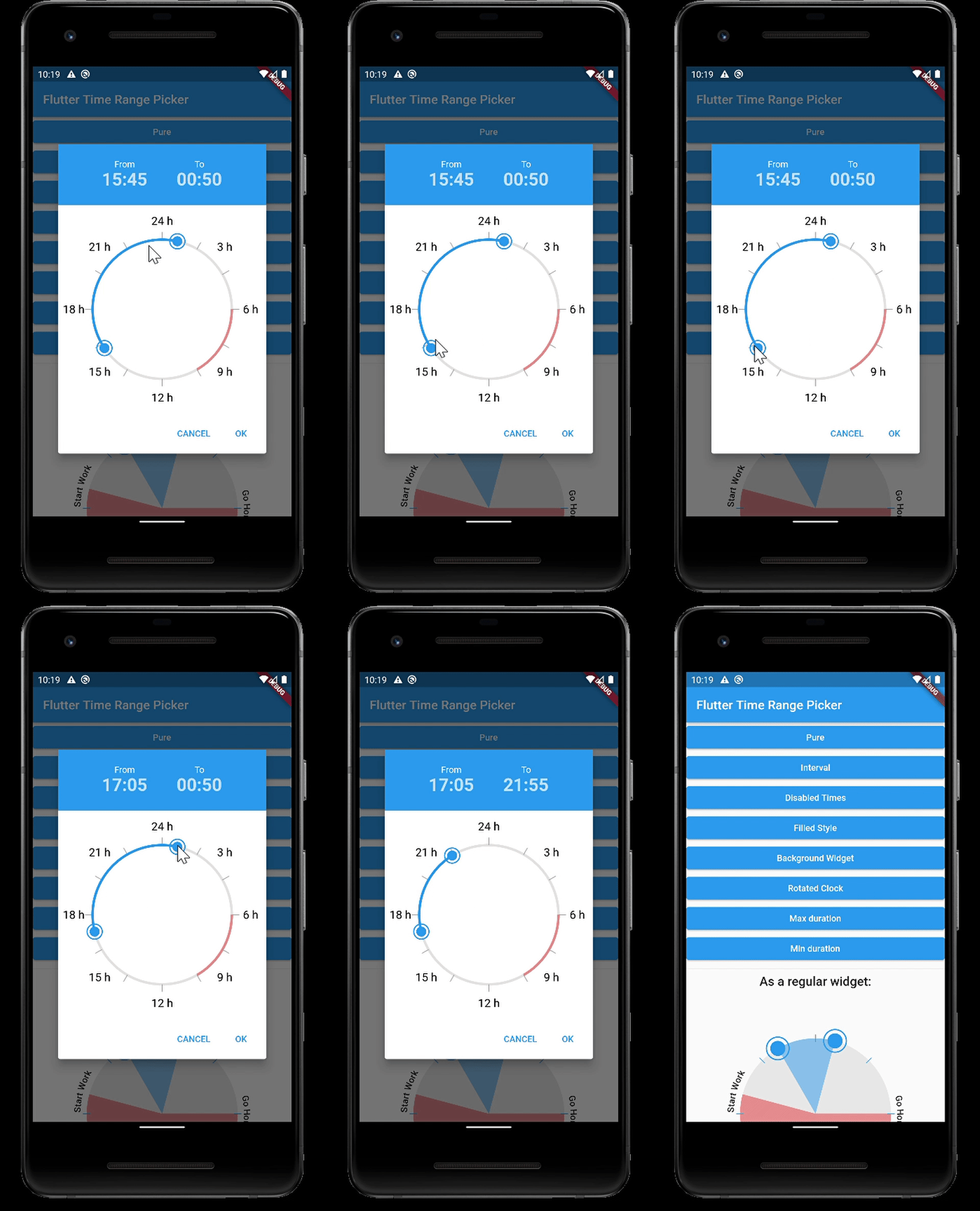
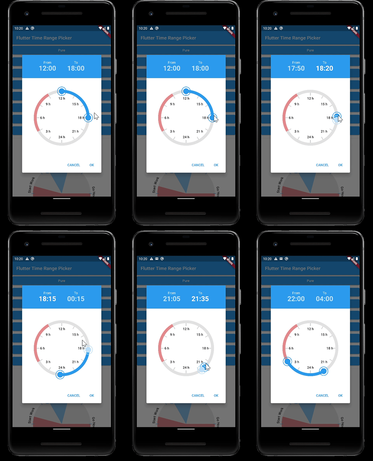
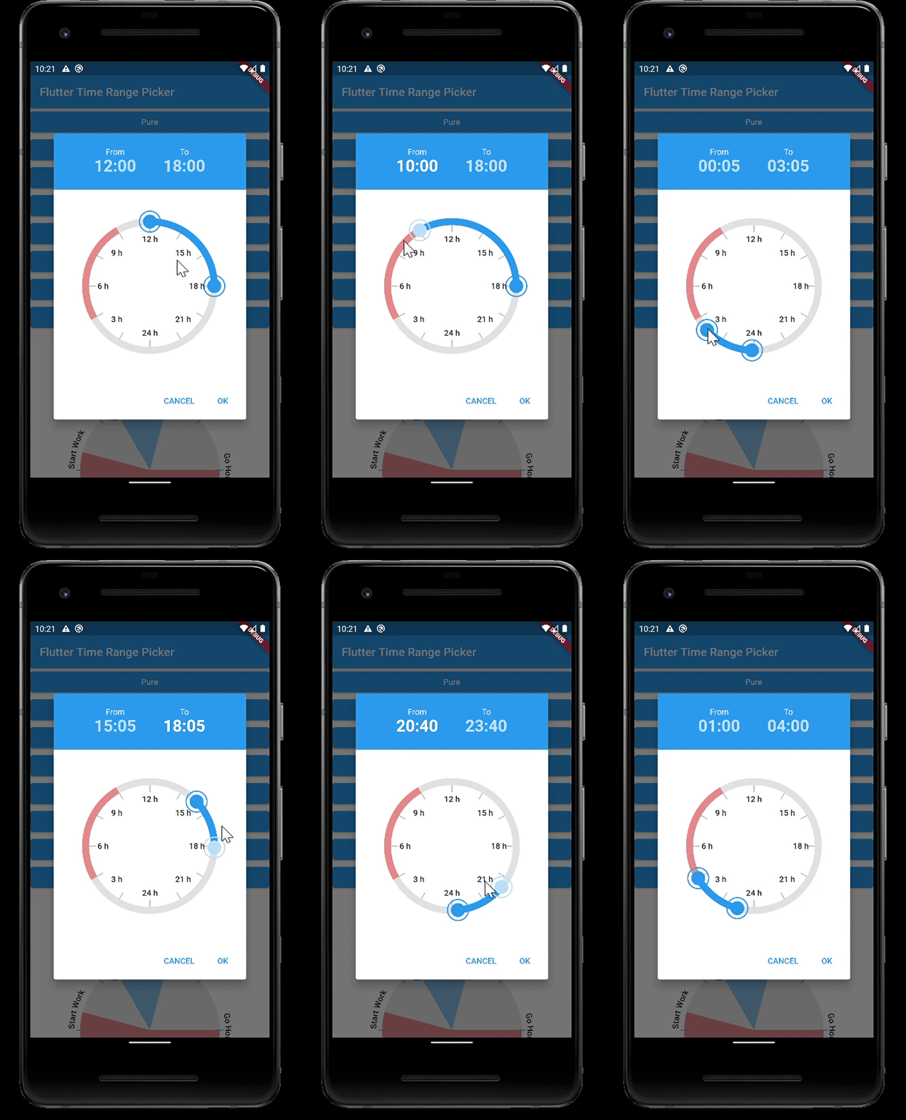
Simple

Simple

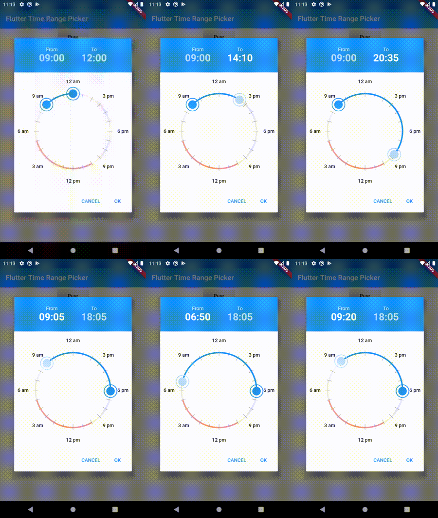
Interval

Interval

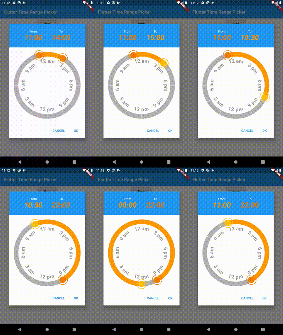
Filled Style

Filled Style

Disabled Timeframe

Disabled Timeframe

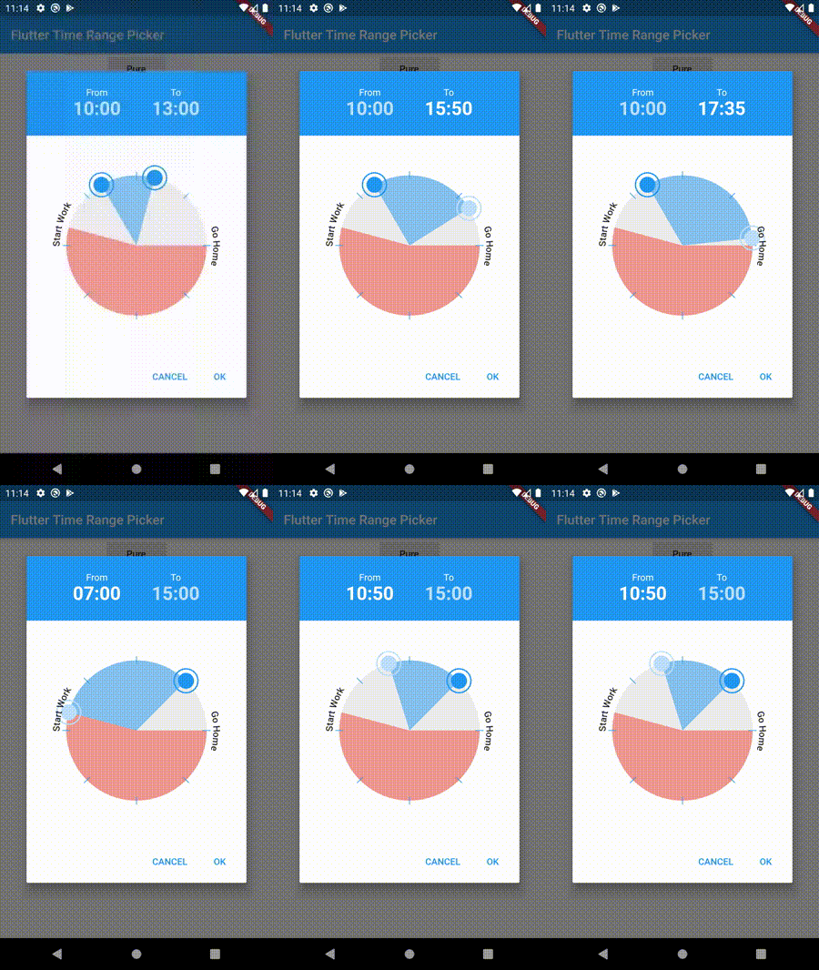
Background Widget

Background Widget

Rotated Clock

Rotated Clock

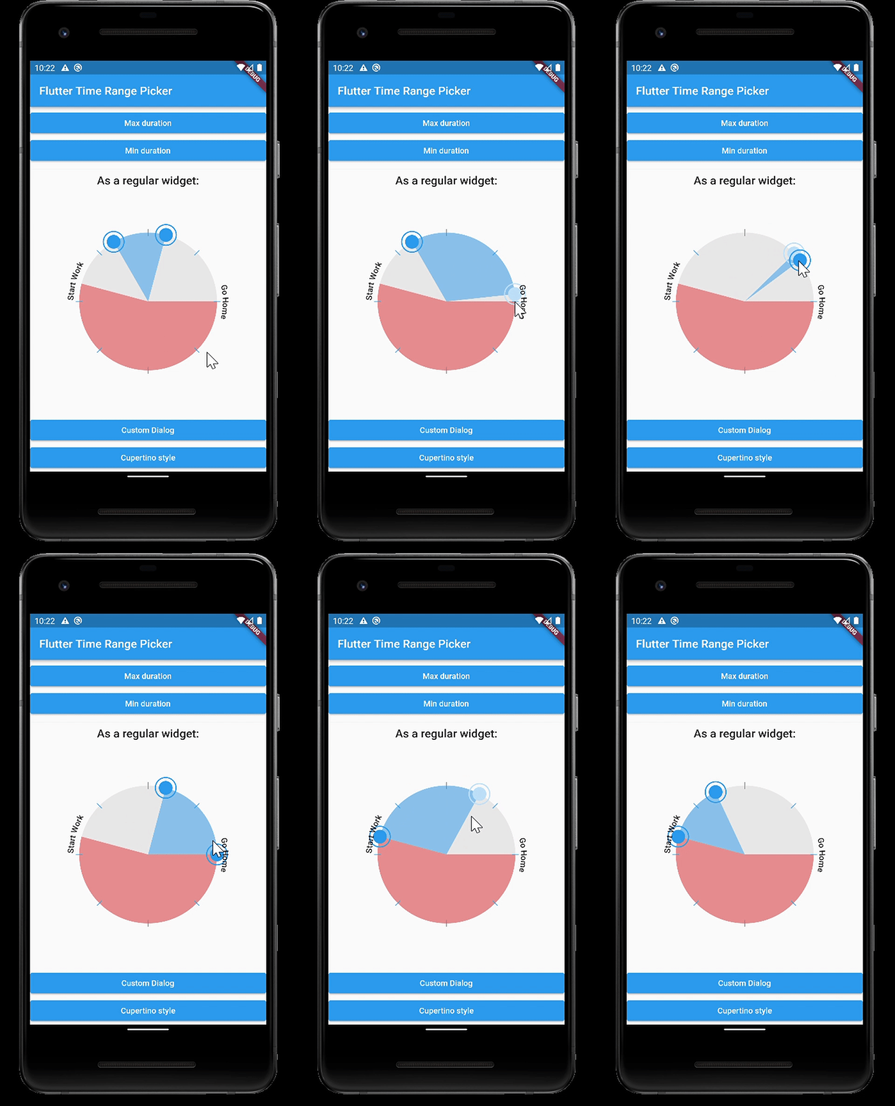
Max Duration

Max Duration

Min Duration

Min Duration

Default Widget

Default Widget

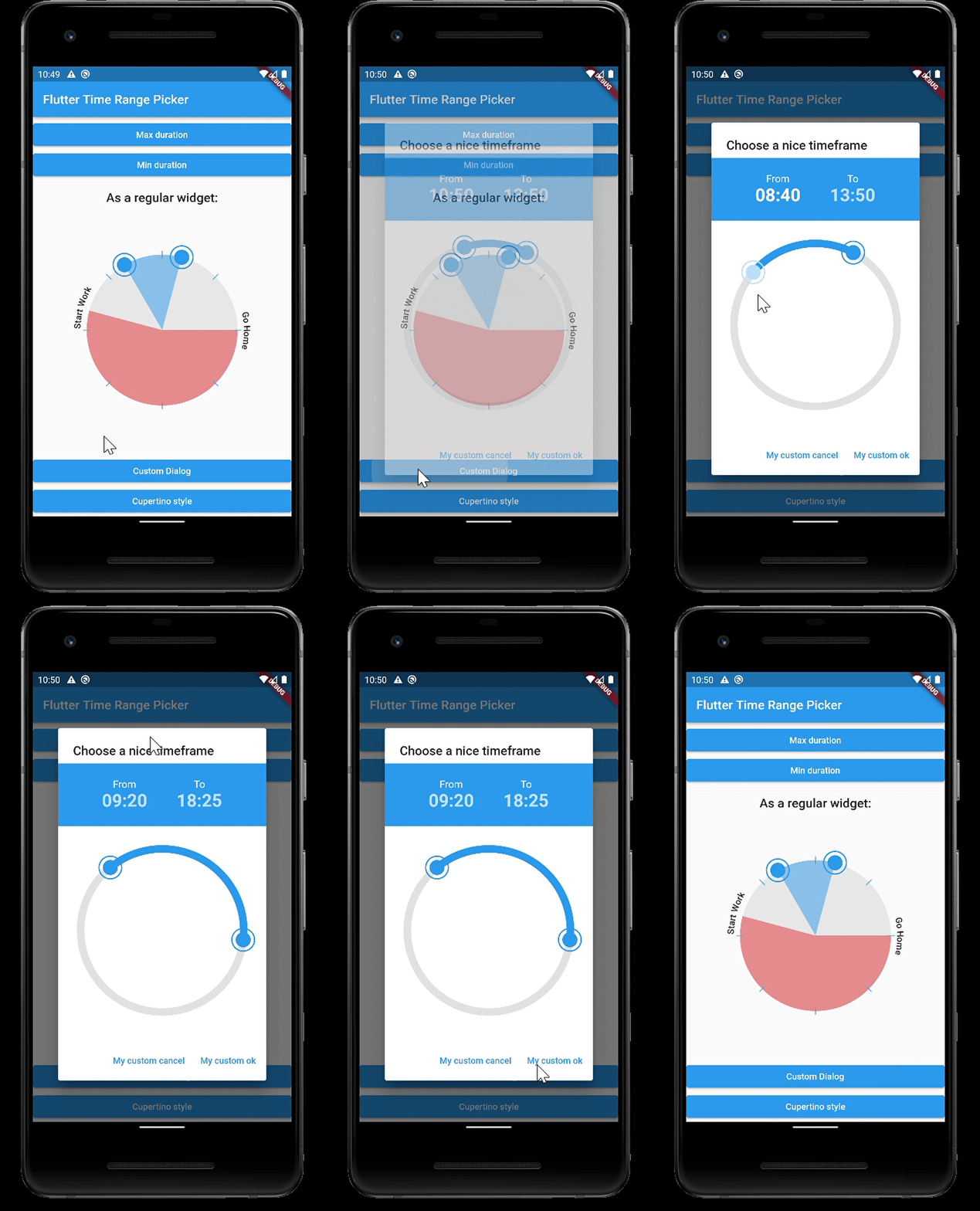
Custom Dialog

Custom Dialog

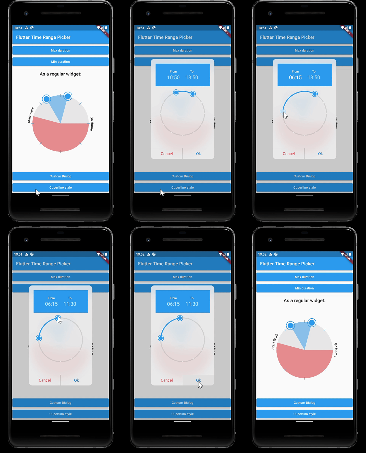
Custom Dialog iOS Style

Custom Dialog iOS Style

Parameters
type param default description
TimeOfDay start TimeOfDay.now() preselected start time
TimeOfDay end now + 3h preselected end time
TimeRange disabledTime disabled time range (this time cannot be selected)
Color disabledColor Colors.red.withOpacity(0.5) the color for the disabled section
PaintingStyle paintingStyle PaintingStyle.stroke Style of the arc (filled or stroke)
Function(TimeOfDay) onStartChange
Function(TimeOfDay) onEndChange
Duration interval Duration(minutes: 5) Minimum time steps that can be selected
String fromText "From" label for start time
String toText "To" label for end time
bool use24HourFormat true use 24 hours or am / pm
double padding 36 the padding of the ring
double strokeWidth 12 the thickness of the ring
Color strokeColor primaryColor the color of the active arc from start time to end time
double handlerRadius 12 the radius of the handler to drag the arc
Color handlerColor primaryColor the color of a handler
Color selectedColor primaryColorLight the color of a selected handler
Color backgroundColor Colors.grey[200] the color of the circle outline
Widget backgroundWidget a widget displayed in the background, use e.g. an image
int ticks number of ticks displayed
double ticksOffset 0 the offset for ticks
double ticksLength strokeWidth ticks length
double ticksWidth 1 ticks thickness
Color ticksColor Colors.white Color of ticks
bool snap false Snap time bar to interval
List labels Show labels around the circle (start at 0 hours)
double labelOffset 20 Offset of the labels
bool rotateLabels true rotate labels
bool autoAdjustLabels true flip labels if the angle woulb be upside down (only if rotate labels is active)
TextStyle labelStyle Style of the labels
TextStyle timeTextStyle TextStyle of the time texts
TextStyle activeTimeTextStyle TextStyle of the currently moving time text
bool hideTimes false hide the time texts
double clockRotation 0 rotate the clock around angle
Duration maxDuration null maximum Duration that can be picked
Duration minDuration Duration(minutes: 30) minimum Duration that can be picked
bool barrierDismissible true barrierDismissible false = user must tap button to close time range picker

Categories

Source repository

Projects using this package