
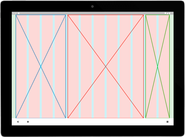
Overview
Wolt Responsive Layout Grid is a Flutter package designed to simplify the creation of dynamic, adaptive grid layouts that automatically adjust to different screen sizes across multiple platforms. It enables developers to build responsive user interfaces with consistent spacing and alignment, ensuring optimal visual presentation on Android, iOS, Web, macOS, Windows, and Linux. The library provides intuitive APIs for defining flexible grid structures based on breakpoints and constraints, reducing manual layout management. Ideal for complex UIs requiring fluid responsiveness, it enhances development efficiency while maintaining design consistency.
Use cases
- Building responsive dashboards
- Creating adaptive product grids
- Designing cross-platform layouts
- Implementing fluid card arrangements
- Developing scalable admin panels
Key features
- Automatic screen size adaptation
- Flexible grid definitions
- Breakpoint-based layout changes
- Cross-platform support
- Consistent spacing and alignment
- Simple API integration
Suitable for
- UI developers focused on responsiveness
- Teams building multi-platform apps
- Projects requiring dynamic grid layouts
- Design systems with adaptive components
- Complex dashboard or catalog interfaces
Considerations
- Requires understanding of responsive design principles
- May need customization for highly specific layouts
- Best used in conjunction with Flutter's layout widgets
- Performance impact in very large grids
- Limited documentation beyond basic examples