

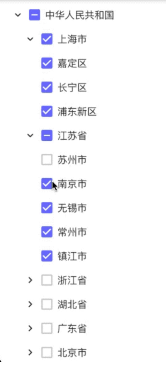
 v0.0.15
flutter_tree_pro
Flutter 树形选择小部件。您可以使用它来选择树节点。这也支持从右到左(RTL)。
28喜欢 140近 30 天下载150Pub 分数
AndroidiOSWebmacOSWindowsLinux
Invincible1996/flutter_tree open-source repository details.

以下为英文项目原文快照,最新内容请访问 GitHub。
A Flutter tree-select widget with checkbox selection, single-select mode, RTL support, and leaf-node drag-and-drop.

DataType.DataList) or nested map (DataType.DataMap)TreeLineStyle)Add dependency to your pubspec.yaml:
dependencies:
  flutter_tree_pro: ^0.0.16
Then run:
flutter pub get
import 'package:flutter/material.dart';
import 'package:flutter_tree_pro/flutter_tree_pro.dart';

class TreeDemo extends StatefulWidget {
  const TreeDemo({super.key});

  @override
  State<TreeDemo> createState() => _TreeDemoState();
}

class _TreeDemoState extends State<TreeDemo> {
  final List<Map<String, dynamic>> listData = [
    {'id': 1001, 'parentId': 0, 'value': 'USA'},
    {'id': 1002, 'parentId': 1001, 'value': 'California'},
    {'id': 1003, 'parentId': 1002, 'value': 'San Francisco'},
    {'id': 1004, 'parentId': 1001, 'value': 'New York'},
  ];

  final List<Map<String, dynamic>> initialListData = [
    {'id': 1003, 'parentId': 1002, 'value': 'San Francisco'},
  ];

  List<Map<String, dynamic>> checked = [];

  @override
  Widget build(BuildContext context) {
    return Scaffold(
      appBar: AppBar(title: const Text('flutter_tree_pro')),
      body: FlutterTreePro(
        listData: listData,
        initialListData: initialListData,
        isExpanded: true,
        isRTL: false,
        isSingleSelect: false,
        config: const Config(
          dataType: DataType.DataList,
          id: 'id',
          parentId: 'parentId',
          label: 'value',
          children: 'children',
          lineStyle: TreeLineStyle(
            color: Color(0xFFE0E0E0),
            width: 1.0,
            indent: 28,
            showVerticalLine: true,
            showHorizontalLine: true,
          ),
        ),
        onChecked: (items) {
          setState(() {
            checked = items;
          });
        },
      ),
    );
  }
}
DataType.DataListUse flat list data with id + parentId and pass it through listData.
Required fields in each item (or mapped by Config):
idparentIdlabel (for display text)DataType.DataMapUse nested tree data with children and pass it through treeData.
If treeData is empty and initialTreeData is provided, initialTreeData will be used as fallback root data.
FlutterTreePro parameters| Parameter | Type | Default | Description |
|---|---|---|---|
treeData |
List<Map<String, dynamic>> |
const [] |
Tree source for DataMap mode |
listData |
List<Map<String, dynamic>> |
const [] |
Flat source for DataList mode |
initialTreeData |
Map<String, dynamic> |
const {} |
Fallback root tree node when treeData is empty |
initialListData |
List<Map<String, dynamic>> |
const [] |
Initial checked items in multi-select mode |
config |
Config |
const Config() |
Field mapping and tree style config |
onChecked |
Function(List<Map<String, dynamic>>) |
required | Selection callback |
isExpanded |
bool |
false |
Expand all nodes initially |
isRTL |
bool |
false |
Enable right-to-left layout |
isSingleSelect |
bool |
false |
Enable single-select mode |
initialSelectValue |
int |
0 |
Initial selected node ID in single-select mode |
Config| Field | Type | Default | Description |
|---|---|---|---|
dataType |
DataType |
DataType.DataMap |
Data mode |
id |
String |
'id' |
Node ID key |
parentId |
String |
'parentId' |
Parent ID key |
label |
String |
'label' |
Display text key |
value |
String |
'value' |
Reserved compatibility field |
children |
String |
'children' |
Children key |
lineStyle |
TreeLineStyle |
const TreeLineStyle() |
Connector line style |
TreeLineStyle| Field | Type | Default | Description |
|---|---|---|---|
color |
Color |
Color(0xFFD9D9D9) |
Line color |
width |
double |
1.0 |
Line width |
indent |
double |
24.0 |
Per-level indentation |
showVerticalLine |
bool |
true |
Show vertical connectors |
showHorizontalLine |
bool |
true |
Show horizontal connectors |
onChecked returns checked leaf nodes after internal filtering/deduplication.onChecked returns at most one selected node.Config.value is reserved for compatibility and is not used by current select-state logic.See /example for a runnable demo:
cd example
flutter pub get
flutter run
MIT
依赖清单 2 项
{"sdk":"flutter"}{"sdk":"flutter"}先按使用场景筛选,再比较项目活跃情况,最后到原始仓库核对使用要求。
“A repository is the most basic element of GitHub.”
GitHub Docs — About repositories ↗