flutter_tree_pro
A Flutter tree-select widget with checkbox selection, single-select mode, RTL support, and leaf-node drag-and-drop.
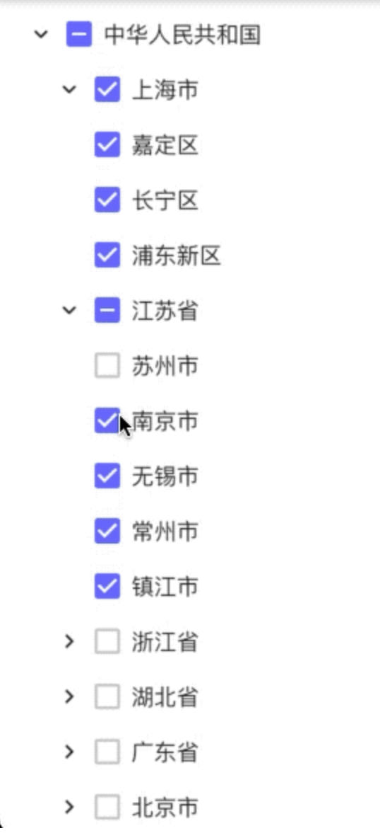
Demo
Features
Build tree data from flat list (DataType.DataList) or nested map (DataType.DataMap)
Multi-select with parent/child check-state synchronization
Single-select mode with initial selected node
Expand/collapse nodes
RTL layout support
Custom tree connector line style (TreeLineStyle)
Drag-and-drop for leaf nodes
Drop on a non-leaf node: dragged leaf becomes a child of that node
Drop on a leaf node: dragged leaf is inserted after target leaf as a sibling
Installation
Add dependency to your pubspec.yaml:
dependencies:
  flutter_tree_pro: ^0.0.16
Then run:
flutter pub get
Quick Start (DataList)
import 'package:flutter/material.dart' ;
import 'package:flutter_tree_pro/flutter_tree_pro.dart' ;
class TreeDemo extends StatefulWidget const TreeDemo ({super .key});
@override
State <TreeDemo > createState () => _TreeDemoState ();
}
class _TreeDemoState extends State <TreeDemo > final List <Map <String , dynamic >> listData = [
{'id' : 1001 , 'parentId' : 0 , 'value' : 'USA' },
{'id' : 1002 , 'parentId' : 1001 , 'value' : 'California' },
{'id' : 1003 , 'parentId' : 1002 , 'value' : 'San Francisco' },
{'id' : 1004 , 'parentId' : 1001 , 'value' : 'New York' },
];
final List <Map <String , dynamic >> initialListData = [
{'id' : 1003 , 'parentId' : 1002 , 'value' : 'San Francisco' },
];
List <Map <String , dynamic >> checked = [];
@override
Widget build (BuildContext context) {
return Scaffold (
appBar: AppBar (title: const Text ('flutter_tree_pro' )),
body: FlutterTreePro (
listData: listData,
initialListData: initialListData,
isExpanded: true ,
isRTL: false ,
isSingleSelect: false ,
config: const Config (
dataType: DataType .DataList ,
id: 'id' ,
parentId: 'parentId' ,
label: 'value' ,
children: 'children' ,
lineStyle: TreeLineStyle (
color: Color (0xFFE0E0E0 ),
width: 1.0 ,
indent: 28 ,
showVerticalLine: true ,
showHorizontalLine: true ,
),
),
onChecked: (items) {
setState (() {
checked = items;
});
},
),
);
}
}
Data Source Modes
DataType.DataListUse flat list data with id + parentId and pass it through listData.
Required fields in each item (or mapped by Config):
idparentIdlabel (for display text)
DataType.DataMapUse nested tree data with children and pass it through treeData.
If treeData is empty and initialTreeData is provided, initialTreeData will be used as fallback root data.
API
FlutterTreePro parameters
Parameter
Type
Default
Description
treeDataList<Map<String, dynamic>>const []Tree source for DataMap mode
listDataList<Map<String, dynamic>>const []Flat source for DataList mode
initialTreeDataMap<String, dynamic>const {}Fallback root tree node when treeData is empty
initialListDataList<Map<String, dynamic>>const []Initial checked items in multi-select mode
configConfigconst Config()Field mapping and tree style config
onCheckedFunction(List<Map<String, dynamic>>)required
Selection callback
isExpandedboolfalseExpand all nodes initially
isRTLboolfalseEnable right-to-left layout
isSingleSelectboolfalseEnable single-select mode
initialSelectValueint0Initial selected node ID in single-select mode
Config
Field
Type
Default
Description
dataTypeDataTypeDataType.DataMapData mode
idString'id'Node ID key
parentIdString'parentId'Parent ID key
labelString'label'Display text key
valueString'value'Reserved compatibility field
childrenString'children'Children key
lineStyleTreeLineStyleconst TreeLineStyle()Connector line style
TreeLineStyle
Field
Type
Default
Description
colorColorColor(0xFFD9D9D9)Line color
widthdouble1.0Line width
indentdouble24.0Per-level indentation
showVerticalLinebooltrueShow vertical connectors
showHorizontalLinebooltrueShow horizontal connectors
Drag-and-Drop Rules
Only leaf nodes can be dragged.
A node cannot be dropped onto itself.
A node cannot be dropped directly onto its current parent.
Drop on a leaf node inserts after that target leaf, keeping the same parent level.
Drop on a non-leaf node appends as the target node's child.
Notes
In multi-select mode, onChecked returns checked leaf nodes after internal filtering/deduplication.
In single-select mode, onChecked returns at most one selected node.
Config.value is reserved for compatibility and is not used by current select-state logic.
Example Project
See /example for a runnable demo:
cd example
flutter pub get
flutter run
License
MIT