
 v3.0.1
rounded_loading_button_plus
Flutter 的一个简单动画加载按钮小部件实现
79喜欢 2780近 30 天下载155Pub 分数
AndroidiOSWebmacOSWindowsLinux
flutter_rounded_loading_button_plus

{"sdk":"flutter"}>=0.27.7{"sdk":"flutter"}^1.3.2以下为英文项目原文快照,最新内容请访问 GitHub。
pub package build codecov style: effective dart License: MIT Awesome Flutter
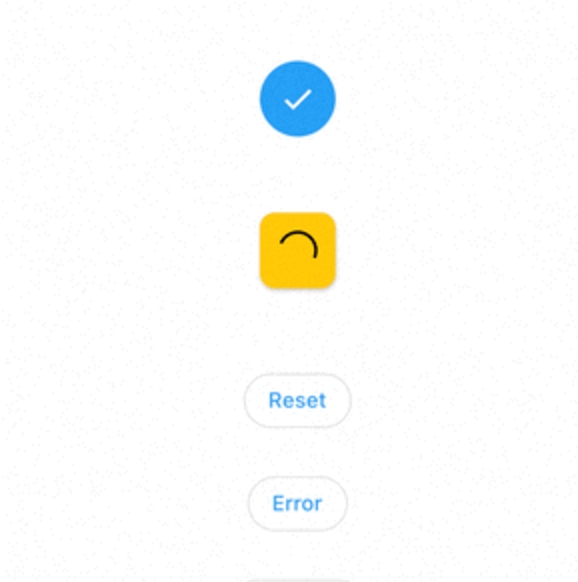
RoundedLoadingButton is a Flutter package with a simple implementation of an animated loading button, complete with success and error animations.
https://raw.githubusercontent.com/armanhadifatah/flutter_rounded_loading_button_plus/HEAD/screenshots/loading-button.gif
Add this to your pubspec.yaml:
dependencies:
    rounded_loading_button_plus: ^2.0.8
import 'package:rounded_loading_button_plus/rounded_loading_button_plus.dart';
final RoundedLoadingButtonController _btnController = RoundedLoadingButtonController();

void _doSomething() async {
    Timer(Duration(seconds: 3), () {
        _btnController.success();
    });
}

RoundedLoadingButton(
    child: Text('Tap me!', style: TextStyle(color: Colors.white)),
    controller: _btnController,
    onPressed: _doSomething,
)
The Rounded Loading Button has many configurable properties, including:
duration - The duration of the button animationloaderSize - The size of the CircularProgressIndicatoranimateOnTap - Whether to trigger the loading animation on the tap eventresetAfterDuration - Reset the animation after specified duration, defaults to 15 secondserrorColor - The color of the button when it is in the error statesuccessColor - The color of the button when it is in the success statesuccessIcon - The icon for the success statefailedIcon - The icon for the failed stateAll contributions are welcome!