搜索插件、代码仓与 APP 分类

rounded_loading_button_plus 封面
插件详情v3.0.1

rounded_loading_button_plus

Flutter 的一个简单动画加载按钮小部件实现

AndroidiOSWebmacOSWindowsLinux
近 30 天下载
2660
喜欢数
79
Pub 分数
155

安装插件

flutter pub add rounded_loading_button_plus

插件介绍

基于插件公开信息、社区数据与项目使用情况整理的选型参考。

一个 Flutter 包,提供带有平滑过渡和可自定义样式的动画加载按钮小部件。它通过在表单提交或 API 调用等操作期间直观地显示加载状态来提升用户体验。该按钮支持圆形和圆角矩形两种形状,并可自定义颜色、大小和动画速度。设计简洁高效,可无缝集成到任何跨平台的 Flutter 应用中。

适合场景

  • 表单提交带加载状态
  • API 调用触发
  • 用户身份验证流程
  • 交互式 UI 元素
  • 移动应用中的进度指示

主要特点

  • 动画加载过渡
  • 可自定义按钮形状
  • 可配置的颜色和尺寸
  • 跨平台支持
  • 与 onPressed 的简单集成
  • 平滑的动画效果

适合对象

  • 开发交互式表单的开发者
  • 需要在异步操作期间提供视觉反馈的应用程序
  • 面向用户界面的 Flutter 项目
  • 初学者到中级 Flutter 开发者
  • 面向 Android、iOS、Web、macOS、Windows 和 Linux 的项目

使用建议

  • 基本使用所需的设置极少
  • 超出核心属性的自定义功能有限
  • 无内置错误处理
  • 最适合简单的加载场景
  • 不适合复杂的状态管理

原始 README

以下为关联源码仓库的 README 原文快照,最新内容请访问源码仓库。

rounded_loading_button_plus

pub package build codecov style: effective dart License: MIT Awesome Flutter

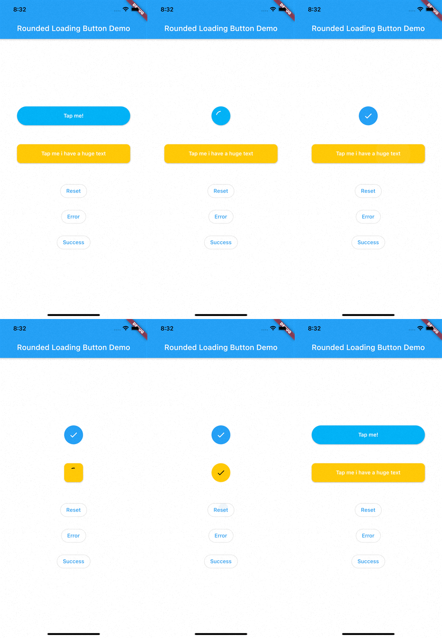
RoundedLoadingButton is a Flutter package with a simple implementation of an animated loading button, complete with success and error animations.

Installation

Add this to your pubspec.yaml:

dependencies:
    rounded_loading_button_plus: ^2.0.8

Usage

Import
import 'package:rounded_loading_button_plus/rounded_loading_button_plus.dart';
Simple Implementation
final RoundedLoadingButtonController _btnController = RoundedLoadingButtonController();

void _doSomething() async {
    Timer(Duration(seconds: 3), () {
        _btnController.success();
    });
}

RoundedLoadingButton(
    child: Text('Tap me!', style: TextStyle(color: Colors.white)),
    controller: _btnController,
    onPressed: _doSomething,
)

The Rounded Loading Button has many configurable properties, including:

  • duration - The duration of the button animation
  • loaderSize - The size of the CircularProgressIndicator
  • animateOnTap - Whether to trigger the loading animation on the tap event
  • resetAfterDuration - Reset the animation after specified duration, defaults to 15 seconds
  • errorColor - The color of the button when it is in the error state
  • successColor - The color of the button when it is in the success state
  • successIcon - The icon for the success state
  • failedIcon - The icon for the failed state

Contributions

All contributions are welcome!

所属分类

依赖

依赖清单 1 项

源码仓库

使用此插件的项目