
 v0.4.9+1
flutter_tags
चयन और इनपुट टैग (TextField) बनाना कभी नहीं इतना आसान था।
297लाइक 43230-दिन डाउनलोड40Pub अंक
प्लेटफ़ॉर्म डेटा नहीं
फ्लटर टैग के साथ आप चयन या इनपुट टैग बना सकते हैं जो स्क्रीन चौड़ाई के अनुसार स्वचालित रूप से अनुकूलित होते हैं।

{"sdk":"flutter"}{"sdk":"flutter"}यह अंग्रेज़ी मूल स्नैपशॉट है। नवीनतम सामग्री GitHub पर देखें।
pub package Awesome Flutter Donate
Create beautiful tags quickly and easily.
Add this to your package's pubspec.yaml file:
dependencies:
  flutter_tags: "^0.4.9+1"
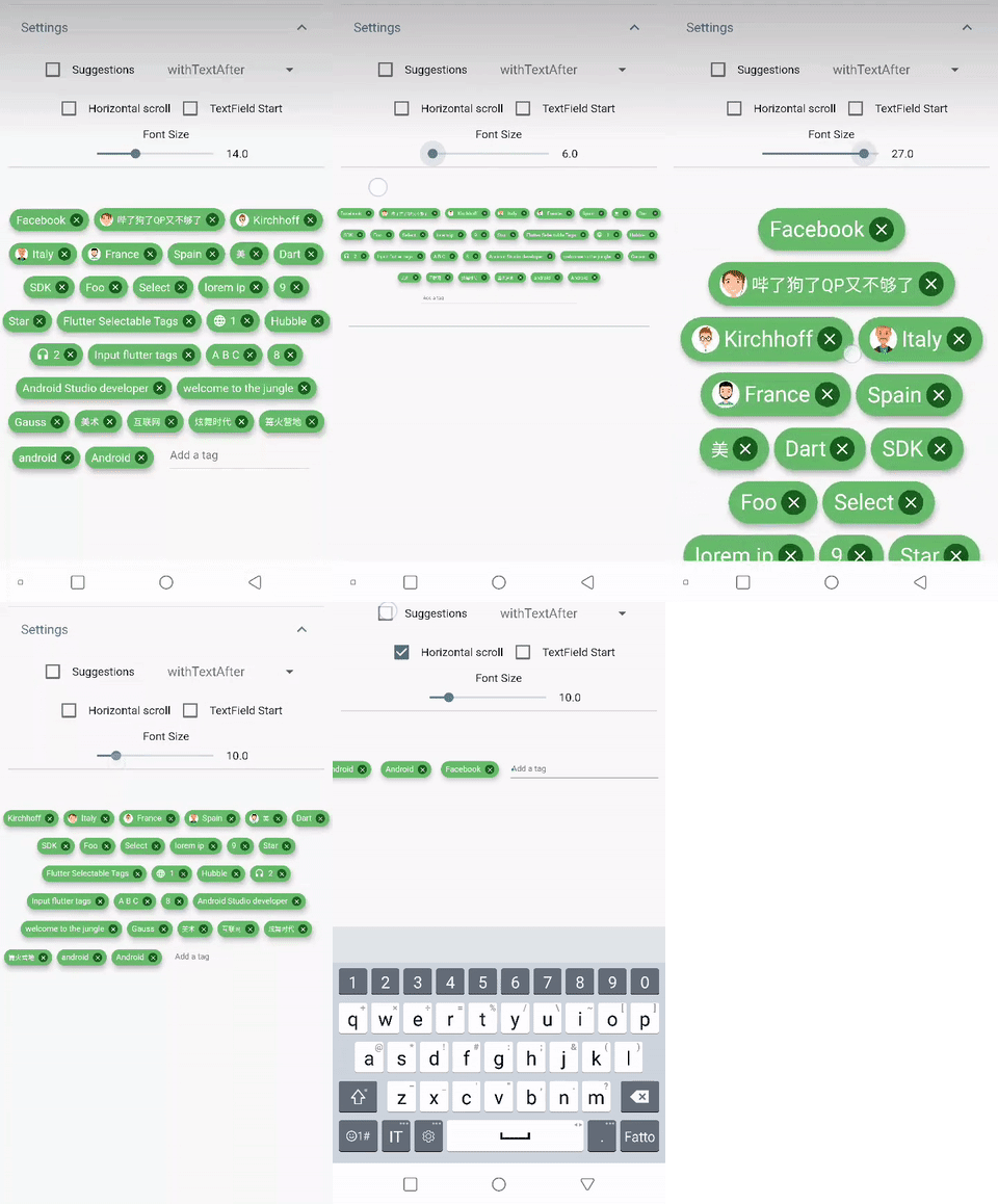
| https://github.com/Dn-a/flutter_tags/raw/master/repo-file/img/example0.4.0_1.gif | https://github.com/Dn-a/flutter_tags/raw/master/repo-file/img/example0.4.0_2.gif |
import 'package:flutter_tags/flutter_tags.dart';
.
.
.
List _items;
double _fontSize = 14;

@override
void initState(){
    super.initState();
    // if you store data on a local database (sqflite), then you could do something like this
    Model().getItems().then((items){
            _items = items;
        });
}

@override
Widget build(BuildContext context) {
    return Tags(
      key:_tagStateKey,
      textField: TagsTextField(
        textStyle: TextStyle(fontSize: _fontSize),
        constraintSuggestion: true, suggestions: [],
        //width: double.infinity, padding: EdgeInsets.symmetric(horizontal: 10),
        onSubmitted: (String str) {
          // Add item to the data source.
          setState(() {
              // required
            _items.add(str);
          });
        },
      ),
      itemCount: _items.length, // required
      itemBuilder: (int index){
            final item = _items[index];

            return ItemTags(
                  // Each ItemTags must contain a Key. Keys allow Flutter to
                  // uniquely identify widgets.
                  key: Key(index.toString()),
                  index: index, // required
                  title: item.title,
                  active: item.active,
                  customData: item.customData,
                  textStyle: TextStyle( fontSize: _fontSize, ),
                  combine: ItemTagsCombine.withTextBefore,
                  image: ItemTagsImage(
                    image: AssetImage("img.jpg") // OR NetworkImage("https://...image.png")
                  ), // OR null,
                  icon: ItemTagsIcon(
                    icon: Icons.add,
                  ), // OR null,
                  removeButton: ItemTagsRemoveButton(
                    onRemoved: (){
                        // Remove the item from the data source.
                        setState(() {
                            // required
                            _items.removeAt(index);
                        });
                        //required
                        return true;
                    },
                  ), // OR null,
                  onPressed: (item) => print(item),
                  onLongPressed: (item) => print(item),
            );

      },
    );
}

final GlobalKey<TagsState> _tagStateKey = GlobalKey<TagsState>();
// Allows you to get a list of all the ItemTags
_getAllItem(){
    List<Item> lst = _tagStateKey.currentState?.getAllItem;
    if(lst!=null)
        lst.where((a) => a.active==true).forEach( ( a) => print(a.title));
}
You are free to wrap ItemTags () inside another widget
Tags(
      itemCount: items.length,
      itemBuilder: (int index){
          return Tooltip(
          message: item.title,
          child:ItemTags(
            title:item.title,
          )
          );
      },
    );
| PropName | Description | default value |
|---|---|---|
columns |
Possibility to set number of columns when necessary | null |
itemCount |
Tag number to display | required |
symmetry |
Ability to view and scroll tags horizontally | false |
horizontalScroll |
Offset drawer width | 0.4 |
heightHorizontalScroll |
height for HorizontalScroll to set to display tags correctly | 60 |
spacing |
Horizontal space between the tags | 6 |
runSpacing |
Vertical space between the tags | 14 |
alignment |
Horizontal WrapAlignment | WrapAlignment.center |
runAlignment |
Vertical WrapAlignment | WrapAlignment.center |
direction |
Direction of the ItemTags | Axis.horizontal |
verticalDirection |
Iterate Item from the lower to the upper direction or vice versa | VerticalDirection.down |
textDirection |
Text direction of the ItemTags | TextDirection.ltr |
itemBuilder |
tag generator | |
textField |
add textField | TagsTextFiled() |
index - requiredtitle - requiredtextScaleFactor - custom textScaleFactoractive - bool value (default true)pressEnabled - active onPress tag ( default true)customData - Possibility to add any custom value in customData field, you can retrieve this later. A good example: store an id from Firestore document.textStyle - textStyle()alignment - MainAxisAlignment ( default MainAxisAlignment.center)combine - * ability to combine text, icons, images in different ways ( default ItemTagsCombine.imageOrIconOrText)*icon - ItemTagsIcon()image - ItemTagsImage()removeButton - ItemTagsRemoveButton()borderRadius - BorderRadiusborder - custom border-sidepadding - default EdgeInsets.symmetric(horizontal: 7, vertical: 5)elevation - default 5singleItem - default falsetextOverflow - default TextOverflow.fadetextColor - default Colors.blacktextActiveColor - default Colors.whitecolor - default Colors.whiteactiveColor - default Colors.blueGreyhighlightColor -splashColor -colorShowDuplicate - default Colors.redonPressed - callbackonLongPressed - callbackonRemoved - callbackIt takes time to carry on this project. If you found it useful or learned something from the source code please consider the idea of donating 5, 20, 50 € or whatever you can to support the project.
If you encounter problems, open an issue. Pull request are also welcome.