

 v2.0.2
flutter_progress_hud
फेड एनिमेशन के साथ अत्यधिक कस्टमाइज़ करने योग्य मॉडल प्रगति इंडिकेटर।
131लाइक 28.9 हज़ार30-दिन डाउनलोड150Pub अंक
AndroidiOSWebmacOSWindowsLinux
FlorinMihalache/flutter_progress_hud open-source repository details.

यह अंग्रेज़ी मूल स्नैपशॉट है। नवीनतम सामग्री GitHub पर देखें।

Highly customizable modal progress indicator with fade animation.
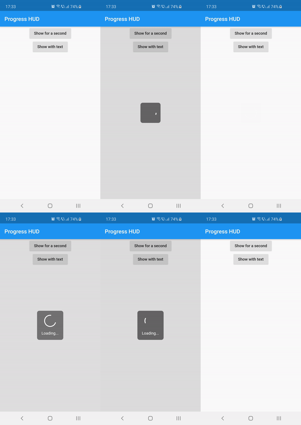
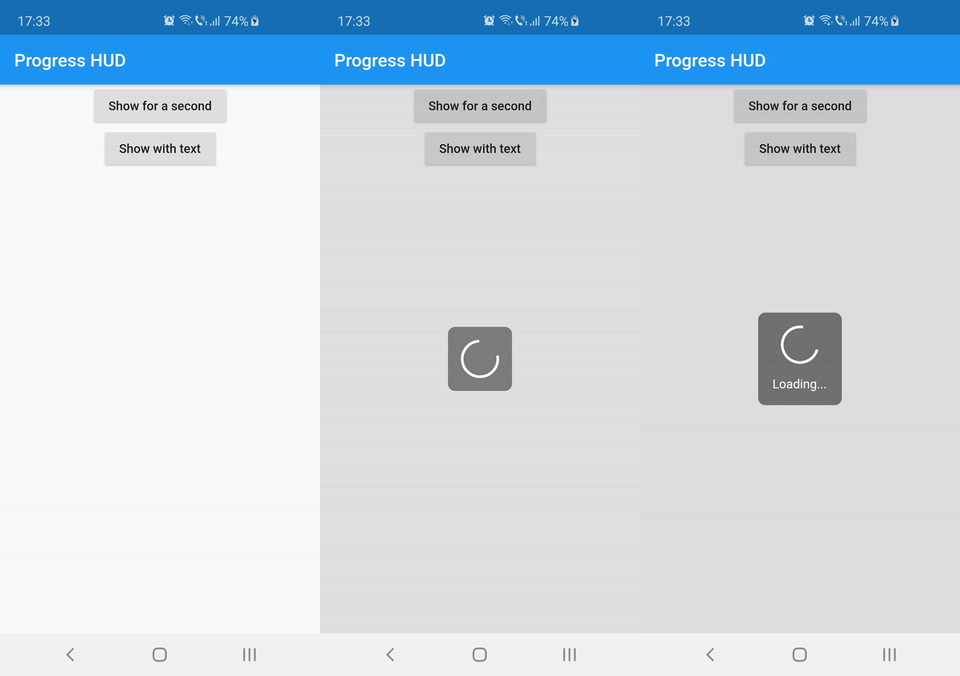
Wrap with ProgressHUD the widget on top of which you want to show the modal indicator.
ProgressHUD(
  child: HomePage(),
)
Get a reference of ProgressHUD
final progress = ProgressHUD.of(context);
Show indeterminate progress
progress.show();
Or a progress with text
progress.showWithText('Loading...');
Then dismiss
progress.dismiss();
ProgressHUD(
        child: Builder(
          builder: (context) => Center(
                child: Column(
                  children: <Widget>[
                    RaisedButton(
                      child: Text('Show for a second'),
                      onPressed: () {
                        final progress = ProgressHUD.of(context);
                        progress.show();
                        Future.delayed(Duration(seconds: 1), () {
                          progress.dismiss();
                        });
                      },
                    ),
                    RaisedButton(
                      child: Text('Show with text'),
                      onPressed: () {
                        final progress = ProgressHUD.of(context);
                        progress.showWithText('Loading...');
                        Future.delayed(Duration(seconds: 1), () {
                          progress.dismiss();
                        });
                      },
                    ),
                  ],
                ),
              ),
        ),
      ),
| Attribute Name | Default Value | Description |
|---|---|---|
| indicatorColor | Colors.white | When using the default indicator widget, this is how you set its color |
| indicatorWidget | A basic CircularProgressIndicator | Custom indicator widget |
| backgroundColor | Colors.black54 | Indicator background color |
| backgroundRadius | Radius.circular(8.0) | Indicator background radius |
| borderColor | Colors.white | Indicator background border color |
| borderWidth | 0.0 | Indicator background border width |
| barrierEnabled | true | You can disable the modal barrier if you want to allow touches while the progress is shown |
| barrierColor | Colors.black12 | Color of the Barrier displayed behind the indicator |
| textStyle | TextStyle(color: Colors.white, fontSize: 14.0) | TextStyle for the Text displayed below the indicator |
| padding | EdgeInsets.all(16.0)} | Indicator content padding |
निर्भरता सूची 2 आइटम
{"sdk":"flutter"}{"sdk":"flutter"}उपयोग के अनुसार छाँटें, गतिविधि की तुलना करें और अपनाने से पहले मूल प्रोजेक्ट की आवश्यकताएँ जाँचें।
“A repository is the most basic element of GitHub.”
GitHub Docs — About repositories ↗