पैकेज, रिपॉज़िटरी और ऐप श्रेणियाँ खोजें

flutter_progress_hud कवर
पैकेज विवरणv2.0.2

flutter_progress_hud

फेड एनिमेशन के साथ अत्यधिक कस्टमाइज़ करने योग्य मॉडल प्रगति इंडिकेटर।

AndroidiOSWebmacOSWindowsLinux
30-दिन डाउनलोड
28.9 हज़ार
लाइक
131
Pub अंक
150

पैकेज इंस्टॉल करें

flutter pub add flutter_progress_hud

पैकेज अवलोकन

सार्वजनिक जानकारी से बना चयन मार्गदर्शन। केवल संदर्भ हेतु।

फ्लटर के लिए एक अत्यधिक कस्टमाइज़ेबल मॉडल प्रगति इंडिकेटर जो चिकनी फेड एनीमेशन के साथ लोडिंग ओवरले दिखाता है। यह असिंक्रोनस ऑपरेशन के दौरान लोडिंग स्थिति को दिखाने और छिपाने का आसान तरीका प्रदान करता है, जो चल रही प्रक्रियाओं को दिखाकर उपयोगकर्ता अनुभव को बेहतर बनाता है। HUD को विभिन्न संदेशों, रंगों और आकृतियों के साथ कस्टमाइज़ किया जा सकता है, और विभिन्न प्लेटफॉर्मों के लिए समर्थन प्रदान करता है, जिसमें मोबाइल, वेब और डेस्कटॉप शामिल हैं। फॉर्म, API कॉल या किसी भी ऐसी ऑपरेशन के लिए आदर्श है जिसमें विजुअल फीडबैक की आवश्यकता होती है।

उपयोग

  • API के अनुरोध के दौरान लोडिंग स्थिति प्रदर्शित करें
  • फॉर्म सबमिशन में प्रगति दिखाएं
  • डेटा फीचिंग के दौरान उपयोगकर्ता अनुभव में सुधार करना
  • बैकग्राउंड कार्यों के दौरान प्रतिक्रिया प्रदान करना
  • लंबे समय तक चलने वाले ऑपरेशन में प्रोसेसिंग स्थिति का इंगित करना

मुख्य विशेषताएँ

  • फेड-इन और फेड-आउट एनीमेशन
  • कस्टमाइज़ किए गए संदेश और उपस्थिति
  • कई प्लेटफॉर्म का समर्थन करता है
  • आसान दिखाएं/छुपाएं विधियां
  • कॉन्फ़िगरेबल ओवरले रंग और अपारदर्शिता
  • उपकरणों के लिए प्रतिक्रियाशील डिज़ाइन

इनके लिए उपयुक्त

  • अक्सर एसिंक ऑपरेशन के साथ ऐप बनाने वाले डेवलपर्स
  • उपयोगकर्ता अनुभव प्राथमिकता वाली टीमें
  • स्थिर लोडिंग संकेतक की आवश्यकता वाले प्रोजेक्ट
  • कई प्लेटफॉर्म के लिए लक्षित ऐप्स
  • पॉलिश्ड फीडबैक की आवश्यकता वाले UI-भारी एप्लिकेशन

विचार योग्य बातें

  • अन्य UI तत्वों के साथ ओवरलैप होने से बचने के लिए सावधानीपूर्वक प्रबंधन की आवश्यकता हो सकती है
  • कस्टमाइजेशन विकल्प सरल उपयोग के मामलों में जटिलता बढ़ा सकते हैं
  • बहुत अक्सर दिखाएं / छिपाएं चक्रों पर प्रदर्शन प्रभाव
  • गैर-मोडल लोडिंग परिदृश्य के लिए उपयुक्त नहीं
  • तीसरे पक्ष के विकल्पों की तुलना में सीमित आंतरिक थीम

मूल README

संबंधित सोर्स रिपॉज़िटरी के मूल README का स्नैपशॉट। नवीनतम सामग्री के लिए रिपॉज़िटरी देखें।

pub package

Flutter Progress HUD

Highly customizable modal progress indicator with fade animation.

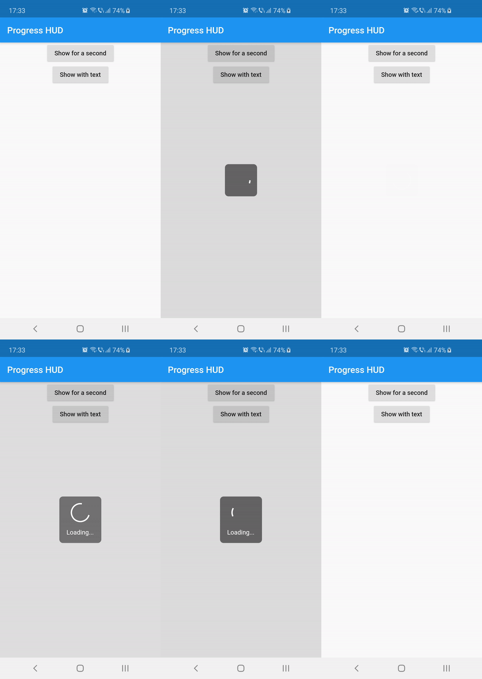
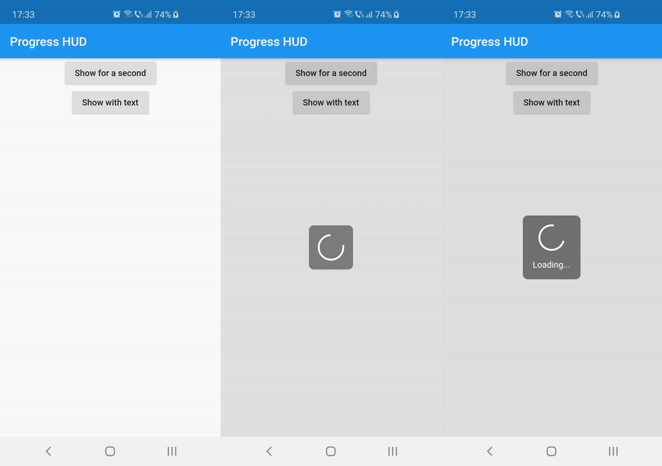
Preview

Usage

Wrap with ProgressHUD the widget on top of which you want to show the modal indicator.

ProgressHUD(
  child: HomePage(),
)

Get a reference of ProgressHUD

final progress = ProgressHUD.of(context);

Show indeterminate progress

progress.show();

Or a progress with text

progress.showWithText('Loading...');

Then dismiss

progress.dismiss();

Example (full)

ProgressHUD(
        child: Builder(
          builder: (context) => Center(
                child: Column(
                  children: <Widget>[
                    RaisedButton(
                      child: Text('Show for a second'),
                      onPressed: () {
                        final progress = ProgressHUD.of(context);
                        progress.show();
                        Future.delayed(Duration(seconds: 1), () {
                          progress.dismiss();
                        });
                      },
                    ),
                    RaisedButton(
                      child: Text('Show with text'),
                      onPressed: () {
                        final progress = ProgressHUD.of(context);
                        progress.showWithText('Loading...');
                        Future.delayed(Duration(seconds: 1), () {
                          progress.dismiss();
                        });
                      },
                    ),
                  ],
                ),
              ),
        ),
      ),

Customization

Attribute Name Default Value Description
indicatorColor Colors.white When using the default indicator widget, this is how you set its color
indicatorWidget A basic CircularProgressIndicator Custom indicator widget
backgroundColor Colors.black54 Indicator background color
backgroundRadius Radius.circular(8.0) Indicator background radius
borderColor Colors.white Indicator background border color
borderWidth 0.0 Indicator background border width
barrierEnabled true You can disable the modal barrier if you want to allow touches while the progress is shown
barrierColor Colors.black12 Color of the Barrier displayed behind the indicator
textStyle TextStyle(color: Colors.white, fontSize: 14.0) TextStyle for the Text displayed below the indicator
padding EdgeInsets.all(16.0)} Indicator content padding

श्रेणियाँ

सोर्स रिपॉज़िटरी

इस पैकेज का उपयोग करने वाले प्रोजेक्ट