
 v1.1.0
slide_to_confirm
एक स्लाइडर जो उपयोगकर्ता के इसे 100% तक स्लाइड करने पर कॉलबैक को सक्रिय करेगा।
150लाइक 1.1 हज़ार30-दिन डाउनलोड140Pub अंक
AndroidiOSWebmacOSWindowsLinux
एक स्लाइडर जो उपयोगकर्ता के इसे 100% तक स्लाइड करने पर कॉलबैक को सक्रिय करेगा।

{"sdk":"flutter"}{"sdk":"flutter"}यह अंग्रेज़ी मूल स्नैपशॉट है। नवीनतम सामग्री GitHub पर देखें।
A customizable slider that will activate a callback when the user slides it to 100%.
In the dependencies: section of your pubspec.yaml, add the following line:
slide_to_confirm: <latest_version>
import 'package:slide_to_confirm/slide_to_confirm.dart';

class MyWidget extends StatelessWidget {

    void confirmed(){
        print('Slider confirmed!');
    }

    Widget build(BuildContext context) {
        return ConfirmationSlider(
            onConfirmation: () => confirmed(),
        );
    }
}
double: Height of the slider. Defaults to 70.double: Width of the slider. Defaults to 300.Color: The color of the background of the slider. Defaults to Colors.white.Color: The color of the background of the slider when it has been slide to the end. By giving a value here, the background color will gradually change from backgroundColor to backgroundColorEnd when the user slides. Is not used by default.Color: The color of the moving element of the slider. Defaults to Colors.blueAccent.Color: The color of the icon on the moving element if icon is IconData. Defaults to Colors.white.Widget or : The icon widget used on the moving element of the slider. Defaults to Icon(Icons.chevron_right).BoxShadow: The shadow below the slider. Defaults to BoxShadow(color: Colors.black38, offset: Offset(0, 2),blurRadius: 2,spreadRadius: 0,).String: The text showed below the foreground. Used to specify the functionality to the user. Defaults to "Slide to confirm".TextStyle: The style of the text. Defaults to TextStyle(color: Colors.black26, fontWeight: FontWeight.bold,).VoidCallback: The callback when slider is completed. This is the only required field.VoidCallback: The callback when slider is pressed.VoidCallback: The callback when slider is release.BorderRadius: The shape of the foreground (the moving element of the slider). Defaults to a circular border radius.BorderRadius: The shape of the background of the slider. Defaults to a circular border radius.bool: Bool that indicates if stick or not the cursor at end of slideView the Flutter app in the example directory to see a working example of how to use and implement the slider.
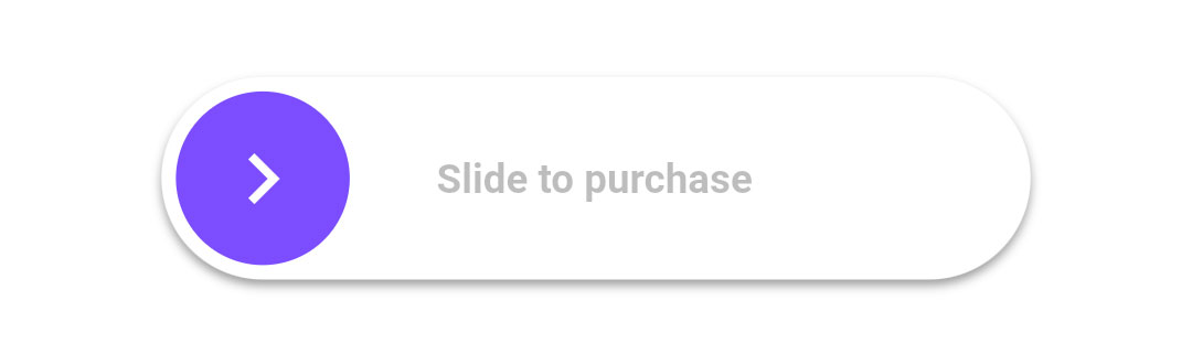
Slider Gif
Slider Gif
Slider Gif
Slider Gif
Slider Gif