सार्वजनिक जानकारी से बना चयन मार्गदर्शन। केवल संदर्भ हेतु।
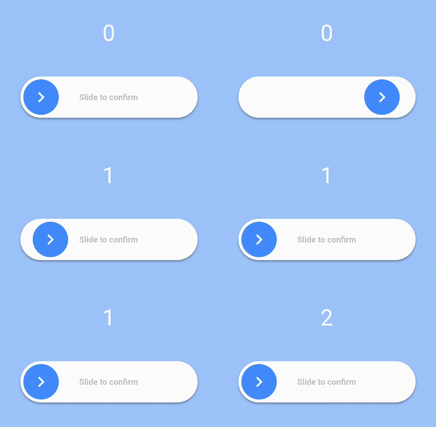
एक फ्लटर पैकेज जो एक कस्टमाइज़ेबल स्लाइडर विजेट प्रदान करता है, जिसका उपयोग उपयोगकर्ता द्वारा इसे 100% तक पूरी तरह स्लाइड करने पर एक बार कॉलबैक ट्रिगर करने के लिए किया जाता है। यह उपयोगकर्ता इंटरैक्शन को बढ़ावा देता है और आमतौर पर आइटम को हटाने या फॉर्म भरने जैसे कार्यों की पुष्टि करने के लिए उपयोग किया जाता है। स्लाइडर में स्मूथ एनीमेशन समर्थन है और इसे कस्टम रंग, आकार और लेबल के साथ स्टाइल किया जा सकता है। यह सभी प्रमुख प्लेटफॉर्म जैसे Android, iOS, Web, macOS, Windows और Linux पर काम करता है।
उपयोग
विनाशकारी कार्रवाई की पुष्टि करें
प्रस्तुति से पहले उपयोगकर्ता सत्यापन
फॉर्म इंटरैक्शन को बढ़ावा देना
अनचाहे टैप को रोकना
इंटरैक्टिव फीडबैक जोड़ें
कस्टम पुष्टि गेस्चर
मुख्य विशेषताएँ
पूर्ण 100% स्लाइड सक्रियण
कॉन्फ़िगरेबल रंग और आकार
पूर्ण होने पर कॉलबैक
स्मूथ एनिमेशन
क्रॉस-प्लेटफ़ॉर्म समर्थन
कस्टमाइज़ किए गए लेबल पाठ
इनके लिए उपयुक्त
फॉर्म पुष्टिकरण
हटाने की क्रिया संकेत
इंटरैक्टिव यूआई तत्व
उपयोगकर्ता भागीदारी सुविधाएं
एक्सेसिबिलिटी-सुधारित नियंत्रण
सरल लेकिन प्रभावी गतिशील इनपुट
विचार योग्य बातें
पूरा करने के लिए उपयोगकर्ता का ध्यान आवश्यक है
अनुकूलता समायोजन की आवश्यकता हो सकती है
एक दिशा में सीमित स्लाइडिंग
तेज़ इनपुट के लिए उपयुक्त नहीं
दृश्य प्रतिक्रिया स्पष्ट होनी चाहिए
जटिल लेआउट पर प्रदर्शन प्रभाव
मूल README
संबंधित सोर्स रिपॉज़िटरी के मूल README का स्नैपशॉट। नवीनतम सामग्री के लिए रिपॉज़िटरी देखें।
slide_to_confirm
A customizable slider that will activate a callback when the user slides it to 100%.
Installation
In the dependencies: section of your pubspec.yaml, add the following line:
heightdouble: Height of the slider. Defaults to 70.
widthdouble: Width of the slider. Defaults to 300.
backgroundColorColor: The color of the background of the slider. Defaults to Colors.white.
backgroundColorEndColor: The color of the background of the slider when it has been slide to the end. By giving a value here, the background color will gradually change from backgroundColor to backgroundColorEnd when the user slides. Is not used by default.
foregroundColorColor: The color of the moving element of the slider. Defaults to Colors.blueAccent.
iconColorColor: The color of the icon on the moving element if icon is IconData. Defaults to Colors.white.
sliderButtonContentWidget or : The icon widget used on the moving element of the slider. Defaults to Icon(Icons.chevron_right).
shadowBoxShadow: The shadow below the slider. Defaults to BoxShadow(color: Colors.black38, offset: Offset(0, 2),blurRadius: 2,spreadRadius: 0,).
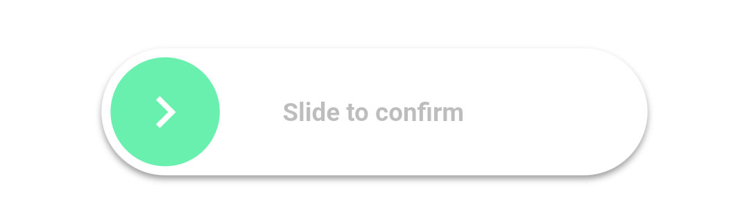
textString: The text showed below the foreground. Used to specify the functionality to the user. Defaults to "Slide to confirm".
textStyleTextStyle: The style of the text. Defaults to TextStyle(color: Colors.black26, fontWeight: FontWeight.bold,).
onConfirmationVoidCallback: The callback when slider is completed. This is the only required field.
onTapDownVoidCallback: The callback when slider is pressed.
onTapUpVoidCallback: The callback when slider is release.
foregroundShapeBorderRadius: The shape of the foreground (the moving element of the slider). Defaults to a circular border radius.
backgroundShapeBorderRadius: The shape of the background of the slider. Defaults to a circular border radius.
stickToEndbool: Bool that indicates if stick or not the cursor at end of slide
Example
View the Flutter app in the example directory to see a working example of how to use and implement the slider.